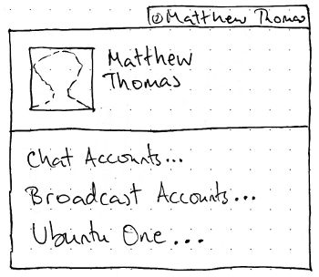
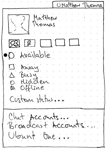
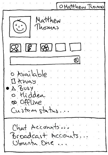
This specification is for the “me menu” that appeared in Ubuntu 10.04, 10.10, and 11.04.
|
Designed by MarkShuttleworth, specified in detail by Ivanka Majic and MatthewPaulThomas
There should be a “Me menu” representing you in Ubuntu. It should let you broadcast to social networks such as Twitter and Facebook, set your status for instant messaging in Empathy, and access settings for instant messaging, microblogging, and Ubuntu One.
This is the design specification for Me Menu. This specification contains some issues not yet resolved. Your feedback is welcome at MeMenu/Comments.
Contents
Rationale
The Me menu is the first port of call for the user to express their status and their identities to the world.
Artwork requirements summary
- A mockup of the menu with the whole Me item (picture + name) highlighted.
A mockup of what the broadcast field should look like if the text in it is currently too long to be submitted (e.g. over Twitter’s 140-character limit).
- Mockups of each of the wireframes below.
Use cases
Initial appearance |
IM set up, no broadcast accounts |
Both IM and broadcast accounts set up |
|
|
|
The menu itself
Unless otherwise specified, activating any menu item should close the menu before carrying out its function.
Title
The title of the menu should be an icon representing your current instant messaging status, followed by whichever form of your name you have chosen in About Me. If you have no instant messaging accounts set up, the icon should be the Offline icon. If you have multiple instant messaging accounts with different current statuses, the icon should be a thick dash, the same as used for indeterminate radio menu items.
The accessible name for the title should begin with whichever form of your name you have chosen, or “Me” if you chose none. This should be followed, if you have any instant messaging accounts set up, by your current IM status in brackets, or “(various)” if you have multiple instant messaging accounts with different current statuses. For example, “frederick (Away)”.
Me item
The first item in the menu should consist of data from your Ubuntu account: your account picture on the leading side, and your “Real name” alongside, with 1 em spacing between them. It should behave exactly as a single menu item. It should be insensitive if gnome-about-me is not installed. Activating the item should open About Me.
The account picture should be scaled, maintaining proportion, to the largest size that will fit in a 3-em square. If you have no account picture, a default user account picture should appear instead.
The name should, if necessary, wrap to two lines of text. If it would take up more than two lines, the second line should end with an ellipsis.
TBD: A mockup showing the first item highlighted.
Broadcast field
The broadcast field should be present if you have at least one broadcast account set up. There is no extra submit button; text is submitted by pressing Enter.
The default contents of the field depends on what your last posting was to each of the set up broadcast accounts.
- If the last posting was the same to all broadcast accounts (for example, if you have only one broadcast account item set up), the default contents of the field should be the text of that last posting.
- In all other cases, the default contents of the field should be nothing.
Test case:
- Using a separate program, post “hello world” to Twitter, “hello world” to Identica, and “hi there” to Facebook.
- Open the Me menu. The broadcast field should be blank.
- Using a separate program, post “hello world” to Facebook.
- Open the Me menu. The broadcast field should say “hello world”.
Submitting text should do nothing (even leaving the caret where it is) if any of the set up broadcast accounts have a character limit that is exceeded by the field’s current context. Otherwise, submitting text should close the menu, and post that text to all broadcast accounts whose account items are checked. If any of them should accept the submission but fail, a notification bubble should be displayed with title text of the form “Status could not be updated” and body text of the form “for {comma-and-space-separated list of accounts that failed}”.
Otherwise, when you submit text the menu should close immediately, and then post the text to all those accounts for which your latest status is not that exact text already. (This is to partly prevent a temporary error on one account from tricking you into double-posting to all the other accounts.)
If posting fails for any account:
- A notification bubble should appear with an error icon, title text of the form “Couldn’t post to Twitter”, and body text giving a more detailed reason.
- Until you next successfully post to that account, an extra row should appear immediately below the field in the menu:
 Couldn’t post to Twitter
Instant messaging statuses
This section should be present only if Empathy is installed and you have set up any instant messaging accounts in it. It should consist of radio items with icons and labels for “Available”, “Away”, “Busy”, “Hidden”, and “Offline”, and an item with label only for “Custom Status…”. Each item should be sensitive whenever at least one of the accounts you have set up in Empathy supports that status, regardless of whether Empathy is currently running.
A status item should be checked if all your Empathy accounts are currently set to that status. It should be set to indeterminate status if not all, but at least one, of your Empathy accounts are set to that status. Activating any of the items except “Custom Status…” should close the menu and set your instant messaging status for all checked chat accounts to the most similar status available for that account, regardless of whether it was offline previously.
Test case: Set up a Facebook Chat account, and no other account, in Empathy. Log out, then log in again. “Offline” should be checked, “Available” should be sensitive, and the other IM status items should be insensitive.
Test case: Set up an XMPP account in addition to the Facebook account. Log out, then log in again. Select “Busy”. Empathy should launch with your status set to “Busy” for XMPP and “Available” for Facebook Chat. The “Busy” and “Available” items should have an indeterminate mark, while all the others are sensitive.
Activating “Custom Status…” should open a dialog for setting a custom status.
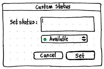
The dialog should be resizable; any extra size should be consumed by an enlarging “Set status” field.
The “Set status” field should allow a single line of text, but wrap it to multiple lines if necessary.
The menu underneath should be for choosing the type of status: “Available”, “Away”, or “Busy”.
The “Set” button should have Enter as its access key. It should be sensitive even if the “Set status” field is empty; this should be equivalent to setting a non-custom status.
If submitted, the custom status should be set for all checked chat accounts that support custom statuses.
Settings items
The menu should end with a separator, a “Chat Accounts…” item, a “Broadcast Accounts…” item, and an “Ubuntu One…” item.
The “Chat Accounts…” item should be present only if Empathy is installed. Activating it should open Empathy’s Accounts window, or focus it if it is already open.
The “Broadcast Accounts…” item should be present only if Gwibber, or the general broadcast accounts utility, is installed. Activating it should open the general broadcast accounts utility (if it has been implemented), or otherwise Gwibber’s “Manage Accounts” window, or focus it if it is already open.
The “Ubuntu One…” item should be present only if the Ubuntu One control panel is installed. It should say “Ubuntu One Settings…” instead if you are currently logged in to Ubuntu One. Activating it should open that control panel, or focus it if it is already open.
Application integration for Ubuntu Lucid
For Lucid, these services should be integrated:
- Gwibber: Twitter, Facebook, Identica
- Empathy: msn, Google Talk, Yahoo Chat
Changes to About Me
The About Me window should be simplified to this.
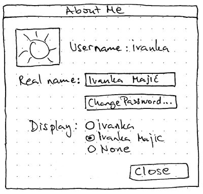
The “Display” radio buttons determine how your name is displayed in the title of the menu.
Handling upgrades
Risks
Facebook Chat does not have a “Hidden” status, so including it in a global IM status menu may mislead people about whether they are actually hidden. See also http://www.szetopia.com/im-presence
Twitter has become hostile to third-party clients. “Twitter will provide the primary mainstream consumer client experience on phones, computers, and other devices by which millions of people access Twitter content (tweets, trends, profiles, etc.), and send tweets. If there are too many ways to use Twitter that are inconsistent with one another, we risk diffusing the user experience.”
Future work
- Broadcast what I am listening to as a status
- Review all messaging apps
- Does the Social Networks service need an alternative list view to support accessibility?
- Generalize the broadcast account settings for use by other applications
- API for those applications to access the settings
Service and account items
The service and account items represent your broadcast accounts and instant messaging accounts that Ubuntu knows about. The items should be present only if you have set up any broadcast or instant messaging accounts.
If you do have accounts set up, these should be displayed as toggle items in a grid that has up to five accounts per row. If you have more than one account set up, the first item should be an All item. This item should be labelled with the localization of the word “All” if it fits in the grid square, or otherwise an All icon (𝍖 an array of dots).Test case: Set up seven accounts. The first row should have five account items (“All” plus four accounts), and the second row should have three account items and two empty spaces.
For this specification, an account item in the on status is “checked”, and an item in the off state is “unchecked”. On first use of the menu, all account items should be checked. The state of each account item should persist even after restarting the computer. Activating an item should toggle it between checked and unchecked, but should not close the menu.
TBD: A mockup showing the difference between checked and unchecked.
Checking the All item should check all the other account items. The All item should be checked whenever — and only when — all accounts are checked. Unchecking it should uncheck every account.
In addition to being unchecked or checked, items for instant messaging accounts should also display whether your status for that service is available, away, busy, hidden, or offline.
TBD: A mockup showing an item in Offline state, and items in checked and unchecked statuses that are Available, Away, Busy, and Hidden.
So, each toggle button needs to have statuses visually representing two things: your IM status, and whether it is selected (checked).
|
Unchecked |
Checked |
Available |
<service>_available_unselected |
<service>_available_selected |
Away |
<service>_away_unselected |
<service>_away_selected |
Busy |
<service>_busy_unselected |
<service>_busy_selected |
Hidden |
<service>_hidden_unselected |
<service>_hidden_selected |
Offline |
<service>_offline |
|
The arrow keys should navigate through the items just as they would for cells in a spreadsheet. Test case: With the seven accounts still set up, open the menu and press Down twice. The “All” item (top left corner) should be highlighted. Press Right once, then Down twice. The text field should be focused. Press Up once. The seventh account (not the sixth!) should be highlighted.
Broadcast field
The broadcast field should be sensitive whenever at least one broadcast account item is checked.
Test case:
- Using a separate program, post “hello world” to Twitter, “hello world” to Identica, and “hi there” to Facebook.
- Open the Me menu. Select only Facebook. The field should say “hi there”.
- Select Identica as well. The field should become empty.
- Deselect Facebook, leaving only Identica. The field should say “hello world”.
- Select Twitter as well. The field should still say “hello world”.
- Deselect both Identica and Twitter, leaving nothing selected. The field should become insensitive.
Submitting text should do nothing (even leaving the caret where it is) if any of the checked broadcast accounts have a character limit that is exceeded by the field’s current context.
Whenever the contents of the field is not the same as the last-posted text, the field should contain an icon-only Reset button inside its trailing end. ↺ Pressing this button, or opening the menu, should reset the field to the last successfully transmitted entry.
The broadcast field should be present if you have at least one broadcast account set up.
Notes from sabdfl:
== Broadcast Message Feedback ==

In order to provide feedback on the success or failure of broadcast
messages and status updates sent from the Me Menu, we will use the
following patterns:

 1. Preserving Menu Interaction

Menus have several key attributes: selecting or activating a menu item
dismisses the menu, and a dismissed menu releases focus and disappears,
clearing screen space.

  => So, we'll preserve the experience that putting a broadcast message
in the me menu and pressing enter closes the menu immediately and
completely.

 2. A throbber for work-in-progress

We often use a throbber or spinny to indicate that work is in progress
in the background. The spinny is most effective if it is tightly
associated with the item that is doing the work, or the place where the
work is being done.

In some cases, a generic throbber / spinny is used, in other cases like
the wifi-connection we use a custom animation of the relevant state
indicator.

From hard experience, we've learned that the engineering of the spinny
needs to be very performance-aware, otherwise it can create an
unnecessary drain on CPU and battery.

  => So, we'll create a throbber / spinny animation for the Me Menu that
will be active while the broadcast message is being sent.

 3. A green flash for success

In Launchpad and other web properties, we use a green flash to indicate
the success of a transaction that does not create a long term change in
state (where we'd use a persistent blue or green colour). It's
desireable to have common patterns between web and desktop properties.
We already use this approach in the desktop in the messaging menu, when
we indicate that someone has come online (a notification tells you who).

  => So, when the message is sent successfully, the Me Menu will flash
green. The flash will use standard timing and effects (harmonised with
the messaging menu and other indicators which adopt the pattern).

 4. Persistent red (or orange) for a warning or significant failure

When we wish to signal a warning, we use orange or red depending on the
criticality. We may use it in a persistent fashion or as a temporary
indicator. For example, when you are disconnected from the wifi network,
a red highlight appears on the wifi indicator. Also, when a security
update has been installed but requires a restart to be effective, we
introduce a red effect on the session menu ("on/off") indicator. We also
have a pattern of signalling which element of the menu is associated
with the warning - for example, the fact that the "Restart" menu item
will be coloured red and changed in text when a restart is required from
10.10 onwards.

 => So, when a broadcast message fails, we will use an orange or red
visual touch to indicate that. We need to debate and decide whether it
should be a transient indication (a flash) or a persistent state
indication (a red/orange element on the icon, or a red/orange effect
around the icon). We also need to decide whether it is a warning
(orange) or a failure (red), and if it is persistent, how to signal
which element of the menu is associated to it. For example, we might
choose to put a persistent orange glow on the Me Menu when the last
broadcast failed, and to outline the text field in that menu in orange -
distinct from the theme's focus colour - as well.
Unresolved issues
- What if a service has no icon?
If you have multiple microblogging accounts with the same service (e.g. a personal Twitter account and a corporate one), they’ll be indistinguishable in the menu.
- Both could be resolved by using text items, instead of the grid of icons.
- Do we need to show a count for the 140 character limit, where you are broadcasting to accounts that have one?
- We could leave space for this beside the field, so that the field doesn’t quite take up the full width of the menu.
Facebook Chat does not have a “Hidden” status, so including it in a global IM status menu may mislead people about whether they are actually hidden. See also http://www.szetopia.com/im-presence
- Social network/messaging service icon grid - clicking on these icons does not close the menu: can we give users an 'out'?
- Should user be able to choose whether or not any name is shown in the panel?
- Yes.
- Keyboard navigation?
- What if service has no icon?
- What if someone uninstalls Gwibber?
- Where does the default set come from?
- Can we try to make the text entry field show the the text on the currently selected service (or services, if they're the same, or 'multiple' if there is different text set for each service)
- Can we try to make the status selection list show the status of the currently selected service?
- If multiple services are selected, can we do the semi-highlighted selections for both services?
- irc.canonical.com, irc.freenode.com - what do we use for icons?
- During multi-selection can we show only the inputs appropriate to all selected services e.g: if twitter+facebook+anything else, limit statuses to those that make sense to twitter (online and offline to turn notification on/off)
- Application preferences: configure gwibber, configure skype...
- what do we use for icons?
- For a user: what is the relationship between the me menu and the messaging menu?
- How do users know that they are all set up?
