SzerencsefiaGTKIdea
|
Size: 3381
Comment:
|
Size: 3304
Comment: converted to 1.6 markup
|
| Deletions are marked like this. | Additions are marked like this. |
| Line 2: | Line 2: |
| ||<tablestyle="float:right; font-size: 0.9em; width:30%; background:#F1F1ED; background-image: url('http://librarian.launchpad.net/2980250/Emblem-16.png'); background-repeat: no-repeat; background-position: 98% 0.5ex; margin: 0 0 1em 1em; padding: 0.5em;">'''Contents'''[[BR]][[TableOfContents]]|| [[Navigation(slides)]] [[Navigation(siblings,1)]] |
||<tablestyle="float:right; font-size: 0.9em; width:30%; background:#F1F1ED; background-image: url('http://librarian.launchpad.net/2980250/Emblem-16.png'); background-repeat: no-repeat; background-position: 98% 0.5ex; margin: 0 0 1em 1em; padding: 0.5em;">'''Contents'''<<BR>><<TableOfContents>>|| <<Navigation(slides)>> <<Navigation(siblings,1)>> |
| Line 8: | Line 8: |
| == Concept == It is an example how to use the color harmony and scale for separation and skip the lines on the menu/tool-bars. |
== GTK theme concepts == These are real and workable example how to harmonize the menu/tool-bars. |
| Line 11: | Line 11: |
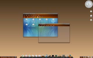
| 1. Caramel: [[BR]] attachment:thumbnail.Caramel.png [[BR]] [attachment:Caramel.png Full Picture] [[BR]] Download: [http://szerencsefia.googlepages.com/caramel] [[BR]] |
=== Caramel === |
| Line 16: | Line 13: |
| attachment:thumbnail.Caramel-0.9_thumb.png [[BR]] [attachment:Caramel-0.9.png Full Picture] [[BR]] 2. DarkCaramel: [[BR]] attachment:thumbnail.DarkCaramel.png [[BR]] [attachment:DarkCaramel.png Full Picture] [[BR]] Download: [http://www.gnome-look.org/content/show.php/DarkCaramel?content=65652] [[BR]] == Concept == This is also an idea but for Metacity. The buttons and the bottom line that make the theme special. One way or another this could be used as well in Hardy. 3. eGutsy: [[BR]] attachment:thumbnail.eBlueBall.png [[BR]] [attachment:eBlueBall.png Full Picture] [[BR]] Download: [http://szerencsefia.googlepages.com/egutsy] [[BR]] [[BR]] 4. Light Coffee 3 : OFF-ROAD [[BR]] attachment:thumbnail.LC3_Off-Road.png [[BR]] [attachment:LC3_Off-Road.png Full Picture] [[BR]] |
||<tablestyle="text-align:center">{{attachment:Caramel_thumb.png}}|| ||[[attachment:Caramel.png|Full Size]]|| ||[[http://szerencsefia.googlepages.com/caramel|Download Caramel theme]]|| |
| Line 38: | Line 18: |
| 5. Light Coffee 3 : OFF-ROAD for UHU-Linux [[BR]] attachment:UHU_thumb.png [[BR]] [attachment:UHU.png Full Picture] [[BR]] |
=== Caramel Gummy === |
| Line 42: | Line 20: |
| [[Anchor(Palette)]] '''Palette''' |
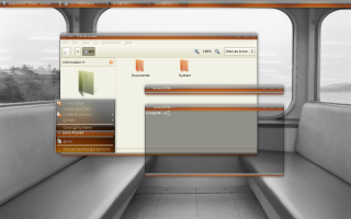
||<tablestyle="text-align:center">{{attachment:CaramelGummy_thumb.png}}|| ||<tablestyle="text-align:center">[[attachment:CaramelGummy.png|Full Size]]|| ||[[http://szerencsefia.deviantart.com/art/Caramel-Gummy-78566957|Download Caramel Gummy theme]]|| |
| Line 45: | Line 24: |
| [[Anchor(ConceptArt)]] '''Concept Art''' |
|
| Line 48: | Line 25: |
| [http://szerencsefia.googlepages.com/hardyideas] | === Dark Caramel === |
| Line 50: | Line 27: |
| === Reference === = Contributions = |
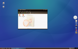
||<tablestyle="text-align:center">{{attachment:DarkCaramel_thumb.png}} <<BR>>|| ||<tablestyle="text-align:center">[[attachment:DarkCaramel.png|Full Picture]]|| |
| Line 53: | Line 30: |
| [wiki:Self:/?action=AttachFile Attach File] | |
| Line 55: | Line 31: |
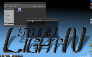
| [[Include(Artwork/Incoming/SubmissionGuidelines/Guidelines)]] | === LightNstudio === ||<tablestyle="text-align:center">{{attachment:LightNstudio_thumb.png}} <<BR>>|| ||<tablestyle="text-align:center">[[attachment:LightNstudio.png|Full Picture]]|| ||[[http://szerencsefia.googlepages.com/lightnstudio|Download LightNstudio theme]]|| |
| Line 59: | Line 40: |
| * I agree wholeheartedly with your design idea. I've always found myself visually frustrated by nautilus and the like because your mind has to process too much to work out what you need to look at. By having this visual separation (not just a jolly line) it is very easy for you to quickly figure out what you want to look at. I LOVE IT!!! Socceroos [[DateTime(2007-12-11T12:53:34Z)]] | * I agree wholeheartedly with your design idea. I've always found myself visually frustrated by nautilus and the like because your mind has to process too much to work out what you need to look at. By having this visual separation (not just a jolly line) it is very easy for you to quickly figure out what you want to look at. I LOVE IT!!! Socceroos <<DateTime(2007-12-11T12:53:34Z)>> |
| Line 69: | Line 50: |
| == Attachment List == | * it only comes off as 'vista-like' because of the colorful background in one of the windows in the caramel screen shot. In fact, it is NOTHING like vista. (And quite gorgeous!) Seeing these made me want to start using Ubuntu again, and I ''really'' hope they are implemented as a default theme, because I don't know anybody who's head doesn't turn when they see these windows. Great work! |
| Line 71: | Line 52: |
| [[AttachList]] | ''Designed by SzerencseFia'' |
Contents |
| Slideshow ^ |< << Slide 56 of 81 >> >| |
Szerencsefia's GTK Idea
I have created several designs for GNOME and I found it interesting. I was the source who merged different bars (menubar + toolbar + Metacity frame) into one complex design (see bellow). This idea can be used for the next upcoming Ubuntu release design. I would love it.
GTK theme concepts
These are real and workable example how to harmonize the menu/tool-bars.
Caramel
Caramel Gummy
Dark Caramel
LightNstudio
Comments
I agree wholeheartedly with your design idea. I've always found myself visually frustrated by nautilus and the like because your mind has to process too much to work out what you need to look at. By having this visual separation (not just a jolly line) it is very easy for you to quickly figure out what you want to look at. I LOVE IT!!! Socceroos 2007-12-11 12:53:34
- These concept images feel extremely open and accessible; much less crowded than the default desktop. (and I don't think it's due to the size of the images/lack of second toolbar) Excellent work!
- Could you provide a download for your first theme? I like it a lot and want to use it. Great Work!
AlessandroDelgado 2008-02-03 A bit Vista-like, don't you guys think?
- Nah, I don't think so. I suppose you meant to comment the dark brown glossy theme, right? If so let say: "MS designers could make somethin' tasteful and they made though, my theme is still biting it." Try out my theme and comment once more after :-P [Szerencsefia]
it only comes off as 'vista-like' because of the colorful background in one of the windows in the caramel screen shot. In fact, it is NOTHING like vista. (And quite gorgeous!) Seeing these made me want to start using Ubuntu again, and I really hope they are implemented as a default theme, because I don't know anybody who's head doesn't turn when they see these windows. Great work!
Designed by SzerencseFia
Artwork/Incoming/Hardy/Alternate/SzerencsefiaGTKIdea (last edited 2008-08-06 17:00:28 by localhost)


