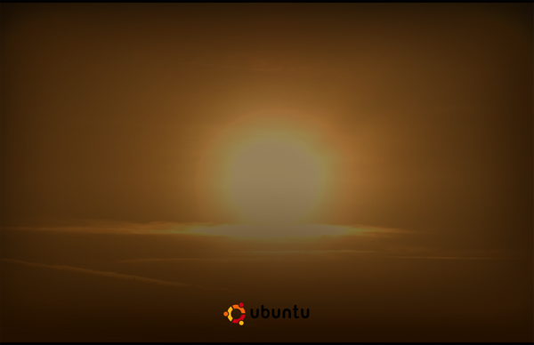
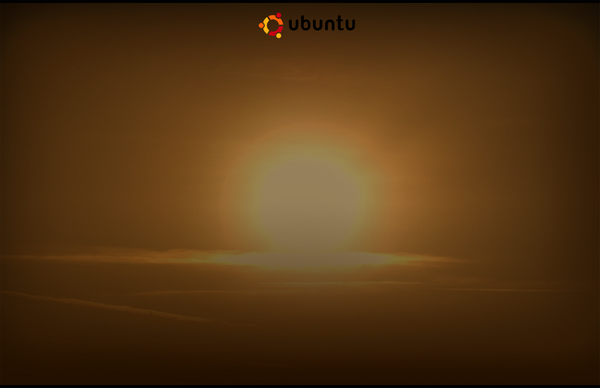
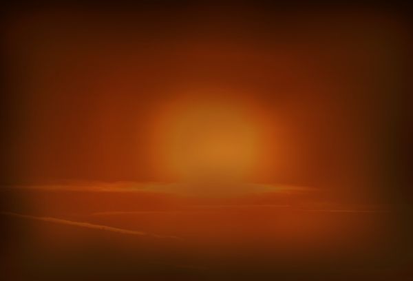
Brown Sunset Wallpapers
Concept
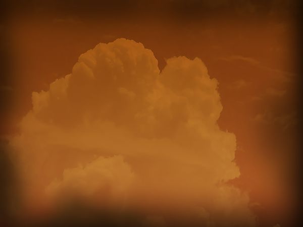
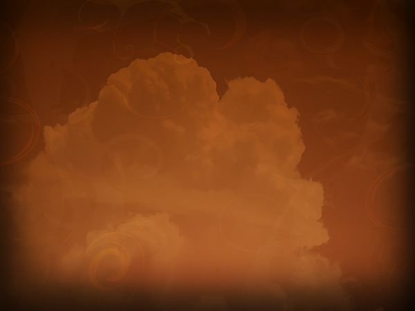
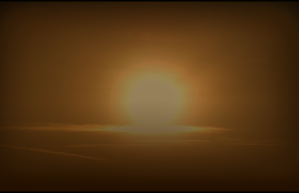
Brown sunset, with the sun at the center, signifying that everything revolves around Ubuntu. And some clouds to the set. Brown, totally Ubuntu, with the Heron Simple background blend in.
Concept Art
I think that I am improving here, at least I think so. Suggestions are most welcome!
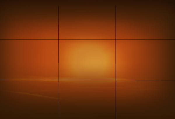
The "rule of thirds"
|
The Sunset
Clouds
Previous Version
Artwork by Silfiriel
Reference
https://wiki.ubuntu.com/Artwork/Incoming/Hardy/Alternate/Solar_Ubuntu_Walls
Contributions
Guidelines
- For images, use a low resolution picture in the wiki page. It should be no taller than 240 pixels. If you need to upload higher resolutions, please upload them as an attachment and link to them from the page.
There are two tools located at Artwork/Documentation/Software/Wiki_Scripts to help you with this
Use attachment:thumbnail.png and [attachment:file.png linkname]
Use @SIG@ to leave your signature at the end of your comment. New comments should be placed at the bottom of the feedback.
Comments
Amazing. Absolutely gorgeous. We might be able to put these into the live cd - I love them! -- Acelin 2008-07-05 18:16:12
- They are quite attractive. But as a devil's advocate, they also look very similar to the style used way back on the first releases with all the naked people adorning them. That is, if 8.10 is supposed to have a totally new and refined look, these might not be the best solution (even though I think they are beautiful). Also, shouldn't these be on the "Desktop Backgrounds Submission" page? -- Brian Fleeger 06 July 2008
- To be honest, these are not well done at all. The Ubuntu logo is washed out, there is no contrast in the imagery, there is no succinct imagery in the first place; only washed out photos, the logo isn't even centered, there is no "rule of thirds" or anything of the kind. Frankly I think you have much work to do.
- I can't say that the wallpapers are perfect, the logo isn't centered well, because I wasn't focusing on the logo all that much. Unbranded wallpapers have always been Ubuntu's tradition. The rule of thirds is out there, i uploaded a thumb to see it. The rest of the complains I consider a matter of taste. The contrast could be better though, and I am asking for help here on matter of the gradient noise. I just can't get it off the photos. i tried multiple graphic software to do it, bur I can't. Also can someone point out instructions for pngcrush??? --Silfiriel
That isn't the rule of thirds. Look at the picture on the top right on http://en.wikipedia.org/wiki/Rule_of_thirds See how the horizon and the tree are lined up with the grid? Maybe try putting the sun at an intersection.
- Ok I admit, I first went to wikipedia to see what's the rule of thirds, but that picture is just one example. read the article well "The rule states that an image can be divided into nine equal parts by two equally-spaced horizontal lines and two equally-spaced vertical lines. The four points formed by the intersections of these lines can be used to align features in the photograph." That doesn't mean that the picture elements must be in that position or any other corners. It simply says that elements must be somehow in accordance with the 9 imagined parts of the photo. I got it by luck, once again I admit. But it's there. --Silfiriel
- Love the first sunset with the Ubuntu name and logo. - Lyceum
- First ones look more fresh than the more brown ones which feel too much burned out. The last sunsets feel a bit like nuclear bomb. Well, I just installed the Dust theme and these don't match with it, so I am not using these on my desktop. -- Karoliina Salminen
- I really like the only one here with an actual Ibex in it - can we have a version without the Ubuntu logo in the top right? -JH
Attachment List
