Espresso
|
Size: 3987
Comment:
|
← Revision 24 as of 2008-08-14 11:53:17 ⇥
Size: 5904
Comment:
|
| Deletions are marked like this. | Additions are marked like this. |
| Line 2: | Line 2: |
| ||<tablestyle="float:right; font-size: 0.9em; width:30%; background:#F1F1ED; background-image: url('http://librarian.launchpad.net/2980250/Emblem-16.png'); background-repeat: no-repeat; background-position: 98% 0.5ex; margin: 0 0 1em 1em; padding: 0.5em;">'''Contents'''[[BR]][[TableOfContents]]|| [[Navigation(slides)]] [[Navigation(siblings,1)]] |
||<tablestyle="float:right; font-size: 0.9em; width:30%; background:#F1F1ED; background-image: url('http://librarian.launchpad.net/2980250/Emblem-16.png'); background-repeat: no-repeat; background-position: 98% 0.5ex; margin: 0 0 1em 1em; padding: 0.5em;"><<TableOfContents>>|| <<Navigation(slides)>> <<Navigation(siblings,1)>> |
| Line 9: | Line 9: |
| The direction of Ubuntu artwork has a lot of varying ideas. One consistent theme however, is using a heavy amount of colour, like brown, for the windows, toolbars, metacity, desktop and start pane. This has its own place in terms of looks - some of the ideas in these mock ups are fantastic, but I think there is a big problem. As a designer I see a lot of people who throw around their businesses identity colour over everything, for example; a good example of this is EasyJet. They have an orange logo, and splash around that same orange on their planes, their staff wear orange clothes, their cruise ships were once bright orange! In contrast look at Nike, their whole website is black, trainers mostly white, the staff in their stores were black, their logo? Orange. What we need to do is withdraw from constantly throwing brown everywhere. Sure, Ubuntu needs a distinctive look, but looking at the competition, Microsoft and Apple; both UIs have subtle amounts of colour. We should do the same - the content of the window should be the thing to concentrate on, not a load of shiny brown widgets! |
== Update == I want to start creating this as a fully working theme. If anyone is happy to help, please see this post: http://ubuntuforums.org/showthread.php?p=5377765#post5377765 |
| Line 16: | Line 14: |
| Espresso is a mockup I created to show an example of this. The window decorations and GTK widgets are mostly gray. Subtle hints of orange are selectively picked for certain widgets. The desktop is one I feel works well with this setup - and is the best wallpaper I've seen so far for Ibex. | This is a concept I've had in my head since Hardy's attempt at a redesign. The idea is is to use a simple, out of the way colour to provide as little distraction to the user as possible. As a designer, I see a lot of companies splashing their identity colour everywhere. Ubuntu has done much the same, everything is brown/orange. What I propose is a much more subtle branding - using hints of the identity colour where appropriate, to create a distinct, but not overtly in-your-face theme. <<Anchor(ConceptArt)>> '''New, version 4''' Changed the buttons, windows and some of the UI. Looks much better IMO now. The widget factory is in focus here. This is a good basic feel of how I think things should be. The cursor is there literally for context - I'm not suggesting changing cursor theme. ||<tablestyle="text-align:center">{{attachment:espresso1_v4_th.png}}|| ||[[attachment:espresso1_v4.png|Fullsize]] Image by Keithamus|| ||Older, v3:[[attachment:espresso1_v3.png|Fullsize]] Image by Keithamus|| ||Older, v2:[[attachment:espresso1_new.png|Fullsize]] Image by Keithamus|| ||Oldest, v1:[[attachment:espresso1.png|Fullsize]] Image by Keithamus|| Progress bars are detailed and colourful (and animated) - to give the user something to look at while waiting. The rest of the widgets provide no strong colour, but are different enough from the window frame to "pop". Selected buttons (like tabs, or checkboxes) draw more attention to themselves with a slight orange border - the user most likely will want to pay attention to what they're agreeing to, or where they are (what tab). ||Oldest, v1:[[attachment:espresso2.png|Fullsize]] Image by Keithamus|| '''Older mockups''' This is a mockup of the start bar, which I think everyone can agree needs work. When you first open it, it shows up the 3 most used applications, and focuses the search bar. Since the old version, I've changed little - the selection box is now a gradient, the tooltip has changed slightly, and the button now works much better I think. ||<tablestyle="text-align:center">{{attachment:espresso3_new_th.png}}|| ||Older, v2:[[attachment:espresso3_new.png|Fullsize]] Image by Keithamus|| ||Oldest, v1:[[attachment:espresso3.png|Fullsize]] Image by Keithamus|| When searching, results come up and the first result is selected (but the searchbar is still focused). Pressing enter can then run the selected result (so, in effect, I could hit start, type "firefox" hit enter, and be running firefox). This is the quicksilver/gnome-do/krunner/raptor style of launching things, which I think is very efficient. ||<tablestyle="text-align:center">{{attachment:espresso4_th.png}}|| ||Oldest, v1:[[attachment:espresso4.png|Fullsize]] Image by Keithamus|| |
| Line 19: | Line 41: |
[[Anchor(Palette)]] '''Palette''' #THIS IS THE LOCATION OF YOUR PALLETE attachment:platypuspalette.png [[Anchor(ConceptArt)]] '''Concept Art''' ##THIS IS THE LOCATION OF YOUR ARTWORK ||<tablestyle="text-align:center">attachment:platypusafraidthumb.png|| ||[attachment:platypusafraid.png Fullsize] Image by Lassegul|| === Reference === #THIS IS THE PLACE WHERE YOU PUT YOUR REFERENCES ||<tablestyle="text-align:center">attachment:Platypus_thumb.jpg||attachment:Platypus_spur_thumb.JPG|| ||[attachment:Platypus.jpg Fullsize] [http://en.wikipedia.org/wiki/Image:Platypus.jpg Source]||[attachment:Platypus_spur.JPG Fullsize] [http://en.wikipedia.org/wiki/Image:Platypus_spur.JPG Source]|| ||attachment:135408702_653c9f3d53_thumb.jpg||attachment:1079696009_86fecbdc56_thumb.jpg|| ||[attachment:135408702_653c9f3d53.jpg Fullsize] [http://flickr.com/photos/webcarnet/1079696009 Source]||[attachment:1079696009_86fecbdc56.jpg Fullsize] [http://flickr.com/photos/k-h/135408702/ Source]|| |
These can, of course, easily be extended to other distributions, perhaps to create a solid branding across official ubuntu distros? If this theme ever gets to the stage of making it, I want it to be flexible with colours - so the user (or distributor) can change the colours very easily to completely change the feel of the theme; much like Murrine. ||<tablestyle="text-align:center">{{attachment:espresso_studiov3_th.png}}|| ||[[attachment:espresso_studiov3.png|Fullsize]] Image by Keithamus|| ||Oldest, v1:[[attachment:espresso_studio.png|Fullsize]] Image by Keithamus|| |
| Line 41: | Line 48: |
| [wiki:Self:/?action=AttachFile Attach File] | [[/?action=AttachFile|Attach File]] |
| Line 43: | Line 50: |
| [[Include(Artwork/Incoming/SubmissionGuidelines/Guidelines)]] | <<Include(Artwork/Incoming/SubmissionGuidelines/Guidelines)>> |
| Line 48: | Line 55: |
| ## * Your Comment Here - -- Keithamus [[DateTime(2008-06-15T13:33:41Z)]] * I've seen some wicked stuff throught the years, but yours really kicks ass! - Anonymousman123 Today, during Twilight. * In Sweden we also have this lovely animal, as well as "knekkebrøt" and polar bears - JachniNücklycken Today, 14:23 08/10/07 * Your concept needs work, make sure you don't make it too cute. The demographic has always been those in their 20's and 30's. - FOSSArtist63 34:43 12/54/23 * I think this animal opens the way to perfect contrasts in a theme / wallpaper / whatever. It's cute in a way, but also dark and itchy, which doesn't have to be the 'Ubuntu message' but it's useful in colorshemes and so on. In other words, nice! - TotalWormage * The platypus - a sort of strange brown penguin. Hmmmm... I think I like the idea! |
## * Your Comment Here - -- Keithamus [[DateTime(2008-06-15T13:44:48Z)]] * It's the best Ibex theme I've seen yet! Great work! * I really like the first Widget Factory view, but you need to make that wallpaper either more simplistic and smooth (ie: the sun's rays) or add some depth to it. It seems rather two dimensional at the moment. -- Brettalton <<DateTime(2008-06-18T22:16:51Z)>> * This is really gorgeous! * The bottom panel is really sexy I love the way it's not the 100% wide. This should be default in Ibex. Also, IMHO the wallpaper should be less saturated. The colors seem too strong to me. What about combining the theme with the Dream wallpaper? * Would look great on Kubuntu, for the Qt theme! * Brilliant theme! A bit like oxygen for KDE4, only cleaner and... different! I'm guessing that this is just a mock up, but it would be great to be able to use it. Far better than the dark theme that's being used... -- Benji <<DateTime(2008-07-11T17:26:35Z)>> * I just love it. It's different, and it sets Ubuntu apart from all the GNOME-based distros. This should be the default theme. --sendo72 * The bottom panel is what makes this theme as it makes it different from other distros as well as not copying Windows or Mac. The panel would work and look better if the tasks were icons instead of words. The kde4 type windows are good but not really inventive. Keep working on it. --Drew * This theme is great ! you should do it, and it would be perfect as Interpid's default theme. I also think it should be included a compact theme. I'm currently using murrine-compact and i love it, cause it allows for more work area in eclipse and other programs. |
| Line 57: | Line 68: |
| [[AttachList]] | <<AttachList>> |
| Slideshow ^ |< << Slide 19 of 79 >> >| |
Espresso
Update
I want to start creating this as a fully working theme. If anyone is happy to help, please see this post: http://ubuntuforums.org/showthread.php?p=5377765#post5377765
Concept
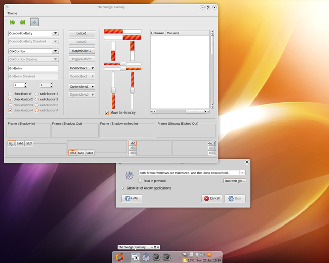
This is a concept I've had in my head since Hardy's attempt at a redesign. The idea is is to use a simple, out of the way colour to provide as little distraction to the user as possible. As a designer, I see a lot of companies splashing their identity colour everywhere. Ubuntu has done much the same, everything is brown/orange. What I propose is a much more subtle branding - using hints of the identity colour where appropriate, to create a distinct, but not overtly in-your-face theme.
New, version 4 Changed the buttons, windows and some of the UI. Looks much better IMO now.
The widget factory is in focus here. This is a good basic feel of how I think things should be. The cursor is there literally for context - I'm not suggesting changing cursor theme.
|
Fullsize Image by Keithamus |
Older, v3:Fullsize Image by Keithamus |
Older, v2:Fullsize Image by Keithamus |
Oldest, v1:Fullsize Image by Keithamus |
Progress bars are detailed and colourful (and animated) - to give the user something to look at while waiting. The rest of the widgets provide no strong colour, but are different enough from the window frame to "pop". Selected buttons (like tabs, or checkboxes) draw more attention to themselves with a slight orange border - the user most likely will want to pay attention to what they're agreeing to, or where they are (what tab).
Oldest, v1:Fullsize Image by Keithamus |
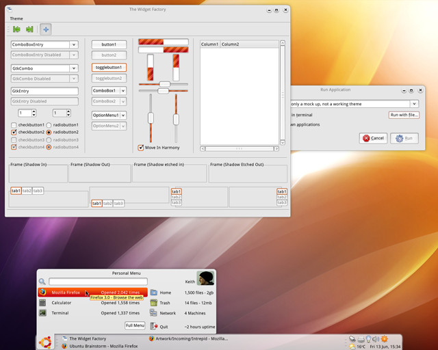
Older mockups This is a mockup of the start bar, which I think everyone can agree needs work. When you first open it, it shows up the 3 most used applications, and focuses the search bar. Since the old version, I've changed little - the selection box is now a gradient, the tooltip has changed slightly, and the button now works much better I think.
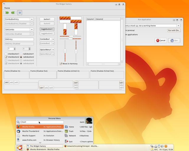
When searching, results come up and the first result is selected (but the searchbar is still focused). Pressing enter can then run the selected result (so, in effect, I could hit start, type "firefox" hit enter, and be running firefox). This is the quicksilver/gnome-do/krunner/raptor style of launching things, which I think is very efficient.
|
Oldest, v1:Fullsize Image by Keithamus |
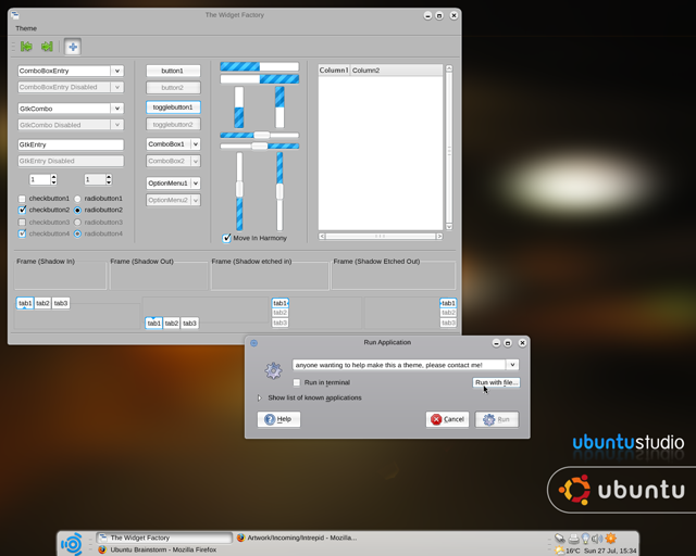
These can, of course, easily be extended to other distributions, perhaps to create a solid branding across official ubuntu distros? If this theme ever gets to the stage of making it, I want it to be flexible with colours - so the user (or distributor) can change the colours very easily to completely change the feel of the theme; much like Murrine.
Contributions
Guidelines
- For images, use a low resolution picture in the wiki page. It should be no taller than 240 pixels. If you need to upload higher resolutions, please upload them as an attachment and link to them from the page.
There are two tools located at Artwork/Documentation/Software/Wiki_Scripts to help you with this
Use attachment:thumbnail.png and [attachment:file.png linkname]
Use @SIG@ to leave your signature at the end of your comment. New comments should be placed at the bottom of the feedback.
Comments
- It's the best Ibex theme I've seen yet! Great work!
I really like the first Widget Factory view, but you need to make that wallpaper either more simplistic and smooth (ie: the sun's rays) or add some depth to it. It seems rather two dimensional at the moment. -- Brettalton 2008-06-18 22:16:51
- This is really gorgeous!
- The bottom panel is really sexy I love the way it's not the 100% wide. This should be default in Ibex. Also, IMHO the wallpaper should be less saturated. The colors seem too strong to me. What about combining the theme with the Dream wallpaper?
- Would look great on Kubuntu, for the Qt theme!
Brilliant theme! A bit like oxygen for KDE4, only cleaner and... different! I'm guessing that this is just a mock up, but it would be great to be able to use it. Far better than the dark theme that's being used... -- Benji 2008-07-11 17:26:35
- I just love it. It's different, and it sets Ubuntu apart from all the GNOME-based distros. This should be the default theme. --sendo72
- The bottom panel is what makes this theme as it makes it different from other distros as well as not copying Windows or Mac. The panel would work and look better if the tasks were icons instead of words. The kde4 type windows are good but not really inventive. Keep working on it. --Drew
- This theme is great ! you should do it, and it would be perfect as Interpid's default theme. I also think it should be included a compact theme. I'm currently using murrine-compact and i love it, cause it allows for more work area in eclipse and other programs.
Attachment List
Artwork/Incoming/Intrepid/Espresso (last edited 2008-08-14 11:53:17 by 130)


