Gimmie-Human
All work on the Gimmie-Human concept theme is suspended. Its ideas have been rolled into a new theme called Long Term Vision (LTV). LTV's art and related development/team sites can be found at the following addresses: LTV wiki: https://wiki.ubuntu.com/Artwork/Incoming/Long_Term_Vision LTV Theme Development Team: https://edge.launchpad.net/~long-term-vision-theme-team LTV Launchpad Project: https://launchpad.net/long-term-vision
Brian Fleeger -- 04 Jul 2008
Gimmie-Human integrates the gnome desktop with the Gimmie/Mayanna desktop organizer, with additional graphical refinements to increase the usability of both. To reduce wasted space, and allow for a tabbed semi-transparent Gimmie-Bar along the bottom, functions from the traditional lower gnome panel were integrated into the upper panel, while other functions from the top panel have been integrated into the menu system. I advocate using this theme with Deadpxl's "Dream Wallpaper" (see incoming artwork by same name) but I also show it with other backgrounds to demonstrate it plays well with others.
If people are interested in this theme, I encourage forks and welcome all suggestions. This is currently just a bunch of pictures and some ideas, but if anyone would like to develop it, just let me know in the comments section. Also, if anyone has any aesthetic suggestions, leave a comment -- if I think its a good idea I will try to implement any changes ASAP.
NOTE No. 1: this is just a submission for the theme and interface itself, not the icons. All images and user interface mods to Gimmie were made by me with input from my sister. I am making them available to the Linux community gratis to do with what they will (GPL? I'm no lawyer). As for the icons, I found them on http://www.iconarchive.com/, and cannot vouch for their origin or license. I assume some similar Tango-style icon set will probably look best in the final product.
NOTE No. 2: The Gimmie project is currently frozen, but a fork called Mayanna is full steam ahead. The developers at the Mayanna project can really use good programmers to help out. If you like this theme and would like to see it become a reality, the best way is to go to their website and help write some code/find bugs! After communicating with them by email, they said this theme was completely implementable, but they need manpower to help with other issues -- so please help! ![]() Their developer group is here: http://groups.google.com/group/MAYANNA Their Launchpad site is here: https://launchpad.net/~mayanna
Their developer group is here: http://groups.google.com/group/MAYANNA Their Launchpad site is here: https://launchpad.net/~mayanna
Concept
Goals:
- Theme should reflect the Ubuntu identity (black, brown, and orange)
- Distinguish Ubuntu from competing OSs
- Strike a balance between transparency and usability
- Introduce an improved user interface which is readily implementable with Gimmie/Mayanna
- Icons and buttons large enough to use with touch interface, or without (touch looks to be going mainstream soon)
- Be clean and minimize unnecessary wasted space
Palette
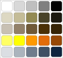
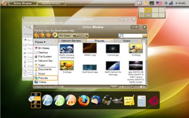
Gimmie-Human strives to maintain the Ubuntu color palette, while using modern transparencies and design that will go well with almost any color-schemed wallpaper background. Whenever feasible I chose to use current Ubuntu solutions such as "Hardy-style" pull-bars and tab appearances. Transparencies and overlapping shapes are used when appropriate, as people have shown almost universal preference for glass and transparencies in architecture and design over the last 150 years. On large surfaces with lots of brown, adding a highly transparent layer of blue over top of the brown made the window more attractive and easier to blend with different backgrounds, thus the blue in the palette. This color layering effect is reminiscent of Mark Rothko’s paintings, and makes the brown easier to blend in with other (cool color) backgrounds. I tried to avoid overly thick window borders and generally just used a single white line around windows. I was unable to show shadow drops in the program I used (i.e. Office Word), but drop shadows would go far in differentiating windows with white over white. I also tried to strike a balance between window and menu transparencies and the need to see the text and buttons on the active windows. I didn’t want to see the same excessive transparencies as on MS Vista, such that an extra glow effect is used just to make window titles legible. Though not very resource intensive, some users may not be able to run with transparent windows, so I tried to make the theme so that it would look just as good when opaque.
When the Gimmie-Human theme is combined with Deadpxl's red and green "Dream Wallpaper," I am really pleased with the results. I think those passionate "Dream Wallpaper" colors embody more of the "human experience" than just the "human" color theme used in past Ubuntu releases. The "human" theme is typically explained saying that human skin is all various shades of brown, and Ubuntu is all about humanity. Yet the colors in "Dream Wallpaper" is much more successful in conveying humanity, because is suggests so much of the range and extremes of human experience (multi-colored, with brightness and darkness).
Concept Art
Clean Empty Desktop
Increase Efficiency and Simplicity
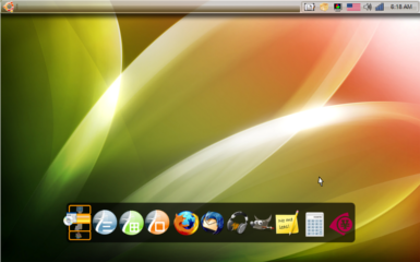
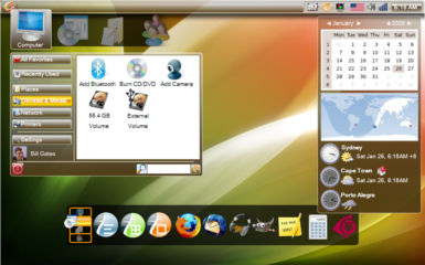
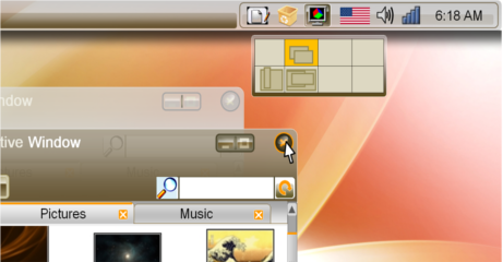
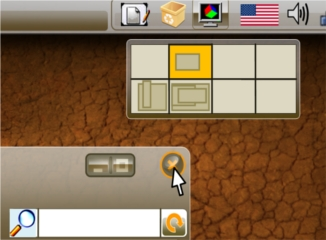
Less is more. For many users, especially laptop users, screen real estate is very valuable and should be used sparingly. I tried to reduce overall unused space on the desktop by combining redundant functions. As I see it, the need for a second panel at the bottom of the screen on the default Gnome setting is directly the result of poor use of space on the top panel. Common panel space wasters in the default setup include: 1) the Ubuntu menu troika (Applications, Places, and System); 2) the panel launchers; 3) having the user name on the upper panel; 4) having the full date and day of the week along with the time on the clock; 5) the duplicate shut-down button (it is in the menu after all, why have two?); 6) and the desktop switcher panel. Under the Gimmie-Human theme, 1) all menu functions are tucked away in the Gimmie main panel, and only appear when they are clicked; 2) panel launch icons are moved down to the Gimmie-Bar (see below for explanation); 3) user name is displayed in the Gimmie panel under the computer tab; 4) just show the time - if people need the day and date, they can click the calendar; 5) only use the shut-down button located on each of the Gimmie tabs; 6) desktop switcher (normally on bottom panel) only shows up when you click on its icon (see sample pictures). Additionally, if icons to the left of the panel (background programs) become too numerous, a hide-inactive-icons function can be used to reduce their footprint. With this much saved space, minimized windows can now go up to the top panel (see sample images) and the bottom panel can be eliminated. Most of this can be done by users already, but it is not default and takes time. Ubuntu really should put its best foot forward if it is ever going to resolve BUG #1 (MS dominance), and that involves a better default layout.
Computer Menu Tab
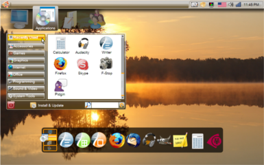
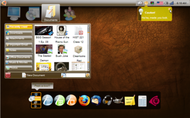
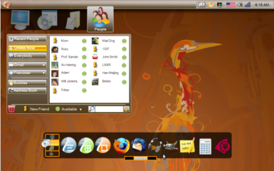
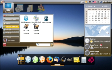
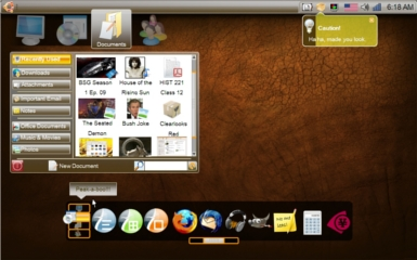
Traditional menu tree systems have been part of computer GUIs from their inception over 40 years ago. The Gimmie/Mayanna interface accepts that most people only use a small number of applications regularly, and therefore the applications should not be the centerpiece of the user interface. Instead, the interface should be task-based, and bring specific functions to the fore. Gimmie/Mayanna uses tabs to access all the tasks users perform on their computerincluding tabs for functions relating to your computer, applications, documents, and people. All buttons and bars in this design are large size, letting artwork and icons be larger and more attractive, and also being suitable for any later transition to a touch-screen interface, should that become technically/economically feasible for common consumers in the next couple years.
I heavily modified the original Gimmie/Mayanna interface to make it more aesthetically pleasing and decrease wasted space on the top panel. Inspired by the KDE 4.0 Kick-Start layout, the tabs would only appear when a user clicks on the Ubuntu logo in the upper left. The tabs are separated from the main window to increase the sense that they are objects floating in space, independent but synchronized. When the user clicks on a tab icon, clutter animations make the background square (which indicates an active tab) shift over, and the previously active icon lowers and fades into shadow. At the same time, the newly active tab icon transitions from being in shadow to being fully lit. It elevates slightly higher than the other icons, and text appears beneath it to show its name (text would only appear on mouse-over for inactive icons). For older computers, these Clutter animations could be cut out entirely.
Gimmie’s original website is here: http://www.beatniksoftware.com/gimmie/Main_Page. A presentation outlining the system’s advantages is here: http://www.beatniksoftware.com/gimmie/Guadec06Slides2.pdf Implementing Gimmie-Human as I outline it here would require some upstream collaboration with the Mayanna developers. Mayanna's developer site is here: http://groups.google.com/group/MAYANNA Their Launchpad site is here: https://launchpad.net/~mayanna
Applications Menu Tab
Documents Menu Tab
People menu Tab
Windows and Window Buttons
Active and Inactive Windows
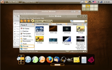
The window buttons were inspired by the latest KDE 4.0 way of spacing the close button farther away from minimize and maximize, reducing the likelihood of unintentionally closing a window. Here, they are further visually distinguished, because the close button is round, while minimize and maximize are grouped together in one long rounded rectangle.
Window Button Details
Gimmie-Bar
Tabbed Gimmie-Bar Detail Images
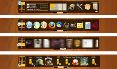
At the bottom of the screen I include a modified Gimmie-Bar to quickly access desktop objects. It uses a black semi-transparent background, and Clutter-animated orange tab buttons to the left (Clutter animations can be turned off on low power systems). Gimmie-Bar is functionally superior to the panel launcher in the default Gnome desktop, and offers greater versatility than the dock from Apple. Also, including the Gimmie-Bar eliminates the need of having a long list of launch icons on the upper panel, saving lot of space. I made some functional modifications to the Gimmie-Bar concept to improve its use of space. If you go to the original Gimmie website, you will see the Gimmie-Bar takes up a lot of space because it shows all four tabs at the same time, and tries to replace the upper menu entirely. I modified it by placing the tabs to the left side, and redesigned it so the user only sees one tab at a time. This allows each tab to fill the whole bar, thus fitting more information.
The Gimmie-Bar is not meant to replace the main menu tab system, just be a repository for the user's factorite/most frequently accessed objects. Objects appearing in the Gimmie-Bar can be user defined (i.e. bookmarks) or dynamically updated such as a "most recently used" or "most frequently used."
To avoid the problem of endlessly shrinking icons when users add more applications, such as seen in Apple’s dock, there is a pull bar to the bottom of the Gimmie-Bar. Ideally, the pull bar should be invisible until mouse-over in the Gimmie-Bar zone. The pull bar resides under the Gimmie-Bar objects, and functions like an accelerator. If a user nudges it slightly to the right or left, the objects in the bar will move slowly in that direction. If a user pulls it all the way to the right or left, objects will start to whiz by at full speed. Also, users could use the mouse scroll wheel/touchpad scroll zone or drag the Gimmie-Bar objects with their mouse to scroll similarly to a PDF document instead of using the pull bar at all. In theory, if it were implemented on a touch screen the effect would be very similar to what the Ubuntu Mobile interface already does. (NOTE: in the picture at the bottom, I included a blur effect only to visualize the sense of motion from using the pull bar. Blur effects are very resource intensive and it is not my intention to suggest using them as an actual default setting.)
Older Images
The following are older renderings that I have now significantly revised. Older images which I have revised only slightly are not reposted here, but can be found in the "attachments" section below.
Reference
Contributions
Guidelines
- For images, use a low resolution picture in the wiki page. It should be no taller than 240 pixels. If you need to upload higher resolutions, please upload them as an attachment and link to them from the page.
There are two tools located at Artwork/Documentation/Software/Wiki_Scripts to help you with this
Use attachment:thumbnail.png and [attachment:file.png linkname]
Use @SIG@ to leave your signature at the end of your comment. New comments should be placed at the bottom of the feedback.
Comments
- Wow, this is much more like it, finally pulling away from windows, if we could find a way to combine the gimme-bar and the nifty effects from akamaru or the kiba dock that would be awesome. nice work, i really hope they use this.
The best concept and fullwork i've ever seen. Congratulations. I think this must be the intrepid ibex (even next) look. "Not Hasefroch, not OSX, just UBUNTU!" - -- AlfonSkunk 2008-06-04 15:18:34
- This is the best concept I've seen for Intrepid! +1 - -- eapache
Brilliant idea, but I'm afraid it won't be able to be added to Intrepid -- to complex. I really love the setup though. Maybe if your theme was a bit sharper (the main window) in contrast to the inactive window, then that'd be great. Also, try adding a bit more red or orange to the mix instead of straight brown.-- Brettalton 2008-06-18 22:20:30
Excellent. It's not only a graphic proposal. It's also a identity definition. Like AlfonSkunk said: not "other thing's like (osx, ms, anything)", just UBUNTU. Regards! - -- Mr.Gustaffson.
Attachment List
