| Edit Wiki ^ |< << Slide 40 of 79 >> >| |
Kin Dust / Didymous
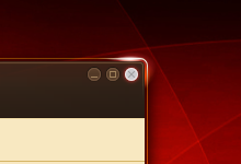
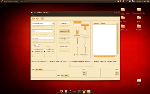
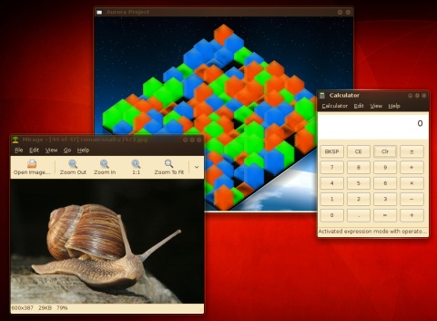
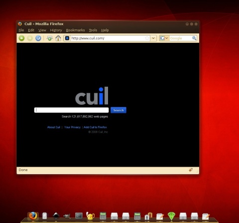
Kin Dust is a variation of Kin Piano and Dust Intrepid. More information to come later.
Downloads
Revision 2 |
|||
Contents |
File |
Size |
Revision |
Bundles |
|||
Everything |
3024.4 KB |
1.0.6 |
|
Seperate Files |
|||
Emerald |
159.4 KB |
1.0.2 |
|
GTK |
28.0 KB |
1.0.4 |
|
GTKB |
23.5 KB |
1.0.2 |
|
AvantWN |
15.6 KB |
1.0.1 |
|
Metacity |
5.0 KB |
1.0.2 |
|
GDM Login |
1068.5 KB |
1.0.1 |
|
Wallpaper Pack |
5116.4 KB |
1.0.2 |
|
Revision History
Contents |
File Version |
Corrected Issue |
Pack Version |
Theme Pack Version |
|||
1.0.6 |
|||
GTKB |
1.0.2 |
Added older version of GTK, if theme fails, this can still be used |
1.0.6 |
GDM Login |
1.0.1 |
New login screen. |
1.0.6 |
1.0.5 |
|||
GTK |
1.0.3 |
Corrected warnings, missing files, bugfixes |
1.0.5 |
Metacity |
1.0.1 |
Updated Buttons; Special Thanks to Devid Antonio Filoni for the button switch |
1.0.5 |
1.0.4 |
|||
N/A |
1.0.3 |
Unreleased |
|
1.0.3 |
|||
Misc |
1.0.3 |
Decreased overall filesize |
1.0.3 |
GTK |
1.0.3 |
GTK Overhaul |
1.0.3 |
Emerald |
1.0.2 |
Adjusted inactive window title |
1.0.3 |
Wallpapers |
1.0.2 |
Streamlined wallpaper package |
1.0.3 |
1.0.2 |
|||
GTK |
1.0.2 |
Panel used colour format from previous theme selection |
1.0.2 |
1.0.1 |
|||
GTK |
1.0.1 |
Panel displayed beige colour buttons |
1.0.1 |
GTK |
1.0.1 |
Launcher Dialog displays beige background, instead of repeating panel-bg. |
1.0.1 |
GTK |
1.0.1 |
Highlighted elements on panels are now a deep orange, instead of off-beige. |
1.0.1 |
GTK |
1.0.1 |
Nullack reported use of the Aurora Engine; no longer requires Aurora Engine. |
1.0.1 |
Known Bugs & Other notes
Contents |
Information |
Priority |
GTK |
Some installs of the GTK will revert to a minimal grey interface. Please email me if the problem has been resolved in the 1.0.5 update |
***** |
GTK |
Openoffice programs toolbar text blends into the toolbar - is nearly unreadable. |
* |
Metacity |
Theres a very slight saturation difference between Metacity titlebars and GTK menubars |
*** |
Firefox |
(please post info on if the fix was used); Firefox toolbar has corrective file, "userChrome.css" style. If not used automatically, place inside your ~/.mozilla/{default}/chrome/*userChrome.css* to get your firefox toolbar back. Make a backup of your userChome.css if you have one - and either use your backup or delete the new Userchome.css to revert your toolbar text back to regular colouring. |
** |
- Special thanks to Andreas Berger for his hard work in bug-stomping, and Devid Antonio Filoni for Metacity updates.
Old Downloads
Bundles |
|||
Everything |
5333.7 KB |
1.0.3 |
|
Seperate Files |
|||
Emerald |
159.4 KB |
1.0.1 |
|
GTK |
35.9 KB |
1.0.2 |
|
Wallpaper Pack |
5116.4 KB |
1.0.1 |
|
Historic Downloads
It is very strongly recommended not to use these files. Available for historic purposes
Contents |
File |
Revision 3 |
|
GTK |
|
Revision 2 |
|
Emerald |
|
GTK |
|
Revision 1 |
|
Avant |
|
Wallpaper Pack |
|
GTK |
|
Screenshots
|
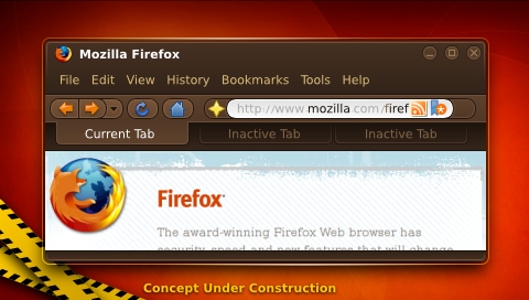
Concept |
Theme Progress
What |
Progress |
Info / Comments |
Emerald |
Complete |
Tweaks, (Download soon) |
GTK |
Near-Complete |
Gnome-Panels underway, Tweaks (Download soon) |
Metacity |
Complete |
Heavy Tweaks |
AvantWN |
Complete |
Ready, (Download soon) |
Contributions
Guidelines
- For images, use a low resolution picture in the wiki page. It should be no taller than 240 pixels. If you need to upload higher resolutions, please upload them as an attachment and link to them from the page.
There are two tools located at Artwork/Documentation/Software/Wiki_Scripts to help you with this
Use attachment:thumbnail.png and [attachment:file.png linkname]
Use @SIG@ to leave your signature at the end of your comment. New comments should be placed at the bottom of the feedback.
Comments
- Beautiful! Innovative, different yet simple, usable and pleasing to the eye. Excellent!
Looking good. I like it, but the colors are a bit too strong to me. I'd suggest desaturating a bit the dark brown, and either desaturating or increasing lighting for the background color. Also, how's the border when you don't have Emerald/compositing? I guess that's important if you plan to apply for Intrepid, and it'd be interesting to provide a sample screenshot. Other than that, it's visually attractive, while retaining identity. -- mernen 2008-08-29 19:47:28
- Without compositing, it looses the wireframe and (of course) the glow on the buttons. I'm trying to beat metacity into letting me build a wireframe (picture a solid orange rim similarly coloured as the scrollbars, slightly jaggy curves)
Attachment List
