Long Term Vision (LTV)
The following is a concept proposal to the Ubuntu Art Team, not an official Ubuntu roadmap All images were created by me and are all freely available to the Linux community.
Long Term Vision (LTV) is one answer to the question, "where do you want Ubuntu to be in two years?" It has the following goals:
- integrate common online tools (email, social networking sites, etc) into the OS’s UI
- make the PC user experience more like consumer electronics
- provide an emotionally compelling and artistic package
If you would like to take part in any aspect of this theme, go to its Launchpad page here: https://launchpad.net/long-term-vision, or join its Launchpad development team here: https://edge.launchpad.net/~long-term-vision-theme-team LTV’s numerous changes can be addressed modularly, in order of ease of implementation. Most of the stylistic changes are easily implementable in time for Intrepid Ibex – others may have to be added later.
LTV’s basic characteristics include:
- Task-based, tabbed main menu (inspired by Mayanna)
- tabbed favorites launcher (inspired by Mayanna-Bar), where tabs correlate to main menu tabs
- no bottom panel, its functions are merged into the top panel
- desktop switcher only viewable on clicking its icon (it takes up too much space)
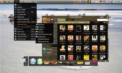
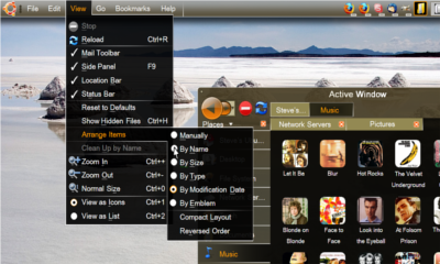
- global menu for active window
- window buttons displayed by single icons (like Netbook Remix), right to left, next to notification panel
- circular right click menus with novel (space saving) super and sub ordinal navigation system
- notification panel is visually distinguished from the rest of the top panel
- tabbed Nautilus navigation (multiple locations open in a single window)
- consistent look for system and window menus
- new maximize, minimize, and close buttons
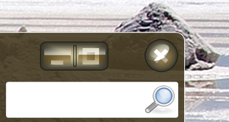
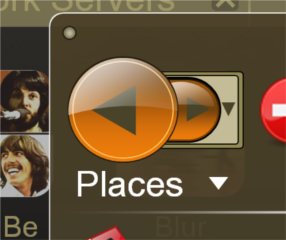
- new larger back button in nautilus (advocate use system-wide)
- attractive open source photographic wallpapers included with the distribution, if not default
- Brown, black, and orange semi-translucent theme tying it all together
- New icons (all the icons in the sample images below were found on the internet, i.e. they are not GPL – a whole new icon set will have to be made for LTV, or use stock)
Concept
Palette
Palette |
|
View Large :: Image by Brian Fleeger |
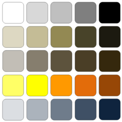
LTV’s color palette heavily uses brown not only because it is an Ubuntu tradition; brown is actually heavily used in graphic design, industrial design, and fashion. In clothing and interior design, brown has a history of being associated with the vanguard of high-fashion and expensive designer goods – think Starbucks, Japanese/Northern European wood furniture, and haut couture.
LTV currently uses a semi-translucent layer of blue over top all large-area brown panels. This is to make the brown blend more easily with cooler colors like blue and green, and is directly inspired by the layered paintings of Mark Rothko (http://en.wikipedia.org/wiki/Mark_Rothko) and to a lesser extent Dale Chihuly’s glass works (http://www.chihuly.com/).
Bright colors like oranges and reds are used sparingly, as embellishments. Excessive use of bright colors is visually and emotionally taxing (imagine living in a house that is all red or all orange). This can even lead to negative emotional associations for the user, i.e. most people will likely want to avoid using such a theme.
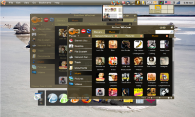
Active and Inactive Windows |
|
View Large :: Image by Brian Fleeger |
Active Window and Global Menu Appearance |
|
View Large :: Image by Brian Fleeger |
Detail of Window Buttons |
|
View Large :: Image by Brian Fleeger |
Detail of Forward/Back Button |
|
View Large :: Image by Brian Fleeger |
LTV is designed to be a moving target, and I have already received some feedback about changes people would like to see even before I posted this wiki. Order of operations is: 1) coordinate with people willing to help; 2) develop a realistic schedule and division of labor, then; 3) discuss how to make changes to each of the individual listed items above as we go through the list.
Tabbed Main Menu
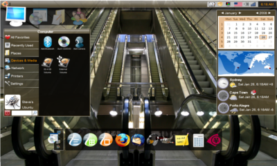
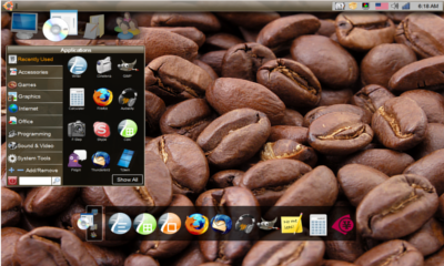
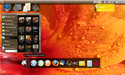
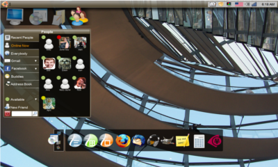
The tabbed menu system is function-for-function inspired by the Mayanna (originally Gimmie) project’s human interface work. Mayanna successfully organizes functions based on tasks, and integrates many features from popular web tools into the main menu, such as Gmail, IM, and Facebook. This interface would completely differentiate Ubuntu from any other competing OS, and be a radical improvement over human-machine interfaces used over the past 40 yrs.
Computer Menu |
|
View Large :: Image by Brian Fleeger |
Applications Menu |
|
View Large :: Image by Brian Fleeger |
Documents Menu |
|
View Large :: Image by Brian Fleeger |
People Menu |
|
View Large :: Image by Brian Fleeger |
Tabbed Favorites Bar
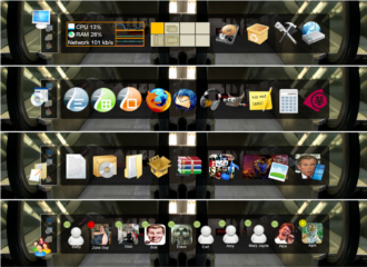
The “Favorites Bar” is a tabbed launcher application. There are 4 tabs, Computer, Applications, Documents, and People, correlated to the 4 tabs on the main menu. Newer systems could use clutter based animations, while older systems could use static/non-scaling icons.
Though inspired by AWN and the tab-based Mayanna Bar, the Favorites Bar does not display window buttons like AWN -- those are displayed on the top panel (discussed below). The Favorites Bar is a tool for displaying a user’s favorite objects, be they application launching icons, commonly accessed files or folders, panel displays (such as the system monitor, trash can, or desktop switcher), or even desktop widgets/screenlets/desklets.
As soon as a new object is added (by either dragging the object into the tabbed zone, or right clicking an object and choosing “add to favorites”), the Favorites bar automatically categorizes and files it into the appropriate tab based on its file-type. So, for instance, when the computer detects you have added a “favorites” file ending in .png, or .jpg, it automatically knows it is a kind of document, and files it under the documents tab. A list of all favorites can be viewed at one time by going to the “Computer Menu” panel – “Favorites” is the first option at the top of the panel.
Tabbed Favorites Bar Views |
|
View Large :: Image by Brian Fleeger |
The Favorites Bar uses a scrollable icon system instead of scalable icons (AWN). Scalable icons result in a messy look, and shifting icon sizes makes them moving targets -- sub-optimal by Fitt’s Law. There are good arguments for and against AWN-type docks, but the biggest is to not look too much like competing OSs. I imagine at least three possible ways of scrolling: a) track-pad or mouse scroll-wheel scrolling; b) zone-based acceleration; or c) a pull-bar that become visible on mouse-over.
Global Menus for Active Windows
LTV uses a global menu system for active windows. This is possible already using existing code, though is unstable.
Active Window Global Menus |
|
View Large :: Image by Brian Fleeger |
Window Icons
The LTV theme displays window icons in a way similar to Ubuntu’s “Netbook Remix.” Mouse-over gives live preview and window title. The active window is indicated by a rounded orange square surrounding the icon. Non-maximized inactive windows are shown with a white square at the bottom right corner. Minimized windows display a white rectangle at the icon's bottom right corner.
Window Icons on the Upper Panel |
|
View Large :: Image by Brian Fleeger |
Circular Right Click Menus
Under Construction, check back later
Reference
Contributions
Guidelines
- For images, use a low resolution picture in the wiki page. It should be no taller than 240 pixels. If you need to upload higher resolutions, please upload them as an attachment and link to them from the page.
There are two tools located at Artwork/Documentation/Software/Wiki_Scripts to help you with this
Use attachment:thumbnail.png and [attachment:file.png linkname]
Use @SIG@ to leave your signature at the end of your comment. New comments should be placed at the bottom of the feedback.
Comments
- There is alot to like about this theme: A. It is good to see a theme that takes lower resolution screens into account especially with Linux in consumer electronic devices B. The use of a black and white frame on windows and panels ensure that thay stand out from any backgraound image, no matter how busy it is C. Having 'contacts' as a selection menu is something that has been lacking from all OS's especially given the degree of conectivity with other people these days D. Icons in panels with a preview windows are good E. Good to see an alternative for the file browser. The one really glaringly bad thing is that it all looks cluttered or overtly complex. There are two menus, have one or the other else it will confuse new users. Maybe show with a simple wallpaper as the examples are very busy. The close, maximise and minimise buttons, whilst I appreciate that aurthor was trying something different, dont seem to work. I think they need to be simple for this theme. Keep working on it, as this is the most foward thinking theme out there at the moment. --Drew
- I agree with Drew here. The theme is great so far for the above-mentioned reasons. I would however advise against a tabbed main menu as depicted. It conveys a feeling of complexity where simplicity is desirable. This is what the tabbed favorites bar (a great idea in the style it is shown!) is for. The main menu should probably better not be touched. Is it possible to theme the gimmie bar (or the mentioned fork) at all? I would love to take part in developing this theme! -- Rekado (2008-08-22)
Attachment List
