Panel arrangement ideas
The default panel arrangement in Ubuntu has long been the two panels with one at the bottom and one at the top, the first serving primarily the window list and workspace switcher functions and the second providing all the menus, quick launch icons and notification area functions. This is a proven concept but it is also somewhat boring and unsuitable for laptop users, who have only limited screen estate, especially vertically which is where the panel makes the most difference. In short, I think the advantages of a new panel arrangement would be two-fold - both in distinguishing Ubuntu as a distro which is not afraid to do things differently if it results in what is ultimately a better user experience and in catering to those with only limited screen real estate, in particular laptop users.
This page can be dedicated to discussing potential new panel arrangements.
Concept
Opening with my own concept, the two panels could remain two in number, but with one switched to the side of the screen in order to better make use of the available screen estate.
To emphasise the workspaces, which in my experience many new users of Ubuntu and other distros don't understand, we could focus the horizontal panel on workspaces; making sure that names are shown by default and that the names are chosen to be sensible defaults for new or inexperienced users. This will make sure that the workspaces are clearly visible and will aid users in understanding the concept. This bottom panel could also be used for various other tasks, such as the screen-locking applet, the deskbar and the traditional show desktop.
The vertical panel would mainly be the original top panel but moved; however, as the workspaces will take up a considerable amount of room on the bottom panel, the window list could also be shown here. Due to the unfortunate way in which the window list applet cannot write the names of windows vertically instead of horizontally, and due to once again the comparatively limited vertical dimensions, it would be best if the window list were either stored in a drawer as the window list applet or stored in a drawer using the window selector applet.
Both have advantages and disadvantages; the former is slightly more intuitive and welcoming to new users, although they would have to get used to the idea of clicking on the drawer to see their window list, but makes poor use of screen space, looks inelegant and is also still divorcing people from the workspaces. The latter is slightly less intuitive and welcoming to new users, but is more elegant, more efficient in use of screen space and also emphasises the nature of workspaces, showing as it does windows in groups, those groups decided and denoted by the workspace on which they are located. - -- Akria 2008-07-10 03:05:26
Palette I don't think palettes really apply here, but perhaps someone might want it.
Concept Art
Reference
|
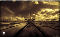
Note: this is my current desktop and layout running Intrepid alpha 1. Note how the workspace-oriented nature of Ubuntu is emphasised with the window selector and the prominent showing of the workspaces on the bottom panel; also note how the user switcher and clock are part of a drawer in the vertical panel, saving yet more space. Full size is the attachment akria_desktop.png |
Contributions
![]() End of edit conflict
End of edit conflict
Guidelines
- For images, use a low resolution picture in the wiki page. It should be no taller than 240 pixels. If you need to upload higher resolutions, please upload them as an attachment and link to them from the page.
There are two tools located at Artwork/Documentation/Software/Wiki_Scripts to help you with this
Use attachment:thumbnail.png and [attachment:file.png linkname]
Use @SIG@ to leave your signature at the end of your comment. New comments should be placed at the bottom of the feedback.
Comments
* Well, I think 8.04 comes w/ 2 panels by default: top and bottom which i find pretty useless. We can move windows list applet and switch workspaces applet to the top and remove the bottom panel. That way we will save up extra 23 pixels and also give new users some familiar perspective. (Windows) Single panel at the top is more pleasing and attractive than having two panels. -- Dmitriykalinin 2008-07-21 09:27:45
* I just can fully agree with Dmitriykalinin. I have a laptop and I put the windowlist applet to the top panel, replaced the broad Main/System/Places menu with the small version and now I just have the top panel and muuuch more space on my little laptop screen. And I think it looks very nice! If the panel would be left on the bottom instead the top I think it looks too much like KDE/Windows. I added a screenshot of my configuration:
-- DanielT 2008-07-26 11:37:56
- This concept has been on my mind for a long time and I have experimented with using panels on the sides to see how usable it is. My conclusion is that this could work but only if the active tasks was changed from buttons with text to icons. It takes a little getting used to but the extra vertical screen real estate was worth it. I would not suggest having any horizontal panels if you were to use vertical panels. This would make a different and distinctive desktop (that Mark has been talking up) that is different to other Linux distros but also other OS's as well. --Drew
Attachment List


