| Edit Wiki ^ |< << Slide 69 of 79 >> >| |
Ubuntunion
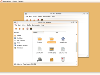
Ubuntunion shall become a GTK and Metacity/Emerald theme. The idea behind it is that every window - including the title bar - shall appear as an union, with no lines seperating it (same idea as behind Sapiens).
Concept
Around every window, there is a rounded border that forms a frame for the union that the window shall be. Inside the window, there are ideally no lines or colored areas that seperate the whole window. The different parts of a window (title bars, menus, toolbars...) are seperated by gradient lines, seperating and uniting them at the same time. The colors used come from the Tango Desktop Project color palette, thus Tango/Tangerine would be the preferred icon theme for this concept. Orange is used for highlights like the border of an active window or highlighted text, white for backgrounds, and gray for other parts (like borders of buttons, seperators, borders of inactive windows).
Palette

Concept Art
|
|
Full size Image by Plippo |
Full size Image by Plippo |
First mockup of nautilus in Ubuntunion theme |
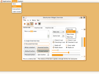
Widgets for Ubuntunion theme |
Desktop color is only a placeholder for some nice background image |
|
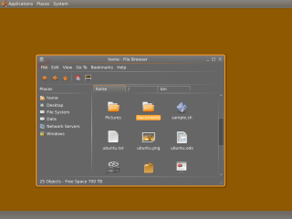
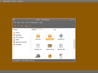
Dark/Half dark edition
|
|
Full size Image by Plippo |
Full size Image by Plippo |
Ubuntunion dark edition |
Ubuntunion Half dark edition |
Desktop color is only a placeholder for some nice background image |
|
Reference
Sample Downloads
I've created a first version of the Metacity theme (contains the window borders and title bar). It doesn't look that well without a fitting GTK2 theme, but if you change the background color of your GTK2 theme to pure white it's OK. ubuntunion.tar.gz
A first rough version of a GTK2 theme (using the pixmap engine) will follow as soon as I find the time to create it.
Contributions
Guidelines
- For images, use a low resolution picture in the wiki page. It should be no taller than 240 pixels. If you need to upload higher resolutions, please upload them as an attachment and link to them from the page.
There are two tools located at Artwork/Documentation/Software/Wiki_Scripts to help you with this
Use attachment:thumbnail.png and [attachment:file.png linkname]
Use @SIG@ to leave your signature at the end of your comment. New comments should be placed at the bottom of the feedback.
Comments
Please share your opinions and ideas with me:
This is a nice idea, how it seems too simple for my liking. Also, I do think you need to use that strong orange colour a bit more, otherwise, keep up the great work! --LostOverThere
- Thank you. Simplicity is one aim of this theme, so I probably won't be able to change this. I've added a new mockup which shows ideas for the design of widgets, where you see how the orange color is used in different places. If you have any ideas how I could use more orange at specific places, please let me know. I also plan to create a dark (or half dark) version of the theme soon. -- Plippo
- Wow, I love it! Finally a theme that I think could be the new default. Its so bright and cheerful, I like how it uses the signature Orange that Ubuntu is known for without overdoing it. I would love to see this as the default theme for Intrepid. -- GHRobson
- Not too excited with the buttons, but definitely brilliant borders. I love its simplicity. --dandesigns
- I really don't like the big bold border and the whole theme seems too light. Maybe add a bit more contrast?
I love this theme to death, but it needs a bit of polish. In my opinion, the title bar buttons could use less contrast. The thing I like about this theme is that it makes the user focus on the content of the window by seamlessly integrating the menu and the controls to the window, so the straight-on black foreground color of the controls on the title bar is a bit of a distraction. I also find their hover state to be a bit harsh with the orange border around the buttons and the darker gradient they get. I think an almost unnoticeable change of foreground color would work better. Keep up the good work! -- jegHegy
- Thank you so much for all your motivating comments. I'm currently working on a rough proof-of-concept GTK2 theme for the first version. As soon as I've finished that, I will create a new version of the theme, trying to include as many of your great ideas as possible. I've attached the source Inkscape SVG of the mockups, so if you would like to experiment with them and get interesting results, just include them in the "contrubutions" section --Plippo
- It's beautiful, I would definitely use this as a theme. But (there's always a but) the title bar should be brown, the way it is now, and the title bar buttons should be different, something new perhaps, or maybe even the old human buttons. Also I am a bit skidish about the tabs in nautilus. I just don't find it functional tabbing in a file browser. So go ahead, I'll be eagerly waiting for the final edition. --Silfiriel
Good work on these mock-ups! One question: if this theme's concept is to have no separating lines, then why are there...separating lines? --TimScaffidi
As a comment to TimScaffidi: I actually like the way some of the separations are gone, while still keeping distinct indications of tabs, etc. I takes the Sapiens idea and makes it work: it's a modern, but not too glossy looking theme. --MHB
- White version is beautiful! --Salutis
Attachment List


