Contents |
Workbench
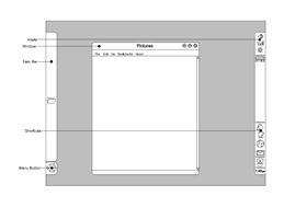
This concept is not highly original and steals many ideas from other pages. What is concept is however is a unified form of an alternative desktop that goes in part to filling Mark Shuttleworth’s mandate to create the best desktop. This concept does not talk about colours and fonts, (as I will leave that to people that have a an eye and talent for that) however it does provide the basis for a discussion of the desktop form. For that reason this concept is called workbench to get people thinking outside of the ‘traditional’ desktop.
Concept
This concept has two ideas that are a departure form the normal. They are:
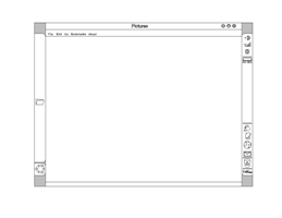
- Use panels/taskbars on the sides of the screen instead of the top and bottom.
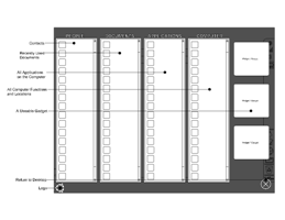
- Have a customisable menu that uses the entire screen
Palette
There is no specific palette for this theme.
Concept Art
|
Fullsize Image by Lassegul |
|
Fullsize Image by Lassegul |
|
Fullsize Image by Lassegul |
Panels/Taskbars
Whether we like it or not people associate an OS with the layout of the desktop. Most users can change their wallpapers but do not often change their panels and therefore this should be distinctive for other OS’s. This sidebar idea gives the OS a distinction all of its own. When you look at workable screen space, applications tend to put their toolbars on the top and bottom of the windows. Most applications tend to be read (or used) vertically meaning that the most valuable space is used by OS taskbars at the top and bottom. Gnome is especially bad for this as it occupies both top and bottom of the screen. This is becoming more and more relevant as monitors are becoming a widescreen as standard. This aspect ratio is suiting this proposal. These taskbars can be disappearing to conserve screenspace in lower resolution uses. In taskbars at the top or bottom this can be annoying as every time the bottom or top is touched (which is often) the taskbars appear. In a side taskbar, these critical places are preserved.
Menu
The menu is a contentious point on OS’s. More and more content have been added to these over the years and more complicated ways of displaying this information are used. Since most menus, when expanded, cover the screen, why not use the entire screen. I propose a menu like the dashboard application in MacOS X, in which the screen is darkened and the menu items are displayed like floating widgets. This means that customizing the menu is as simple at dragging into the area you want it to be. The menu can be brought up by clicking on the Ubuntu icon or hitting the super key. The menu can be removed by clicking the ‘X’ or hitting the super key again. This menu can also have widgets that are often used without taking the focus off the main window.
Reference
#THIS IS THE PLACE WHERE YOU PUT YOUR REFERENCES
Contributions
Guidelines
- For images, use a low resolution picture in the wiki page. It should be no taller than 240 pixels. If you need to upload higher resolutions, please upload them as an attachment and link to them from the page.
There are two tools located at Artwork/Documentation/Software/Wiki_Scripts to help you with this
Use attachment:thumbnail.png and [attachment:file.png linkname]
Use @SIG@ to leave your signature at the end of your comment. New comments should be placed at the bottom of the feedback.
Comments
This idea looks interesting, for point of view of a completely new desktop design. I have been thinking these quite a bit in the Nokia internet tablet development, and where to place a bar have been thought and rethought many many times. It might work also better if the toolkit was at the same time upgraded to e.g. Clutter (http://www.clutter-project.org ). Nowadays when all the monitors are widescreen, placing the bars on the left and right side could be justified as the space in the vertical direction tends to be what is more limited. Some nice slick and elegant transitions built into that, and we would have something that could resemble something like Gnome 3.0, i.e. the next generation desktop. Of course that would require a lot more than just couple of bars, but one would need to start from somewhere. Maybe someone could try it out how it would feel - it would take just couple of clutter actors to make this? Of course there could be an another alternative - save space and not put that much bars visible, for congested screens that could be a possible idea (although I can fill my several thousands of pixels wide screen with a lots of stuff with ease, there is never too much space on desktop...). Maybe touch screen use could be thought also with this concept, it might be that the desktop computer hardware will eventually go into the touch screen direction and it will no longer be limited to the luxury of the handhelds. Sizes of objects could be then designed that in mind so that you would not need mouse but finger would be enough to touch all elements. -- Karoliina Salminen
Attachment List


