SimpleFlatWindow
Contents |
| Slideshow ^ |< << Slide 48 of 55 >> >| |
SimpleFlatWindow
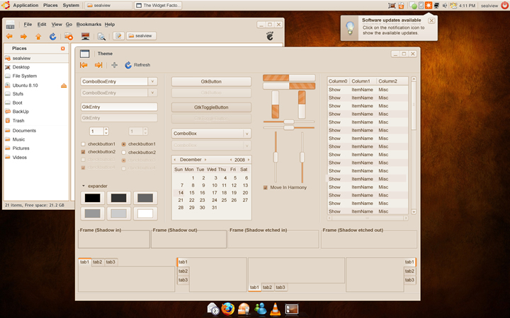
Since the beginning of Ubuntu I was a sucker for its chromatic and tried to find out a simpler way to put all the needs of a user at a handy touch.
Concept
This mocup was inspired to me by a world wide known software producer (I don't want to make an add here) and thought it is very useful and practical. Yes, I have made the mocup on the Human Theme! Well, I did it because I like it very much.
Please don't mind the Wallpaper!
What's the difference?
1. The Window Menu an the Title Bar has been merged for more work space in the window. 2. I took the right to make small changes to buttons, combos, and so on. 3. No more Window Title, which I think is useful only for those whom might work in development and media, any way we recognize a window by its Icon or by its content. ( I might be wrong here, so, yes criticize me) n. that's all...
Concept Art
|
SimplerFlatWindow.png Full Image |
Contributions
Comments
There has to be another way to present a window's Title to the user.. The titlebars that we have today are very cluttered, in my opinion. It takes up a lot of space and does very little for the user. What if we had little tabs connected to different windows that auto-hide in the top corners of the windows? You can just hover in that area to see it, or when a person clicks on a window from another window the title tab pops out quickly to let them know.. Personally, I just think there are better ways to display that information to the user.. Anyone else have any ideas? -- bradwjensen 2008-12-07 12:53:41
Some thoughts on the window title thing: many applications use the document title as the primary part of the window title (this is also recommended by the Gnome HIG). This offers a bit more information than the icon alone. You should take this into consideration when considering removing the window title completely. -- m-mckinley 2009-01-23 23:07:23
- very nice mockup, I always thought that the text on the base surfaces should be engraved like you imagined here. its so basic.. About the titles: they should be on the left side fading into the title color at the right side if they are too long. should work well and looks nice. Gusztee
This needs more love <3 Very pleasing design to the eye, bigger and clearer, just a good use of space. My only concern is a program like Maya with two-dozen menus would fill the titlebar and make it hard to move the window. I guess if we disable the left-click for the menu icon and drag the window around by the newly large top left corner that would be OK (the 1% who actually use that icon could still right-click). BobCFC
Attachment List
Jaunty Jackalope
