Branding_GIMP
|
Size: 1555
Comment:
|
Size: 5270
Comment:
|
| Deletions are marked like this. | Additions are marked like this. |
| Line 13: | Line 13: |
| == Platypus == Being a shy but elegant animal, the platypus is often ignored by the Ubuntu artwork community. This must not go on. We need art that can bring the characteristics of this wonderful little animal to Ubuntu. |
== Branding The GIMP == The GIMP on Ubuntu needs a branded splash in 9.10. |
| Line 18: | Line 16: |
| The platypus, is shy, cute and dangerous. An interesting mix. The artwork should be in adorable colours, with a few small, menacing areas. Mostly orange and pink. Touches of danger, can be expressed in small, dark, shapes difficult to define. Make them reminscent of the poisonous hind spur in shape. | Keeping with the Ubuntu color pallete |
| Line 21: | Line 19: |
| {{attachment:dummy_tn.jpg}}<<BR>> [[attachment:dummy.png|Full size]] |
{{attachment:gimp-ubuntu.png}}<<BR>> [[attachment:gimp-ubuntu.xcf|Full size]] -- [[LaunchpadHome:philippevoinov]] <<DateTime(2009-08-03T08:05:31Z)>> |
| Line 28: | Line 26: |
| {{attachment:dummy_tn.jpg}}<<BR>> [[http://made-up.com/dummy.png|Source]] |
The font used for "GIMP 2.6" is Walkway from [[http://www.dafont.com/walkway.font|here.]] |
| Line 31: | Line 28: |
| == Contributions == | == Comments == ## To Add a Comment with your signature, date and time of your edit, enter: ## * Your comment, followed by: at-sign SIG at-sign (no spaces in between) " Yes, this is in keeping with the ubuntu color paletette, but while is it very natural it also kind of dull. Everythging is just a bit "blah" and there nothing that really catches your eye with this splash, I've seen some good examples of distro specific GIMP branding (wish I could recall some of those at the moment) and think this one could stand up very well, but also needs a good bit of work. I think the words "Ubuntu", "GIMP' and "2.6" really need to stand out a little more. Keep at it, though, as I believe that GIMP and OOo are two of the most prominent pieces of software in Ubuntu and definitely need to carry branding of some sort. --[[LaunchpadHome:blueyonder64]] <<DateTime>> == Concept == I think a good way to integrate GIMP, the Ubuntu logo, and the warm color pallet would be to make a splash screen influenced by Leonardo Da Vinci. The Ubuntu logo could be sketched out roughly integrating the word "GIMP" as the signature. The paper could be a warm parchment. There would also preferably be a quill of some sort integrated in. The picture below is a rough idea of the style we're going for. Just thought I'd throw this out here to see what people thought. ## THIS IS THE LOCATION OF YOUR ARTWORK {{attachment:SmallDavinci.jpg}}<<BR>> [[attachment:DaVinciIdea.jpg|Full size]] -- [[LaunchpadHome:BenSeefeldt]] <<DateTime>> == Reference == ## THIS IS THE PLACE WHERE YOU PUT YOUR REFERENCES |
| Line 37: | Line 49: |
| * I can see where you're trying to go with this, trying to associate GIMP with a famous artistic style, but at the same time I;m not sure that the concept really fits. GIMP being more of a Photoshop type of application, it just seems to me that something like this would perhaps be more appropriate as a splash for a drawing program like Inkscape. But I would defintiely love to see some more mockups of your idea before making any further comments. --[[LaunchpadHome:blueyonder64]] <<DateTime>> | |
| Line 39: | Line 52: |
| == Concept == {{attachment:gimp-madsrh.png}}<<BR>> [[attachment:gimp-madsrh.png|Full size]] -- [[LaunchpadHome:MadsRH]] <<DateTime>> == Comments == * I like this one. -- [[LaunchpadHome:jonathanharker]] <<DateTime(2009-09-03T15:41:06+1130)>> * This is more professional and clean. But I'm not sure if GIMP needs a big and horizontal splash screen since its windows are small and vertical. [[LaunchpadHome:popoi]] <<DateTime>> == Concept == The original didn't quite fit the color scheme, so I made a new one with the ubuntu colors. I left the old one on here though. ## THIS IS THE LOCATION OF YOUR ARTWORK {{attachment:GimpSplatterSplashMini.png}}<<BR>> [[attachment:GimpSplatterSplash.png]] {{attachment:GimpSplatterSplashMinicolor.png}}<<BR>> [[attachment:GimpSplatterSplashcolor.png]] == Reference == ## THIS IS THE PLACE WHERE YOU PUT YOUR REFERENCES The font was the windows sans font. I made everything else from scratch using inkscape and the gimp. == Comments == ## To Add a Comment with your signature, date and time of your edit, enter: ## * Your comment, followed by: at-sign SIG at-sign (no spaces in between) == Concept == Keeping with the Ubuntu color pallete but in a more eye-catching way. This is some sort of spin-off from the first proposal. ## THIS IS THE LOCATION OF YOUR ARTWORK {{attachment:gimp-splash-easy.jpg}}<<BR>> [[attachment:gimp-splash-easy.xcf|Download XCF file]] -- -- [[LaunchpadHome:jerivasmelgar]] <<DateTime(2009-10-06T16:40:40-0603)>> == Reference == ## THIS IS THE PLACE WHERE YOU PUT YOUR REFERENCES The font used for "GIMP" is Gulim from [[http://freefonts.co.in/fonts/G/Gulim.html|here.]]<<BR>> The font used for "2.6" is Alba Super from [[http://www.abstractfonts.com/font/9423|here.]] == Comments == ## To Add a Comment with your signature, date and time of your edit, enter: ## * Your comment, followed by: at-sign SIG at-sign (no spaces in between) |
Branding The GIMP
The GIMP on Ubuntu needs a branded splash in 9.10.
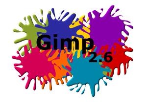
Concept
Keeping with the Ubuntu color pallete

Full size -- philippevoinov 2009-08-03 08:05:31
Reference
The font used for "GIMP 2.6" is Walkway from here.
Comments
" Yes, this is in keeping with the ubuntu color paletette, but while is it very natural it also kind of dull. Everythging is just a bit "blah" and there nothing that really catches your eye with this splash, I've seen some good examples of distro specific GIMP branding (wish I could recall some of those at the moment) and think this one could stand up very well, but also needs a good bit of work. I think the words "Ubuntu", "GIMP' and "2.6" really need to stand out a little more. Keep at it, though, as I believe that GIMP and OOo are two of the most prominent pieces of software in Ubuntu and definitely need to carry branding of some sort. --blueyonder64 2024-04-25 13:48:55
Concept
I think a good way to integrate GIMP, the Ubuntu logo, and the warm color pallet would be to make a splash screen influenced by Leonardo Da Vinci. The Ubuntu logo could be sketched out roughly integrating the word "GIMP" as the signature. The paper could be a warm parchment. There would also preferably be a quill of some sort integrated in. The picture below is a rough idea of the style we're going for. Just thought I'd throw this out here to see what people thought.
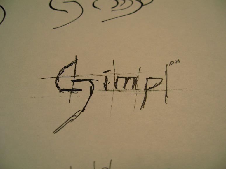
Full size -- BenSeefeldt 2024-04-25 13:48:55
Reference
Comments
I can see where you're trying to go with this, trying to associate GIMP with a famous artistic style, but at the same time I;m not sure that the concept really fits. GIMP being more of a Photoshop type of application, it just seems to me that something like this would perhaps be more appropriate as a splash for a drawing program like Inkscape. But I would defintiely love to see some more mockups of your idea before making any further comments. --blueyonder64 2024-04-25 13:48:55
Concept

Full size -- MadsRH 2024-04-25 13:48:55
Comments
* I like this one. -- jonathanharker 2009-09-03 04:11:06 * This is more professional and clean. But I'm not sure if GIMP needs a big and horizontal splash screen since its windows are small and vertical. popoi 2024-04-25 13:48:55
Concept
The original didn't quite fit the color scheme, so I made a new one with the ubuntu colors. I left the old one on here though.
Reference
The font was the windows sans font. I made everything else from scratch using inkscape and the gimp.
Comments
Concept
Keeping with the Ubuntu color pallete but in a more eye-catching way. This is some sort of spin-off from the first proposal.

Download XCF file -- -- jerivasmelgar 2009-10-06 22:43:40
Reference
The font used for "GIMP" is Gulim from here.
The font used for "2.6" is Alba Super from here.
Comments
Artwork/Incoming/Karmic/Branding_GIMP (last edited 2009-10-06 22:39:51 by ip-sv)
