Homosapien
Homosapien
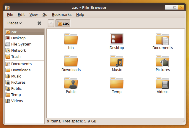
Homosapien is my imagination for the new Metacity theme in Ubuntu 10.04
Concept
To create an original Metacity theme that's modern, fresh, simple and clear that will work with the current Human GTK theme and Humanity icons.
Latest Metacity Screenshot
2nd Version
This is the second version, now containing 4 flavors:
-Homosapien: Origin. -Homosapien: Earth. -Homosapien: Dust. -Homosapien: Blend.
1st Version
Reference
Buttons in .SVG
Title Bars in .SVG
-Fixed the top white line's hard edges and position (looks nicer and smoother now ![]() ).
).
Contributions
Download
02032010
Human-Lucid
Download Human-Lucid GTK Theme v0.2
Comments
Love it. By far one of the best proposals in a long time. It’s unique, legible, sleek, modern, stylish without being distracting, and it nicely adopts the classic “Ubuntu Brown.” I personally think it’d make a great default for Lucid. My only four initial suggestions are: (1) The top edge highlight is a little too severe, especially in the top-left corner. (2) The window border could stand to be a couple pixels thicker (for easier resizing). (3) The text contrast for the window title should be greater (i.e., "whiter") for legibility purposes. (4) The plus sign on the maximize button should become something other than a plus sign for maximized windows -- I'm not sure if this is currently the case, but otherwise it can become confusing (as it is in Shiki). Great work. (Sidenote: Somebody has made this into a downloadable Metacity theme at gnome-look.org) -- topdownjimmy 2010-02-01 14:47:40
I reworked it and posted it to Ubuntu-Art.org. Please test it out. Human Lucid-- dashua 2024-04-16 13:51:57
It looks good so far, I like the blend for the unfocused windows, but needs more refining at the lower left and right corners. About the buttons I'm going to make a complete set to help you guys make it great, best of luck

I've updated the Metacity theme by adding rounded corners. The corners are hard to get right as theres not a lot of control you have other them. That said I've spent a fair bit of time trying to get them looking good. Metacity download link -- zacbarton
- Nice. Should make a version with brighter title bar.
- Yes, I'm working on that, I'll update my mockup preview as soon as it is finished. --rAX
Great theme. This is the best I have seen in a long time. The only thing I can think of, (not even sure if this is possible), would be to make it so if there is only one or two buttons that they would have rounded corners on the left side as well as the right. (If only the X, there would be 4 rounded corners instead of the right 2 being rounded and the left 2 being square) --natew

