Logo
Differences between revisions 1 and 14 (spanning 13 versions)
|
Size: 310
Comment:
|
Size: 1669
Comment: converted to 1.6 markup
|
| Deletions are marked like this. | Additions are marked like this. |
| Line 1: | Line 1: |
| *We're trying to create a new team logo, and anyone is welcome to contribute their designs! | ||<<Include(CaliforniaTeam/Menu)>>|| Here's our final logo: {{attachment:Ubuntu_Cali.png}} Thanks to everyone who contributed! (And SVG of the [[http://www.nhaines.com/ubuntu/california/logo/ubuntu-california_logo.svg|logo]], thanks to Nathan Haines) |
| Line 7: | Line 15: |
| |attachment:ubuntu-california-emblem1a.png| | {{attachment:ubuntu-california-emblem1a.png}} |
| Line 9: | Line 17: |
| |attachment:ubuntu-california-emblem1b.png| | {{attachment:ubuntu-california-emblem1b.png}} |
| Line 13: | Line 21: |
| *Contribute your logo here! | * Not sure if I like the "California Ubuntu" or if "Ubuntu California" would be better. Also, question about what font to use for Ubuntu. * I think that "Ubuntu California" is a bit more traditional sounding, as the Ubuntu should be first. What are the rules about using the Ubuntu font again? {{attachment:california-emblem2.png}} = 3 = * Here's something I cobbled together after talking on IRC. * Forum post and SVG located [[http://ubuntuforums.org/showthread.php?t=558190|here]] {{attachment:Calif_logo.png}} = 4 = * Here's an idea that someone mentioned during last IRC meeting. {{attachment:Calif_logo_v2.png}} = 5 = * Here's what I was thinking with the Ubuntu-California design. I'm not sure which looks better. I think they lose something in the thumbnails (too subtle) but for our team icon (on Launchpad) we could simply use the California outline by itself. * Different sizes plus SVGs available here: http://www.nhaines.com/ubuntu-california-logos/ {{attachment:ubuntu-california1-192.png}} {{attachment:ubuntu-california2-192.png}} = 6 = *Here's another version w/ drop shadow and bear. {{attachment:calif_logo2.png}} {{attachment:calif_logo1.png}} |
|
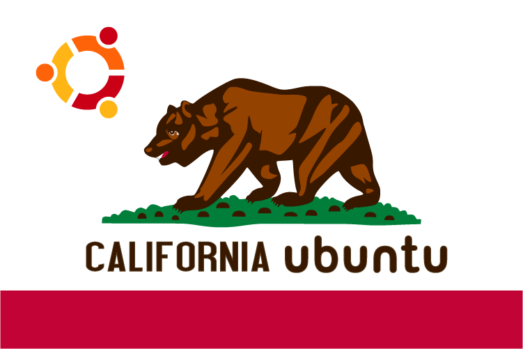
Here's our final logo:

Thanks to everyone who contributed!
(And SVG of the logo, thanks to Nathan Haines)
1
Big thanks to Axxium from the LouisianaTeam for our first design!!


2
- Not sure if I like the "California Ubuntu" or if "Ubuntu California" would be better. Also, question about what font to use for Ubuntu.
- I think that "Ubuntu California" is a bit more traditional sounding, as the Ubuntu should be first. What are the rules about using the Ubuntu font again?

3
- Here's something I cobbled together after talking on IRC.
Forum post and SVG located here

4
- Here's an idea that someone mentioned during last IRC meeting.

5
- Here's what I was thinking with the Ubuntu-California design. I'm not sure which looks better. I think they lose something in the thumbnails (too subtle) but for our team icon (on Launchpad) we could simply use the California outline by itself.
Different sizes plus SVGs available here: http://www.nhaines.com/ubuntu-california-logos/


6
*Here's another version w/ drop shadow and bear.


CaliforniaTeam/Projects/Logo (last edited 2011-06-04 06:37:49 by alderaan)


