Work is under way for a set of icons that will land in Dapper. These icons aim to make the most of the existing Ubuntu palette. A snapshot of work in progress is provided below. Please send comments to the art team.
The plan is to leverage the existing themes, such as the Gnome default, as well as Tango, but to do our own icons for the most important and visible elements of the Dapper desktop. Essentially, there will be 5 icon themes that are used, in descending order of priority:
- The "Human" theme, which is our own unique theme that uses the Ubuntu palette and style guidelines. We are open to community contributions to this icon set. The work is being lead by a commercial icon developer, funded by Canonical, but community contributions would help us increase the icon quality and completeness of the theme coverage.
A "repaletted" version of Tango, which we have yet to give a name (let's call it OrangeTango for now) which is essentially Tango icons modified to use the palette that will look better on the Ubuntu desktop. This repaletting will be entirely community led (it would be nice if someone wants to take charge of this theme). Contributing to this theme should be easier than contributing to Human, because it's mainly about working on existing Tango icons.
- Tango, which is a good fallback, its high quality, consistent. The palette is sometimes not great on the Ubuntu desktop but that's not a problem for many icons.
- The Gnome default icon theme, for its completeness.
- Hicolour, because traditionally that's the last fallback.
You can see a page which shows the coverage of each of these themes at http://daniel.holba.ch/ubuntu/ic/ and this will be updated every hour automatically, based on the packages in Dapper.
That page uses the following priorities:
x10. Dapper Professional Requirement These are our most highly visible icons. There should not be more than 70 icons with this priority. These are the icons we definitely want professionally designed or contributed by the community after professional review. General rules for getting a "10" on the priority are:
- the icon is visible on the default desktop, in many folders, in the default panel, in one of the major applications (firefox, openoffice, evolution), or on one of the apps/places/system menu
- the icon represents a device or peripheral that is in widespread desktop use
x9. Dapper Professional If Possible These are icons that are also highly visible, but are not absolutely essential to have by the time Dapper is released. We would like them to be professionally designed but will also accept community-contributed icons that might not have passed the professional review, or are repaletted Tango or Gnome icons. There should be no more than 50 of these. Essentially, this list is the "we have more time on Dapper" list.
x8. Very Visible These icons are very visible so there is a big win if the community contributes good-looking icons, but we won't try to get these professionally designed.
x5. Minor
- MIME category icons like Music, Film, Photo, Picture, Text, Document, Script, Code, Font
x4. Very Minor
- Very common file types, the sorts of types that everyone would recognise immediately, like PDF, DOC, XLS, JPG, GIF, PNG, AVI, MPG. These will typically be badged versions of the mime category icons, unless they are very app-specific like PDF.
x3. Common
- Types of files that would not be used by a typical home user, but would include things used by more power-user type characters. For example ZIP files, HTML, TAR files, Gimp images. Not developers, but people who are actively creating content or stretching the set of applications installed by default.
- Templates for common document types.
- Interchange formats like RTF, CSV, i.e. not the usual app format but the one you'd choose to move something between applications or platforms.
x2. Low importance
- File type icons that may be recognisable to developers, such as PHP, TTF, PY
x1. No importance We've looked at this icon and considered it, there's some vague interest in having it look good (it's not obsolete or minor-app-specific) but we don't think its important to have that particular icon perfect.
- Icons for very minor or unrecognisable file types like core files, sockets.
- Icons that are only used inside specific applications.
x0. Whatever This icon exists somewhere on the system, but we have expressed no preference on it whatsoever.
You might see statements like "Use Gnome" or "Use Tango" in the right hand column of the page. This is where we have identified that the Gnome or Tango icon looks better given our existing goals and requirements. It would be nice to use that icon directly, or move that icon into the community-contribution theme, for repaletting.
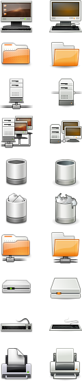
Below is an example of the new icons on the Ubuntu desktop.
This is what the icons look like on a white background:
Tango style
This is a proof of concept "tangoification" of new ubuntu icon design, making those icons tango style require only little changes
You can find tango guidelines here
http://xoomer.virgilio.it/bat/orango-tango/side-by-side.png
In these icons, I slightly changed the color to comform better to the tango palette, added some perspective, made the stroke a tad lighter and added an inner light stroke (so the icons looks good on any background).
You can find find svgs here.
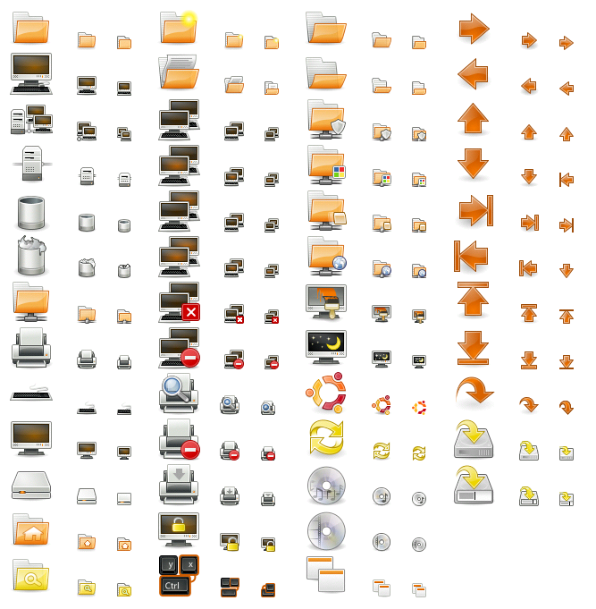
These are the tangoified icons I have now:
http://xoomer.virgilio.it/bat/orango-tango/status.png
This is a mix of "tangoified" ubuntu icons and other tango icons, see how well they blends.
http://xoomer.virgilio.it/bat/orango-tango/dappericons-tango-style-blending.png
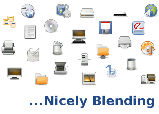
Some of the application icons here are actually the upstream icons (banshee, evince, soundjuicer....)