Comments
AlexanderDomanski: Nice idea to remove stuff that is usually opened through Nautilus. I am doing so for a long time to keep menus clutter free. But I do not like the idea to remove the system tool menu. It must be a clear seperation if I administer (read change) my system or if I do something with my System which does not affect the system itself but has something to do with it. For me these are for example the log viewer and the network tools. By the way: I do not like the idea of moving new login to the screensaver. That is not a typical use of it, is it? It is crap to wait ten minutes for the screensaver to than click on new login. New login in nested window should be hidden only, and not entirely removed.
AlanTam: I cannot find a revalent spec about replacing things like "Firefox Web Browser" with "Web Browser". This makes sense since we should have specified a preferred browser in "Preferences -> Preferred Applications", and this link should point to that preferred application. The same should also apply to many other things, e.g. mail client, cd burner. Should we invent new /etc/alternatives/* for them?
AlanTam: "Preferences -> Removable Drives and Media Preferences" is mostly about "which application to launch" when an event occurs. So why not merge it into "Preferred Applications"?
ChristophNoack: First, keep up the good work. I have some comments to your specification, because things should presented to the user in a common and complete way.
- General Policy: For common operations there should never be only one point to access each function. People are lazy (sorry) - they don't want to search functions. On the other hand: People don't seem to understand "where" the programs come from if they are just linked with MIME.
- System Tools, Floppy Formatter: First, why use a "File"-Menu for that entry? Second, how to format USB-Sticks and stuff like that? There should be a common way to "erase" removable disks in the system. Maybe there is a way to extend the tool "disks"...
- System Tools, Gparted: It own's a really confusing name. Why not name it "Gparted Partition Editor" if we want to keep it?
- System Tools, New Login: Is it really necessary to enable the screensaver first? This is a key feature of multi-user systems - why not use "Fast User Switch Applet"? This encourages users to use it and does not create more "mess" on the "default" user desktop if it is used by a group of people (like a family).
- System Tools, Ubuntu Device Database: Why not hide after using it? And it seems more than a information collector - name it "Device Database Collector"?
- System Tools, Archive Manager: Is "Make compressed file..." an equivalent to "new archive"? We should not forbid the workflow: make archive -- drop Files from different places?
- System Tools, File browser: This is not really redundant. It opens another view of the user's data. Therefore it is not a representaton for one place, it is a file "browser". Maybe the Computer view can be opened in this view by default?
- Graphics, XSane: I think people do not want to start Gimp just to scan. Additionally, XSane owns functions for copying, emailing, batch-scanning etc. It should not be hidden (but it needs some interface love)
Office, OpenOffice from Template: Why not name it "Create from Template"? Your proposed workflow: Create any document -- Access File menu to create from Template -- Close unused document. It should be better integrated - why not use it from the Nautilus "Create Document" menu? Certainly, "OO from Template" is not used, because there doesn't exist good templates yet.
- Sound and Video, Sound Joicer: What is a ripper? We should name it "Extractor" or something like that.
- Sound and Video, Totem: We should name it "Totem Media Player" and keep it. It has playlist functionality and plays already inserted DVDs.
- Preferences, File Management: I don't know if it is a good idea to hide it. It also contains preferences for desktop or trash. This is hard to discover if the user is used to "spatial browsing". Please refer to "System Tools, file browser".
- Coordinaten with Gnome, Font and Theme: The installation of new fonts should be simplified. It is hard to discover.
There are so many other places to improve the usability (common file selector, better working with old disk drives). Just an idea: In contrast to over-slim the menu - create an applet to automatically shows the 5 most used applications in the Panel? First, the user learns what applicatons he owns - later there is only need for an one-click-start-program behaviour.
Sandis Neilands: Hi! I made some notes while reading this spec too.
"Configuration Editor - Hide, useful only for powerusers." Then why not to move it to Preferences -> Advanced Configuration Editor. Advanced users are users too!
"System Monitor - move to "System" > "Administration"". Why? Is it somehow related to system administration? It seems to me that this tool is more like speedomeeter than steering wheel.
- "Archive Manager - hide, as it's available as right click in Nautilus." As Cristoph said above, this breaks workflow.
- "Image Viewer - Hide, as it is best accessed by launching a file." (Image Viewer == eog?) If hiden, then "Open with Image Viewer" is needed in directory's right click menu in nautilus. However I don't see a clear reason why not to use gThumb or something more complete as default image viewer/manager/simple editor. If I remeber right, they are both in default Breezy install. But this is another issue I suppose... However if you make gThumb the default it shouldn't be hiden, because it provides some extended functionality.
"Totem - hide, as it is best accessed by launching a file." This assumption isn't allways correct. For example - if i have really long movie split in 3+ avis (theoras?) I would like to create playlist instead of double-clicking on files (which makes me exit the full screen mode) in the middle of the movie. Totem works with multiple files => according to your first rule it shouldn't be hidden.
- "Multimedia Systems Selector - hide, due to confusion for users and likelyhood of users messing their system up." If that is your fear, then why not add "Reset to defaults" button instead hiding the tool even for those, who find it useful.
- "Windows - hide, power users only." Again - power users are users too! Addition of "Defaults" button would be sufficent enough.
Some time ago i filed a bug ([WWW] http://bugzilla.ubuntu.com/show_bug.cgi?id=18591) about gnomebaker being in Sound & Video category. I think it's relevant.
A little note about user-friendlieness: please don't repeat the same mistake windows made - being user-friendly doesn't mean hiding advanced stuff from newbies. If it's hidden, there is a possibility they never discover how to enable it. Instead a clear and understandable organization is needed. So - keep up the good work!
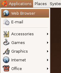
NigelTao: Add the "Web Browser" and "E-mail" launchers to the top of the application menu - since they're used so often, make them two (close) clicks away, instead of three. Note that you can do this now, on Breezy with editable menus. Other OSs/distros that do so (or did so) include Microsoft and Novell Linux Desktop, although note that Microsoft botched it by putting the Web Browser icon the furthest away from the first click.
JorgeBernal: hiding the "MIME items" should imply an increase on the number of "New file" templates on nautilus, otherwise creating a new document becomes extremely difficult. Looking at the detailed spec it seems OO.org items are not going to be removed so I think what you wanted to mean in the spec was "If an item is a viewer and is primarily launched by a specific MIME type and works with one file at a time, it can be hidden"
StuartLangridge: if applications that are generally tied to a mimetype and launched with one file, like Totem, are now to be launched only by launching the file, do those applications need "File > Open" any more? If it's there then people will be encouraged to think that they should open files by using it, and will then be frustrated because they'll think "I must launch Totem and then use its Open command" and not be able to find Totem. If it doesn't have an Open command then they'll be more at home with the idea that "Totem" isn't an application, their movies are "directly clickable" rather than having to be opened in a helper app -- the focus goes back to the file, not the application.
JorgeBernal: About Evolution... my mum has no idea what the word "Groupware" means, but she know what email is, she's not alone about this ![]()
Maybe we should include something in the documentation for power users if items are going to be removed. For instance, I completely agree on hiding multimedia systems selector, but if I need to run it a table with Hidden items -> Command name would be nice
What happens when installing a new app tied to a MIME-type? The menu would be inconsistent ![]() gnome-app-install love, maybe?
gnome-app-install love, maybe?
ManuLopezIbanez: It would be nice to get this completely fixed and define a general policy for Menus. However, it is not going to happen for Drapper, nor in the near future. Perhaps enforcing the wrong policy will be worse than having nothing. And it is going to be very difficult to get it right in the first strike. There are going to be very conflictive opinions on some issues, especially if reasons are not clear as crystal to most people and it just looks like a personal feeling. As the quote in the GNOME Usability says: What's important is not that we can conceive the idea, but that when we actually test it on people you discover it doesn't work... your intuition is wrong.
First, please, we should not reinvent the wheel. Is there any chance to work with GNOME Usability and Better Desktop on this? After all, Libre Software is about sharing knowledge and cooperation...
Second, there is not need to enforce everything. If something is not clear and cannot be tested thoroughly, it is always better to leave it as is now. For example, New Login replaced with button in gnome-screensaver doesn't make much sense to me. What happens if you don't use screensaver? How will you find this option? Another example, why "About Me" + "Users & Groups" + "Sessions" should be integrated? What they have to do with each other? "About Me" and "Sessions" don't require sudo while "Users & Groups" does.
Third, do not make things impossible (or very difficult) for experienced users. For example, make easy for a power user to unhide everything that is hidden by default. Now there is a task that goes Develop way to right-click on menu item and select "Hide", however, how are you going to "unhide" menu items without a Menu Editor and using D&D and right-click? And, by the way, the answer is no: that someone is an experienced user doesn't mean that she/he prefers to edit obscure configurations file using vi from the command line, if there is a quick, clear and nice interface, experienced people will love it.
Finally, anyone aware of this policy is automatically disqualified to test it (me included). We can give our opinion and surely if it doesn't work for us, then it is broken. However, it doesn't follow that if it works for us, then it works. Since we have been exposed to this spec, we are biased and we already know how it works and how to make it work.
Duffman25: I agree with most of the changes proposed, however, if many items are going to be hidden, then I suggest that they still apear in 'gnome-control-center'. It would be ideal if some love was dedicated to it to at least make it more polished, something similar to what suse has done in suse 10.0: http://shots.osdir.com/slideshows/slideshow.php?release=464&slide=37 This would please the people at the forums that have asked for a proper control panel: http://ubuntuforums.org/showthread.php?t=44985. This should be the best solution: http://ubuntuforums.org/showpost.php?p=234968&postcount=20. Note that I'm not saying ditch the menu System-Preferences, but provide another way of accesing the hidden ones that is easy to use, clear & uncluttered.
AlexHudson: comment about "If an item is primarily launched by a specific MIME type and works with one file at a time, it can be hidden" - that seems pretty wrong to me. Firstly, it destroys my use of the application without needing a file - sometimes I don't want to save my work, sometimes I want to cut'n'paste it into another application I have open. I don't necessarily want to have to create a file just to do that. Also, it seems it's just moving the problem: instead of the application being in the Applications menu, it's now effectively in the 'Create new file' menu (unless I want to edit old data, which I probably only want to do 60% of the time). Plus, my apps are now split between two menus. I like the idea of being document-centric, but don't like this approach.
System Tools/New Login: So, my wife needs to check her email... I have to somehow start the screen saver so that she can switch user? Sounds like we need a user switcher applet like Mac OS X. (ÉtienneBersac : See fast-user-switch-applet).
- Accessories/File Browser: This isn't duplicated by the places menu - not when you have spatial browsing (my preferred method) switched on.
- Graphics/XSane Image scanning program: I regularly scan bills and travel documents and things I may need to fax. Why do I need to run GIMP to do this?
- Groupware: What's that - okay, I know what it is but my wife and my cat (she likes to sleep on my keyboard!) don't.
- Other tasks: If you want a right-click menu to hide items, then we should be able to hold down a modifier key to reveal hidden items.
ÉtienneBersac: I agree with a lot of changes except xsane removal.
- Some people install GNOME and KDE. But users do not want to see KDE apps in GNOME menu and GNOME apps in KDE menu.
- Using an entry "Web Browser" is very good for user. But web developper often want to test their work with both firefox, opera and konqueror. The "Web Browser" should be juste add and let the firefox entry hidden.
- GDM should be able to "prelog" a user when clicking on user name in fast-user-switch-applet.
Richard Kleeman: I use xsane often outside gimp. It doesn't make sense to me to be forced to launch the big program gimp when a simple scan is desired. Also I did not understand the removal of "login as another user" I use this all the time, is it integrated somewhere else obvious?
JeffSchroeder: Did anyone think about users who want to use totem to stream internet videos? This is an inconvenience to them. Normal users would do this and totem <---> firefox/epiphany integration isn't that great ATM.
LorenzoEDanielsson: As others have pointed out, one thing I would like is that KDE applications don't show up in Gnome. I'm not sure if the opposite holds. I'd like to be able to access applications like Gimp, Inkscape and Abiword from KDE. Regarding Evolution, I really wish they would do a proper split into multiple applications. I don't really understand why my mail client handles my appointments. I know there's been some discussion about this upstream, but I don't know what the final decision is. Otherwise, I mostly quite like the spec. I'll lose some things that I use regularly, but 1. I can always add them myself and 2. I'd be ready to sacrifice a lot to get less bloated menus.
TobiasWolf: For new inexperienced users functional completeness of the system is mirrored in the application menus. Every function the system is able to perform should be present (example: Hey, you could use Bittorrent to download that quickly - Let me have a look, no, I don't have Bittorrent, pity). If it's hidden, it is not existent. Another example: As a little challenge, I dumped Breezy on a friend's laptop who had no prior linux experience at all. On asking how it goes she replied "I can't hit Ctrl-Alt-Del to end processes". Still, the function is in fact present in the menus, but shortcuts (mouse and kb) are used by anybody (novice and advanced) once they have been discovered. To conclude: It is to be seen whether there should be only one way to access a function. I would say no, since the menu is like a software "shelf" where everthing that's present has a place, but there are also nice shortcuts like RMB -> burn, RMB -> create archive where they contextually make sense. Also different ways to access a function are good as in the Windows task manager's ctrl-alt-del keyboard shortcut,or the mouse-based right-clicking the task bar. A final example: In MS Word the most frequent function used is "paste". It's in the menus, there's a button, there's a context menu and there's a shortcut. The most frequently used method to access paste is the kb-shortcut. Still noone would remove it from the menus, because it has to be present as a prove of it's existence <http://blogs.msdn.com/jensenh/archive/2005/11/7.aspx>.
resulting recommendations
- make a distinction between integrated GNOME products and branded third-party Products. Epiphany could be "Web Browser", but Firefox should remain "Firefox Web browser"
Do not overdo the hiding. EOG can be hidden because it works well together with nautilus. gThumb could take the place of the "Image Viewer" because it defaults to a browse mode. One Image Viewer is enough in the menus.
- Do not hide Archive Manager
- Do not hide Bittorrent
- Do not hide File Manager (because of --browser vs. spatial mode in Places)
- Do not remove preferences like "Windows" entirely. Maybe more ingration.
KarlRelton: I support the calls to not hide Totem. Some of our DVDs simply do not auto-play (others do), and Nautilus opens a browser window on them - showing my daughter all kinds of confusing looking files rather than simply playing the film. Opening totem movie player from the menu is easy to explain as the work-around for such discs. No matter how well device detection etc. works, there are bound to be corner cases like this where having the menu button is the best 'get out of jail' card.
MatthewEast: there are some good ideas on this spec, but a lot of the ideas will harm Ubuntu in my opinion. Removing all items from menus which are launched by a specific mime would hurt me because I like opening some programs from the menu directly (PLEASE DON'T REMOVE TOTEM, or anything in GRAPHICS!). Equally, moving non-administrative activities into the Administrative menu simply to eliminate the System Tools section is a bad idea IMHO. I would prefer moving the System Tools submenu from Applications to System. In general - you should look at the nature of the problem that the spec is aimed at fixing: in fact, only small amounts of tweaking needs to be done to the menu, massive purging is not needed. A menu can be tidy and useful without being minimal. I currently think the Applications menu is very well ordered and quite intuitive. If I am looking for a program, I know where to find it. If i think it's the the wrong place (as I recently did for gnome-blog), I file a bug, and it gets moved (in the case of gnome-blog, from Accessories -> Internet).
I agree with several of the changes in the former System Tools menu (e.g. all things tweaking preferences going into... preferences <g>). OTOH some of the other ones seem to be vastly complicating matters by oversimplification and belittling the users by making them look dumber than they are. There is lots of argumentation on this topic to be found e.g. in Cooper, A & Reimann, R: About Face 2.0 - The Essentials of Interaction Design, Indianopolis (Wiley), 2003 (a definite and rewarding must-read in the field, imnsho). It roughly boils down to axioms like "Nobody wants to remain a beginner", "Optimise for intermediates", "Imagine users as very intelligent but very busy", "Users of sovereign applications are perpetual intermediates.". Or, in other words: help and tutor beginners to become intermediates as fast and as painless as possible. But don't hinder the intermediates to do something (i.e. don't be over-protective). It is *them* which are your major target (specialist cases withheld). Too much rigidity in terms of interfaces has always been a rather bad idea (and is not needed for consistency). A possible way to deal with the issue would be having two kinds of menu configuration (like e.g. "Novice" and "Adept") which could be toggled easily. The second one (yes, two is sufficient) enabling e.g. some of the more 'dangerous' and/or 'redundant' menu entries. An enhancement would be to suggest something to the user to try out from time to time while she gains confidence and experience in using the system. Thus more powerful features or alternatives could be actively discovered one after the other. (btw, menu items should *never* be hidden, just disabled. Unless you want to severely interfere with the user's motoric memory.)
- Anyway: to be forgiving in terms of errors is ways better than hiding things.\footnote{Maybe Ubuntu should automatically be able to save at least some of the last-known-good configurations, making accidents much better reversible. Why not e.g. version at least all important settings in /etc by default and provide a startup-option (properly announced) to easily revert messy changes? A kind of default emergency conf files in case of desaster might also be a good idea.}
- And while i'm at it: *please* move Scribus into Graphics, it *definitely* does not belong into Office (think 'Quark XPress' or 'Indesign' if it is not apparent why). btw, this is also one of the Qt-based applications that should never be removed from the GNOME menu due to its lack of a gtk-based counterpart.
CarlosRibeiro: It's clear that the Ubuntu menu can be improved, and greatly simplified, but please, **don't overdo it**. Usability is a fine art; it's all about balance, it's about not cluttering the menus but also allowing for people to find their own preferred idioms of choice. Also, **acessibility** comes to mind as a potential problem. Sometimes menus are just that -- more accessible, specially considering people with disabilities.
Lastly, let's try to avoid turning it into a religious battle: "having only one obvious way to do something" (as some say, the 'Python Way') versus "having more than one way of doing things" (or the 'Perl Way'). Balance is hard to attain but it's the right thing to do IMHO.
- The top-level "Places" menu needs to be renamed. The term "Places" is vague and -- what's worse -- doesn't accurately describe the menu items it contains. In fact, every single item in the menu refers to *file access*: home folder, bookmarked folders, recently accessed files, special Nautilus directories like "Computer", remote directories, and file search. None of these are "places" -- they're "things", but more specifically they're directories and files.
- For usability's sake, the menu name needs to reflect what the menu entries are for, and that's Documents or Files. Or some other label; suggestions are welcome. But the name Places at *best* doesn't communicate anything at all, and at *worst* is misleading.
- FYI, I filed a bug report about this and almost immediately a flurry of people jumped at the chance to mark it WONTFIX/NOTABUG/INVALID etc. But it's a serious topic: a lousy, lousy menu name that I'm willing to bet gets little discussion because next to nobody even uses the Places menu.
- Think back, when was the last time you used it? "Connect to Server" is the only thing in it that can't be done faster in a Nautilus window; the Bookmarks and Recent only work some of the time. This is Not Good -- and it's the second word on the user's screen.
SaschaBrossmann: I am using it regularly to access bookmarks and NFS mounts which i don't like cluttering my desktop. If you don't have a Nautilus window open all the time, it saves quite some mouse clicks.
NathanWillis: I agree that it contains useful items; I am saying that it would be *more* useful (or at least more used) if it were properly named. Both the examples you cite are better described by Files than Places.
Furthermore, although Places might sort of describe entries like "Home Folder," "Desktop" and "Computer" -- it doesn't describe "Connect to Server..." "Search for Files" is not a place. "Recent Documents" is not a place. "Bookmarks" is not a place. Those last two are actually submenus, sure, but although the bookmarks themselves might arguably be places, documents are not places -- recent or otherwise.
MattiasWadenstein: How about a right-click "show expert options" in the menus to show hidden options? I've spent several minutes trying to figure out how to unhide something (window manager properties), with no luck. I don't mind hiding stuff to unclutter, but hiding it so far away that a "power user" can't find it, even when he knows what he is looking for, is not good usability either.
NicholasSmith: What about redesigning the layout of the main menu (not the menu bar with the three seperate menus). I like what Sun did with their gnome install, pushing the Applications into a sub-menu, and having other frequently used entries in the primary menu. I think it's an improvement over the stock gnome main menu and could at least be a start in improving things. You can see the layout in the screenshots http://shots.osdir.com/slideshows/slideshow.php?release=279&slide=55
SaschaBrossmann: I tend to disagree as i don't think that mimicking the Microsoft UI even more is the way to go to improve things. In this case, it might look cleaner (and more familiar to windows users, which IMHO seems the main reason why they did it). OTOH it introduces at least one more hierarchy level, which means that you also require at least one more click and more pointer movement for similar tasks. The division into "running applications", "navigating the file system" and "managing the system" that is basically inherent in the current menu layout seems better to me in that respect. It is also more task-centric, which is nearly always an aim to strive for. (There might still be a better way, though.)
NathanWillis: here, again, as the lone crusader for this cause, let me point out that Places is the wrong name for a menu described as "navigating the file system." Is there no one that has a real objection to changing this? There appears to be no argument in favor of keeping it labelled Places; why don't we change it? What else needs to happen?
SaschaBrossmann: I support this request, though i would prefer to replace the current object-centric nominalism by a more task/action-centric, erm, "verbism" ;-). e.g. "Applications" => "Run" (or for devil's sake "Start" ;-)), "Places" => "File", "System" => "Administrate".
NeilWoolford: General policy is good, to reduce clutter and group programs appropriately, but maybe some details are tricky... The slightly spartan nature of Gnome over KDE is one of the reasons I use and recommend Ubuntu.
Purging "System Tools":
- Many people misunderstand the New Login move; they think it is only to be available on the screensaver login, when it is actually also to be available as an option at logout. A definite improvement as these are where you expect 'log in as new' to be, the points at which you (re)log in normally.
Accessories:
The terminal now appears here. I'd consider moving it to System->Administration. I for one open the terminal to perform system administration tasks above all else. (Of course some might want to move the text editor on similar grounds, but I think that just falls in the same mental set as Calculator and Tomboy. Real men use vi for system administration editing anyway
") unless they are emacs zealots
unless they are emacs zealots ") - don't flame, just a joke...)
- don't flame, just a joke...) SaschaBrossmann: I disagree. The terminal is not a specific administration tool but provides a generic interface to the system. I would even put it into the top hierarchy therefore as an item of its own, but that may seem slightly excessive to others
Graphics:
- Moving XSane access into Gimp is unhelpful as there are circumstances in which you would want a standalone XSane. Scanning to email, to fax and scanning for office documents occur to me. Note that Xsane does not give the user a choice of XSane mode (viewer, save, copy, fax, ocr or email) when started from within the Gimp. It acts purely as a Gimp plugin.
- From my use of XSane, it scans to email pretty nicely, I use that quite a lot. If you don't want to use the image in the Gimp this move would be a pain. (Granted OOo can import direct from scanner, but it is well down the menus and frankly not very nice to drive anyway...)
SaschaBrossmann: Full ACK. I find myself often scanning stuff which i do not want (or need) to deal with immediately in terms of full image processing etc. Those tasks are not necessarily related. Having to fire up Gimp each time does certainly not improve workflow (and ease of use). Further, the standalone XSane is much less resource hungry than Gimp, i.e. takes less time to start, eats less memory etc. which is also something that should be heavily considered.
"Internet" and "Office":
OpenOffice from template should probably stay. It is a quickstarter route and many people will use it a lot. It is fewer clicks and doesn't start you with an empty document that you have to close on exit from OOo. The name "From Template", although used within OOo, is confusing; the Windows version has the Quickstarter in the system tray: the same function under a better name as you can browse, preview and open a variety of documents both new and existing, not just templates. Perhaps a menu item renamed Quickstarter would be helpful for users. (You don't need to make the decision about which bit of OOo you want before starting your document either.)
ChristophNoack: "OOo from Template" is definitely not a quickstarter (a quickstarter would preload the application without opening a windows that prevents other OpenOffice.org application windows to be opened [OOo 1.1.2]). Maybe one can use for starting OpenOffice.org, but it is intended to select a template/document to work with. Addtionally, the OpenOffice quickstarter for Windows does NOT even respect the Windows Human Interface Guidelines by offering the features you mentioned. For the rest: full acknowledgement
Sound and video:
- Keep totem as a menu selectable item. Not every DVD autoplays on every system and Totem can be usefull driven from menu, eg to find audio clips and playlists as well as video clips and whole DVDs. (Appears to have been reverted after feedback.)
- Keep sound recorder *only* if it works out of the box for most people... Pet gripe of mine as the KDE version works fine on my Gnome desktop but the Gnome one doesn't.
MattBretl: Here's my personal proposal for integrating the show/hide/install/uninstall process for Applications menu items... Comments obviously welcome.
- Right-clicking on a menu item should reveal options for Hide and Uninstall.
- Every menu (Accessories, Games, Graphics, etc.) should have a "More..." option at the bottom of the list. "More..." would display a list of Hidden programs and Not Installed programs. Hidden programs could be launched by double-clicking, or displayed in the menu using a tick box. Not Installed programs could be installed by double-clicking.
I believe that this follows a user's train-of-thought when searching for applications. Example: I'm looking for a spreadsheet program. I go to the Office menu, but I don't see the desired program. I click "More..." and can immediately run, display in menu, or install the desired program. (Clicking off the Office menu and going to Applications -> System Tools -> Applications Menu Editor or Applications -> Add Applications is counter-intuitive, when all I really want is "More..." programs in my Office menu.)
This also encourages users to experiment with the wealth of free software available. Most people associate "Add Applications" with inserting a CD or floppy disk from a retail box. (Look at the icon for Add Applications - it's a CD, a floppy, and retail box!) "More..." suggests that free software is just a single click away, which is the impression that we'd like to achieve.
The no sudo/ no menu should be extended to naultilus and gtk file picker so if there is no sudo access you cant browse to '/'
nouse4anick: As a CS major, some of my work depends on some of these options being open to me. I would love to know the reasoning behind removing the 'new login in nested window' option among others. One of the greatest things I have found about Linux is the ability to customize everything to what YOU need it to do. If I need to have nested window logins, I should not have to spend 3+ hours trying to find a work around!
MenusRevisited/Comments (last edited 2008-08-06 16:15:58 by localhost)