Please check the status of this specification in Launchpad before editing it. If it is Approved, contact the Assignee or another knowledgeable person before making changes.
Launchpad Entry: mobile-ui
Packages affected:
Summary
This project describes the user interface for UME on Mobile Internet Devices. Eventually UME may span many types of devices with various forms and requirements. Each of these will have different user interface charactersitics which may or may not be satisfied with this design.
Mobile Internet Devices are x86 hand-held PCs. Given the similarities in function and system characteristics to Nokia's N-level hand-held devices, Nokia's Hildon Application Framework was selected as the underlying application/UI framework (see https://wiki.ubuntu.com/MobileAndEmbedded/AppFramework) The UME user interface will look markedly different and be designed with user and OEM customization in mind.
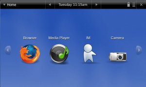
An example of the UI today:

Rationale
Mobile Internet Devices have the following system characteristics:
- Low-power, hand-held mobile device
- Screen dimension: 4.5" to 7"
- Screen resolution: 800x480 up to 1024x600 (expected)
- ~512MB SSD, ~512MB RAM (depending on model)
- Limited or unknown hardware controls (UI needs to be able to do it all)
UI Goals
- Simple, touchable, fun (Large, colorful icons and controls)
- Finger-navigable
- Soccer Mom and Gen-Y'ers should be able to play music, view photos, browse, chat, and navigate in car.
- Home screen highly customizable and extensible by OEMs and hackers.
Mobile devices are not general purpose desktops (yes, you can just run an Ubuntu desktop on it if you want). Applications should be easily started, stopped, and navigable with the finger. Generally they will have fewer applications than a desktop (~20 instead of 100's). It is assumed that the primary applications would be:
- Browser
- Multimedia apps (music, movie, photo)
- Chat
- Camera
- Location/GPS
- Games
- Configuration applets
Use Cases
1) Soccer Mom puts in her purse on the way out the door. Uses location services to get to kids piano teacher's house. Browses the web during piano lesson. Takes a few notes in notepad. Chats with husband about when he's coming home.
2) Gen-Yer takes MID in his pocket to bar. Takes picture of himself with the cute waitress. Checks out the picture. Uploads picture to MySpace. Views MySpace page. Chats with buddies. Sends his GPS coordinates to them to find him.
Scope
This spec describes the user interface for UME on Mobile Internet Devices.
It covers the elements that make up the Home Screen, how these relate to the underlying Hildon Application Framework, comparison of Maemo UI with UME UI, customization possibilities, and design constraints.
It does not cover specific application user interfaces. An application UI design and style guide is provided in the Mobile UI Style Guide Blueprint/spec
Design
The core components are those found in GNOME Mobile, including GTK, matchbox window manger, and Hildon Application Framework.
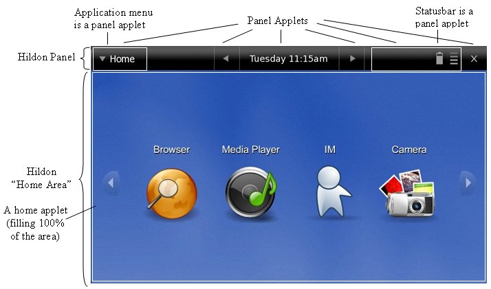
The UME Home Screen consists of one or more panels containing panel widgets/applets, and a large open area containing home widgets/applets. The panel at the top is called the "Marquee". It is present when applications are running and contains the application menu applet and close application applet. The number of panel and home widgets is restrained by space only. It will be possible to configure the order and location of widgets. The Maemo UI also has these elements. Below is a picture showing these pieces:

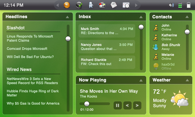
With this design the following UI's are all possible:

![]()
![]()

Steps in transition from Maemo UI to UME UI
- To move the user interface from the Maemo UI to the UME UI, we do the following:
- Hide the task navigator (a panel). (/etc/hildon-desktop/desktop.conf file change)
- Create a new panel and place it at the top. (/etc/hildon-desktop/desktop.conf file change)
- Tell matchbox not to show window decorations
- Add new plugins to our top panel (application menu and statusbar)
- Change the theme
- Create a home area plugin for navigation.
About Applets
Language: Currently applets can be written in Python and C. (<tbd> flash)
<tbd> Transparency: If an applet image contains transparency, the panel will show through. This allows applets to work with multiple backgrounds and themes.
Marquee (Panel) Applets
Examples of Marquee applets (* indicates Intel is working on currently):
- List of existing applications (already part of Hildon)
- List of running apps
- Quick-launch
- Close app*
- Statusbar*
- Application-specific drop-down menu*
- Clock*
- Activate previous application*
- Activate next application*
- ...
Home Applets
- Examples of Home Applets (* indicates Intel is working on currently):
- Application Launch UI* (more options welcome)
- RSS Reader
- Clock
- Radio
- ...
Current and Future Home Screen
The addition of new home applets could greatly alter and improve the feel of the user interface as a whole, especially for application launching applets.
Some toolkits to look at:
Clutter Toolkit -- OpenHand OpenGL 2D library
Pigment -- Fluendo OpenGL 3D library (Clutter vs Pigment comparison by MacSlow)
EVAS -- part of Enlightenment
Implementation
Intel has been working on a reference user interface (shown above). This UI is to highlight the areas of the framework and provide a base from which people can begin to add new applets.
Outstanding Issues
