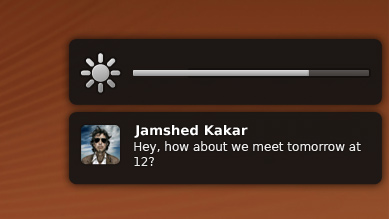
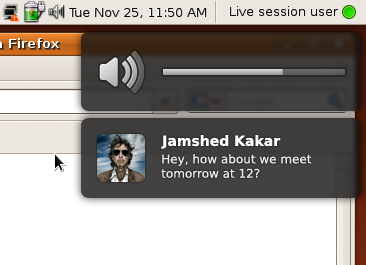
NotifyOSD
This is the design specification for Notify OSD. If you are a software developer looking for advice on making your software compatible with Notify OSD, see NotificationDevelopmentGuidelines.
This specification contains some issues not yet resolved. Your feedback is welcome at NotifyOSD/Comments.
To improve the user experience for notifications in Ubuntu, the Desktop Notifications Specification and later the KNotification API should be implemented in a consistent way, with non-interactive, non-directional, non-overlapping notification bubbles that can be clicked through and look beautiful. For compatibility with this new system, high-profile programs should be patched so that they do not rely on notifications being interactive or pointing to notification area icons, and when an unpatched program incorrectly requests a notification with actions it should be shown as an alert box. Any notification configuration should be handled by individual applications. Visual confirmation of hotkey changes to volume, screen brightness, and backlight brightness should also be presented in bubbles the same way as notifications.
Canonical Ltd’s Design team and Desktop Experience team are the upstream developers for this work. Notify OSD is hosted on Launchpad.
Contents
- Rationale
- Use cases
- Targeted environments
- System nomenclature
- Bubble appearance and layout
- Bubble behavior
- Fallback alert boxes
- Logging notifications
- Critical and non-critical queues and do-not-disturb mode
- Treatment of the Desktop Notifications Specification 0.9
- Treatment of the KNotification API
- Treatment of hotkeys
- Treatment of hardware device detection
- Architecture
- Compatibility fixes accepted upstream
- Compatibility fixes still to be maintained
- Release notes
- Unresolved issues
Rationale
There are many reasons that a computer may want to notify you of things not directly related to what you are doing right now. Software updates may be available; you may have received a new instant message; your 300-page print job may have finally finished; you may have only ten minutes of battery left. Sometimes these events need a response or at least acknowledgement, or don’t need to be read immediately, in which case they should be presented in an alert box or some other window. For cases where a notification is best read immediately but there is no applicable response, however, the most appropriate mechanism is a non-interactive notification bubble. (For more details on the various notification mechanisms and when to use each one, see NotificationDesignGuidelines.)
Ubuntu currently uses notification-daemon, which presents notification bubbles as interactive and therefore risks accidental clicks. The current bubbles are also rather unattractive, so replacing the notification system also gives us the opportunity to make them beautiful. And presenting volume, brightness, and similar changes in the same way as notifications decreases visual variety, and introduces a consistent appearance for non-interactive things.
Use cases
Examples of notification bubbles and other forms of notification:
- Ten seconds after waking from sleep, your notebook successfully connects to your company’s wireless network. A notification bubble appears, with a wireless icon and the text “Connected to Yoyodyne”.
- You and your colleague Camila are collaborating on a presentation over instant messaging. Whenever Camila says something while the presentation window is in front, what she says appears in a notification bubble with her buddy icon. If she says something else within a few seconds of the bubble appearing, the bubble grows smoothly to accommodate the new text, and its disappearance is delayed. As soon as you switch back to Camila’s chat window, her notification bubble disappears.
- You begin giving your presentation to the management team. Five minutes in, Camila sends you another instant message: “Hope it's going well! ;-)”. Fortunately, this time no notification bubble appears to disrupt your presentation.
- Twenty minutes into your presentation, while you are answering a question and not looking at the screen, your battery reaches a critically low level. An alert box appears, floating over the presentation, warning you of this fact.
- You quickly connect the notebook to a colleague’s power supply. The alert box disappears by itself.
- With the presentation over, you disconnect from the power supply and return to your office. A notification bubble appears showing that the notebook has switched to battery power.
- You browse the company intranet while waiting for your e-mail program to launch. This being a Monday, you have over 100 new messages, and because your e-mail program is in the background it notifies you of this using a bubble. At the same time, the envelope icon in the top panel darkens to indicate the new messages. You open the envelope menu to switch back to your Inbox.
Examples of confirmation bubbles:
- Your secondary display is a little too bright, so you want to dim it without affecting your primary display. Looking at the secondary display, you press the Reduce Brightness key on your keyboard. An overlay appears on that display, showing the brightness reducing.
- Immediately after changing the brightness, you increase the sound volume, also with the keyboard. The brightness overlay is replaced instantly by a volume overlay. After a few seconds, the overlay fades away.
- You change the volume again, this time using the volume menu in the top panel. No overlay appears, because visual feedback is provided by the menu itself.
Targeted environments
It is most important for Notify OSD to work correctly with Compiz in either Ubuntu or Kubuntu, Metacity composited in Ubuntu, and kwin composited in Kubuntu.
Other targets are Metacity non-composited, kwin non-composited, xfwm4 non-composited, and xfwm4 composited.
System nomenclature
Notify OSD should be packaged under the name notify-osd. When running, its process should also be called notify-osd.
Bubble appearance and layout
Notify OSD should display two types of bubbles, which this specification calls confirmation bubbles (confirmation of e.g. change in sound volume, change in display brightness, or ejecting a CD) and notification bubbles (e.g. instant message, unrequested change in Internet connectivity).
For the purpose of this specification, the term leading means “left” whenever the system is using a left-to-right language, and “right” whenever the system is using a right-to-left language. The term trailing means “right” whenever the system is using a left-to-right language, and “left” whenever the system is using a right-to-left language. All mockups in this specification are of LTR layouts.
Inside the bubble
|
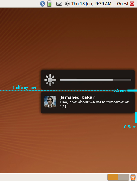
Regardless of type, a bubble should appear as a rectangle of color #131313 (regardless of theme) with opacity 90%, corner roundness 0.375 em, and a drop shadow of #000000 color and 0.5 em spread. The bubble should blur whatever is behind it with a Gaussian blur of 0.125 em.
A bubble should be 18 ems wide (not including the drop shadow). Its height depends on the contents, but should be a minimum of 5 ems, and a maximum just tall enough to display 10 lines of body text (which means the maximum height of a bubble with a title is greater than of a bubble without a title). Furthermore, the bottom limit is 6 ems from the top of the bottom panel, if there is one, or otherwise 6 ems from the bottom of the screen (as if there was a 5-em bubble at the bottom plus 0.5 em margin on each side). Regardless of font and screen size, a bubble must not be so tall that it extends beyond the bottom limit.
Bubbles feature an icon, and/or some text or a gauge. All text elements should have a drop shadow of #000000 color and 0.125 em spread.

Icon
Any icon should be scaled so that its largest dimension is 3 ems, while retaining the icon’s original aspect ratio. This means that vector and bitmap icons should be simple, without fine detail or thin strokes, and all icons should be square or nearly square whenever possible. If the icon is a bitmap, Sinc/Lanczos scaling should be used to minimize jagginess.
If the bubble has no text, the icon should be horizontally centered within the window. Otherwise, the icon should be horizontally and vertically centered within a 3-em square that is flush with the leading side, with 1 em margin to the trailing side.
Icons representing alerts, warnings or errors should use an x or ? symbol with smooth gradient ranging from light red (#ff6363) at the top to dark red (#cc0000) at the bottom. Other than that, all icons and gauges should use one color theme: a smooth gradient ranging from light gray (#ececec) at the top to medium gray (#9b9b9b) at the bottom. Every icon should also use a black 2px outline with 30% opacity. There should also be a 1px white highlight with 40% opacity on the top and left edges to improve the definition. Different opacity values of this scheme (excluding the black outline) are allowed, for example to depict an inactive/disabled state or different levels of intensity (e.g. brightness). All icons and gauges should use gently rounded corners with the recommended roundness of 0.1 em radius and the roundness should not exceed 0.25 em radius.
![]()
This set is subject to change.
Text layout
If there is text, it consists of a title and/or a body. Both of these should use the standard application typeface, aligned to the leading side, and should wrap to multiple lines if necessary. If a word is wider than the line, it should wrap following usual Pango rules for the current interface language.
Both title and body text should appear to the trailing side of the icon. If there is no body text, the title text should be vertically centered with the center of the icon. If there is body text, the title text should be top-aligned with the top of the icon, and the body text should begin immediately underneath. This applies even if body text is added to a bubble that previously had only a title: the title text should move from its centered alignment to top alignment as the body text appears.
Title text
The title should be the standard application font size, of color #ffffff, and bold weight.
In the title text, any string of one or more consecutive whitespace characters (U+0020 SPACE, U+0009 CHARACTER TABULATION, U+000A LINE FEED (LF), U+000C FORM FEED (FF), or U+000D CARRIAGE RETURN (CR)), even if a mixture of those, should be treated as a single space. Leading and trailing whitespace should not be presented.
If the title would take up longer than three lines, it should be truncated at just enough characters to fit an ellipsis character “…” at the end of the third line.
Body text
The body should be 0.8 × the standard application font size, of color #eaeaea, standard weight, and should not contain any extra formatting.
In the body text, any string of one or more consecutive whitespace characters that contains at least one newline (U+000D CARRIAGE RETURN (CR), U+000A LINE FEED (LF), or U+000D CARRIAGE RETURN (CR) immediately followed by U+000A LINE FEED (LF)), even if a mixture of those, should be treated as a single newline. Then for each line in the text, any string of one or more consecutive (non-newline) whitespace characters, even if a mixture of them, should be treated as a single space, and leading and trailing whitespace should not be presented.
Gauge
If a notification bubble has a gauge, the gauge should display the old value for 500 ms before switching to the new value for the remainder of the time, as a visual indication of what the change was.
Interaction
|
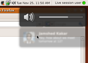
Whenever the pointer moves into a bubble, whatever is behind the bubble should instantly become no longer blurred, and the bubble itself should instead receive a 2-pixel Gaussian blur and reduce to 40% opacity. When the pointer leaves the bubble, it should instantly return to its normal appearance.
Other than that hover effect, bubbles should not directly respond to input devices in any way.
Outside the bubble
|
If any windows are open, a bubble should appear on whichever display contains the largest amount of the focused window at the moment the bubble starts appearing. If no windows are open, a bubble should appear on whichever display the pointer is on at the moment the bubble starts appearing. (A touch-only display has an invisible pointer, so whenever it is touched it becomes the display the pointer is on.)
Each display should show a maximum of two bubbles: one confirmation bubble and one notification bubble. The first bubble on a display should be positioned 0.5 em from the bottom of whichever panels are at the top of the display (or 0.5 em from the top of the display, if it has no top panels). The second bubble on a display should be positioned 0.5 em from the bottom of the first bubble. Each bubble should be 0.5 em from the trailing edge of the display.
Bubble behavior
Animations and durations
|
Notification bubbles |
Confirmation bubbles |
|
Critical |
Non-critical |
||
When it appears |
After all other pending critical notifications, before all non-critical ones. |
After all other pending notification bubbles. |
Replaces any earlier confirmation bubble immediately. |
How it appears |
Fades in over 200 ms if first in a series, or 300 ms if subsequent. |
Fades in over 700 ms if first in a series, or 300 ms if subsequent. |
Fades in over 100 ms. |
Appears if screensaver inhibited |
yes |
no |
yes |
Standard duration |
10000 ms + 250 ms/(line of body text) |
5000 ms + 250 ms/(line of body text) |
2000 ms |
Extended by input |
If between 1000 and 3000 ms there are any modifier keypresses or ≥10 non-modifier keypresses or ≥1 click, extend by 2000 ms. Very difficult to implement. |
no |
|
Extended by confirmation bubble appearing |
Resets to previous duration, minus 1000 ms. This has no effect because it waits to leave at the same time as the confirmation bubble anyway. |
n/a |
|
Visible merging with enough room to show all body text |
Over 250 ms, bubble grows initially linearly but decelerates as it reaches its new size; and title fades out if there was no body text. Then over another 250 ms, the new text fades in, regardless of how much there is. |
n/a |
|
Visible merging with overflow |
Old text displays for bubble’s normal duration. Then over 250 ms (really?), text that will no longer appear in its current position scrolls up, with oldest text scrolling off the top and new text scrolling onto the bottom. |
n/a |
|
Extended by visible merging |
+ 500 ms + 250 ms/(line of body text) |
n/a |
|
Visible replacement |
Over 300 ms, the old contents fade out. Then over another 300 ms, the new contents fade in. |
Changes instantly. |
|
Extended by visible replacement |
+ 2000 ms + 250 ms/(line of body text) |
Resets. |
|
Maximum duration |
15000 ms (overriding all the above) |
||
How it disappears |
Over 300 ms, fades out. |
||
If a bubble is replaced with one that has the same icon and the same title text, and the new body text is an extension of the old body text, this should not be presented as a normal replacement; instead the bubble should be presented as if the old and new bubbles were being merged.
If the pointer is over the area where a bubble is about to appear, it should appear as normal, ignoring the pointer unless it leaves and then re-enters the area. In all other cases where the pointer is over a bubble, however, the bubble’s duration should pause until the pointer leaves. For example, if a notification bubble has been fully visible for 2000 ms when the pointer enters, it should switch to its mouseover appearance until the pointer leaves, then switch back to its normal appearance and display for a further 3000 ms.
If the only bubble on a display is fading out when another bubble would appear underneath it, the newer bubble must instead wait until the older one has completed fading out.
If two bubbles are on a display simultaneously, the first should never disappear before the second; instead it should disappear at its scheduled time or at the second bubble’s scheduled time, whichever is later. (A second bubble may, however, disappear before the first.) The first bubble, if it is a notification bubble, should also never change size while any confirmation bubble is also visible; instead, it should wait until all current confirmation bubbles have disappeared.
Sound
If a notification bubble has a sound associated with it, that sound should be played starting from the moment the bubble has finished fading in.
Merging notifications
Notify OSD should merge two notifications into a single notification if all of the following are true:
- they come from the same program
- they have the same title, or lack of title
- they have the same actions, or lack of actions
- the first is not already open as a fallback alert box
- both of them have indicated that they allow merging
- the second notification is not specified as a replacement of any other notification.
When merging notifications, the icon and sound (if any) of the latter notification should be used. The body text of the latter should be appended to the body text of the former, with a line break inserted between them if there was none already. For example, if the notification in queue position 4 has title “andrew_p” and body text “Hey Coral”, while the notification in queue position 7 has the same icon and title “andrew_p” and body text “Are you still in Oregon?”, then the body text of the notification at position 4 should be changed to
Hey Coral
Are you still in Oregon?
and the notification at position 7 should be deleted from the queue.
If the earlier bubble is already being displayed and not yet in the process of fading out, it should smoothly grow to make room for the new text, the new text should appear instantly, and the old icon should instantly be replaced by the new one.
Overflow of long messages
|
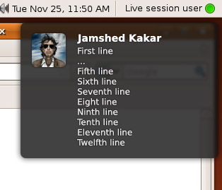
If a bubble’s body text — either initial, or after merging — would take up more than ten lines inside the bubble, the body text should be presented as:
- the first line of text;
- an ellipsis (…) on a line by itself;
- the last eight lines of text.
The transition from the non-overflow presentation to the overflow presentation, i.e. the arrival of an eleventh line of text, should be:
- the first line should stay where it is;
- the second line should cross-fade into the ellipsis that replaces it;
- the third line should scroll up into oblivion, with following lines (including the new eleventh line) following the third line upward.
Handling spam
If, after any merging, there are more than 20 notifications from the same program (as identified by its D-Bus ID), then … what?
If there are more than 1000 notifications in the queue, any further notifications should be discarded, period.
Fallback alert boxes
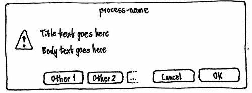
For cases where applications have expected the notification system to allow interactivity without checking whether it actually does, and cases where applications have expected the notification system to display a notification indefinitely, Notify OSD should show an alert box as a fallback. The alert box should appear centered on whichever display the pointer is on at the moment it is due to appear. Because they require a response but should not block the queue, multiple alert boxes may be open at once.
An alert has custom text and buttons. The title of the alert should be the name of the process that is invoking the notification. The icon should always be the ![]() dialog-warning icon. The text should be presented uniformly in the standard application font size.
dialog-warning icon. The text should be presented uniformly in the standard application font size.
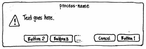
The first button should be positioned in the bottom right corner of the alert. Immediately to its leading side should be a “Cancel” button that has no action. Any other buttons should be positioned from leading side to trailing side, starting at the bottom leading corner of the alert. None of the buttons should be set as the default (because the system can’t detect that any of them are safe as a default).
Activating any button should close the alert, and then perform the associated action if any.
Logging notifications
For debugging and anorak purposes, each notification (but not each confirmation bubble) should be logged in the file “$HOME/.cache/notify-osd.log” (bug 332950). The log should take this form:
[timestamp, process-name] title
body
body
body

[timestamp, process-name, appended] title
body
body
body

[timestamp, process-name, replaced] title
body
body
body
The timestamp should be in the format defined by RFC 3339.
The log should be cleared whenever you log out or log in.
Critical and non-critical queues and do-not-disturb mode
Every notification, whether it is to be presented as a bubble or as a fallback alert box, should be treated as if it is in one of two queues: critical or non-critical. All pending critical notifications should appear before any pending non-critical notification bubbles appear; and within each queue, notifications should appear in chronological order. (This means, for example, that a fallback alert box should not appear until earlier notification bubbles have finished displaying. This prevents a later interactive notification from appearing inappropriately before an earlier non-interactive one from the same program.)
Whenever a program is inhibiting the screensaver, Notify OSD should be in do-not-disturb mode. While in this mode:
All notifications should be logged as normal.
Critical notifications, and all confirmation bubbles, should appear as normal.
- Any non-critical notification bubble that was already being displayed, at the moment Notify OSD entered do-not-disturb mode, should remain for its scheduled duration.
- Normal processing of the non-critical notification queue should stop, so that no further notification bubbles appear.
Once it has been in the queue for 30 seconds, any non-critical notification that would be rendered as a fallback alert box should (for compatibility) appear as normal, except that it should open explicitly unfocused and in the background.
- Once it has been in the queue for 30 seconds, any non-critical notification that would be rendered as a bubble should be discarded from the queue and never displayed.
When Notify OSD leaves do-not-disturb mode, normal processing of the non-critical notification queue should resume.
Treatment of the Desktop Notifications Specification 0.9
Notify OSD should function as an implementation of the Desktop Notifications Specification 0.9, as follows.
org.freedesktop.Notifications.GetCapabilities
The system should return the capabilities {"body", "body-markup", "icon-static", "x-canonical-append", "x-canonical-truncation"}. (For why it should return "body-markup", see “Sanitizing body text”.)
org.freedesktop.Notifications.Notify
If actions is not supplied and expire_timeout is not set to “0”, the notification should be presented as a bubble:
If the hint “x-canonical-private-synchronous” is supplied, it should be treated as a confirmation bubble; otherwise, it should be treated as a notification bubble.
If replaces_id is supplied, and it matches a bubble that is currently visible, it should be presented as a replacement of that existing bubble. If the matching bubble is in the queue and not yet visible, the new bubble should take the old bubble’s place in the queue.
If app_icon is supplied, and it is a valid icon, the notification bubble should use that as its icon. Otherwise, if the icon_data hint is set, the notification bubble should use that as its icon. (The reference to “image_data” in the Desktop Notifications Specification is an error.)
If the hint “x-canonical-private-icon-only” is supplied, the bubble should use the icon-only layout. Otherwise:
The system should assume summary to be raw plain text, and use it as the title text of the bubble.
If body is supplied, the system should sanitize it, and then use it as the body text of the bubble.
If the hint “x-canonical-append” is supplied with a string value “allowed”, and replaces_id is not specified, the bubble should be treated as if it allows merging.
If the hint “sound-themed” is supplied with a string value that is a valid sound name, that sound should be associated with that notification bubble.
If the hint “urgency” is supplied with a value of 2 (and the hint “x-canonical-private-synchronous” is not supplied), the bubble should be in the critical queue. Otherwise, it should be in the non-critical queue.
All other hints, and all other parameters (including expire_timeout) should be ignored.
If actions is supplied and/or expire_timeout is set to “0”, the notification should be presented as a fallback alert box:
If body is not supplied, summary should be used as the text of the alert.
If body is supplied, the system should sanitize it, concatenate it with the summary with a blank line between them, and use the combination as the text of the alert.
The default action should be given the label “OK”, and used as the first button for the alert. This action should be supplied regardless of whether the application requests it, because notification-daemon sends it even if it was not declared, and some applications rely on that behavior.
Any other actions should be supplied as buttons for the alert.
All hints, and all other parameters (including replaces_id), should be ignored.
Sanitizing body text
The Desktop Notification Specification states that “Body text may contain markup. The markup is XML-based, and consists of a small subset of HTML along with a few additional tags … Notification servers that do not support these tags should filter them out.”
Unfortunately, the specification does not state explicitly whether body text may contain markup if the server does not return the capability “body-markup”. And even if that was not allowed, notification-daemon supports markup, so many programs use it without first checking whether the server supports it. The specification also does not specify how clients should transmit < or > characters that are not intended to be interpreted as HTML tags. And if this is supposed to be done using character references, the specification also does not specify whether character references should be recognized for all characters, or just for <, >, and &. This leaves us in a situation similar to RSS 2.0: “Here’s something that might be HTML. Or maybe not. I can’t tell you, and you can’t guess.”
Meanwhile, notification-daemon uses Pango markup directly, which means it interprets not only the markup defined in the Desktop Notification Specification, but also the extra elements and attributes recognized by Pango.
Because it would be extremely difficult to find and fix all programs that use markup without checking (much more difficult than finding and fixing those that use actions without checking), Notify OSD must instead accept markup and ignore it. This in turn means that it must advertise that it accepts markup ("body-markup") — even though this markup has no effect on the bubble text — so that clients can deduce that they need to escape non-markup <, >, and & characters.
To provide a reasonable amount of compatibility until the Desktop Notification Specification is revised to be more precise, Notify OSD should try to guess whether < > and & characters are being used as plain text or HTML, as follows:
If the text contains a < character that is immediately followed by a letter or by a / character, and a > character occurs later in the string, the sequence from that < character to the soonest-following > character inclusive should be treated as an HTML tag and removed. Repeat for all such remaining sequences. All other < and > characters should be assumed to be literal. Then:
If the text contains a “&” character, and a “;” character occurs later in the string, the sequence from that “&” character to the soonest-following “;” character should be presented as follows:
String
Presented as
&
&
&
&
&
&
<
<
<
<
<
<
<
<
>
>
>
>
>
>
>
>
'
'
"
"
anything else
unaltered
Repeat for all such remaining sequences. All other & characters should be assumed to be literal.
This Desktop-Notification-Specification-specific sanitizing should happen before the normal whitespace filtering for body text.
Applications should be highly encouraged to escape “<”, “>”, and “&” characters (e.g. as “<”, “gt;”, and “&” respectively) in text they receive from external sources (such as instant messages or song metadata).
org.freedesktop.Notifications.CloseNotification
The relevant notification should disappear immediately, without fading out.
org.freedesktop.Notifications.GetServerInformation
The system should return out_name = “Notify OSD”, out_vendor = “Canonical Ltd”, out_version = “1.0”, and out_spec_ver = “0.9”.
org.freedesktop.Notifications.NotificationClosed
Should be implemented as specified.
org.freedesktop.Notifications.ActionInvoked
This signal should never be emitted.
Treatment of the KNotification API
Notify OSD should function as an implementation of the KNotification class (but not the previous KNotify class).
The precise behavior will be defined before the KNotification support is implemented.
Treatment of hotkeys
Volume changes
When you change the system’s volume using the MUTE_KEY, VOLUME_DOWN_KEY, or VOLUME_UP_KEY, the change in volume should be shown in a confirmation bubble with a gauge. The icon should be of a muted speaker if volume is muted, or otherwise an unmuted speaker with waves representing the approximate volume. To make clearer which key was pressed, if the bubble was not already open, the gauge should show the old value for half a second before switching to the new value. If you press the reduce-volume key when the volume is already at zero, or the increase-volume key when the volume is already at maximum, the icon and gauge should flash.
Visually, the bubble should not contain any text. But for accessibility purposes, the bubble should expose the title text “Volume”, and body text of the form “is now muted” or “is now at 60 %” as appropriate.
Brightness and backlight changes
|
When you change the display’s or keyboard backlight’s brightness using keyboard hotkeys, the change in brightness should be shown in a confirmation bubble with a gauge. To make clearer which key was pressed, if the bubble was not already open, the gauge should show the old value for half a second before switching to the new value. If you press the reduce-brightness key when the volume is already at zero, or the increase-brightness key when the volume is already at maximum, the icon and gauge should flash.
Visually, the bubble should not contain any text. But for accessibility purposes, the bubble should expose the title text “Brightness” or “Backlight brightness” as appropriate, and body text of the form “is now at 60 %”.
Disc ejection
|
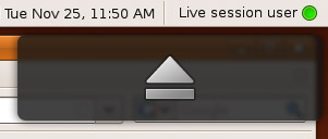
When you press the EJECT_KEY, a confirmation bubble should appear containing only the eject icon. Implementation: Issue a notification using the “x-canonical-private-icon-only” and “x-canonical-private-synchronous” hints.
Visually, the bubble should not contain any text. But for accessibility purposes, the bubble should expose the title text “Eject”.
Play, Pause, Stop, Previous, and Next
When you press the PLAY_KEY, PAUSE_KEY, STOP_KEY, PREVIOUS_KEY, or NEXT_KEY, a confirmation bubble should appear containing only the icon for that function. Implementation: Issue a notification using the “x-canonical-private-icon-only” and “x-canonical-private-synchronous” hints.
Visually, the bubble should not contain any text. But for accessibility purposes, the bubble should expose the title text “Play”, “Pause”, “Stop”, “Previous”, or “Next” as appropriate.
Treatment of hardware device detection
|
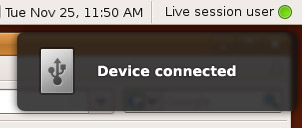
When a device is connected, a confirmation bubble should appear immediately, with a generic USB, Firewire, or miscellaneous (e.g. eSATA) device icon, title text “Device connected”, and no body text.
A further confirmation bubble should not appear when the device is fully identified.
Architecture
Relationships with external modules: (SVG source)
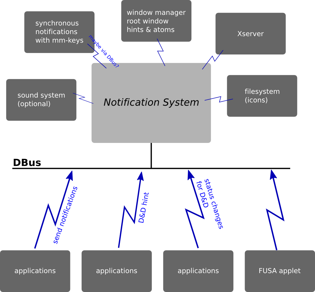
(See also a detailed description of components involved in hardware hotkeys.)
Overview of internal modules: (SVG source)

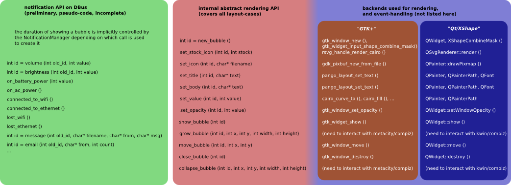
Details of the visual layer: (SVG source)
Compatibility fixes accepted upstream
Ubuntu and upstream developers have made fixes to several programs to make their notifications compatible with Notify OSD and the Desktop Notifications Specification. For designs of fixes that are now incorporated into the upstream projects, see PreviousCompatibilityFixes.
Compatibility fixes still to be maintained
Other compatibility fixes have not yet been implemented, or have been implemented in Ubuntu packages but not yet merged upstream. These fixes are listed in this specification to assist in regression testing. Once a fix has been accepted upstream, move it to PreviousCompatibilityFixes.
See NotifyOSD/Compatibility-Post904
Release notes
If you have written programs that use libnotify notification bubbles (such as with ______ or ______), read the Notification compatibility guidelines for advice on how to ensure compatibility with Ubuntu 9.04.
Unresolved issues
- Put notifications in a text log.
- Because we have a queue, bringing a chat window to the front should remove from the queue all notifications from that person.
From “frustphil”: What if you use the keyboard to focus a control that is underneath a currently-open bubble? For example, Ctrl K to focus Firefox’s search field.
- Should there be a manual way of entering "do-not-disturb" mode? E.g. by setting IM status (though going online to get fewer notifications could be a bit counter-productive).
bug 336950: Notify OSD should expire notifications when app goes off DBus
- [From djsiegel] Should bubbles be wider by default? That would make longer messages easier to read, but could make confirmation bubbles look a wee bit weird.
The Play/Pause/Next/Previous confirmation bubbles are not included in Ubuntu 9.04, because they resulted in either two notifications of an event, or one notification of nothing happening (bug 343261, bug 345363, bug 351986). Should the idea be retired permanently?
- The constraints of (a) bubbles can expand, (b) two bubbles can be on the screen at once, (c) bubbles may not move, and (d) bubbles may not collide, cannot be satisfied simultaneously.
The changes made to update-notifier have spawned a series of serious discussions with multiple bug reports which are combined in #332945.
- Windows has an API for the "old" behavior of popping up persistent bubbles (with actions). When Wine attempts to properly implement this API, they'll have to make a decision about how to handle applications expecting the old-style persistent bubbles. Unlike distribution packages, these applications can't be changed, and some require the user to interact through their notification bubbles. We need to make sure a user running these Windows apps through Wine doesn't suffer breakages (eg overlapping notifications).
- If the pointer is left resting where notification bubbles would otherwise appear, perhaps future bubbles should appear in a different place until the pointer moves elsewhere. [Cody Somerville]
