
Comments:
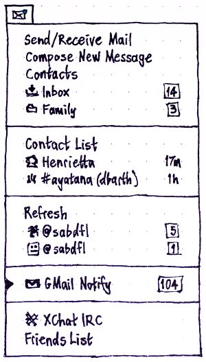
From the current mockups , there are just a couple of oddities:
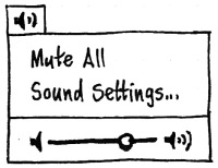
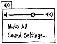
The volume indicator displays the status lower and the settings option above , wouldnt it be consistent if teh slider was above and the settings option the last , so that the menu layout is maintained similar in all the indicators. Mockup >
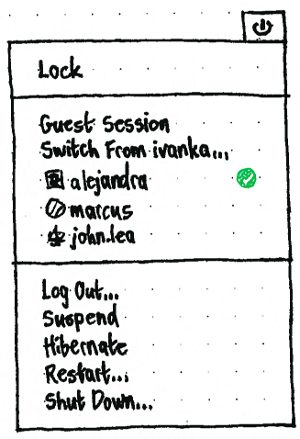
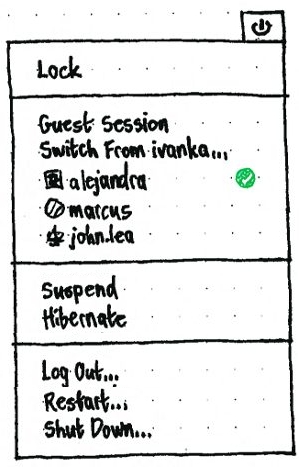
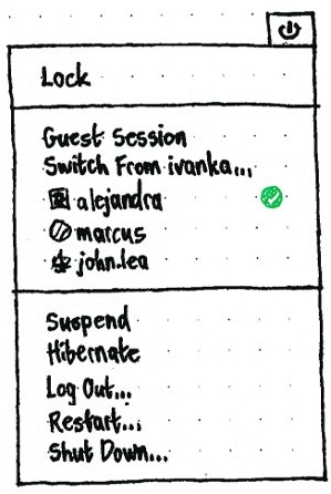
- For the session menu there isnt any ordered arrangement of the timed and the un-timed session options. If the suspend and the hibernate options are moved above it would be easier to recognize the layout , rather than only depend on the ellipses. Also if they are moved above , it makes it easier to recognize the options from the top are options where the user session is saved intact , while the last three options are the options which close the session. --mac_v
This looks completely awesome, especially the volume and extended battery info; hopefully it will actually get done for Lucid ![]() -- twright-tdw 2009-12-23 14:54:06
-- twright-tdw 2009-12-23 14:54:06