Initial_Proposals
Artwork and Screenshots
Proposed Title Pages
Please group your proposals using a header with your name, followed by your proposed images that can be attached here or externally linked. Try to make them about 500px wide so we can fit two side-by-side.
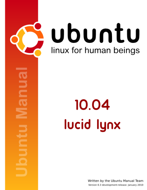
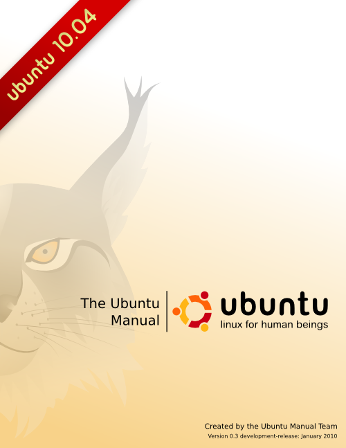
Wolter Hellmund's proposals:
Vish's proposals:
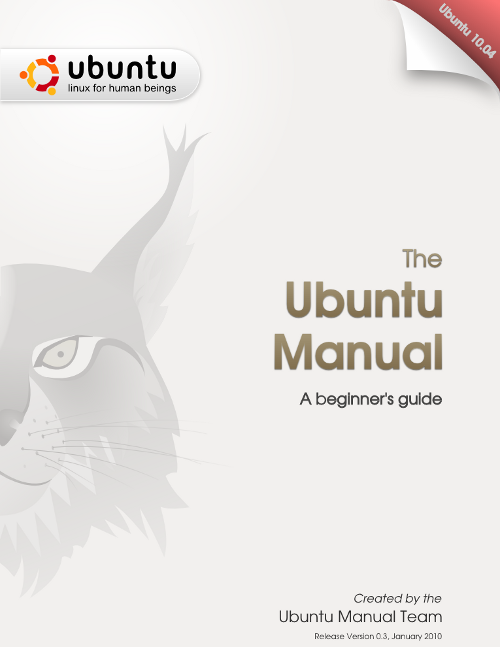
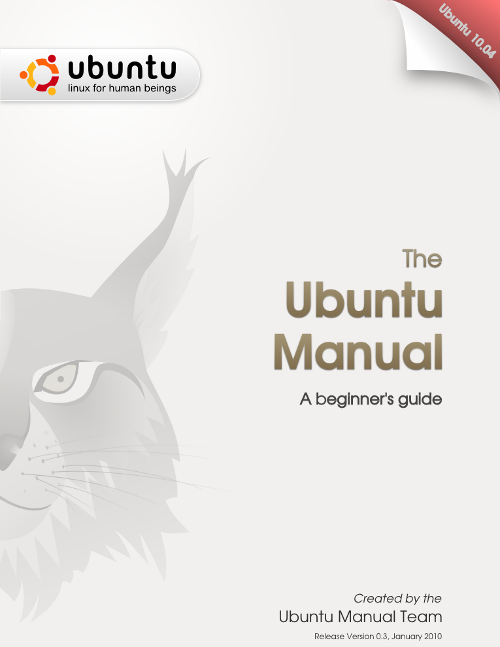
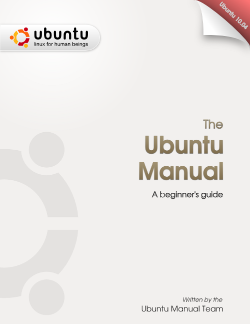
This is just a mockup of an idea. First 2 with lynx overlay from wolter. The top right corner color is to vary with every version.The text "A beginner's guide" is just a place holder. [The team is still in search for a better catch phrase] --vish
thorwil's proposals:
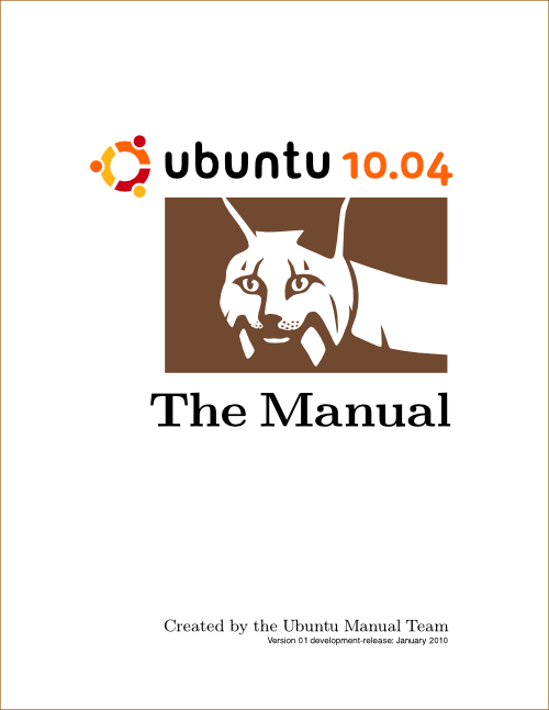
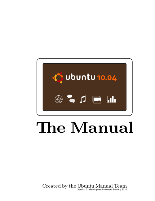
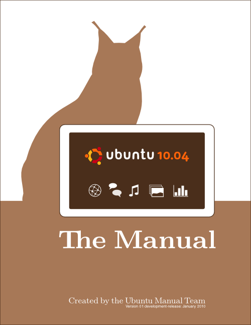
The icons are just placeholders for now. Fonts are meant to match whatever will be used in the manual.
KolorGuild's proposals:
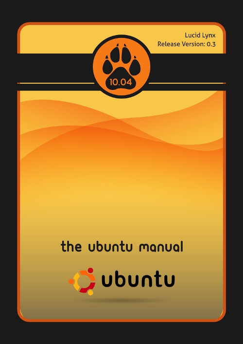
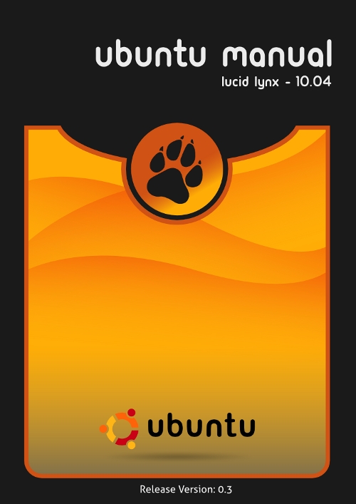
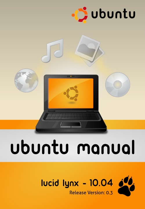
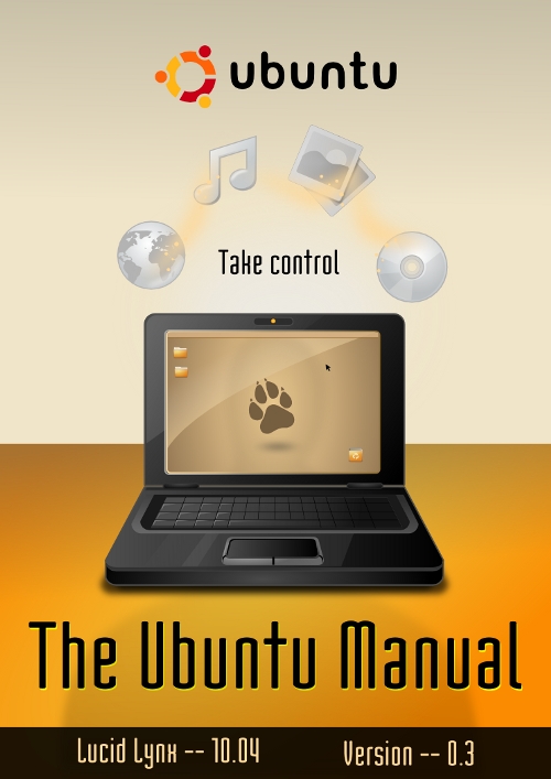
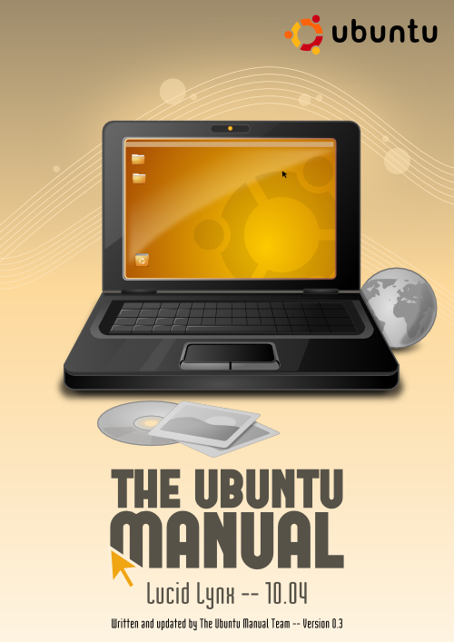
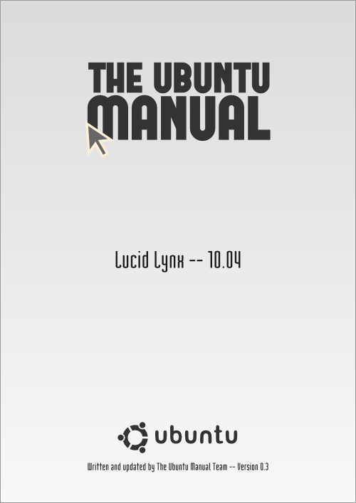
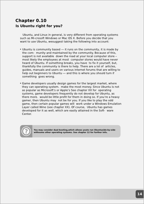
'The Click' - Just some rough ideas with logo alterations and page layout for the inner pages.
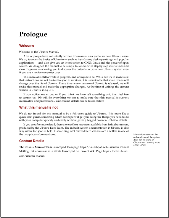
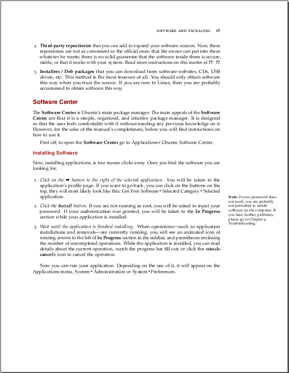
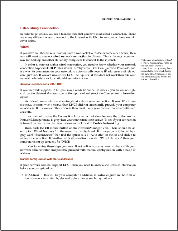
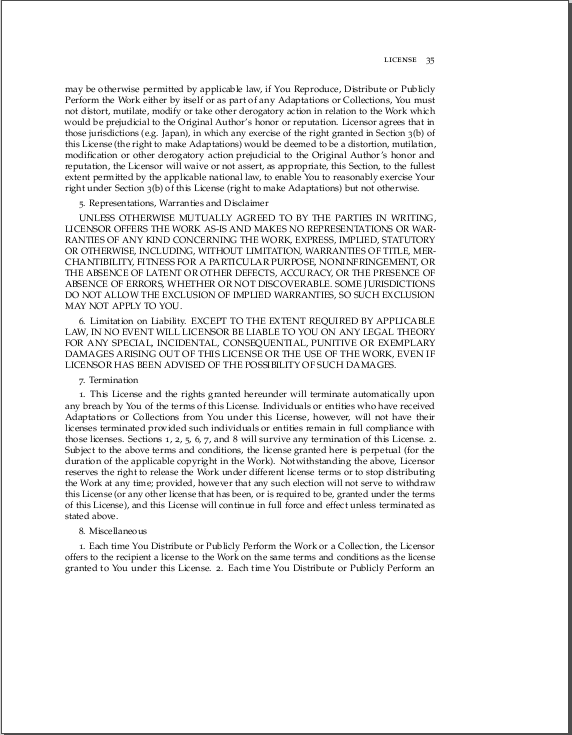
Actual document screenshots
These are actual screenshots from the PDF document as it stands. These are development preview screenshots, and do not represent the final version of the manual.
The final release is some months away, and we still have plenty of work to do. But this may give you some idea of how it might look.
Comments
Benjamin Humphrey's Feedback
I moved my comments into a new format because the bullet point didn't allow me enough flexibility.
Wolters proposals
I don't like your first proposal very much. The second one with the Lynx looks awesome, the Lynx is kickass. The "Ubuntu Manual" text/title might need some work to make it "shinier" and fancier - but other than that, nice work. I'm not sure about the colour of the gradient down in the bottom right.
Vish's proposals
My favourite is "Vish #2" with the Lynx a bit lower down. I don't like your Lynx on Vish #3 - it's a good drawing, but it just doesn't fit with your design. Vish #4 is great, but I prefer the Lynx on the cover - it looks so much cooler!
Thorwil's proposals
I don't think your proposals are different enough, but if I had to choose one I would choose #1. Yours are the lightest ones, which is good as the background for the whole manual is just white - these proposals will fit in with our styling the most.
KolorGuild
Not too fond of your first two proposals, I find them too "curvaceous" in lieu of a better word - I think that they don't quite match the style that we are going for. Your third idea, however, is fantastic! I absolutely love the top half with the laptop and the icons around it - this is great. The bottom half, however, might need a rethink. You could try changing the "ubuntu manual" text to something different, maybe the text like on thorwil's proposal. Perhaps you could polish it some more and spend some more time on attention to detail, like shading, different fonts, outlines and borders of sections, complimenting colours etc.
Overall Comments
All of the proposals I feel are great, you all have excellent ideas and have put a lot of effort in. I'm not sure whether these are the final proposals, or whether you would enhance them some more, if we choose you to design the title page. I think that all of the title page proposals are lacking a bit of "finish" - that professional edge that distinguishes the difference between something that has been created in Gimp by a home user, and something that has been professionally created by a graphic designer. Perhaps Vish's proposals are the most detailed and polished - the rest still need some work. Remember this is going to be one of the first things that hundreds of thousands of users see when they use Ubuntu for the first time - so it needs to match the quality control guidelines set down by Canonical - it needs to look like we have paid a professional company to create these title pages.
I implore you to think outside the square with your designs and really make this something great. So far, you guys are definitely doing well and I love the work! Keep it up!
- Both look good, I particularly like the 2nd one. The only problem with "Lynx" is that it's a predatory cat. Not the most welcoming creature. But Wolter's done a good job with that cover art. Alistair "b1ackcr0w" Munro.
- I like the latest title page I saw made by wolter more than what vish made. vish uses a better Ubuntu logo image though. Grey cover uh. and the changing page effect hmm. well it's a PDF not a book. in the future the manual might be a book, but for now it's just a PDF. wolters had nice colours, where as this one is using darker colours so not as nice. - sebsebseb
I have to say I like Vish's more, but "The Ubuntu Manual" does not look very good. The gradient is unnecessary and ragged-left alignment looks awkward. The background could be a slight shade lighter to make it a little more welcoming feeling. Other than those points, Vish's comp with Wolter's lynx could be a winner. - Andrew Wilkinson
- I like walters second one the most but i do think vish's would look awesome if walters lynx was on it and the grey was changed to something else, but they are both awesome! - Ryan Macnish
I prefer Wolter's second one (with the lynx). YannBuntu
- I prefer Vish's last one or either one of the first two. brishu
I like the Vish's proposals 2dn one, but if you add a picture of a lynx, then it should be mentioned somewhere on the cover, but would like it had been added just because I want to do, which is not so. - V A R G U X
I like Vish's second design the best. Wolter's lynx is awesome, and I like the simple design. It looks like it wouldn't eat all of my printer's toner if I wanted to print the guide. The colors are pretty staid, so I could print it safely in black and white. You might want to raise the "Created by..." block a bit so my printer doesn't cut it off. —Kevin Godby
ubuntu-manual/Artwork/Initial_Proposals (last edited 2010-02-04 13:26:05 by p57968EBC)


