This is the place to post your ideas for the Gutsy artwork, most importantly the wallpaper.
Gutsy is pretty much finalised, submit any new ideas to the Hardy IDEAS page.
- The official guidelines will be posted soon, it is only available for contributing takes and submissions.
The goal is to get back to something as unique and beautiful as included in previous versions: 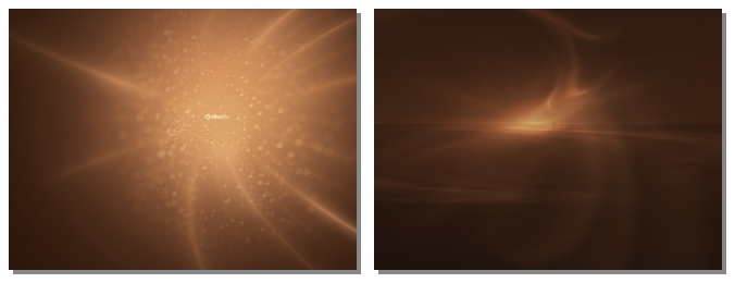
{{ https://wiki.ubuntu.com/Artwork/WallpaperRules now contains a prelimary list of suggestions for your creation. it is by no means official or approved by anyone but the author , me , and I don't have any authority. You may wish to examine it for the instruction it provides will apply very well to all of the art created on this page. }}
I am working on a simple palette to start from. Coming soon! Using the colors shown in the images above or the color palette below are the best starting point.
-- Lets get this colour palette up and running. Anyone have any suggestions? Where are the previous versions? [LasseGullvågSætre2] 2024-11-09 08:26:00 -- Can we add black and white to the color list? Or perhaps very close substitutes (#eee and #111?) [PrashantVaibhav]
Here is what we have had until now, pretty much:

Let's just stay away from the pinkish colors ![]()
Submissions
Add your ideas below. For more detailed discussion and feedback please use the mailing list.
Junel's ideas
After reading the comments on dark wallpapers, I whipped up a couple of wallpapers. It's bright and cheerful and I think fits the human theme. It does contain the color brown but I also added yellow and green to the mix. See thumbnails below:


Full resolution here:
http://www.junelmujar.com/wallpapers/
- Now _this_ looks promising. Maybe you could create a version where the green and orange elements are more intertwined with both colors represented on both sides of the screen. --Sokraates
Justin's ideas
I have uploaded a few pictures of mine, take a look and see if you like them.I know they don't conform to the Ubuntu palette, but I'll search for more pictures and fine ones that do. I'm mainly looking for feedback on whether or not this is the kind of stuff we are looking for.
http://i73.photobucket.com/albums/i217/xsidekick409/xsidekick409-3.jpg?t=1185571663
http://i73.photobucket.com/albums/i217/xsidekick409/xsidekick409-2.jpg?t=1185571705
http://i73.photobucket.com/albums/i217/xsidekick409/xsidekick409-1.jpg?t=1185571738
Justin---
All three of these are too visually busy. I think you need to keep things simpler/subtler so that the actual /icons/ on the Desktop remain as the main focus. alex@weej.com
Heres another idea, just a basic sketch of my idea to have flowing Ubuntu logos across the screen as a background. Keep in mind its not complete. Send me feedback.
http://i73.photobucket.com/albums/i217/xsidekick409/xsidekick409-4.jpg?t=1185574002
Justin---
Hey again. I'm sort of having a hard time figuring out how to make a minimalistic background since most of the things I make are usually visually complicated. Bear with me, its just about learning a new style. Here's another sketch of an idea.
http://i73.photobucket.com/albums/i217/xsidekick409/lightbulb.png?t=1186775384
--Justin
Update: http://i73.photobucket.com/albums/i217/xsidekick409/lightbulb2.png?t=1187234593
The background is still a bit bland, I'm still working out something for it. --Justin
--Durand--hese ones look awesome! I like the simplicity and the look of the lightbulbs.
Here are a few pics that I have been working on (kwwii)
note that brown fluid is a crop and edit of work I made from Joseph Connors - more stuff from him coming soon 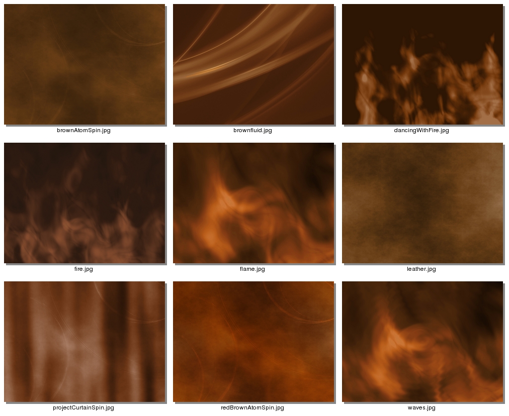
-Amazing job. I like em.
--These are really great. --Strabes
--You have to change the name from "Brown Fluid" to something else. With a little more work it can be nice. -- Lassegs
-- Very Very nice. I hope one of those is in Gutsy -- Asjdfwejqrfjcvm Msz34rq33
As promised here is more work from Joseph Connors
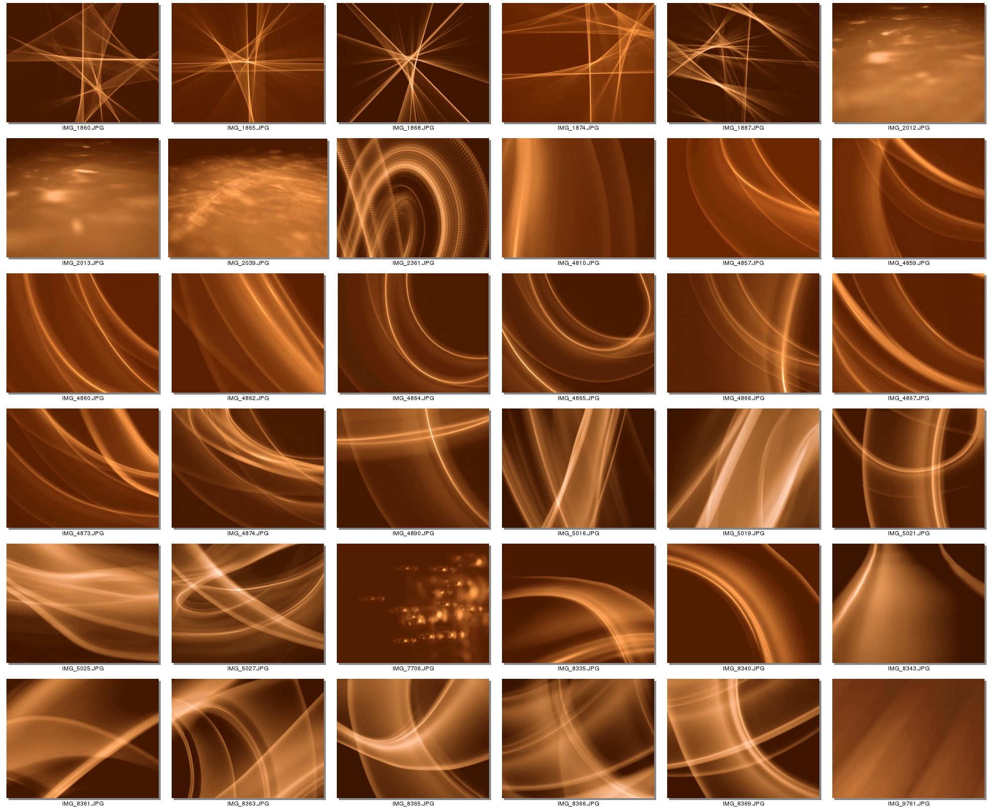 eh.... the best one I see here is 5019... who is this guy ? where did the rules for wallpaper creation go ? isn't there some rules somewhere for this kind of thing ?
...see above for a (very good) rough list of rules KennethWimer 2024-11-09 08:26:00
Joseph is a talented photographer that I met through the KDE4/Oxygen contest for wallpapers (1900+ submissions). Actually we "found" him by surfing flickr (http://www.flickr.com/photos/jciv/) and then asking him if he would be interested in helping out. Note that these pics are rough sketches of what is possible and the colors are not 100% that what they should be. KennethWimer 2024-11-09 08:26:00
There's a lot of amazing quality work on this page (that puts the Feisty and Edgy wallpapers to shame). I particularly love the new Joseph Connors selection, although I don't know how I'd go about choosing just one as a favourite. A small number of well chosen images from this page would make a fine collection for 'core' backgrounds for Gusty. --Oomingmak
troy_s's Garbage
|
-- TroySobotka 2007-09-03 04:44:29 100% Inkscape. |
:-O These are jaw-dropping! I love them! Very inspiring! -- Damianvila 2007-09-03 11:45:24
I dare stray away from the typical "Brown or Orange" wallpapers for those who do the asme on their Gnome Themes. See what you think.(Andrew L)

How about this? Skiessi 2024-11-09 08:26:00
My Humble Submissions (Robinhoover)
Tried to create some images that conveyed: simple, strong, secure and expressive.

and a bit more restrained:

Larger 1600x1200 versions are available. Thx for the chance to participate.
- I like these fairly well. Except that the logo is at such an angle, it makes the word Ubuntu look distorted. But overall, great job! --Asjdfwejqrfjcvm Msz34rq33
Animal textures
Lion
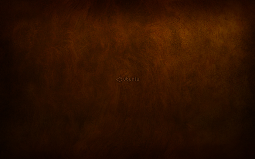
This wallpaper's texture is based on a lion's mane. You can see the full size (1680x1050) here.
Damianvila 2007-08-23 20:35:48
- Damianvila, great work. If you would remove the logo and make the fur just a bit brighter, you gt #1.
you might also try to integrate something like the elements in brownfluid above by kwwii into the picture, to give it a unique element that kinda "brands" the image without using the name "ubuntu". terlmann2024-11-09 08:26:00
I really love the animal texture wallpapers, especially the brighter clear lion, but, I was wondering if there's any of these images available without the ubuntu logo in the middle? I'm seriously not that stupid that I don't know what OS I'm using and need my wallpaper to tell me. A version without branding would be wonderful. I understand the reason behind setting the default to one with branding, I just think it would be really nice if we had these available without as well. I did find the dark lion one buried amidst the other ones, am I just blind and missing clean versions of the other animal textures? Trinkit 2024-11-09 08:26:00
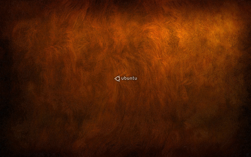
I didn't like how dark it was and I used GIMP's "Expand HSV" or whatever it is called in the English version. I like this one better and I did the same adjustments to Damianvilas other wallpapers, the edited ones are in the attachments: Skiessi 2024-11-09 08:26:00
1680x1050 version here.
Lion (clear version)
I've made the wallpapers a bit clearer, and I created a new clear one based on the lion's wallpaper - Damianvila 2007-08-25 00:18:21
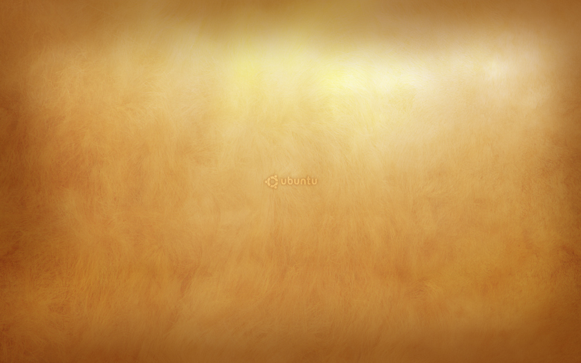
The full size (1680x1050) is here
Elephant

This one's based on elephants. You can see the full size (1680x1050) here.
Elephant blue
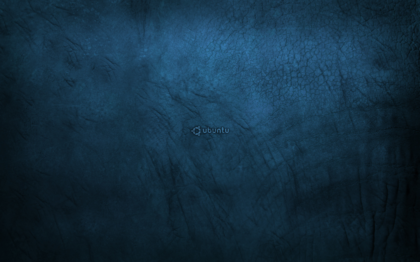
And in blue, just because. See the full size (1680x1050) here - Damianvila 2007-08-24 20:49:06
Giraffe
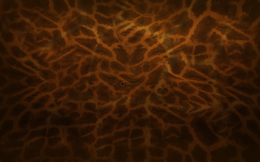
Full size (1680x1050) here
More ideas
I'd like to make versions with other animals, like hippos and zebras. But i think it's OK as it is, as you can have a clear idea of the possibilities.
This one below is so you can have a rough idea of what it will be like without the logo and with "fluid" added Damianvila
Get the full size (1680x1050) here
With "fluid" added. A bit darker, though. I need to improve it. Damianvila 2007-08-24 01:26:47
Done. https://wiki.ubuntu.com/Artwork/Gutsy/Wallpaper --terlmann
And speaking of faces...
 - Damianvila
 Haha, this is great, but a little to spooky for my taste. Kinda remember something like Mofasa talking from beyond the grave. In fact, all these are great! [LasseGullvågSætre2]
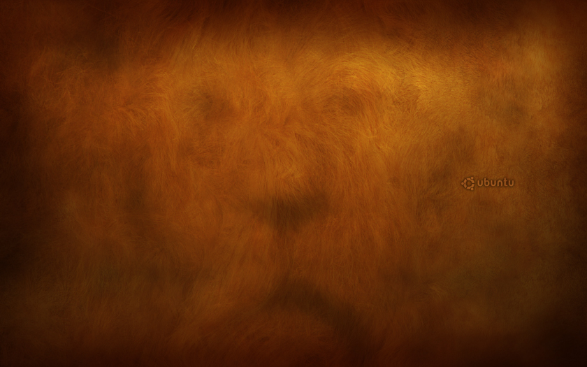
Full size here (1680x1050)
Yo damianvila, check it out : I branded the sucker ! https://wiki.ubuntu.com/Artwork/Gutsy/Wallpaper#preview --terlmann
I really like this animal idea, in the release version could simply include Giraffe, blue elephant and lion and we would have enough for many tastes. vexorian 2024-11-09 08:26:00
Final versions (unbranded): You can get the final versions here. -- Damianvila 2007-09-22 17:32:34
Borders

Kinda inspired by foresight, I think this one is nice, but it needs some more work. I'll be happy to send you the .svg, just email me at lasse(at)sosialisme(dot)no. 1600x1200(full version) version at the attachments page.
LasseGullvågSætre2 2024-11-09 08:26:00

Fixed up, made darker and warmer, made a cleaner added logo in the middle, and changed resolution to widescreen. Fullsize 1650x1050 here LasseGullvågSætre2 2024-11-09 08:26:00
I like this better than the other
 Damianvila
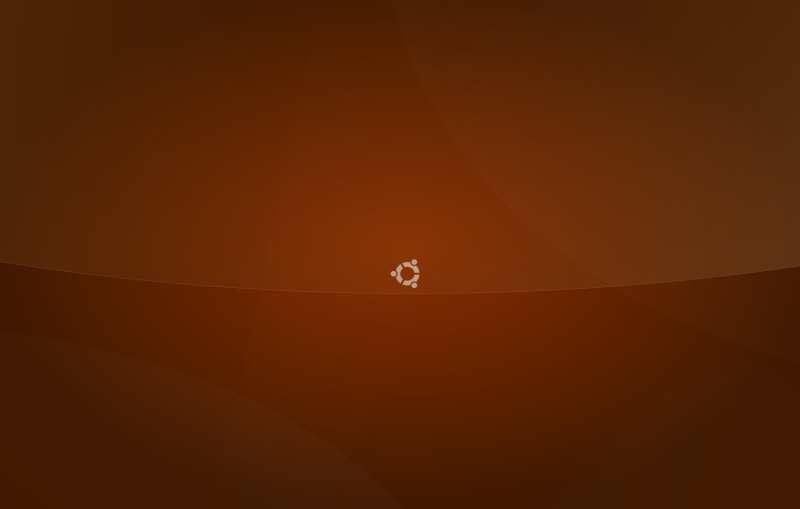
Evolved. A little more exciting, fixed the swoosh and lifted it a little. Scaled down ubuntu logo. Full version 1650x1050 here LasseGullvågSætre2 2024-11-09 08:26:00
I left this project behind after it was slaughtered on #ubuntu-artwork :). Got something else up my sleeve now. Don't hesitate to tell me if there still is some interest for this wallpaper, I can finish it, and Ill upload the fixed resolutions. If you want the SVG, just email me. LasseGullvågSætre2 2024-11-09 08:26:00
- -- Fixed the resolution
--Hi Lasse, I don't understand why anyone would slaughter these images - I think they are wonderfull. Perhaps people have a problem with the similarities with the Forsight Linux wallpaper. I especially like the first and the last one. The middle one has great colour, but I'd like a little less "glare" on the upper part. I'm using the last one on my desktop now, but for it to be perfect the image could use some anti-aliasing. I would also like to have a version without the logo. BTW, where's the attachment page you mention, I couldn't find it.
Springer
Sorry for treating the wiki as a worklog, but I'm uploading a work in progress here, hoping to get some feedback. This is what I've done with vectors so far, it needs some bitmap-editing to get right. Going from Photoshop to Gimp is harder than going from Illustrator to Inkscape.LasseGullvågSætre2 2024-11-09 08:26:00
 Full version (1680x1050) here
Lasse: it's looking great! :-D -- Damianvila 2007-09-03 11:45:24
 Now created with phi in mind, fibos(whatshisface) number sequence, and masks. Thanks troy_s. And trying to follow the sample colour schemes. Full version (1680x1050) here LasseGullvågSætre2 2024-11-09 08:26:00
 Springer, version 3. Swishes made better, shine toned down, some swoosh edits and colour correction. Full version here
 Same as above, just added my own colours to it. I like it better this way, but bigger parts of the image is not pure ubuntu colour palette (its based on it). Full version here LasseGullvågSætre2 2024-11-09 08:26:00
Physalis
A series of "Physalis" wallpapers, which are clean and light weight (only 27,7KB :: 2560x1600). See more at valik.wordpress.com




The full size images (2560x1600 or 1600x1200) are available right here. [Valentyn]
_
I originally made it for edubuntu. But i think i can render an ubuntu one if u people like it.It's called wire+edubuntu=wiredubuntu=wired+ubuntu!!Comments please.
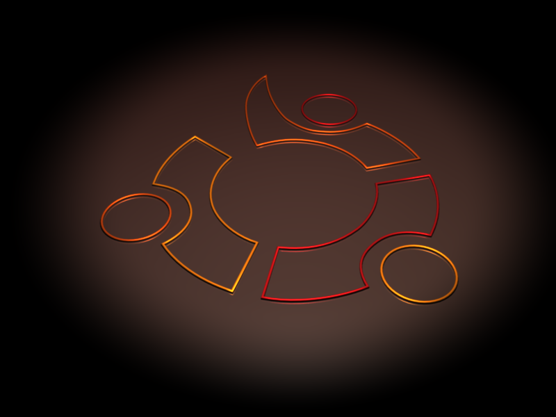
i also got high res version.
Could you post a high res version somewhere or send it to me per email? KennethWimer 2024-11-09 08:26:00
I like the wiredubuntu design. Using the low rez on a high rez screen with black background. Just looks neat. ![]() - Scorpuk.
- Scorpuk.
Another Try
Here is another sequel with big prominent logo and...nothing else.I also uploaded both wiredubuntu.blend in the attachments. -Titon4 
twright
here's what i've got (still got a lot of rough edges)

one more (using XaoS and the gimp) 
new version (I'm not sure which i prefer) 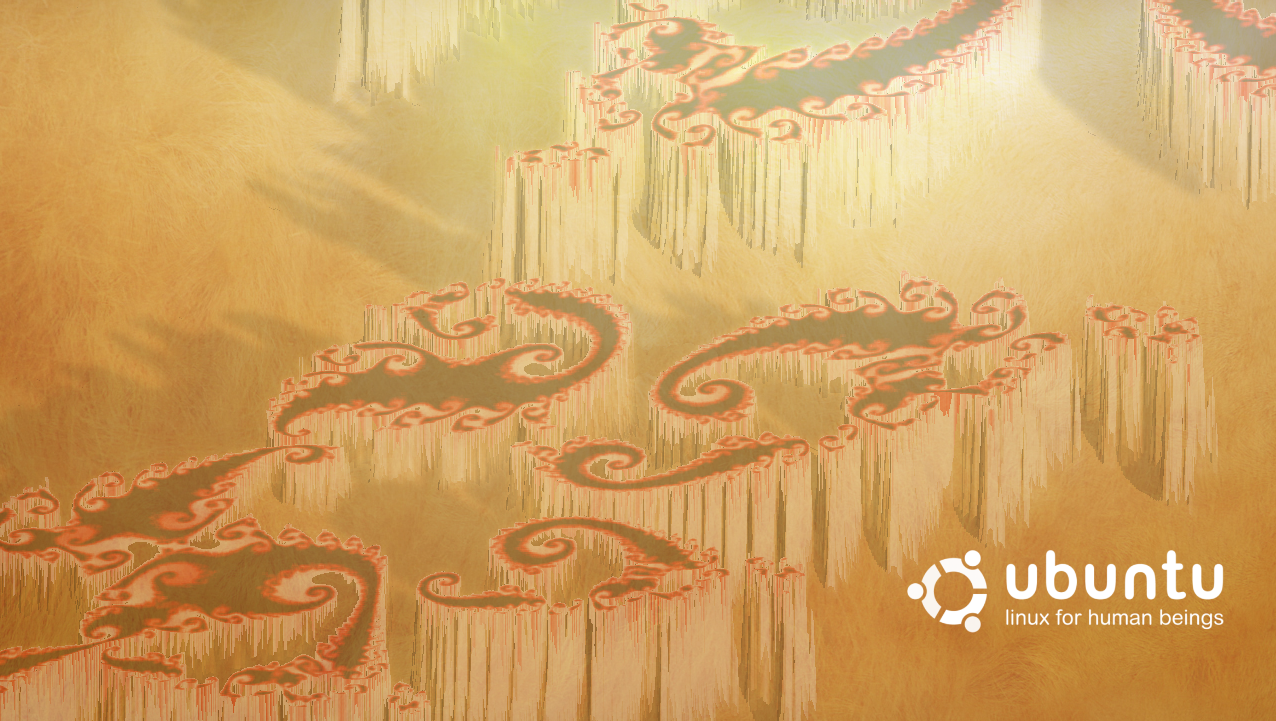
email me at twright@antimalwaresupport.co.uk if you want the .xcf's
Springer + Wiredubuntu
I made this combination when I was bored. It's just a blueprint for a better quality version which I'm going to make later. [Skiessi] 2024-11-09 08:26:00

 ...Yeah, it fits. Kinda differs from the older ones..
+EDIT: This one looks good on my 19" cube screen when it's stretched to fit the whole desktop (4:3), but when I watch the same file/picture on a newer LCD display, I can see how low quality it really is... I'll make the better version as soon as I get some better hardware.
- ps. the loading time of this page is getting out of hand :/
Proposal to the desktop look

Thats my proposal to a new Human look, while mantaining the original Human colors and icons. Its a theme using the new 'Aurora' GTK+ Engine and 'Blended' Metacity theme. The wallpaper is also by me, and its in SVG format so fits well on any resolution. *** This is not a mockup ***, its the real thing, as set on my GNOME theme preferences.
I think it solves the problem of Ubuntu desktop being too dark or too brown, using orange accents gives a much cleaner and fresh look. Aurora Engine and Blended metacity also adds more bevel/gradients to the interface, making it look more 3D, then more modern, and will suite better with upcoming Compiz 3D features for a new generation in desktop environments. - HenriqueFreakcode
I very much like the widgets on this theme but it really does lack some color. Adding a bit of the orange/brown look as seen in the previous stuff would still be needed to pep things up a bit. KennethWimer 2024-11-09 08:26:00
I like the button and form look, but it should use a good window border cause one like that doesn't look nice, doesn't match the rest of the theme and I think it needs a selected color variation. I also hope it got orange highlights for mouse over on buttons. It also got a major problem and it is aurora, that engine looks nice but at least in my computer it is terribly slow. Vexorian 2024-11-09 08:26:00
I stick to the opinion of HenriqueFreakcode and would like to say that with this theme I feel very comfortable using linux. It's more natural and eyecandy than ever! Here's my desktop:

Best regards, Anton Kerezov a.k.a dilomo
I think that the Aurora gtk-engine MUST be used in the new Human theme for Gusty, it fits perfectly with the Compiz 3D look, even if you use metacity you will have a great modern theme. - Nukeador
Here it's my idea:
GTK-engine: Aurora modified with an orange look.
Wallpaper: Lion wallpaper
Window-borders: Ubuntu-superhuman A human-like border theme.
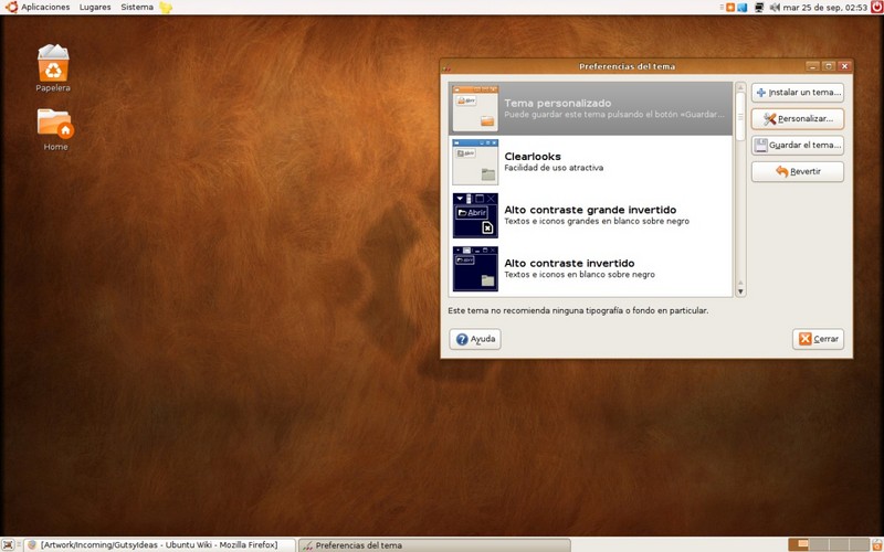
-- Nukeador
Stripped Clean and Fresh Wallpaper
Its just fresh, not too bright, not too dark, simple, clean and stripped Wallpaper. I don't know if it fits in bill.  The work is not final, as you can see the cross strips at lower right corner, that were left unintentionally, later i got eye on it. ra21vi@gmail.com
My Submission (Sketec)
Here is my submission, I tested it's popularity on another submission based website. I haven't had any feedback (comments), but I would consider it's rating very positive. Here are two variations.
First, with text:

Second, without:

Larger 1600x1200 versions and SVG source here:http://www.sketec.com/ubuntu/. Thank You for the opportunity to contribute. Any and all comments welcome.
Hi guys,
I see a lot of activity for future wallpapers here...but what about the grey menu bars...they really have to look more glossy by default I think!
GO HERE >> https://wiki.ubuntu.com/Artwork/Incoming/GlassPanel
Orange pack




1280x800: 1 2 3 4 5 | SVG: orange-svg.tar.gz
I like the first one clean and elegant. vexorian 2024-11-09 08:26:00
Keep up the good work, everyone.
misosaki 2024-11-09 08:26:00
--my piece of the pie-Lituus Limacon-- http://lituuslimacon.deviantart.com/art/human-blobs-64281732
btw, the lion-textured wallpaper (the brightest of the three with Ubuntu in the middle) is the best, imo
DrSilly

Splash Screen
I made this pretty quick, its not the best quality so later I will upload a better one. :-} 
GDM
I have created a gdm theme for this release based on the elephant image by damilionvila and the Avio theme by Tobias Oelgarte. get your copy for all and any purpose here :
http://myfreefilehosting.com/f/f599867d19_0.25MB http://d4.myfreefilehosting.com/d2/Ubuntu-fresh.tar.gz

Thank you , --terlmann
it's really great that the theme is hosted on a "for IE only" site. --YMan Fixed mano. just use the link above.
Hi Guys Im new user
This is my humble collaboration for Ubuntu 7.10 wallpaper. Congratulations to all by its works, all are good artists. It is the first time that I use GIMP and I request excuses by my English ![]() Im from Argentina. Thank you very much and we see ourselves soon.
Im from Argentina. Thank you very much and we see ourselves soon.
Ubuntu Sparks (1280x1024)

