This theme is no longer being developed and I am going to use the "Savanna" name for my next project. The screenshots in this page are horribly out of date anyway. ~~~
Savanna
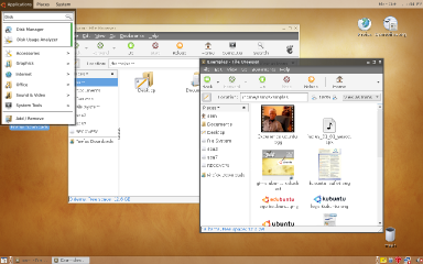
How about we try a theme without using gradients and glossy bits. I'm suggesting a theme with mostly flat colours, and using subtle transparency (care of composite-by-default) and shadows to add depth.
Concept
Just thought I'd throw an idea out there. I think the current human theme looks like a brown version of the winXP theme and the glossy, shiny themes have been done to death by Vista and OSX.

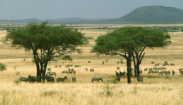
Palette The palette for this concept is based of the colours from the African Savanna (hence the name). The main colours are still brown (the more golden end of that range) but I've also included a wider range of colours such as blue and green for highlights. This theme aims to evoke the African origins of 'Ubuntu' and to work with the hugely popular 'animal' wallpapers.

Concept Art
http://www.gnome-look.org/content/show.php/Menubar+mockup?content=64732
Note: the menubar in the screenshot is another concept for Hardy. I'm probably going to put a bounty up for the coding when I've written up a proper spec of what is / how it works.
Reference
Contributions
Guidelines
- For images, use a low resolution picture in the wiki page. It should be no taller than 240 pixels. If you need to upload higher resolutions, please upload them as an attachment and link to them from the page.
There are two tools located at Artwork/Documentation/Software/Wiki_Scripts to help you with this
Use attachment:thumbnail.png and [attachment:file.png linkname]
Use @SIG@ to leave your signature at the end of your comment. New comments should be placed at the bottom of the feedback.
Comments
Well... that's my GTK theme (Zenith) on the screenshot, and even I admit it doesn't match Ubuntu look 'n feel. Maybe it could be reworked, but I'm going to put more effort on using the Aurora engine from now on. -- HenriqueFreakcode 2007-10-27 02:43:40
You should take a look at Shaun Inman’s Mint (http://www.haveamint.com). I think that your menubar concept could benefit from more subtle rounded corners. Also, HenriqueFreakcode, is your Zeinth theme available on Gnome Look? It’s easily one of the best that I’ve seen ’round here. Have you tried an orange color scheme to more closely match Ubuntu? --BramPitoyo
* The menubar concept here is designed to inherit the style of the window through metacity/compositing. If the theme itself had rounded edges the menu would be rounded too.. I just realised that this isn't actually the most up to date version of this theme I've got online, the other version (I'll have to track it down myself) is more developed and coherent. I've kind of let this theme stagnate at the moment as I'm really busy at work at the moment - 16hr days, 5 days a week. I've now set my sights on working on a Gobuntu theme when things calm down a bit. --KidProQuo
Attachment List
