Power
|
Size: 20336
Comment: - bug 880881; + bug 1430542 (Indicator doesn't use weighted average with different-sized batteries)
|
Size: 20398
Comment: bug 1438535 ("Last full charge" should display more precise values)
|
| Deletions are marked like this. | Additions are marked like this. |
| Line 80: | Line 80: |
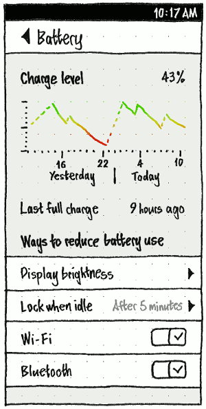
| The “Charge level” (phone/tablet) or “Battery charge level” (PC), should be shown as a [[#percentage|percentage]]. The “Last full charge” should similarly be displayed to zero decimal places, using the most appropriate unit: for example, “2 hours ago” or “51 minutes ago”. When appropriate, the “Last full charge” row should instead read “Charging” or “Fully charged” with no time value. | The “Charge level” (phone/tablet) or “Battery charge level” (PC), should be shown as a [[#percentage|percentage]]. The “Last full charge” should similarly be displayed to zero decimal places in the most appropriate unit, seconds minutes or hours (bug Bug:1438535): for example, “48 seconds ago”, “1 minute ago”, or “61 hours ago”. When appropriate, the “Last full charge” row should instead read “Charging” or “Fully charged” with no time value. |
Contents
Ubuntu has various interfaces dealing with power. These include a panel in System Settings (“Battery” on the phone and tablet, “Power” on the PC), a battery menu, alerts for low battery, and the ability to suspend or hibernate.
Use case |
Phone |
Tablet |
PC |
See charge level |
|
|
|
See time when last full |
|
|
|
See charge history |
|
|
|
See time remaining |
|
|
|
Configure screen blanking |
|
||
Configure auto-suspend |
|
||
Configure lid/cover behavior |
|
|
|
Confirm charging has begun |
|
|
|
Confirm discharging has begun |
|
|
|
Be warned of low battery |
|
|
|
Information about chargeable things
Icon
![]()
Wherever it is represented, a chargeable thing should be represented by an outline icon that most closely matches the component or device: a battery, a mouse, or otherwise a generic box.
If it is a battery that is either missing or of unknown charge level, it should use the generic battery icon.
If the thing is fully charged and not discharging, the icon interior should feature a plug emblem (bug 850011).
If it is discharging, the icon interior should be filled from left to right approximately as much as the remaining charge. If it has less than 30 minutes left, the fill should be red rather than black. (This coloring is deliberately time-based, not percentage-based; how much time you have left is more important than how long the battery can theoretically last.)
And if it is charging, the icon interior should feature a lightning bolt emblem. Depending on clarity and space available, the icon interior may also be filled from left to right approximately as much as the amount charged.
Percentage
Wherever a component’s percentage charge is shown, it should be rounded to zero decimal places and have no trailing space, for example “99%” or “100%”.
Color
The color for a component’s charge level should follow a gradient from bright green (#00ff00) for 100% to bright red (#ff0000) for 0%. (This color should not be used in the indicator, however, as it would be present so much of the time as to be distracting.)
Time remaining
The time is relevant for a component if “Show Time in Menu Bar” is checked (as it should be by default), and either (a) the component is charging, or (b) the component is discharging and the estimated time is less than 24 hours. (A time greater than 24 hours is probably a mistaken calculation.)
The brief time-remaining string for a component should be:
- the time remaining for it to empty or fully charge, if estimable, in H:MM format; otherwise
- “estimating…” if the time remaining has been inestimable for less than 30 seconds; otherwise
- “unknown” if the time remaining has been inestimable for between 30 seconds and one minute; otherwise
- the empty string.
The expanded time-remaining string for a component should be the same as the brief time-remaining string, except that if the time is estimable:
- if the component is charging, it should be “H:MM to charge”
- if the component is discharging, it should be “H:MM left”.
The accessible time-remaining string for a component should be the same as the expanded time-remaining string, except that the H:MM time should be rendered as “H hours M minutes”, or just as “M minutes” if the time is less than one hour.
Handling multiple batteries
If a device has multiple batteries and uses only one of them at a time, they should be presented as separate items inside the battery menu, but everywhere else they should be aggregated. Their percentages should be averaged, weighted by the capacity of each (bug 1430542). If any are discharging, the aggregated time remaining should be the maximum of the times for all those that are discharging, plus the sum of the times for all those that are idle. Otherwise, the aggregated time remaining should be the the maximum of the times for all those that are charging.
For example, if your notebook has two internal batteries — one fully charged, and one that will discharge in 22 minutes — and your wireless mouse battery is estimated to discharge in 27 minutes, then the menu title should represent the mouse. Even though the internal battery will lose power first, the mouse is the device that will lose power first.
Settings
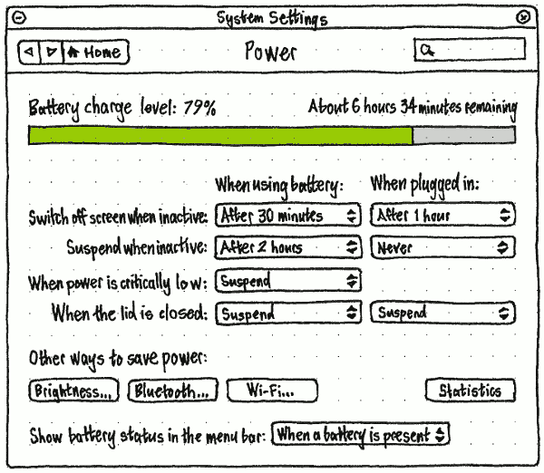
On the phone and tablet, the System Settings panel should be labelled “Battery”, because “Power” would be imprecise; it is uncommon for those devices to be connected to mains power except when charging. But on the PC, the panel should be labelled “Power”, because desktop PCs never run off battery (and the panel may also include a UPS).
|
|
The “Charge level” (phone/tablet) or “Battery charge level” (PC), should be shown as a percentage. The “Last full charge” should similarly be displayed to zero decimal places in the most appropriate unit, seconds minutes or hours (bug 1438535): for example, “48 seconds ago”, “1 minute ago”, or “61 hours ago”. When appropriate, the “Last full charge” row should instead read “Charging” or “Fully charged” with no time value.
On the PC, the charge meter should use the color for that charge level. And in the “Statistics” graph on the PC, and the charge graph on the phone/tablet, each point should use the color for that charge level. Charge level while asleep should be shown as a dotted line, from the level just before sleep to the level just after waking. The Y axis should be unlabelled, because its meaning and range is obvious, with major tick marks at 0% 50% and 100%. The X axis should have tick marks for every o’clock that has passed in the past 24 hours, with major tick marks for the most recent o’clock and every six before that, labelled using the current time format but without minutes. For example, if you use AM/PM format and the current time is 4:51 PM, the labelled tick marks should be “10 PM”, “4 AM”, “10 AM”, and (the last tick mark) “4 PM”. In addition, yesterday’s range should be labelled “Yesterday” when there is room, and today’s with “Today”.
“Display brightness” should navigate to a mirror of the “Brightness” screen (bug 1289470).
“Lock when idle” should be a mirror of the “Lock when idle” item in “Security & Privacy”, with the same summary value and page stack.
The “Switch off screen when inactive:” and “Suspend when inactive:” menus should all have options “After 5 minutes”, “After 10 minutes”, “After 15 minutes”, “After 20 minutes”, “After 30 minutes”, “After 1 hour”, “After 2 hours”, “After 3 hours”, and “Never”.
Any option in either “Switch off screen when inactive:” menu that is equal to or greater than the current selection in the corresponding “Suspend when inactive:” menu should be selectable but greyed out, indicating that it has no effect. For example, if “When using battery:” “Suspend when inactive:” is set to “After 2 hours”, then in the “When using battery:” “Switch off screen when inactive:” menu, the options “After 2 hours”, “After 3 hours”, and “Never” should be greyed out.
“Brightness…” and “Bluetooth…” should navigate to the relevant System Settings panel. “Wi-Fi…” should navigate to the “Network” panel with the first Wi-Fi card selected. “Statistics” should open the Power Statistics window.

The “Show status in the menu bar:” menu should have options “When a battery or chargeable device is present” (bug 1298088), “When something is charging or discharging”, and “Never”. By default, the setting should be “When a battery or chargeable device is present”. (If the menu disappeared whenever the thing was fully charged, this would make it difficult to realize that it was fully charged.)
Indicator and menu
The battery indicator exists to indicate how much time you have left when a rechargeable thing (battery, UPS, mouse, iPod, Bluetooth phone, etc) is discharging, and conversely how much longer it will be before everything fully charges. On the PC, the battery menu exists to give you more detailed information, and to let you access power settings.
On the PC, everything that is accessible in the battery menu should also be accessed in the settings panel, because the menu may not be present.
|
|
Presence
On a phone or tablet, the indicator should always be present, because these devices almost always rely on battery.
On a PC, if you are logged in, the menu should be present depending on the “Show battery status in the menu bar” setting. If you are not logged in (at the login screen, lock screen, or standalone installer session), the menu should be present as if the setting was “When battery is present”.
Title
Regardless of form factor, the indicator should tell you at a glance what you need to know most: which component will lose power soonest (and optionally when), or otherwise which component will take longest to charge, optionally how long it will take, and optionally its current charge level. More detailed information can be accessed inside the menu itself. On a phone or tablet, the component in question will almost always be the phone or tablet itself, though it may be an external keyboard.
- If “Show battery status in the menu bar” is set to “Whenever a battery is present”, but the charge level has not yet been detected, the menu title should consist of a generic battery icon.
- If all components are fully charged and none are discharging, the menu title should consist of a battery-with-a-plug icon, mouse-with-a-plug icon, or thingy-with-a-plug icon, depending on which components are present (using thingy-with-a-plug if there are zero or multiple chargeable components). The accessible name should be “Battery charged” regardless.
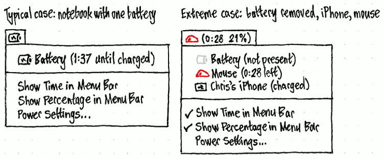
- If anything is discharging, the menu title should represent the component (not battery, but component) that is estimated to lose power first. For example, if your notebook battery is estimated to discharge in 1 hour 47 minutes, and your wireless mouse battery is estimated to discharge in 27 minutes, the menu title should represent the mouse.
- If no devices are discharging, the menu title should represent the device that is estimated to take longest to charge.
The menu title should begin with the icon of the thing it is representing.
On the PC, if the time is relevant and/or “Show Percentage in Menu Bar” is checked, the icon should be followed by brackets. If the time is relevant, the brackets should contain the time-remaining string for that component. If “Show Percentage in Menu Bar” is checked (as it should not be by default), the brackets should contain the percentage for that device. If both conditions are true, the time and percentage should be separated by a space.
Regardless, the accessible name for the whole menu title should be the same as the accessible name for that thing’s component inside the menu itself.
For example, if both “Show Time in Menu Bar” and “Show Percentage in Menu Bar” are checked:
- If your notebook battery is discharging at 99% but there is not enough information yet to calculate the time remaining, the menu title should appear as a battery icon followed by the text “(estimating… 99%)”, and the accessible name should be “Battery (estimating… 99%)”.
- If your notebook battery is at 18% charge, estimated to run out in 1 hour 47 minutes, and your wireless mouse battery is at 30% charge, estimated to run out in 27 minutes, the menu title should appear as a mouse icon containing a red sliver, followed by the text “(0:27 30%)”, and the accessible name should be “Mouse (27 minutes to charge, 30%)”.
- If your wireless mouse battery is at 34% charge, estimated to finish charging in 48 minutes, and your UPS is at 81% charge, estimated to finish charging in 1 hour 10 minutes, the menu title should appear as a UPS icon containing a lightning bolt, followed by the text “(1:10 81%)”, and the accessible name should be “UPS (1 hour 10 minutes to charge, 81%)”.
Menu contents
PC
The menu should contain:
One item for each battery, regardless of whether it is present. (If there are more than one, they should be listed alphabetically in order of sysfs path, but not showing that sysfs path.)
- One item for each UPS.
One item for each connected wireless mouse or keyboard (bug 1100546).
- One item for each other connected component with known charge level, for example a music player or phone.
- A separator, if you are logged in and the menu has any previous items.
- A “Show Time in Menu Bar” checkmark item, if you are logged in.
- A “Show Percentage in Menu Bar” checkmark item, if you are logged in.
- A “Power Settings…” item, if you are logged in (so that you can’t wander around System Settings while logged out, or use power settings to hinder others from logging in).
(If you are not logged in, and there are no chargeable components, the menu would contain nothing at all. But that does not matter, because in that case the menu should not be present anyway.)
The menu item for each chargeable component should consist of two elements.
- The icon representing that thing.
Text representing the name of the component (“Battery”, “Mouse”, “UPS”, “Alejandra’s iPod”, etc) and the charge status in brackets:
“X (not present)” if it is a battery that has been removed;
“X (charged)” if it is fully charged and not discharging;
“X (expanded time-remaining string)” if it is charging, or discharging with less than 24 hours left;
“X” if it is discharging with 24 hours or more left.
The accessible label for the menu item should be the same as the visible label, except with the accessible time-remaining string instead of the expanded time-remaining string.
If you are logged in, selecting the item for a chargeable component should open the “Device Information” window for that component (bug 1255655). If you are not logged in (at the login screen or standalone installer session), the item should be insensitive.
The “Power Settings…” item should open the System Settings “Power” panel.
Unfortunately the Linux kernel does not provide real-world identifiers for multiple batteries in a computer; they have only serial numbers, and labels of the form “BAT0” and “BAT1”. So we cannot show useful distinguishing labels like “Battery (front slot)” in the menu.
Session variations
This is a summary only; the specifications of individual items are authoritative.
In the guest session and live session, the menu should be identical to the normal session.
In the standalone installer session and at the login screen:
- The individual items for batteries etc should be insensitive.
- “Show Time in Menu Bar”, “Show Percentage in Menu Bar”, and “Power Settings…” should not be present.
Phone and tablet
|
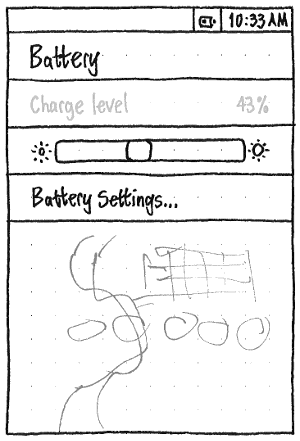
The “Charge level” item should be insensitive, showing the charge status of the phone’s battery. If a Bluetooth headset is connected and its charge level is known, “Charge level” should instead be “Internal battery”, and it should be followed by a similarly insensitive “Bluetooth headset” item showing the charge status of the headset.
The brightness slider (bug 1289470) should exactly mirror the one in the Brightness settings panel.
“Battery Settings…” should navigate to the System Settings screen.
Warnings
|
|
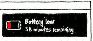
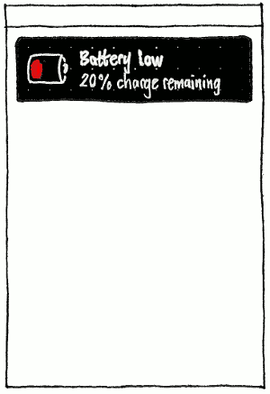
When the device’s battery/batteries are discharging and reach — or begin discharging and already have — 1 hour or less remaining (PC) or 20% or less remaining (phone/tablet), a notification bubble should appear with primary text “Battery low” (sentence case) and secondary text of the form “1 hour remaining” (PC) or “20% remaining” (phone/tablet).
|
|
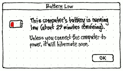
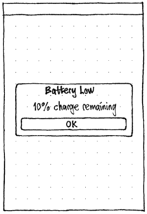
When the device’s battery/batteries are discharging and reach — or begin discharging and already have — 30 minutes or less remaining (PC) or 10% or less remaining (phone/tablet), an alert should appear with “Battery Low” (Title Case) as its title (PC) or primary text (phone/tablet) (bug 1296431).
On the PC, the primary text should be of the form “This computer’s battery is running low (about 29 minutes remaining).” or “This computer’s batteries are running low (about 29 minutes remaining).”. The secondary text should be “Unless you connect the computer to power, it will hibernate soon.” or “Unless you connect the computer to power, it will shut down soon.”, depending on the current setting.
On the phone/tablet, the secondary text should be of the form “10% remaining”.
State changes
When a component begins discharging
When a component begins charging
Links
Upstream GNOME control center power panel work: http://live.gnome.org/Design/SystemSettings/Power
Upstream Indicator work: http://live.gnome.org/GnomeShell/Design/Guidelines/SystemStatus/BatteryPower
Unresolved issues
Bug 883857: Battery warning popup buttons dont make sense
Power (last edited 2017-01-27 12:17:50 by mpt)
