Appearance
Contents
Ubuntu desktop
A single “Appearance” panel should provide a setting for choosing a Yaru variant (Light, Standard, or Dark), and settings for the Launcher.
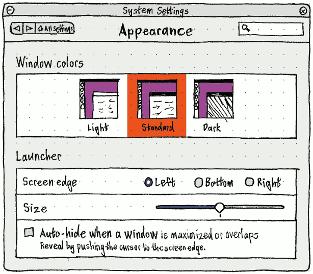
Choosing any of the theme options should set the toolkit and cursor theme simultaneously. Whenever the current themes for toolkit and cursors are not the same, or the current theme is not Yaru (for example, selected using gnome-tweak-tool), the list should show nothing selected.
Whenever the “Appearance” panel opens, the list of themes should be scrolled, if necessary, to show the current selection.
Theme snap installation
Whenever a theme change is detected, if
- there are any installed snaps that don’t contain or link to that theme, and
- the Snap Store contains a snap providing that theme,
then a “Change Theme” prompt should appear. (It doesn’t matter if the prompt takes ten or twenty seconds to appear.)
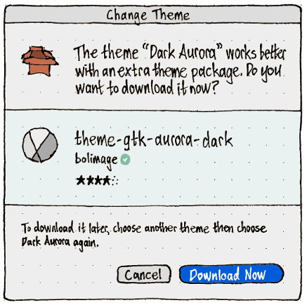
The snap icon, title, publisher, and rating should be presented the same way as on the Snap Store.
If you choose “Download Now”, the dialog should morph so that the question is replaced by a progress indicator, while the caption and commit buttons are removed.
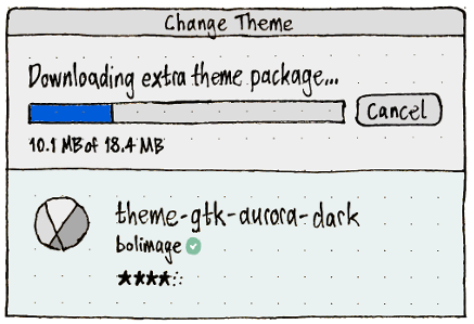
The first half of the progress bar should be allocated to “Downloading extra theme package…”, and the second half to “Installing extra theme package…”. (This is the same allocation used for software updates, and could be updated based on download- and install-speed metrics.)
If any error occurs during the download or installation progress, the dialog should morph to become an error alert.
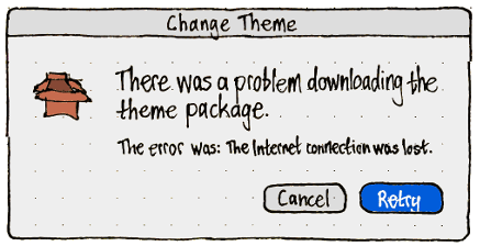
If installation succeeds, and no applicable snaps are currently running, the primary text should change to “Installation complete” for two seconds, then the dialog should close automatically.
If any applicable snaps are currently running, the dialog should morph to display each of them with its own Relaunch button, plus “Skip” and “Relaunch All” buttons.
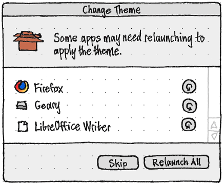
Clicking any of the relaunch buttons should send a signal to the relevant app(s) to close, and once they do, should launch them again.
If any listed app closes, whether because it was relaunched here or for any other reason, it should disappear from the list. If the list becomes empty, the dialog should close automatically.
Ubuntu Touch
“Background”
“Background” refers to the area behind all open windows in windowed mode, and to the welcome (lock) screen in staged mode.
Access

On the System Settings main screen, the “Background” icon should include a thumbnail of the currently selected background. Therefore, all the backgrounds in the icon should reflect the aspect ratio of the current display.
Structure
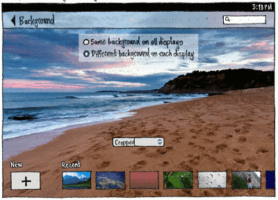
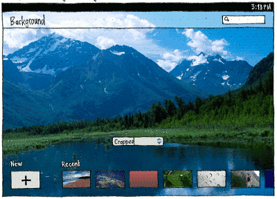
When choosing a background, by far the best representation is seeing the full-size background on the screen itself. This avoids frustration from choosing an image that has too low resolution, or from cropping an image poorly, and not being able to see the problem until you have exited. It’s also more fun.
Achieving this representation requires custom behavior in two ways.
First, each display should have its own Background UI. (This is unlike Display settings, where all displays must be configurable on the primary display because a misconfigured display might not be working at all.)
Second, the UI for each display should let you see the background on that display:
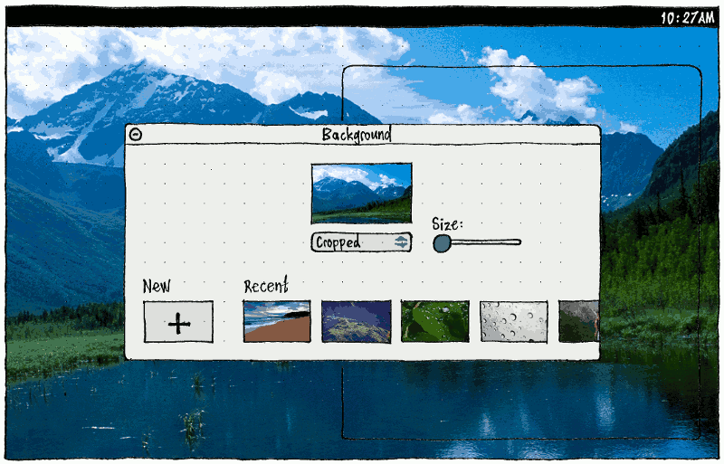
In staged mode, System Settings should be full-screen whenever you are on the “Background” panel, and the header should be semi-transparent, so that you can see the background behind it.
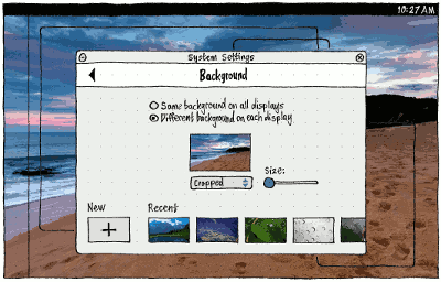
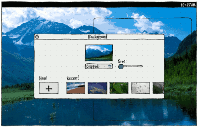
In windowed mode, all non-System-Settings windows should be transparent whenever you are in the “Background” panel, so that you can see the background around the System Settings window, with only outlines remaining to reassure you that they are still open. As soon as you switch to another panel, or close, minimize, or unfocus System Settings, all other windows should resume visibility.
You can’t pinch or drag the real background to resize or crop it, so the windowed mode needs its own controls for that. Therefore, the Background UI must be different in staged mode than in windowed mode.
|
Staged mode |
Windowed mode |
The display that System Settings has been on |
|
|
Any other display, when “Different background on each display” is chosen |
|
|
Staged mode layout

“New”, “Recent”, “Pinch to crop”, and “Drag to move” should all be white text with a black outline, so that you can read them against any background.
Tapping “New” should open a picker for selecting a new image, including an “Ubuntu Backgrounds” collection (bug 1288364) that does not appear when the picker is called from other apps. (Alternatively, this collection should be placed by default in the Gallery app.)
After a fresh install, the “Recent” list should should be pre-populated with the default images from the most recent Ubuntu contest. Otherwise, it should consist of the ten most recently chosen distinct background settings — that is, an image rendered in a particular way. This means there may be multiple recent background settings that use the same picture but with different renderings. A background setting should be saved whenever you leave the “Background” screen.
If you choose a new image, that image should zoom up from the “New” button to be shown as the current background, following its appropriate default rendering. If you choose any of the “Recent” items, that image should similarly zoom up from its thumbnail to become the current background. At the same time, any “Recent” items to its left should slide along one spot, making way for the previous selection to zoom down to become the most “Recent” item. If you chose a new image, the least recent setting should disappear from the list.
Long-pressing a “Recent” item should reveal a popover menu with a single item, “Delete”. (Deleting recent background settings will be a rarely-needed function, usually wanted only after relationship breakups.)
In the usual case where there is not enough room to show the “New” button plus all the “Recent” items in a single row:
- The entire row should be scrollable horizontally. That is, it should be a horizontally-scrolling list spanning the screen, with transparent background and no border.
- To indicate that there is more off-screen, the spacing between the “Recent” items should be expanded if necessary depending on the screen size, just enough that one of them is between 1/3 and 2/3 off-screen.
- The scroll position should reset whenever you return to the screen (so that you don’t lose sight of the “New” button) or choose a different background (so that you can see the previous selection become the new most recent, and undo it if necessary).
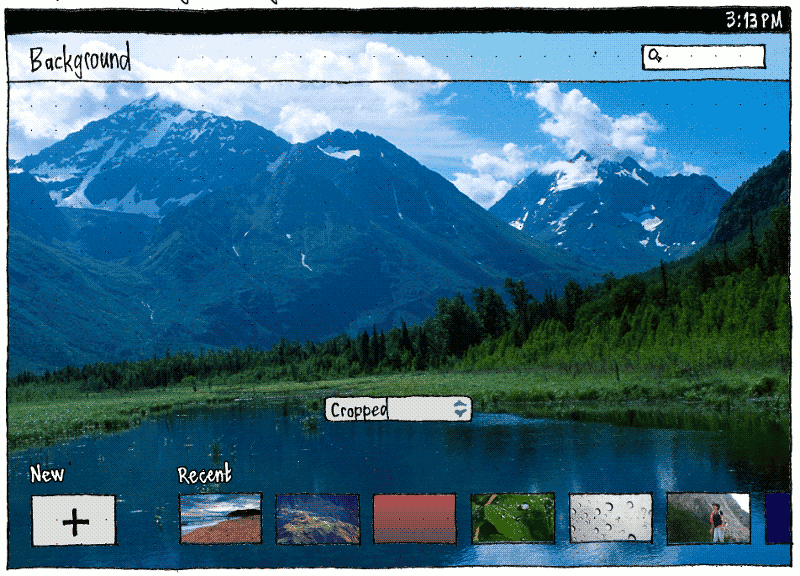
Whenever “Different background on each display” is chosen, on each other display a full-screen dialog should appear for configuring the background for that display.
Windowed mode layout
The windowed mode layout is different, so that it can contain a correctly-proportioned thumbnail for dragging.
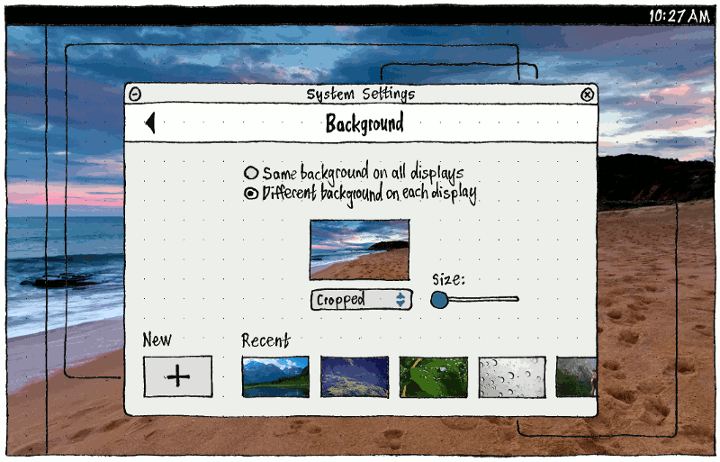
Similar to the staged mode layout, whenever “Different background on each display” is chosen, on each other display a parentless dialog should appear for configuring the background for that display.
Background image rendering: Tiled, Fit/Stretched, Cropped
Whenever you select a new image, its default rendering on each display should be whichever is most likely to suit that image on that display, but you should be able to change the rendering using a radio menu.
Option |
Enabled |
Use as default |
“Tiled”, with one tile exactly centered on the center of the display |
If image pixel size is less than the display’s in either dimension |
1. If image pixel size is less than 1/4 the display pixel size in either dimension |
“Fit” exactly on the display |
If image is at least as large as the display, with exactly the same aspect ratio (for example, exactly the same pixel size) |
2. If image is at least as large as the display, with exactly the same aspect ratio |
“Stretched”, scaled differently in each dimension to exactly fill the display in both |
If “Fit” is not present |
3. If image’s aspect ratio is within 10% of the display’s |
“Cropped”, scaled proportionally at least enough to fill the display in both dimensions |
If image does not have exactly the same aspect ratio as the display |
4. In any other case |
Cropping
Whenever the rendering for the current image is set to “Cropped”, and you have a touchscreen or multi-touch touchpad, the standard gestures should resize and pan the picture to choose the cropped area (bug 1368286). In case you do not realize this:
- Whenever you have been on the “Background” screen for five seconds without changing anything, the “Drag to move” hint should fade in and out over two seconds.
- Unless you have moved a pointing device in the meantime, this should be followed by the “Pinch to crop” animation fading in and out.
Whenever you move a pointing device (indicating that you aren’t using a multi-touch input device, even if you have one), a “Size:” slider should appear instead, so that you can resize the image without pinching.
- Over any non-control part of the screen (in staged mode) or the preview (in windowed mode), the cursor should be a grabbing hand, indicating that you can drag to move the image.
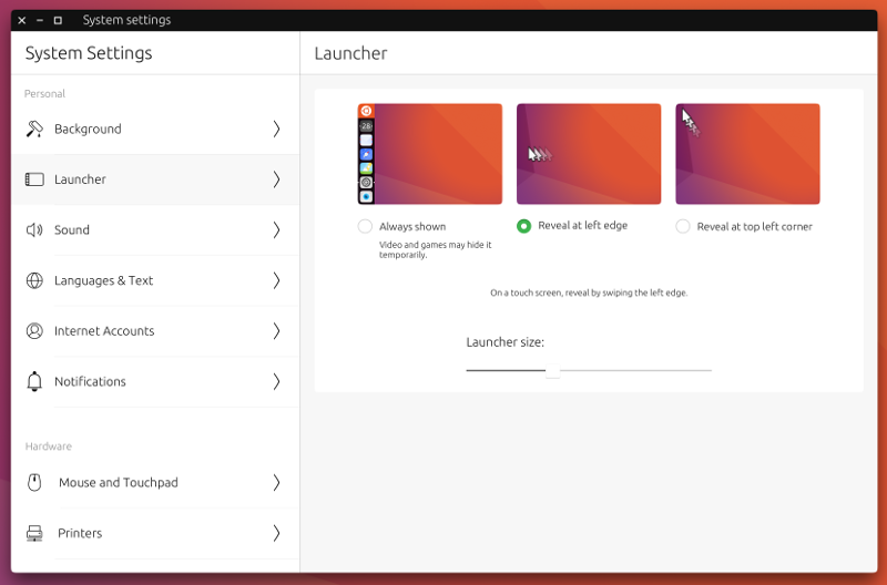
“Launcher”
|
Errata: “Video and games” should be “Full screen videos and games”
It is practical to persist or resize the Launcher only on large displays.
Therefore, The “Launcher” category should be present only when one or more display at least 90 GU wide is currently detected (for example, the built-in display). If you are on the panel at the moment that this stops being true (for example, on a phone when you disconnect the only external display), System Settings should automatically navigate back to the main screen.
In addition, the introductory label should be “Launcher appearance on large displays:” if the current display does not fall into this category (to explain why the settings aren’t applying to the display that you’re looking at), and just “Launcher appearance:” otherwise.
Clicking/tapping a diagram should function exactly the same as clicking/tapping the radio button below it.
Appearance (last edited 2020-01-14 12:20:47 by mpt)
