Discussion
Folder Discussion
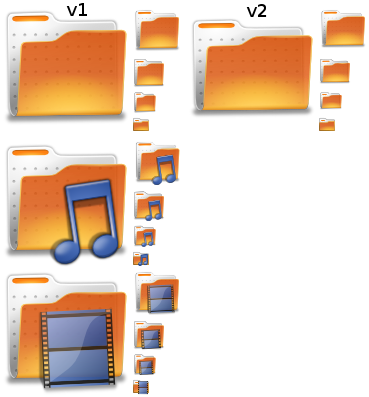
Below we have the two folder icons to work from. Please list below it good elements & bad elements from each so that we can go forward to create a better breathe folder icon.
Design Points to hit
- Color must be orange
- Use of the dots on the inside is strongly suggested
- Bottom glow (a totally artistic decision separate from reality) on the front of the folder.
![]()
Human
Good:
* Orange!! - Matches the human feel, however it needs to be a bit less saturated for a less cartoony look
* I think the question is which shade of any colour, think of the all the Pantone colours.
*
Bad:
* Glossy when it doesn't need to be
* Do we need those dots when it is one of the most commonly used icons? Is that extra detail that we need?
*
Oxygen
Good:
* The design shows it is 3D
*
*
Bad:
* Blue - Not human-like
*
*
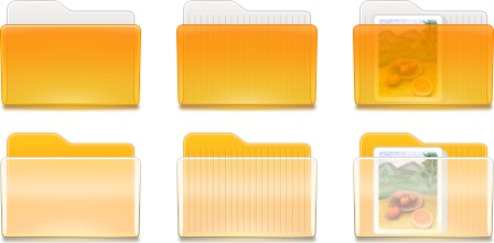
Folder Concepts
Ken Vermette

Thorwil

SebastianPorta

mac_v

Generic/empty Concepts
DannyKing


 Shadow needs work.
 Colour of pixels up for debate
Artwork/BreatheIconSet/Discussion (last edited 2009-07-06 06:05:15 by ABTS-TN-dynamic-023)