| Edit Wiki ^ |< << Slide 33 of 81 >> >| |
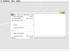
Milk-Ubuntu
This is my first edit, feel free to bear with me.
I'll try to update this page every few days with progressed.
Concept
White can emphatize branding and highlight the wonderful orange Ubuntu logo.
Sadly very bright gray tones look bad on some lcd screens, so one should be very careful when using gradients.
Reference
Not yet
Contributions
Comments
* Great! ...I'd love to see a softer, visually gentle interface developed for Ubuntu, this concept and ../TooHuman are the best I've see so far. A few thoughts:
- I don't much go for that plasticy Win Media Centre style "shine" which seems to be all the rage at the moment and I think it looks particularly nasty on this theme. How about trying something more subtle? If you're finding them troublesome I'd ditch them altogether. I find those brightly coloured window buttons a bit lurid and out of keeping. How about Pastels? Lastly the bare white is, again, rather harsh. Have you experimented with off whites and very pale greys?
* Tac: thx ! I am still beginning working on it, for now, let's see how it develops. I don't plan pastels for now. I'd rather keep it as white as I can and try to use vivid colors to add vivacity in small doses. I agree about plasticity.
* While it's not a bad design, it's not something I'd personally like to see. Like the comment above, I'm not a huge fan of the shiny look. Also, the close/min/max buttons seem to close to the OSX stoplight design. I think Ubuntu should have something more unique. -- Mikm 2008-04-08 08:04:01
Attachment List
