TooHuman
| Slideshow ^ |< << Slide 60 of 81 >> >| |
Too Human
-- Page continued here: -- https://wiki.ubuntu.com/Artwork/Incoming/Intrepid/TooHuman
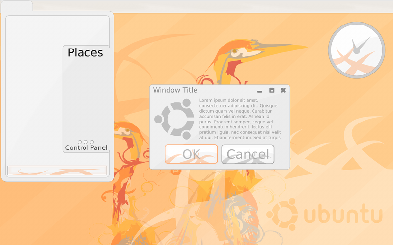
The idea of the too human theme is that even with a palette of gentile and warm colors you will be able to stun and amaze even OS-X and Vista users.
The theme must be distinctive and fresh. no feature shall be included just because other OS's do it that way, but conversely features will not be rejected because the are used in other OS's.
All images are released under the creative commons share and share alike license 3.0
palette

images

made in inkscape - just a mockup
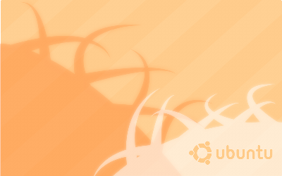
wallpaper


all the .svg's and full size images are in here: toohuman.tar.bz2
Contributions
Guidelines
- For images, use a low resolution picture in the wiki page. It should be no taller than 240 pixels. If you need to upload higher resolutions, please upload them as an attachment and link to them from the page.
There are two tools located at Artwork/Documentation/Software/Wiki_Scripts to help you with this
Use attachment:thumbnail.png and [attachment:file.png linkname]
Use @SIG@ to leave your signature at the end of your comment. New comments should be placed at the bottom of the feedback.
Comments
- Good but too light. Darker window borders would be better.
- I like the widgets but I'm not a fan of OSX style windows. -- George12
- Thanks for the feedback, I will try to make some more within the next few days -- Tom Wright
- This is the best one I've seen so far,I really want the Hardy style to be something like this -- Mahdee Jameel
- I like the softer tones and would like to see this style developed. Who says the desktop has to be visually aggressive?
- I think this is a great theme. I'd like to have a style that does not impose itself too much. This one does the job. It is nicely polished and unobtrusive.
- I like the soft tones but I find the text difficult to read. I think the text needs to be darker as right now it hurts my eyes trying to read it. It blends into the background too much. - Andrew Fenn
Can I pick my jaw off the floor now? This is damn-near perfect. The detailing is fun and contemporary without being obtrusive. The clarity of the interface is fantastic and the low-contrast look is much less fatiguing on the eyes. This is a look that also allows for great visuals without relying on graphic effects only available on newer hardware. These are mock-ups, right? Any chance you could make actual GNOME/GTK themes for these so we can see how it works when actually implemented, and whether or not rewrites to GTK/GNOME would be necessary for these to look 'right'? I like the less 'physical' look of this, because I've gotten somewhat sick of the (poorly-executed) Linux look of fake physical objects stacked on top of each other, particularly with 'physical'-looking GTK icons on top of 'physical'-looking buttons. EDIT: I think this would go great with ../Fela Kuti -Sumit
- Thanks for all the great feedback, i had totally forgotten about this stuff. Just to conferm this theme is a mockup made in inkscape; if anyone wants to make a GTK+ version that would be amazing but i am not the person (I have only programmed a bit and that was in java). Coinsidently i did make a wallpaper based on the Fela Kuti backgrounds. I will see if i can find it. Usability wise do the window boarders need to be smaller, and how would they look with compiz? Hopefully i actually will be able to make some more soon (some docks for a start, i'm thinking AWN or cario-dock style). --Tom Wright
- I really like the concept of this, the way that rather than be too dark and shiny and sharp like vista or OSX it remains simpler rounder and yet is still very smooth and modern looking, it makes it very distinctive from the others and i think that's really good direction to go in.
Great update! I think the borders are fine, not too broad, even on your fairly low-res mockup. ..but, oh no, what's with the ghastly faux "gloss"? I loved this theme for its simplicity. It was smooth, flat, simple - elegant. Now it isn't! Please don't destroy it for some naff "eye candy"! I think i remember the people at [../gelatin gelatin] doing the same, for a while, but they seem to have got a grip now!

- you are right, much too glossy and the borders are too sharp. i have done my best too improve it but it still lacks polish. i will not attempt to design the dock as awn is better than anything i could design. -- Tom Wright
Tom! Please forgive the typo! ..corrected now. I like the borders and think this is a really great theme. It's just the new "shine" thing which I think spoils the new mockup - don't lose your design's beauty and simple elegance in your quest for "polish"... soft, smooth and gentle on the user is infinitely better than gimmicks and "polish"
 The only other thing I'd suggest is, maybe a wee bit lighter on the window control graphics? I hope my error hasn't disheartened you - I think you're doing a fine job.
 - That's OK, it's all part of the development cycle. Hopefully I will be able to improve it some more. Some shadows would probable do a lot of good but they need compiz which requires accelerated graphics and in most cases propitiatory drivers so I would like it to look as good as possible without. -- Tom Wright
- Wow, I love this. I think it is so simple. yet so amazing. It's inspired me, I wish that 8.10 will looks like this. It would be a great achievement.
- I really really liked this until everyone messed it up telling you it was too shiny etc. this whole anti-shiny thing on ubuntu really gets on my nerves.
- I will do some more work on this when i get time, i might be able to make a theme for cairo clock. I have no experience of making gtk+ themes so the theme will be harder to do. A softer look is one of the aims for this theme so i do agree that some of the previous versions didn't work. I have made GDM themes before so i could try make one --Tom Wright
Attachment List
Artwork/Incoming/Hardy/Alternate/TooHuman (last edited 2008-08-06 17:00:09 by localhost)