| Edit Wiki ^ |< << Slide 42 of 79 >> >| |
Kin Tonic
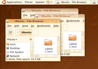
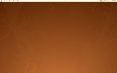
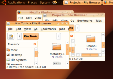
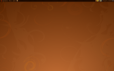
A peach coloured dawn on the shores of the Ubuntu desktop.
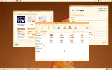
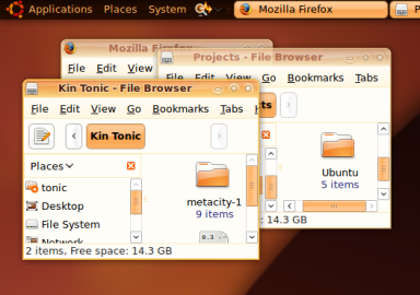
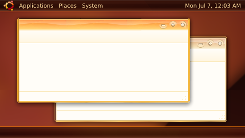
Windows are decorated with the print of waves upon a sandy beach and the peach coloured dawn motif is carried throughout the theme.
Downloads
Variation |
Emerald file |
Metacity & GTK file |
Other Files |
Human |
(n/a) |
(n/a) |
|
Original |
(n/a) |
(n/a) |
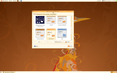
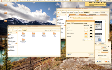
Screenshots for Kin Human
Fullsize - Kin Human in Compiz and GWD |
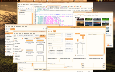
The Kin Human gtk theme is just a recoloured variant of the Human-Murrine theme.
Custom colours |
|
Window Background |
#FFF8E6 |
Selected Items Background |
#FFA443 |
Tooltips Background |
#FFD976 |
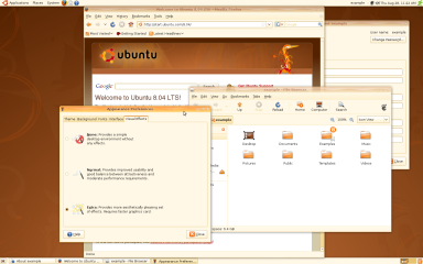
Screenshots for Kin Tonic
Concepts
There have not yet been any ideas for wallpapers, login manager themes or usplash themes.
|
This was the prototype using Emerald and Compiz. The window controls were edited out. The window and panel decorations were derived from the Kin (Artwork/Incoming/Intrepid/Kin_Intrepid) and Kith (Artwork/Incoming/Intrepid/Kith_Intrepid) styles proposed by Ken Vermette.
Contributions
Guidelines
- For images, use a low resolution picture in the wiki page. It should be no taller than 240 pixels. If you need to upload higher resolutions, please upload them as an attachment and link to them from the page.
There are two tools located at Artwork/Documentation/Software/Wiki_Scripts to help you with this
Use attachment:thumbnail.png and [attachment:file.png linkname]
Use @SIG@ to leave your signature at the end of your comment. New comments should be placed at the bottom of the feedback.
Comments
As people have said on the mailing list - its great. Nautilus looks a little bar (too white/bright) and maybe needs a little more darker tones to add contrast in the window. The only other thing I could suggest would be top make the window boarder around the outside of the window a little darker as the theme feels just a little too light and bright. But other then that, fantastic job here! -LostOverThere 2008-07-31 11:17:06
Yummy! Reminds me of tangerine ice cream ![]() Two minor comments: perhaps the wavy line in the title bar could be a little bit blurrier (gaussian 1px?). Also about the window buttons: the unmaximize button could move a pixel downwards maybe, and could we have an X (the maximize cross rotated 45 degrees) instead of the circle as "Close"? I know I'm nitpicking but this is such a nice theme I couldn't keep myself from commenting. Good work. -- vyruss 2008-07-31 18:52:24
Two minor comments: perhaps the wavy line in the title bar could be a little bit blurrier (gaussian 1px?). Also about the window buttons: the unmaximize button could move a pixel downwards maybe, and could we have an X (the maximize cross rotated 45 degrees) instead of the circle as "Close"? I know I'm nitpicking but this is such a nice theme I couldn't keep myself from commenting. Good work. -- vyruss 2008-07-31 18:52:24
Attachment List
