NewHumanTesting
Known problems with the NewHuman theme
Add any problems you find with apps when using the NewHuman theme, perhaps with a nice screenshot to visually explain the problem but do make sure to go through the list before adding duplicates.
Note that many of these problems may be due to the theme itself. This page is not intended to point fingers but rather to collect information. If you have any knowledge as to why the problem occurs please add it as a note to the problem(s) in question.
Comments on the viability of using a dark theme do not belong here! This page is only for information gathering, not artistic opinions.
List
Applications:
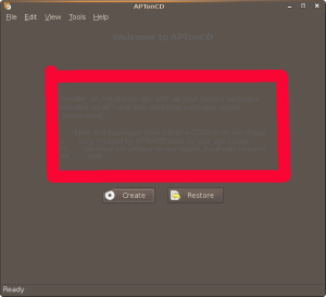
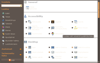
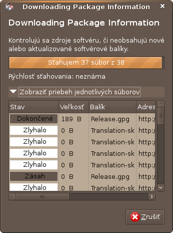
APTonCD
- Description unreadable
- Description unreadable
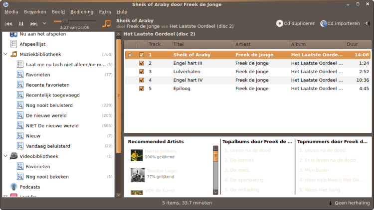
Banshee
- Related music is not readeable
- Related music is not readeable
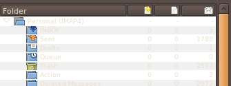
Claws
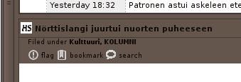
- Folder view is unreadable unless folder is selected or has new mail
- Same for message view
- Folder view is unreadable unless folder is selected or has new mail
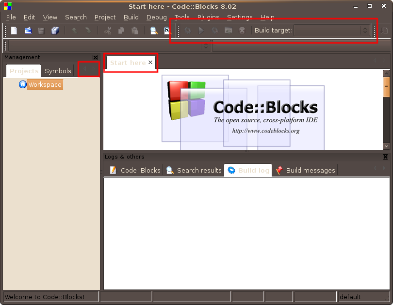
Code::Blocks
- Related to wxWidgets
- Ugly white bar around toolbars
- Inactive toolbar icons hard to see
- Active tabs nearly illegible
- Arrows for tab scrolling hard to see
- Related to wxWidgets
Compizconfig Settings Manager
The main dialog has almost white text on white background, developer believes it's a problem with the theme since another dark theme works
Evince
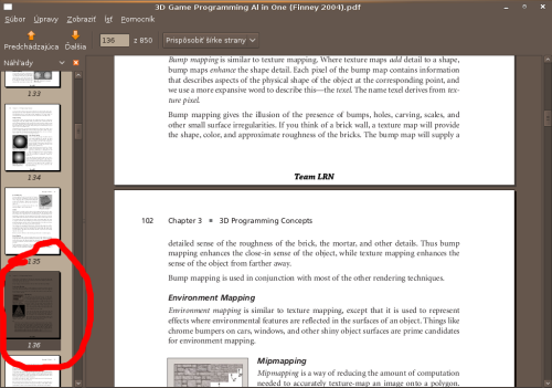
- Selected thumb (from page thumbnails) on left side panel hidden
- Selected thumb (from page thumbnails) on left side panel hidden
Evolution
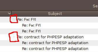
- Thread expand/collapse widget hard to see
- Thread expand/collapse widget hard to see
F-Spot
- Icons are grey
- Icons are grey
Filezilla
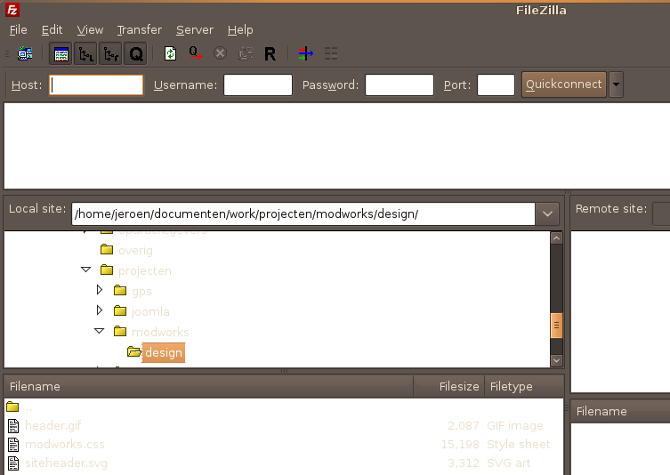
- Most text in the screens have too low a contrast against the background
- Most text in the screens have too low a contrast against the background
Firefox
- 'Download Complete' phrase is hard to read
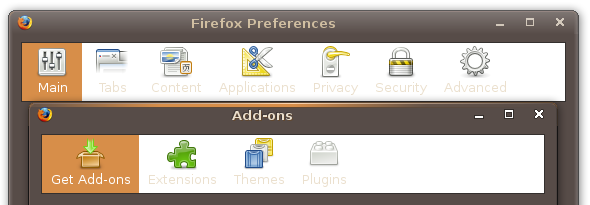
- Category sections in preferences/add-ons unreadable
- Highlight of location bar hard to see. Better if bg is filled.
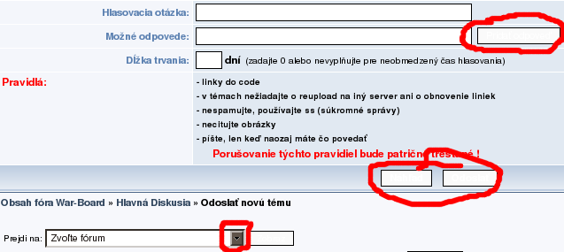
- Text on submit, reset.. forms is unreadable (please, set default colors like at Ubuntu 8.04) in option form, design is annoying (arrow)
- Buttons in Wordpress admin are difficult to read (fine in Human)
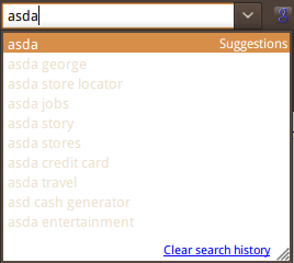
- Google Search box is hard to read
- 'Download Complete' phrase is hard to read
Gedit
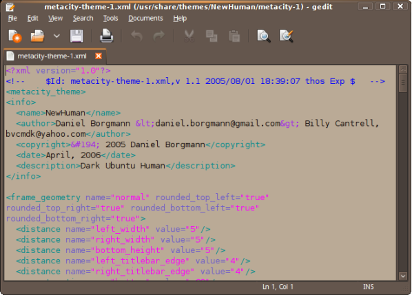
- For some strange reason gedit uses the input box bg color instead of the normal document bg color. We can set a theme that makes it usable with the darker bg but I am not sure if we really want to give people a text editor with a dark bg
The same bug is reported in my case in Eclipse Editor. So override gedit theme is not a good idea. Lizardking
- Bluefish Editor also suffers from this bug.
- For some strange reason gedit uses the input box bg color instead of the normal document bg color. We can set a theme that makes it usable with the darker bg but I am not sure if we really want to give people a text editor with a dark bg
Gmail Notify
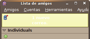
- 'New Mail' pop up is impossible to read
- 'New Mail' pop up is impossible to read
Liferea
- When no feed is found, it displays the following message. The problem is that it is REALLY hard to read
- Likes to show text with a black color in the user interface, making it almost unreadable with a dark background.
- When no feed is found, it displays the following message. The problem is that it is REALLY hard to read
Nautilus
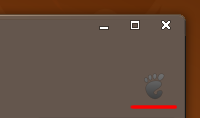
- Throbber is black on dark-grey-brown
- Some grayed out elements in toolbar are difficult to notice. This happens for grayed text in buttons, and specially for history buttons (the lone angles pointing down). On the other side, grayed out icons themselves are ok.
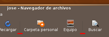
- Toolbar separators (those vertical lines that separate button groups) are difficult to see.
- In list mode, column header for Name has an arrow at its right that's barely noticeable (this arrow shows the sorting in use for file names, and changes when clicking the column header).
- When creating directory or renaming file/dir, very light text on white background.
- Throbber is black on dark-grey-brown
OpenOffice
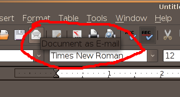
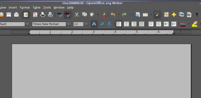
- Tooltips are black on dark grey, hard to read.
Not easy to use with the dark theme, because the buttons haven't a good contrast and into OpenOffice Impress some buttons are not easy to read. Think to the persons with visual problems
- gEdit and other text editors have the paper colour not white! I think that the paper have to be more natural, of course white.
- Tooltips are black on dark grey, hard to read.
Pidgin
Skype
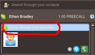
- Text turns white on cyan, making it hard to read.
- Text turns white on cyan, making it hard to read.
Synaptic
- Update list of packages, some areas are white while others are brown
- Update list of packages, some areas are white while others are brown
Thunderbird
- Toolbar text is invisible/hard-to-read
- Text on new mail notification popup is not readable.

I have fixed this by adding few lines to Thunderbird userChrome.css, see my dark theme on my website LUX. Download the userChrome.css file from userChrome.css here and place in ~/.mozilla-thunderbird/XXXXXX.default/chrome folder. - SzerencseFia
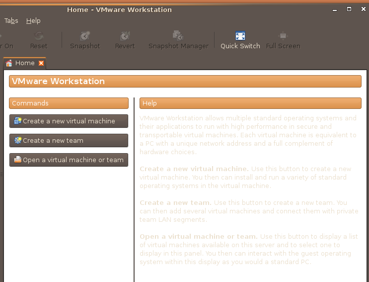
VMWare Workstation
- Poor contrast between foreground text and background
- Poor contrast between foreground text and background
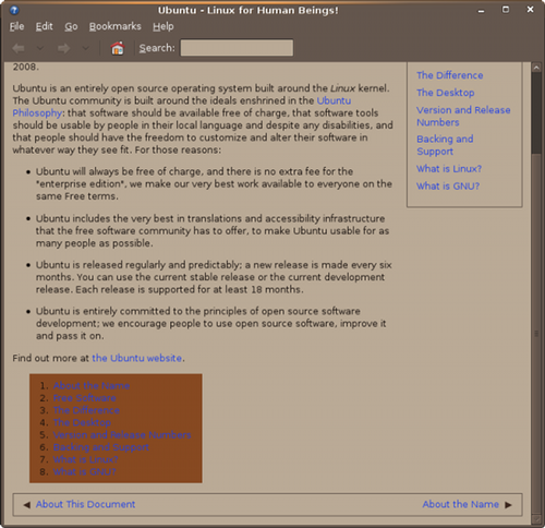
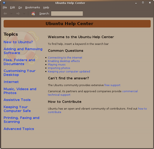
Yelp
- Html background of this list looks odd and blue gives the wrong contrast
- Html background of this list looks odd and blue gives the wrong contrast
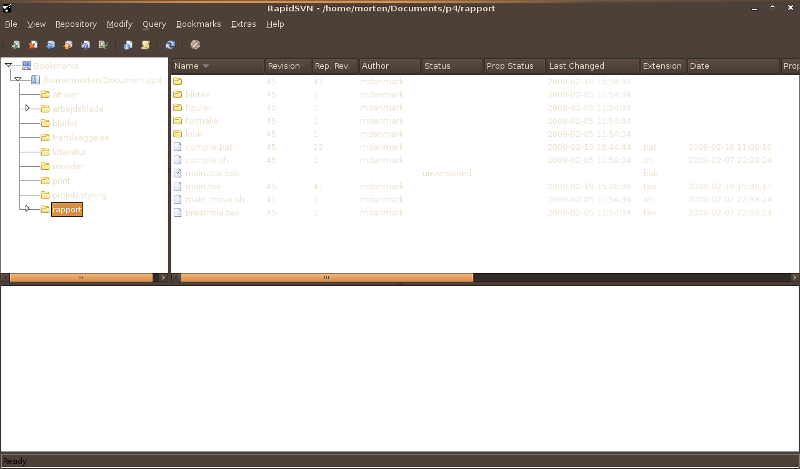
RapidSVN
- Text is hard to read.
- Text is hard to read.
- amule
- Emacs - White space between border and scrollbar
- vlc (as this is being ported to QT this will not be a problem in the future)
- xchat-gnome
- rhythmbox
General:
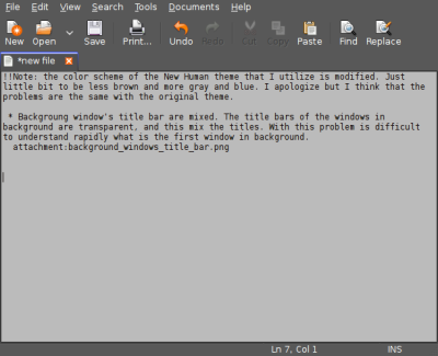
Note: for some images on this wiki, the colour scheme of the New Human theme that I utilize is modified. Just little bit to be less brown and more grey and blue. I apologize for this, but I think that the problems are the same with the original theme. [edited]
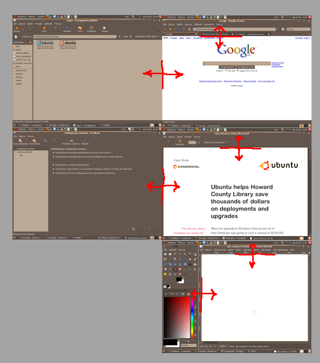
- Background window's title bar are mixed. The title bars of the windows in background are transparent, and this mix the titles. With this problem is difficult to understand rapidly what is the first window in background.
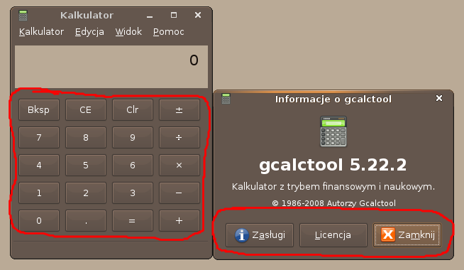
- Windows buttons like Minimize, Maximize and Close, when pressed, are not in feeling with the theme. Them are glossy and that don't looks great.
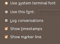
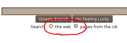
- Check boxes are not clear, is not simply understand what is selected and what not
- Where there are multiple tabs, for the tabs that are unselected it is not clear where one ends and the next starts. Perhaps the border colour for most things in this theme should be a contrasting light brown since the face colours are predominantly dark brown.
- It is very hard to tell which tab is activated in Firefox
- It is very hard to tell which tab is activated in Firefox
- Most of webpages, PDF documents, blank images have a white background. When you switch between applications or white background and dark GUI, your eyes feeling pain. Contrast is stark.
- Buttons (and other widgets) blurs in with the background. More contrast or some different color will be useful.
Fixed problems
Please move any fixed problems from above to here.
- Compizconfig Settings Manager
Neil J. Patel mentioned that one can add gtk definitions (something like GtkWidget::link-color=@fg_color, GtkWidget::visited-link-color = shade (0.2, @fg_color)) for these colors in the gtkrc. I am now adding this to the newest version which will be in the sponsoring queue tomorrow (and therefor updated within a couple of days at the most)

- This seems not to be a problem anymore (compare the screenshot to the current view of the same dialog)
This problem still exists!! (9-27-08)
- This seems not to be a problem anymore (compare the screenshot to the current view of the same dialog)
- gTranslator - Box on right side is white and selected area (red color) is animated
- Bad icons in gnome-app-install
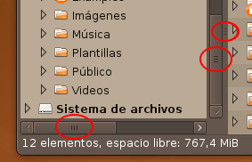
- Scrollbar color is hard to distinguish from its background, specially when scrolling a directory with lots of files (many times I miss where the scrollbar is positioned, and its size is hard to tell).
- (Now I'm being too picky) The little decoration in the middle of scrollbars is difficult to notice, as well as the central decoration in resizer (the vertical border between panels in Nautilus). I think these two are not very important, but anyway...
- (Now I'm being too picky) The little decoration in the middle of scrollbars is difficult to notice, as well as the central decoration in resizer (the vertical border between panels in Nautilus). I think these two are not very important, but anyway...
Artwork/Incoming/Intrepid/NewHumanTesting (last edited 2009-04-02 16:29:15 by p50896BDB)
