Demo
|
Size: 1845
Comment:
|
Size: 2486
Comment:
|
| Deletions are marked like this. | Additions are marked like this. |
| Line 31: | Line 31: |
---- /!\ '''Edit conflict - other version:''' ---- |
|
| Line 34: | Line 36: |
---- /!\ '''Edit conflict - your version:''' ---- * guys please give very high priority to a intuitive keyboard access for all the commands. i would hate it to be usable only with a mouse. and the login and the other button after the login name and password should also have rounded edges. other than that SUPERB job --tgpraveen * I do agree with mr.doob, this doesn't look like it's the best OS in the world ;-). The background color seems a bit dull - perhaps look at mr.doob's submitions for inspiration. I do love the GDM --MadsRH ---- /!\ '''End of edit conflict''' ---- |
Contents
Ubuntu Karmic boot demo and proposed GDM theme
Contributors: Otto Greenslade, Mat Tomaszewski, Mark Shuttleworth, Michael Forrest, Kenneth Wimer
Boot with automatic login - Flash mockup
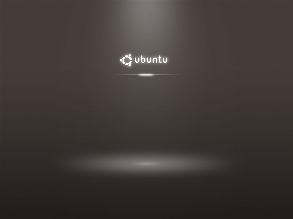
Splash screen

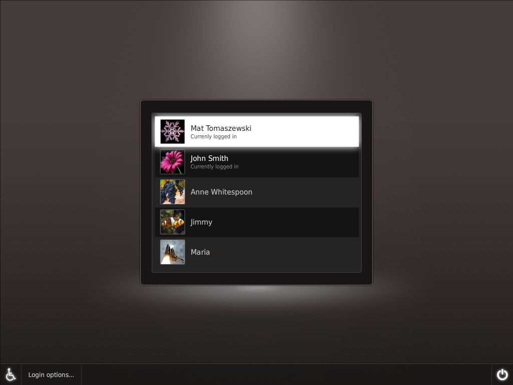
GDM theme

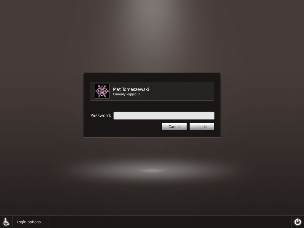
GDM theme – selected user

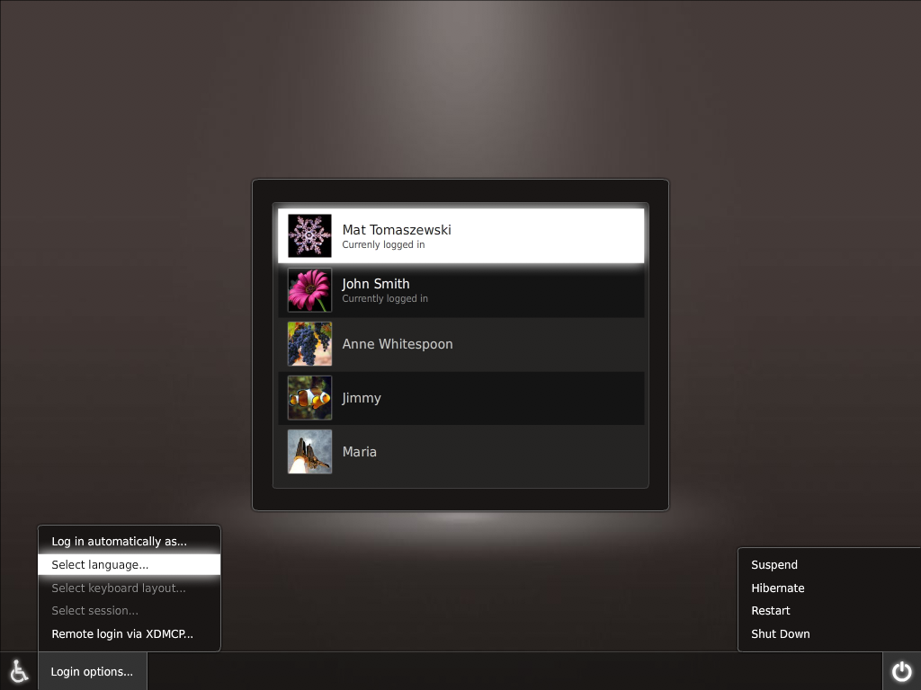
GDM theme – menus

Comments/Feedback
What you have done is just superb! If you can implement that then you are the men
 I have some things I'm not sure about but they are not fatal: The right/left edge of menus I would not make round so that it merges better with the bottom bar. Also that spot on the floor and the user selection window don't fit imo but I have no idea how I could improve it
  . Just to mention that this new shiny login will need a whole lot of beautiful preinstalled user images. --AntonKerezov
 - Not bad! But I think you guys can do much better than this. I don't think it feels professional enough. I'll try to remix this and put it up with my suggestions. --mr.doob
![]() Edit conflict - other version:
Edit conflict - other version:
- guys please give very high priority to a intuitive keyboard access for all the commands. i would hate it to be usable only with a mouse. and the login and the other button after the login name and password should also have rounded edges. other than that SUPERB job --tgpraveen
I have some constructive criticism as well, first off, I agree with AntonKerezov. Other things: The line separating the options menu button and the weelchairsymbol, is it really neccesary? Think it looks better without. The highlight when going in to the options menu is way to glossy. Otherwise nice! -olskar
![]() Edit conflict - your version:
Edit conflict - your version:
- guys please give very high priority to a intuitive keyboard access for all the commands. i would hate it to be usable only with a mouse. and the login and the other button after the login name and password should also have rounded edges.
other than that SUPERB job --tgpraveen
- I do agree with mr.doob, this doesn't look like it's the best OS in the world ;-). The background color seems a bit dull - perhaps look at mr.doob's submitions for inspiration. I do love the GDM --MadsRH
![]() End of edit conflict
End of edit conflict
Artwork/Incoming/Karmic/Boot/Demo (last edited 2009-09-23 14:00:09 by pc013354)