Login
![]() WIP
WIP
Creating New Login Experience for Ubuntu
The login experience is an important part of interaction with the system; a gateway to the user's personal account and an opportunity to reinforce Ubuntu brand and its values. The current solution leaves a feeling of unfulfilled promise and does not provide a truly delightful experience. There are few fundamental goals that the new Face Browser should achieve:
- To provide a responsive, reliable and easy-to-use interface to log into the system
- To wow and delight end users
- To make Ubuntu login experience unique, different and simply amazing!
Iteration 2 [GDM] edit by mac_v
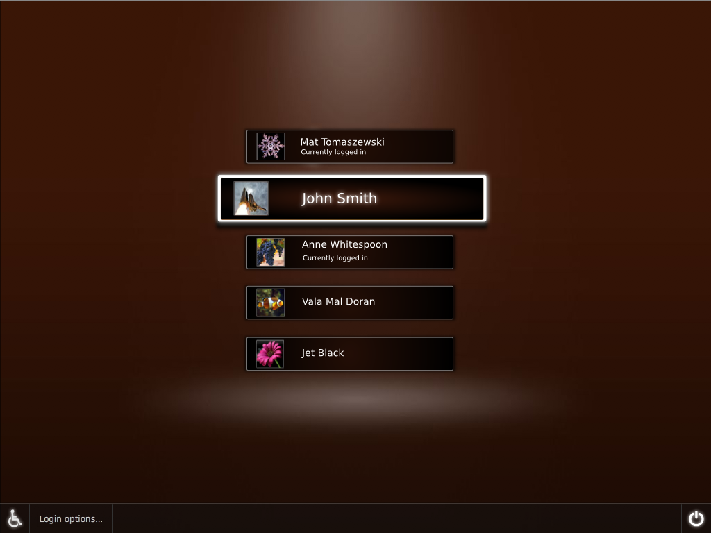
- Just an idea for the gdm. I'v not changed anything else , only the gdm has been altered.
- The present gdm doesn't seem to use the space provided by the boot , the boot seems to occur in a room with light from above but the gdm just hangs in front.
So I'v *tried* to use the space and create a 3rd dimention to the gdm list.
- The idea is to have the selected option grow and move forward. [rather than a simple highlight]
For list with more than 5 items , we could use> http://www.cs.umd.edu/hcil/fisheyemenu/ [thorwil]

Sidenote: For a11y reasons I have not changed the text size of the other non-selected items , but rather only increased the size of the selected item. [Maybe the non-selected item's text could be a bit smaller , size 12?] --mac_v
Comments
Heading
Use footnotes, attachments, and like where appropriate. 1
Footnote sample (1)
Artwork/Incoming/Login (last edited 2009-08-19 12:38:40 by yttrium)