LittleDetails
It is important that Ubuntu is polished up to the little details. You are encouraged to add more cases or improve existent ones! After you add an entry to this wiki page, report an appropriate bug in Ubuntu and Upstream. Without a bug report, the developers won't notice that it's an issue.
Related spec: https://blueprints.edge.launchpad.net/ubuntu/+spec/desktop-karmic-death-by-100-paper-cuts/
Also see: PaperCut
Contents
-
Some cases that can be improved
- Applications menu
- Volume "Safe to remove" notifications
- Places menu
- Thunderbird
- software-properties-gtk
- Rhythmbox
- F-Spot
- Window list
- Gtk+ ComboBox has a big blank area above the position of its control
- Gedit and Eye of Gnome
- Music-applet
-
Nautilus
- Easy unmounting
- Usable pathbar
- Intelligent trash-bin
- Context-sensitive emblems
- Non-intuitive term "Move to trash"
- Fonts Installer
- Global location for video/image thumbnails
- Media Folders
- Copy queuing / better file copying mechanisms
- 'Open With' Nautilus list is unsorted
- Trying to run an application that fails to start gives no error
- File Properties and Ownership
- Firefox
- Scale Command
- Calendar/Clock Applet
- Audio preview
- Moving panel icons
- Proxy Settings
- Network Manager
- System Tray
- Automatic fsck for JFS/NTFS
- Can't force mounting of unclean NTFS volumes in GUI
- Remote audio for remote VNC desktop
- Scaling support for remote VNC desktop
- Eye of Gnome
- Screenshot taking
- Pidgin vs Ayatana
- Update manager
- Misc
- Power applet/display brightness
- Generalized usability issues/uphill battles
Some cases that can be improved
Applications menu
- Highlight recently installed applications
- Especially new Wine applications (we inherit this problem from Windows, which feels the need to tell you about new start menu items)
- But only for the current session /dael99
Volume "Safe to remove" notifications
At present when a hard drive partition/USB pendrive/external drive is unmounted , safe removal notification is displayed inconsistently. Before the safe removal notification there is a notification that the "writing data to drive is still going on and to wait". But sometimes this wait notification is skipped since the small write operation was over very quickly. So this leads to the user being presented with ONLY the safe removal notification , thus the user is not notified about delay due to the write operation.
But when there is no pending write operation, to delay the unmount, the user is not presented with any notification about safe-removal.
This causes confusion in the regular non-technical user/new users to Ubuntu , who usually keep waiting for the safe removal notifications to remove the drive or leads them to double-check the mount status of the drive before removing the drive
This confusion can be avoided by presenting the "Safe to remove" notification AT EVERY unmount. And this could be done elegantly using the notify-osd notifications for every volume unmount regardless of the delays. The "Wait" notification can also be done using the notify-osd. Since both these notifications don't require user interactions.
Places menu
Quick Unmount
There should be an indicator attached to the main Places menu, to quickly unmount a drive.
Before:

After:
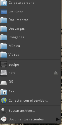
This is very useful and native for migrated MS Windows users.
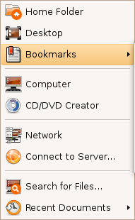
Bookmarks
Before:
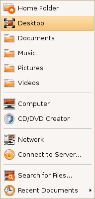
After:
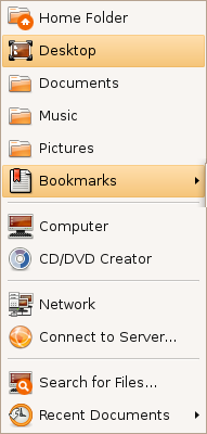
This menu shows now the 3 most used bookmarks and hides the rest under a submenu (instead of hiding all of them).
Shutdown/log out icon
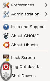

This is with the default Human theme on Intrepid. It should either stick with the red power off logo, or the grey one.
- This is fixed in Jaunty. There are no Lock screen/Log out/Shutdown entries in the System menu.
In the User Switcher Applet
The current user-switcher/shutdown applet shows the gnome-logout or gnome-session-logout or system-logout or maybe the gtk-exit icon. It should show the system-shutdown icon to be more consistent with the 4 main actions (Suspend, Hibernate, Restart, Shutdown)


CD/DVD Creator
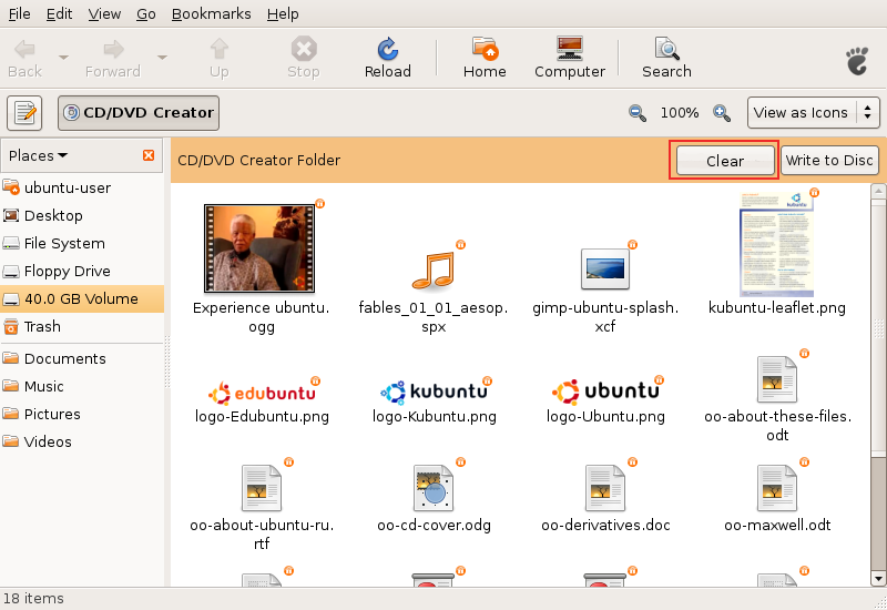
Added the "Clear" button. There should be also a message instructing the user and maybe a progress bar with the space occupied.
Response: Good idea! I started work on this: http://bugzilla.gnome.org/show_bug.cgi?id=520414
- Does it still make sense, as Brasero is used for burning?
Same icons in all places
![]()
![]()
When the user changes the default icon of a folder (like shown in the first image), this change should be reflected under the Places menu (like shown in the second image). This behavior is now nonexistent.
Recent documents
Currently, recent documents in the Places menu are hard to reach. The list gets polluted very easily with unimportant files. It can be solved with creating "Recent documents" applet with pinning capability (just like in Tomboy or Microsoft Office 2007).
It may also be quite useful to be able to delete individual entries, or possibly exclude certain directories from being added as "recent documents". It's a little annoying to scan log files or temporary directories and have their entries clutter up your working "documents".
It would be nice to have recently downloaded files to automatically appear in this menu.
Thunderbird
There is a clear button in the quick search box that is probably a leftover from Vista. It is glossy blue and stick out like a sore thumb with Ubuntu's brown theme. Additionally, it looks like it should close something, not clear it. The icon should be changed to the brush icon (see searching in Rhythmbox), or perhaps recolored to match the Ubuntu theme. 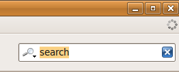
software-properties-gtk
Double clicking on a line in the "Third-Party Software" tab does not bring up the "Edit Source" dialog, when it should.
Rhythmbox
Rhythmbox searches for codecs when it finds a file it can't play. Because there is a 7z archive in my library, it currently searches for a 7z codec, which is obviously doesn't find. Rhythmbox (and really any library application) should only search for codecs that are appropriate for the application.
F-Spot
F-Spot, the default photo application, lacks caching when watching photos. It would be nice if the next image would appear instantly, without redrawing, just like in gqview.
It is important, as users use cameras that produce very large (8 or 10MP) images.
Window list
- Minimized windows use square brackets that looks ugly and reminds of the DOS era.
"[Title]" could simply become "Title", pleasing the eye and making the list more readable.
- When "Windows preview" effect is enabled in Compiz (displays a nice small preview while cursor is over a window button), default tooltip (the gnome one) should be disabled. Getting two tooltips results in something ugly.
Gtk+ ComboBox has a big blank area above the position of its control
This is done so the cursor is located on the currently selected option, so if the user changes their mind, they can simply release the mouse button (assuming they didn't move the mouse) and the selection won't change. Perhaps this can change to a small dot to the left of the currently selected option, so the user simply has to move the cursor off of the combo box to keep the selection from changing.
Response: If the user changes their mind, they can simply click anywhere on the screen (or press Escape) and the selection won't change either. Comments in the bug describes, why current behaviour is good when there is a place to display all options and why it's bad when it hides some of them (it's a corner case).
Gedit and Eye of Gnome
- Gedit has unnecessary gap at the right edge prevents scroll bar from appearing at the right place. To click on the scroll bar- after moving the pointer all the way to the right side of the screen, the user must pull the mouse back to the left 2 pixels (instead of using Fitt's law to perform the action easily).
- Eye of Gnome has the same problem.
Music-applet
- Music-applet suffers from the same bug as Gedit, although it is on the top border.
Nautilus
Easy unmounting
If user mounts USB device, it is important to unmount it to save data properly.
Additional bar in the Nautilus window displaying device's content would allow user to remember about it and perform the action easily.
Usable pathbar
Currently pathbar is hard to use with long folder names, e.g. parent folder button isn't displayed in such case. It would be easy to fix with using some "..."s to shorten long names.
Intelligent trash-bin
- Add an option to auto-purge elements older than X days
- Allow restoration of individual items or the entire trash bin to the locations they were in before they were moved to the trash
Context-sensitive emblems
- Nautilus should auto-detect the most common type of files inside a folder and attach an emblem accordingly (this feature is available in Konqueror)
- There's shold be context menu item to add emblems to a file, instead of going to the properties page. Tis will be very useful when we migrate to Zeitgeist/Mayanna.
Non-intuitive term "Move to trash"
An user doesn't want to move a file/folder, but to delete it (the fact that there's an undo - a trash, shouldn't change the terminology). The term "move" misses what user wants to do.
Simple "Delete" would be much easier to spot, especially when the menu has many items (there are >10 in mine). It would be simpler and shorter.
When user enables permanent deleting in preferences, the term could be "Delete permanently".
It was already mentioned in the forums (usability task "Search sample document from a specific option, delete and then restore it.").
Fonts Installer
Currently, to install ttf fonts in Ubuntu is a pain, since we have to open Nautilus as root (there's no worse thing for begginers), look for the /usr/share/fonts folder and then paste the fonts inside. This could be avoided if there was an graphical font installer, with a button to look for the fonts and a "install" button. The installer would, obviously, ask for the root's password. It would also be nice if, as the user browse the /usr/share/fonts folder on Nautilus, a notification bar on the top of the page (like those on autorun discs and on the trash bin) said: "Want to install fonts? Try the <font installer>" (< > is a button). This is for those who don't know about the installer. And, of course, the software would be on the "open with" menu for ttf and other font files.
Global location for video/image thumbnails
Older PCs can take minutes generating thumbnails for videos and images on central shares. While the Windows method is ugly (dumping a hidden "thumbs" file into each visited directory), it would be very elegant if Nautilus had the ability to use a central location for its thumbnails - rather than ~/.thumbnails. This would mean that as multiple clients on the network visited directories, those files would be thumbnailed only once (the first visit), while second visits would use the already-created thumbnails from the first visit.
This would result in less network traffic to the servers, less work for each client, and a faster experience overall.
Media Folders
Add and option to play the content of the folder (or the selected items) in the default media player or play a slide-show if images are selected.
Current: 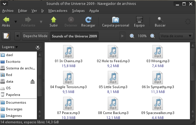
Media added: 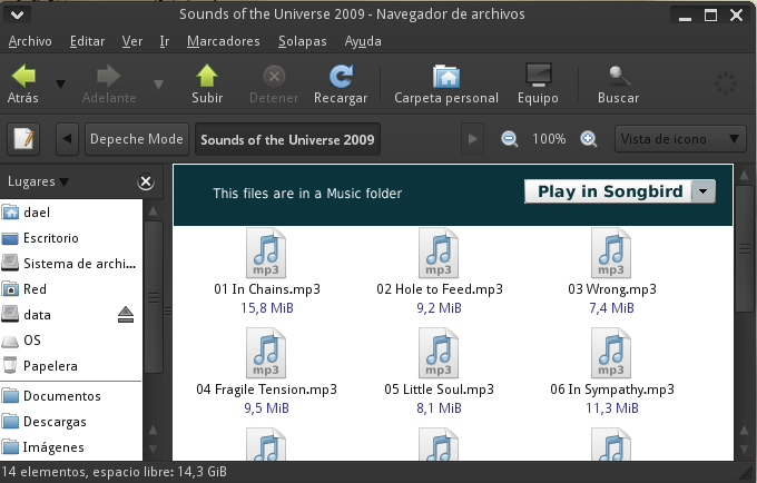
The drop-down list should show other players, showing first the default player.
Also, there should be an option to set the folder (and maybe it's subfolders) as Music, Video or Images folder. As it can be imagined, currently we have 3 media folders by default. Implementing this shouldn't be so hard.
Copy queuing / better file copying mechanisms
Nautilus does not offer to rename files when errors occur copying files between filesystems. It does notify the user that the file will not be copied but unlike Kubuntu's user interface, it does not suggest to simply rename the file and continue copying.
- Better file copy mechanisms are needed between filesystems (offer rename)
https://bugs.launchpad.net/bugs/263338
Currently when a user needs to copy multiple documents he is often bombarded with a number of copying windows each trying to compete for system resources. This is specially annoying when copying from CD/DVDs.
'Open With' Nautilus list is unsorted
When you right-click on a file, then "Open with...", you get a menu with contains a lot of entries, and they are not sorted at all. It's very difficult to find the needed application. Moreover, once you have entered a command "manually", it adds it to the menu, so if you enter 5 times 'vlc', you have 5 'vlc' in the menu.
Trying to run an application that fails to start gives no error
In the terminal when trying to run an application that fails to start an error message such as "Segmentation fault (core dumped)" or "error while loading shared libraries: xxxxxx.so.0: cannot open shared object file: No such file or directory" is printed to the terminal. When trying to run the same application from Nautilus no error message is shown. In fact nothing happens. Its impossible to tell if the application did something or not.
- If a segmentation fault happens a dialog box with the error message and an explanation of it should be shown.
- If the application fails to run due a missing library then a dialog box offering to install the needed package should be shown.
- If the application fails to run due missing execute permission then a dialong box should explain this and ask if the user wants to give the file execute permission.
File Properties and Ownership
If you run nautilus as root, then right click a file to choose properties, then permissions, you are given the option of changing the owner and access level.
If you run nautilus as root, select more than one file, then choose properties/permission, you can still change the access level, but now the owner is mysteriously greyed out. This forces the user to a command prompt to use something like "chown -R scaine:scaine directory/".
Firefox
Spell Check
If you right click on a Firefox text area, you can select which language to use for spell checking (very useful if English isn't your main language). However, every item is duplicated with a xx_XX entry: 
Adding applications
If you add an application for a new mime type, instead of being given the list of installed apps (as gnome does), you are presented with a file dialog and have to browse to the executable of the file. This is especially poor on Ubuntu because you don't actually have any idea where this might be - you probably just used add/remove programs to install the new app. Is it possible to invoke the Gnome application chooser from firefox?
Scale Command
Currently, we can show all the working windows in the desktop trough the scale plugin of Compiz. It would be nice to have a "Scale" trigger next to the "Show Desktop" applet. Also, it should detect when there is only one app running, so it gets auto-deactivated. Also, it would look nicer if it looks like as the "Show Desktop" applet.
Python code (from Greg Till, GPL):
#!/usr/bin/env python

import os

def main():
    scale=os.popen('dbus-send --type=method_call ' +
    '--dest=org.freedesktop.compiz ' +
    '/org/freedesktop/compiz/scale/allscreens/initiate_key ' +
    ' org.freedesktop.compiz.activate string:\'root\' ' +
    'int32:`xwininfo -root | grep id: | awk \'{ print $4 }\'`')

if __name__ == '__main__':
    main()
Calendar/Clock Applet
The current clock/calendar applet is not very useful; we can view events and task but we need to open Evolution to modify them or simple add a new event. Also, it's very ugly.
Short time: Add contextual menus to the calendar to allow us to add, edit or remove an event, interaction trough a pop-up that ask for the less details as it could ask (name, date, description and a tag). The same for the task list. Also, the calendar should show the icons of the events and show the next 5 days events.
Current: 
Maybe long time: Completely renew the applet. It could be based on the weather+the clock/calendar+hamster applets
Mockup: 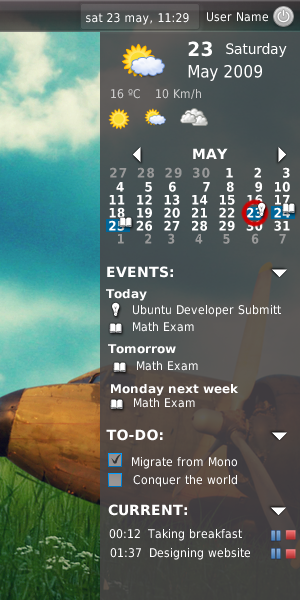
In the top is the weather, the day, the next 3 days weather. In the middle the calendar with full enhancements, the events and the to-do list. In the bottom, is the hamster-applet like time manager, tracking the time we expend doing some task.
The clock applet can't be easily configured to use a 12 hour format, it is only available for some country's, most users are used to 12 hour format.
Before 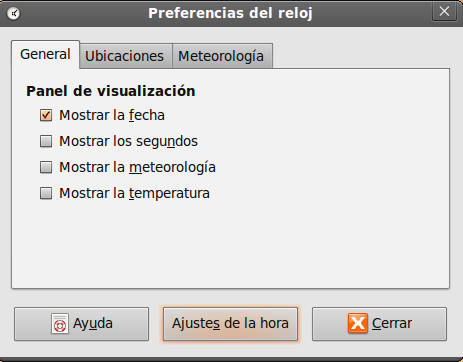
After 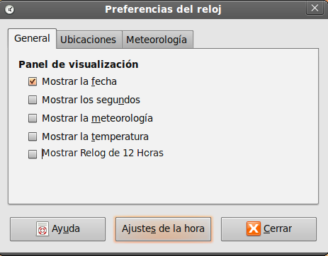
Audio preview
Automatic audio preview of music files frequently creates "double playing" and confuses users. Gnome bug Ubuntu bug
- This could be done trough a custom key, like space bar or control when hovering an icon./dael99
Moving panel icons
Sometimes panel icons will move out of order when you change screen resolutions, as often occurs if you have a docking station and higher resolution monitor. This can result in custom panel applets (like, say, the weather indicator) taking over the corner of the screen where the switch users menu normally is. Similar issues happen with the time and system tray.
https://bugs.launchpad.net/gnome-panel/+bug/44082
- One simply and elegant way to handle this could be adding an item in the panel contextual menu to restore previous panel configuration, something like a "Restore", very intuitive I think. In depth, the panel should save the current configuration when user log-off and restore it when selecting "Restore" from the menu.
- Do not "Restore" from the default installation, do it from the last user config.
- It's minor, but on new installs, an "unlock all" option would save a LOT of unnecessary right clicking.
- When adding a launcher to the panel by right-clicking on an apps icon from the application menu and choosing "add to panel", the new icon will often position itself directly to the right of the window list, preventing that gadget from showing its contents.
- Having added a new launcher to the panel and re-positioned it, the new icon will often randomly swap places with other launchers on the next logout/login.
Proxy Settings
There's an incredible number of places to set proxies. Update manager/Synaptic, Gnome->System->Preferences->Network Proxy, Firefox, Evolution, and likely others all have separate proxy settings. This gets especially confusing in the case of update manager and synaptic.
This also affects wget which is called by synaptic for certain packages (https://bugs.launchpad.net/ubuntu/+source/wget/+bug/232469) such as flash-plugin, java and some (non-free) fonts.
On the subject of both wget and synaptic, if you use an authenticated proxy (such as those in a corporate environement), then these applications generally fail, since they don't prompt for a password (unlike Firefox). Putting a password into the apps themselves is largely bad practice in a corporate environment since your password is at the mercy of whatever policy your company uses, so if you change your password, then launch these apps, they're likely to lock out your account if you're not careful.
Network Manager
When entering manual IPs, the tab key doesn't take you to the next task (IP address->subnet mask->default gateway) but instead makes you click again.
- Network manager is unable to disable selectively network interfaces of the same type - you can only disable all wireless, all cable etc. If you have 2 wifi interfaces and you want to disable one (for any reason) you have to use command line.
- There really needs to be a "refresh" button on there, since the list is static once accessed (ie, once you've clicked on the icon to see the list of available networks, the list is "fixed" until you click on the desktop, then click back on the network manager icon to see the available networks again. Really annoying when you're waiting for an access point to recycle).
System Tray
Actually, the system tray is pretty much disorganized,I mean, the icons on the system tray should have a consistent look i.e they all should be resized to fit properly the tray area and not pass menu bar height, also it should have an option to show a max number of icons in tray and the other icons are automatically hidden. It could also be nice to have an option trough right click to easily change the tray icon of any application.
Before: 
After: 
Comment from Jeff: This is a very bad idea. This would encourage applications to force useless icons down our throats like in the Windows world (why do you think windows' notification area is such a mess?). The solution is less icons to begin with, 'not' hiding them.
See the comments on this bug report, especially #8 and #12 (the rest, too).
See also the Human Interface Guidelines which are crystal-clear on the "appropriate uses" of the notification area.
Inherit
This comes over and over. The System tray should only show non-win apps. All the applications with a space in the Task Manager List (the bottom), should "append" the contextual menu from the systray to the contextual menu of the Task Manager. This way, we could keep cleaner the systray.
The Task Manager Contextual menu: 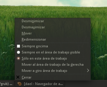
The Systray Contextual menu 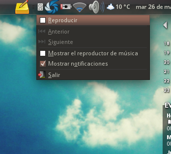
Utopic Mockup 
Also, this can be extended using the Task Manager with only the icons, the systray contextual menu "inherited", and reuse the launchers for the Task Manager, this way we don't need an icon for launcher, other for task manager and other for systray, only one.
Note: Battery, Network Manager and no windowless apps, should stick with the systray.
Automatic fsck for JFS/NTFS
When using JFS (e.g. for MythTV storage) or NTFS and a blackout occurs, people need to remember to manually fsck their JFS/NTFS drives and manually mount them (or restart their boxes). This isn't a big deal, but it really is one of those things that separates Linux from the commercial desktop operating systems that just "do the right thing", whether or not we agree with what they call the right thing. If necessary, we can make that something people can disable.
Can't force mounting of unclean NTFS volumes in GUI
If an NTFS volume is marked as unclean after a reset Ubuntu won't mount it until you run chkdsk on it under Windows. There is a CLI option to force mounting it, GUI doesn't offer that leaving new users angry when having to run Windows just for chkdsk. For safety, force-mounting could mount the NTFS volume as read only.
[comment by scaine] : Incredibly, the GUI window actually opens a window telling you what you need to type into a terminal in order to force the NTFS to mount uncleanly, but the text isn't copy-able so you must keep the window open and type its contents into a terminal manually! So, the GUI knows what to do, but forces you to a terminal to do it.
Remote audio for remote VNC desktop
It's great that remote desktop works out of the box in Ubuntu. But it would be nice if VNC remote desktop could also support remote audio, as is available for RDP clients. Either that, or it would be nice if Ubuntu could act as a RDP server.
Scaling support for remote VNC desktop
There is no option in system/preferences/remote desktop to specify that this computer's screen should be scaled down by a given factor. Therefore, on my 1920x1200 desktop, I am forced to install and use x11vnc which allows this. Otherwise, when trying to VNC to my main desktop from my laptop which has a much smaller screen, it's largely unusable.
There is an arguement, I suppose, that the scaling should be done client side, but since I tend to use VNC over slow(ish) connections, I prefer the server to do the scaling so that the whole 1920x1200 desktop isn't sent over the link, instead a much smaller screen is sent, having been scaled before being sent.
Eye of Gnome
Eye of Gnome should have an option "Edit in GIMP" in the Edit menu. This would make it easier to edit the file without having to close EoG first.
Screenshot taking
When I try to take a screenshot using the Print Screen key while a dropdown menu (File, Edit, etc.) or a Context Menu (right-clicking on something) is showing, nothing happens. It's really annoying, because I have to open Eye of Gnome from the Accessories menu, choose a time interval, click the menu I want to show and wait.
Pidgin vs Ayatana
On slow connections (modem, 3G) Pidgin makes a flood of notifications (Xxx is available) once it connects to Jabber/XMPP /other protocols. These notifications last for at least 2 minutes when you have over 100 contacts. This is very useless and annoying. Something should be done about it. These notifications should be skipped or merged into one.
Update manager
Update manager should warn about laptop running on battery when installing big updates. Mac OS X's update manager does that. That would be an improvement in usability - the laptop wouldn't run out of power when doing dist-upgrade or downloading and installing, eg: >100MB. https://bugs.edge.launchpad.net/ubuntu/+source/update-manager/+bug/377697
FIXED in Karmic

Misc
- When opening a file for which only root has write permissions, the user should be prompted for the password to enable writing to it. The user would of course have the option to supply no password, in which case the file will remain read-only. Similarly, if only root has read permissions, the user is notified and offered a password prompt to allow them to read the file.
- When unmounting an external hard drive Ubuntu should also eject it. It would bring us to Mac OS parity. Currently when I unmount my 320 GB external drive it keeps spinning until I pull the USB plug manually and then it suddenly stops which makes me feel I did something wrong. In order to avoid this, I have to go to console and eject the drive.
Power applet/display brightness
- The power applet has a "dim display" setting which can be used to automatically dim the display when running on battery power. However, the applet ignores adjustments from the brightness hotkeys, so if you wiggle the mouse to re-light the display it goes back to the wrong value (it always goes back to what you've set in the power applet rather than your last manually set value).
Generalized usability issues/uphill battles
This is a small section on problems that don't affect only one or two apps, but pretty much half of the applications I encounter out there. I filed tons of bug reports and they usually got fixed, but this is tedious, and I'd like those things to be formalized as a "design rule of thumb" that gets applied/evaluated by everyone "by default".
Remember the window sizes and maximization states
I can't state how many dozens (hundreds?) of times I had to file this. If your application has a resizable window and this window doesn't automatically remember its dimensions and maximization state (and restore them before painting the window so that it doesn't "bounce" around in front of the user), your application is broken. Especially on modern high-resolution screens, even more so if your application is intended to display lots of data or a long list of items.
List:
- gnome-terminal
- Baobab
- GnoCHM
- Seahorse
- Gnome Format
- Synaptic Package Manager (running under Compiz)
[comment] : This is particularly annoying on thunderbird, where I want a horizontally long but fairly narrow window for the main screen, but tall windows for when I open each e-mail. However, since thunderbird uses the same window identifier for the main window and any opened email, I can't even use predefined window sizes. Strangely, thunderbird on windows has no issues with this set up.
Large (non-resizeable) windows on small screens
These windows are very difficult to deal with on small screens, as the window has to get moved around a bunch. Coupled with the Compiz bug below, this makes some windows useless or next to useless.
List:
- Compizconfig-settings-manager (can't resize small enough for 640x480)
Code::Blocks > Settings > Editor (almost too big for 1280x800 screen)
- GNOME Video Preferences
Moving windows (Compiz)
Alt+drag to move doesn't allow the titlebar of a window to move beyond the top panel in Gnome when running Compiz (works fine in Metacity). While this is fine on most screens, this makes it very difficult to use some preference screens on smaller screens.
Additionally, there is a small inconsistency regarding this that turns into a laborious workaround for this bug. You can Alt+drag a window to the panel but not beyond. But if you then right click on the titlebar of the window and click move and then only move the mouse up, the window is allowed to move past the panel. This is a small inconsistency, and is useful in some cases, but the UI should be consistent and usable.
Scrolling '''sucks'''
Some easy examples:
gnome-appearance-properties and pretty much all other applets/preference dialogs in GNOME. This particular case in GNOME has not yet been fixed after four years.
- Ubuntu's language/locale package management thingy
epiphany's "add bookmark" window
f-spot's import window
evolution's send/receive dialog
nautilus' properties dialogs
The disease of persistent "tray icons" (notification area icons)
This is directly opposed to the suggestion "System tray" above (in this wiki page). Many applications show an icon in the panel's notification area by default, and some even insist on doing it. This is bad. It's the kind of disaster that plagues the Windows world, and we should ruthlessly fix applications that infringe on the principle of least intrusion. See the comments on this bug report. See also the Human Interface Guidelines which are crystal-clear on the "appropriate uses" of the notification area.
There is, however, a raging debate on the "grey area" of panel applets vs notification icons; network manager, pidgin and empathy, for example, have a persistent icon by default.
Perhaps most applications should have an option to have a notification icon, but they should leave it off (eg: no icon) by default. The following list shows how many applications can be expected to have notification icons. However, the average user will not have all of these applications installed, much less running at the same time; this does illustrate the fact that sooner or later, the notification area will need to be shrinkable and just display the recently-used icons.
Network
- Firewall applications (Firestarter, Guarddog, Mobloquer, gufw, etc.)
- Makes it easy to allow/deny applications to access the web, and the web to access the computer without keeping a window open.
- Ever present icon, only when application is running.
- Network analyzers (Wireshark, etc.)
- Makes it easy to collect packets without keeping a window open.
- Display for duration of background activity.
- File synchronizers (Conduit, Dropbox, etc.)
- Makes it easy to sync files between computers without keeping a window open.
- Ever present icon.
- Download/Upload managers (Tucan, etc.)
- Make it easy to upload files to filesharing websites like Rapidshare, Megaupload, etc. without launching or keeping a window open.
- Ever present icon, only when application is running.
- Network managers (network-manager, wicd, etc.)
- Technically only when a device is present, but very close to all computers nowadays have network devices.
- Ever present icon.
File Operations
- Bittorrent and filesharing clients (Transmission, Deluge, Azureus/Vuze, KTorrent, Opera, Frostwire, etc.)
- Makes it easy to monitor torrents/downloads without keeping a window open.
- Ever present icon, only when application is running.
- Backup applications (Timevault, etc.)
- Makes it easy to control backup operations and revert files.
- Ever present icon.
- File operations monitors
- Makes it easy to monitor file operations without keeping a window open.
- Duration of background activity.
Office
- Email and calendar clients (Thunderbird, Sunbird, Evolution, Kmail, Opera, etc.
- Makes it easy to monitor email and appointments without keeping a window open.
- Ever present icon.
Personal
- Music players (Rhythmbox, Banshee, Amarok, Songbird, etc.)
- Makes it easy to control background music without opening an application; could make music-applet obsolete.
- Ever present icon, only when application is running.
- Chat, IM, and VOIP clients (Pidgin, Kopete, Emesen, Skype, Ekiga, etc.)
- Makes it easy to chat online without keeping a chat window open.
- Ever present icon, only when application is running.
- Screenshot and desktop recording applications (Gnome-screenshot, GTK-recordMyDesktop, Shutter, etc.)
- Makes it easy to control recordings and screenshots without having to keep a window open or pull up a window.
- Ever present icon, only when application is running.
- Notetakers (Tomboy, Basket, etc.)
- Makes it easy to make and find notes without keeping a window open.
- Ever present icon, possibly only when application is running.
- Key and password managers (KeePassX, etc.)
- Makes it easy to manage keys and especially passwords for websites, applications, ssh, etc.
- Ever present icon, only when application is open.
- Wallpaper managers (Dynamic Wallpaper, webilder, Wallpaper Tray, etc.)
- Automatically change wallpaper from a list of local files or from images on a website.
- Ever present icon, only when application is running.
Development
- RSS clients, and VCS monitors (Bazaar-notification, etc.)
- Makes it easy to keep track of VCS's without keeping a window open.
- Ever present icon, possibly only when application is running.
Utilities
- Image managers (Gmount-ISO, AcetoneISO, etc.)
Makes it easy to mount/unmount disk images like ISO's & DMG's without keeping a window open.
- Ever present icon, only when application is open.
- External Device Managers (Ejector, media-applet, etc.)
- Makes it easy to mount/unmount external media without having to go to the desktop; could be obsolete if eject buttons make it into Places menu as shown above in this page.
- Ever present icon, only when external device that needs to be unmounted is attached.
Audio Managers (PulseAudio, etc.)
- Makes it easy to control the volume level for users who don't have multimedia keys, establish audio sinks/sources between computers.
- Ever present icon.
- Print monitors
- Only when a document is printing, makes it easy to control any active printers.
- Duration of background activity.
- Search managers (Tracker, Beagle, etc.
- Makes it easy to start, pause, and use indexing apps without keeping a window open.
- Ever present icon.
- Battery monitors
- Make it easy to see battery status, possibly control power usage.
- Ever present status, only when a battery or battery-backup like a UPS is connected.
- Bluetooth managers
- Make it easy to pair with and explore nearby Bluetooth devices.
- Ever present icon, only when a Bluetooth device is present.
- Compositing managers (fusion-icon, etc.)
Very useful for computers running Mathematica and apps that don't run well with Compiz/compositing, it makes it very easy to turn off and back on.
- Ever present icon.
- Alarm clock (alarm-clock, etc.)
- Makes it easy to control alarms without keeping a window open.
- Ever present icon, only when application is running.
- Macro and cron applets (dothisnow, etc.)
- Makes it easy to show/control actions without keeping a window open.
- Ever present icon, only when application is running.
- Update manager (update-manager, etc.)
- Makes it easy to control system updates.
- Transient icon in response to event.
- Application crash monitor (apport?)
- Makes it easy to submit bug reports.
- Transient icon in response to event.
Use XDG folders
See these links:
http://ploum.net/post/184-cleaning-user-preferences-keeping-user-data
http://ploum.net/post/207-modify-your-application-to-use-xdg-folders
Synthesize the menu
- Barra de menús (por defecto) vs Menú principal comparación de píxeles utilizados:
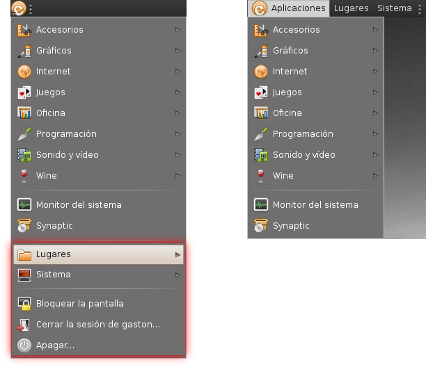
- Cantidad de ítems:
[comment] why just synthetize the menu, to look like other OS. The concepto of a one-button based start menu is just old. Why not use something like Mayanna or Gimmie. I totally agree with the space waste, but we could go further with Mayanna (if this get fixed, of course).
LittleDetails (last edited 2012-01-23 08:00:25 by 230-55-139-94)

