Networking
This is an incomplete, in-progress, and partly-implemented specification for Ubuntu’s networking features on PC and phone.
Ubuntu lets you connect to the Internet and other networks in various ways, including Wi-Fi, Ethernet (PC only), PBX (phone only), cellular data, and Bluetooth. This is implemented using NetworkManager (upstream, Ubuntu package, Ubuntu bug reports) and oFono (upstream, Ubuntu package, Ubuntu bug reports).
If you need help with networking in Ubuntu, see Ubuntu Help “Internet and Networking”.
Contents
- Overall interface structure
- When an app tries to use the Internet
-
Connections
- Flight Mode
- Common behavior across connection types
-
Wi-Fi and hotspots
- Naming and listing Wi-Fi networks
- Wi-Fi in “Network” settings (PC)
- “Wi-Fi” settings (phone)
- “Previous Networks”
- Wi-Fi in the network menu
- Suggesting that you connect to Wi-Fi
- Entering Wi-Fi network details
- Connecting to a broadcast Wi-Fi network
- Connecting to a hidden Wi-Fi network
- Authentication variations, certificates, and PAC files
- Hotspot setup
- Progress, errors, and confirmation for Wi-Fi connection or hotspot setup
- Cancelling a connection
- Wi-Fi network properties
- Wired connections
- Cellular connections
- Bluetooth connections (PC only)
- To do
- VPNs
- Proxies
- Firewall (PC only)
- Sharing
- PC-specific designs (to be integrated above)
- Future work
- Unresolved issues
Function |
Phone |
Tablet |
PC |
Overall interface structure
On all form factors, the networking interface is based on System Settings panels and indicator menus. On a phone or tablet, both the settings panels and the menus are broader (showing more at the top level) than on a PC, because network connection is usually more variable and more expensive than it is on a PC.
On all form factors, there are also occasional dialogs (for example, for Wi-Fi suggestions or captive portals) and notification bubbles.
Settings
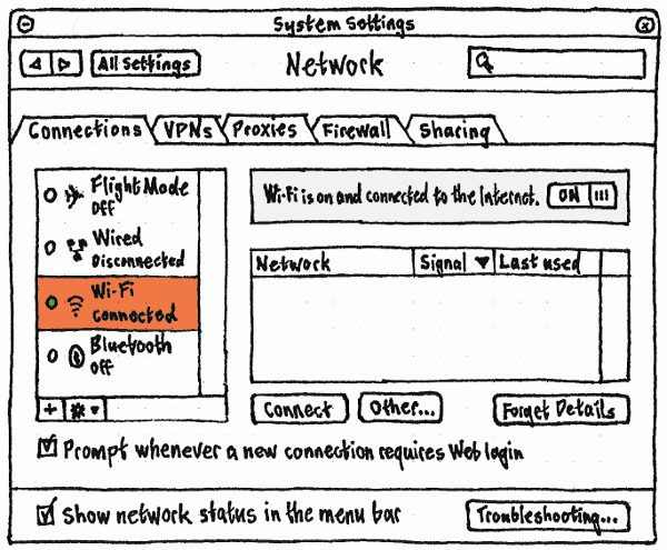
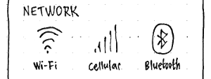
On a PC, networking settings should be shown in a single System Settings “Network” panel, with tabs for “Connections”, “VPNs”, “Proxies”, “Firewall”, and “Sharing”. At the bottom left of the panel should be a “Show network status in the menu bar” checkbox (fixing bug 829673).
because cellular and Bluetooth connections are networking settings should be split across the System Settings “Flight Mode” top-level item, and the “Wi-Fi”, “Cellular”, and “Bluetooth” screens.
Network activity menu (phone/tablet)
|
On a phone or tablet, it is useful to know when apps are using the network, for several reasons:
- You may want to check that nothing important is using the network before turning on Flight Mode.
- Since the device is highly mobile and does not have a wired connection, you may want to check before moving into a space that has no networking (such as a lift/elevator or subway).
- Data can be expensive, and even Wi-Fi data may be subject to a bandwidth limit.
- On a phone, screen real estate is at a premium, and apps may not have room for custom progress feedback.
- Often an app’s developer will have a faster connection than their users, and so may not provide enough custom feedback when a task is waiting on the network.
All these reasons apply much more to a mobile device than to a PC. And it is also a CTEA Level 3 requirement (Canonical-only link): “(d) when transmitting data via mobile data network [5.3.1.1.6, or] WLAN [5.3.1.1.7], the mobile smart terminal should give the user the corresponding status messages on the user’s home screen.”
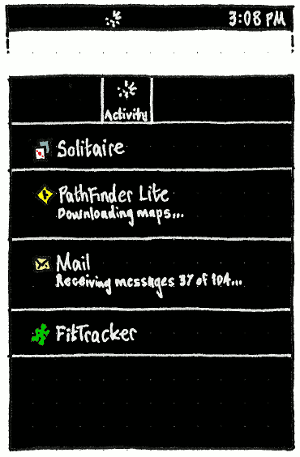
Therefore on the phone and tablet only, the network “Activity” indicator, a custom animated spinner, should be visible whenever any process has used the network in the past five seconds.
Initially, this indicator may not have a menu at all. When it does, the menu should list all apps that (a) have sent/received data — or (b) the download service has been doing a transfer on behalf of — in the past five seconds, most recent first, but updating only once every five seconds. Choosing an item in the menu should switch to that app, so that you can use the app’s own UI for cancelling/stopping/pausing the activity. (Or, as a last resort, force-close the app.)
If it has been sending/receiving data, an app should not have any choice about whether it appears in the menu. But for reassurance, an app should be able to specify a reason that it has been using the network. For example, “Loading high scores”, “Uploading 3 photos”, or “Checking the weather”. Whenever an app provides a reason, it should be displayed in small print below the app name, immediately followed by an ellipsis “…” — until the reason changes, or until it expires together with the app item as a whole.
TBD: Decide how to represent non-app processes in the menu, depending on which processes they are, and how often they use the network.
We considered listing download service transfers individually in an indicator menu like this one. Unfortunately, the number of transfers that would appear in the menu would often be very different from the number of transfers you’d expect to find there. There’d be more than you expected if a single task consisted of transferring dozens/hundreds of files. And fewer than you expected if an app couldn't/didn't use the Download Manager service, or if a server zipped multiple transfers into a single download for bandwidth reasons.
Network menu (all form factors)
People will usually open the Network menu when something is wrong with their Internet connection. The menu should let you see at a glance whether you are connected to the network, and if so how; switch quickly between likely connection methods; and access more detailed network information and settings.
Title
On the PC, the title of the menu should show the most unusual method by which the computer is currently connected to the Internet, or that it is not connected at all. So it should consist of an icon:
✈ the Flight Mode icon if the computer is in Flight Mode; otherwise
 the cellular icon with 1 to 5 bars for the current cellular signal strength, if there is one; otherwise
  the wired connection icon, if there is an active wired connection; otherwise
  an animated Wi-Fi icon, if Wi-Fi is connecting; otherwise
  the Wi-Fi icon with 1 to 4 arcs for the current Wi-Fi signal strength, if there is an active Wi-Fi connection; otherwise
  the cellular disconnected icon, if a cellular device is connected but has no network connection (because a PC needs to distinguish this state from “no mobile device connected”, which a phone doesn’t need to do); otherwise
  the Wi-Fi icon with 0 arcs, if Wi-Fi is on but there is no connection; otherwise
  the Wi-Fi off icon, if Wi-Fi is off; otherwise
  the wired disconnected icon, if there is a wired networking device but it is not detected; otherwise
 a red
 icon. (If the PC is air-gapped so that disconnection is the normal state, you will have “Show network status in the menu bar” turned off so that this icon doesn’t appear.)
The accessible name for the title should consist of the word “Network”, a space, and then bracketed text equivalent to the icon. For example, “Network (Flight Mode on)”, “Network (mobile, 1 bar)”, “Network (wireless, 70%)”, “Network (wired)”, “Network (mobile, disconnected)”, “Network (wireless, disconnected)”, or “Network (none)”, respectively.
On the phone, because there are more connection types, they are more variable, and the phone may be dual SIM, the title is more complex. It should consist of:
Flight Mode indication: ✈ the Flight Mode icon, if Flight Mode is on, otherwise nothing at all.
SIM status indication:
- the text “No SIM” if the phone has zero currently-usable SIMs; otherwise
- nothing at all, if the phone is in Flight Mode; otherwise
- the text “No service” if none of the phone’s SIMs are associated with a cellular network; otherwise
for each currently-usable SIM, its individual SIM status, in its color if there is more than one SIM.
the text “SIM locked” if it is locked; otherwise
- nothing at all if the modem is unregistered (because this is so brief, any specific indication would look flickery); otherwise
- “SIM error” if a SIM is present but otherwise unusable (for example, the phone is SIM-locked and this is the wrong one); otherwise
- “No network” if no cellular network has been chosen; otherwise
- “No signal” if there is not enough signal for the selected cellular network to be usable; otherwise
- from 1 to 5 bars (never 0 bars) for the call signal strength, if Wi-Fi is on; otherwise
- from 1 to 5 bars for the cellular data signal strength, if cellular data is on; otherwise
- from 1 to 5 bars for the call signal strength, if there is no current data connection.
 a roaming icon if the SIM is currently roaming; otherwise nothing at all.
And thirdly, if the SIM has cellular data turned on and there is no Wi-Fi connection:
- “3G” if the current data connection is 3G
- “EV” if it is EV-DO
- “H+” if it is HSPA+
- “L” if it is LTE
“E” if it is EDGE (up to 236 kbit/s)
 a tortoise if it is slower than EDGE, for example GPRS (up to 20 kbit/s) or 1xRTT (up to 153 kbit/s)
 “×” if it has no current data connection.
<<anchor(indicator-title-wifi)>> Finally, Wi-Fi status indication:
This algorithm needs to be complex to produce a simple and useful result: usually only one or two elements will appear at any time. Test cases:
- Turn on Flight Mode, then turn on Wi-Fi and connect to a network; the Flight Mode icon and Wi-Fi icon should both appear.
- Turn off Flight Mode, and have one SIM in the phone, associated with a carrier; only the call signal strength and Wi-Fi icon should be present.
- Turn off Wi-Fi; the Wi-Fi icon should be replaced by the cellular data type icon.
In System Settings, turn off cellular data; the data type icon should become the “×” icon.
Structure
On the PC, if the networking service cannot be found, is in the process of being restarted, or no networking devices are available (e.g. no Ethernet card or wireless card), the menu should contain only an insensitive “Networking not available” item (deliberately sentence case), a separator, and “Network Settings…”. (This should hardly ever happen.)
|
|
|
|
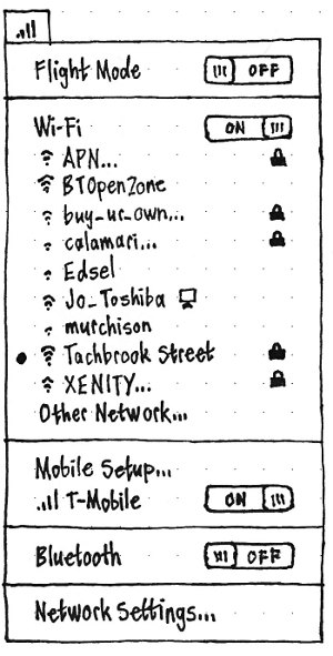
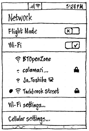
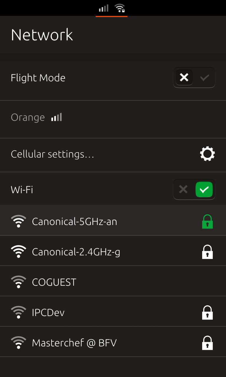
Otherwise, the menu should consist of some combination of sections, in order:
Flight Mode (absent by default on PC, always present on phone/tablet)
wired (absent by default)
Wi-Fi (present by default for each wi-fi card present)
cellular (present by default for each cellular device present)
Bluetooth (present by default for each Bluetooth device present)
VPNs (absent by default)
connection sharing (absent by default)
“Cellular Settings…” (present on any device with a SIM (bug 1252801), except at the login screen on PC)
- “Network Settings…” (always present, except at the login screen on PC).
Most of the time, only a few of these sections will appear — depending on what kinds of cards are fitted, what devices are connected, and other settings as specified later. On the PC, any two adjacent sections should have a separator between them, except that “Share Connection…” and “Network Settings…” should not have a separator between them.
On a device with a locked SIM, the “Network” menu should include an “Unlock SIM…” item immediately before “Cellular settings…”, and that item should be insensitive whenever the unlock UI is currently being shown. Regardless, when wi-fi is on, the menu should list wi-fi networks in the same way as the Wi-Fi screen of System Settings, without the “Other network…” item, and with an insensitive item “No networks detected” instead of the placeholder text.
Session variations
This is a summary only; the specifications of individual items are authoritative.
In the guest session, live session, and standalone installer session, the indicator and menu should be present as normal.
In the login screen, you should still be able to connect to networks so that you can use remote login. Therefore, the indicator and menu should be present as normal, but on the PC, any items that lead to System Settings should be insensitive.
When an app tries to use the Internet
(bug 1275761)
TBD
Connections
Flight Mode
Flight Mode is an easy way to turn off all radio functions in a hurry, for example when you are on a flight that requires this. But it is not draconian; for example if you are on a flight that offers Wi-Fi, you may turn on Wi-Fi individually, while Flight Mode continues ensuring that other connections are off.
When you turn on Flight Mode:
If a phone or Voip call is in progress, an alert should appear, “Turning on Flight Mode will end your call.”, with buttons “Cancel” and “End Call” (bug 1445580). The alert should close automatically if the call finishes by itself. Then, or if you choose “End Call” yourself, or if no call was in progress in the first place:
- If an upload or download is in progress, an alert should appear, “Turning on Flight Mode will stop all uploads and downloads.”, with buttons “Cancel” and “Stop”. The alert should close automatically if all transfers finish while it is open. Then, or if no transfers were in progress in the first place:
If you have a hotspot running, an alert should appear, “Turning on Flight Mode will disconnect any device connected to your hotspot.”, with buttons “Cancel” and “Disconnect”. Could we tell how many devices are currently connected? Then, or if no hotspot was running in the first place:
- All radio transmitting/receiving functions should turn off, including Wi-Fi, Bluetooth, GPS, and cellular connections.
While Flight Mode is on, you may individually turn Wi-Fi and/or Bluetooth back on again, leaving Flight Mode itself turned on.
When you turn off Flight Mode:
- Any transmitting/receiving functions that you changed, since Flight Mode was turned off, should remain as they are.
Any other transmitting/receiving functions should return to the state they were in immediately before Flight Mode was turned on (bug 1488170).
If a SIM PIN is set, the SIM PIN prompt should appear so that you can restore cellular connection.
Test case: Turn on Wi-Fi and Bluetooth. Start a phone call. Turn Flight Mode on; the alert should appear. Have the other party hang up; the alert should disappear, Flight Mode should turn on, and Wi-Fi and Bluetooth should both be off. Turn Wi-Fi back on; Flight Mode should remain on. Turn Wi-Fi back off again; nothing else should change. Turn Flight Mode off; Bluetooth should turn on but Wi-Fi should stay off.
Flight Mode in System Settings
|
|
Erratum: The item should be at the top of the pane, not the bottom.
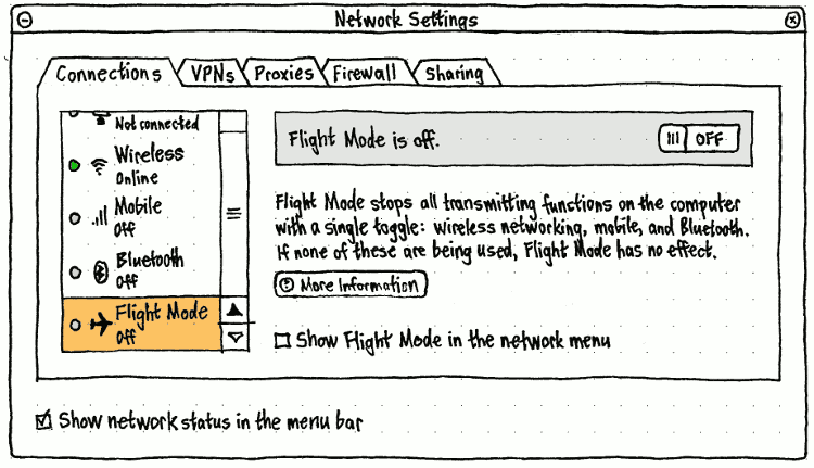
On the PC, at the top of the Network panel connection type pane should be a “Flight Mode” item, with a ✈ icon. The “Show Flight Mode in the network menu” checkbox should be insensitive whenever “Show network status in the menu bar” is unchecked.
On the phone and tablet, the quick access area should include a “Flight mode” switch, because it is the sort of setting you need to change quickly, and because it alters the state of settings in multiple category screens (and therefore does not belong in any of them alone). Its icon should represent the current Flight Mode state. Whenever you toggle Flight Mode in either direction, the icon should become a spinner until all connections have stopped or resumed as appropriate.
Flight Mode in the network menu
|
|
On the phone and tablet, and whenever “Show Flight Mode in the network menu” is checked on the PC, the network menu should begin with a “Flight Mode” toggle item followed by a separator.
Whenever Flight Mode is on, the title of the network menu should also be a ✈ icon.
Common behavior across connection types
PC: Connections in the PC “Network” panel

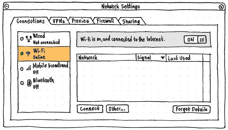
In the “Connections” tab, the device pane should list each device or card through which you could make a network connection. The items in the list should be, in this default order:
- If the machine has any Ethernet cards, one item for each Ethernet card.
- If the machine has any wireless cards, one item for each wireless card.
- If the machine has any connected mobile broadband devices, one item for each device.
- If the machine has any connected Bluetooth devices, one item for each Bluetooth device.
Each item in the list should have four elements:
- a colored bead icon representing whether the device’s state — powered off (grey), offline (red), connected but not on the Internet (yellow), or online (green);
- an icon representing the type of device (e.g. the Bluetooth icon);
- a label for the type of device (e.g. “Wired” or “Bluetooth”)
- a caption for the connection state — “Off”, “Not connected”, “Connected”, or “Online”.
The state icon and device type icon should both have empty “” accessible labels, because the same information is conveyed in the adjacent text.
The order of the items should determine in which order Ubuntu tries to use them, when turned on, to establish an Internet connection. Each item should be reorderable by dragging it (hinted at by switching to a drag cursor on mousedown), or by using Ctrl Up or Ctrl Down when the item is selected.
At the bottom of the panel should be a checkbox, “Prompt whenever a new connection requires Web login”, checked by default for new user accounts. Changing it from unchecked to checked state (even by unchecking it then re-checking it) should immediately check the current connection (fixing bug 1072675).
Connection progress in the network/wi-fi menu

While Ubuntu for PC is trying to establish any network connection, the title of the network menu should be a spinner. Similarly, while Ubuntu Phone is trying to establish a wi-fi connection, the wi-fi indicator should be an animated wi-fi icon.
In both cases, the item for that connection should have a spinner too. If the connection is successful, the latter spinner should be replaced by a radio mark or checkmark as appropriate.
Connecting to a captive portal
(bug 914507)
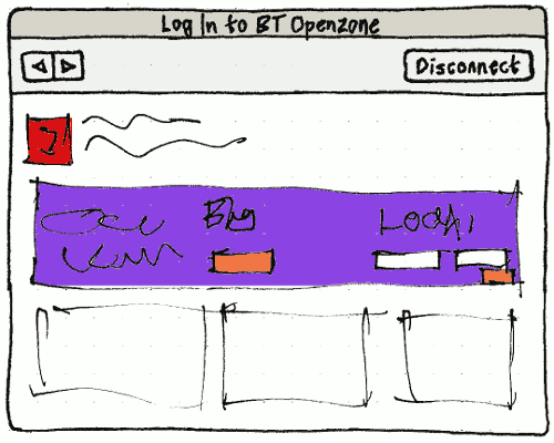
Whenever Ubuntu makes a new network connection, if “Prompt whenever a new connection requires Web login” is checked, it should perform HTTP and DNS checks that the connection is valid. If it is not, a “Log In to {connection name}” dialog (on PC) or full-screen dialog (on phone) should open with a Web frame for the login page.
In the dialog, the Back and Forward buttons should behave as for a Web browser. The connection check should run again five seconds after you navigate to each page in the dialog, or 30 seconds * 2n since the nth connection check while the dialog has been open, whichever is sooner.
The dialog should close if a connection check succeeds, if you choose “Disconnect” in the dialog itself, or if you disconnect anywhere else (such as from the menu).
<xnox> e.g. in the installer we already are doing connectivity check against a known document http://start.ubuntu.com/connectivity-check.html
<xnox> which should have md5sum 4589f42e1546aa47ca181e5d949d310b
<xnox> mpt: the most silly thing about captive portals, is that some of them don't require one to login at all - just open it & look at advertisement. E.g. Virgin WiFi on the underground, after the first login, simply auto-redirects you to a ad.
<xnox> So one can try opening any page in the background to see if it's enough to establish connection ;-)
...
<xnox> mpt: it's reasonable to try this hack without pooping anything up, and if it fails then poop up the OpenZone dialog.
<mpt> xnox, as in make two HTTP requests and discard the first?
<mpt> That could work.
<xnox> yeah.
Disconnection
If you stop any connection from software (e.g. by choosing “Disconnect” in the menu), no notification bubble should appear (fixing bug 345824).
If a connection ends in any other way, a notification bubble should appear with the icon of the connection, “Disconnected” as primary text, and the name of the connection as secondary text. If the end result is no active connections, the primary text should be “Disconnected — offline”.
Wi-Fi and hotspots
Summary: Wi-Fi networks are listed in the first-run setup, in System Settings (where you can reconfigure or reprioritize previously-used networks), and in the network menu. If Ubuntu does not connect to a previous network automatically, you can connect to a broadcast or hidden network from either of those places, or from a “Wi-Fi Available” dialog if Wi-Fi is on but you are not online. If connecting requires authentication details at any time, or when you are setting up or changing a hotspot, you are prompted for these details in a dialog too. Whenever any of those dialogs is involved, progress and success or failure is shown inside the dialog. If no dialog is involved, and the connection is not an automatic one to the previous network, connection success or failure is shown in a notification bubble instead.
Naming and listing Wi-Fi networks
Wi-Fi networks are listed in the first-run setup, System Settings, network menu, and the Wi-Fi suggestion prompt. They are also mentioned by name in notification bubbles and dialogs.
For consistency across all these sites, except where otherwise specified:
The network name should be the SSID, assumed to be UTF-8, with any line-break and direction-changing characters ignored.
The signal strength icon should be a Wi-Fi icon showing from one to four bars for any currently broadcast or connected network. A network that is neither broadcast nor connected should have no signal strength icon at all.
The signal strength accessible label should be “(Very weak)”, “(Weak)”, “(Moderate)”, “(Strong)”, or “(Not in range)”.
The network type icon should be a no-entry symbol if the network is known to be useless, otherwise a picture of a PC (a bit out of date with tethering) if the network is ad-hoc, otherwise nothing at all.
The network type accessible label should be “(Not a real network)” if the network is known to be useless, otherwise “(Ad-hoc)” or else nothing at all.
The network authentication icon should be a padlock if the network is encrypted, otherwise nothing at all.
The network authentication accessible label should be “(Encrypted)” or else nothing at all.
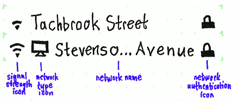
Wherever networks are listed, except where otherwise specified:
Each network’s visible label should consist of its signal strength icon, then its network type icon, then its network name (ellipsized in the middle if necessary), and at the trailing end of the space available, its network authentication icon.
Each network’s accessible label should consist of its network name (not ellipsized), then its network type accessible label, then its signal strength accessible label, then its network authentication accessible label. For example, “calamari (Ad-hoc) (Moderate) (Encrypted)”.
An ad-hoc network known to be useless (for example, “Free Public WiFi”) should be insensitive.
- The list should be sorted with the currently-connected network first, if any, then all others alphabetically by network name.
Wi-Fi in “Network” settings (PC)
|
System Settings “Network” screen “Connections” tab should have a list item for each Wi-Fi card. In the usual case where there is only one, it should be labelled “Wi-Fi”. In the rare case that there are two or more, they should be labelled “Wi-Fi ({kernel ID})”, e.g. “Wi-Fi (wl0)”.
Each network detectable by the selected Wi-Fi card should be listed in the standard format, except that signal strength should be in its own “Signal” column, and there should be an extra “Last used” column, giving the time (if today) or date (if not today) that the PC most recently connected (manually or automatically) to that network.
The networks should be listed in the usual way, except that by default, they should be sorted most recently used first. Test case: From System Settings, connect to a network other than the most recent one; as soon as it connects, it should move to the top of the list.
Whenever the selected network requires authentication details that aren’t already stored, the “Connect” button should be “Connect…”, without the button changing width.
TBD: Include “Connect automatically”, “Prompt when not connected”, and reordering for parity with the phone.
At the bottom of the panel for each card should be a checkbox, “Let other users connect to these networks automatically”, checked by default.
“Wi-Fi” settings (phone)
|
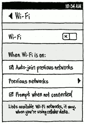
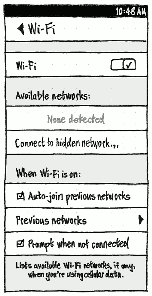
Regardless of whether Wi-Fi is on, the System Settings “Wi-Fi” screen should contain a “Wi-Fi” switch, and “When Wi-Fi is on:” section with “Auto-join previous networks” checkbox (bug 1477087), “Previous networks” item, and “Prompt when not connected” checkbox (bug 1287210).
Whenever “Wi-Fi” is on and “Auto-join previous networks” is checked, Ubuntu should connect automatically to any remembered network when it is available. If you are disconnected and a scan shows more than one remembered network available, Ubuntu should prefer the one that has higher priority in the “Previous Networks” list.
Whenever “Auto-join previous networks” is unchecked, Ubuntu should connect to a Wi-Fi network only if you explicitly choose it. For example, if you are disconnected, you should not be connected automatically to another remembered network. (This is so that, for example, you can be sure you are doing work on a work network, and not the network of a nearby coffeeshop or the hotel where you’re staying.)
|
|
|
Erratum: “Disconnect” should be “Forget This Network”. |
Whenever Wi-Fi is on but no network is connected, next should be a list of “Available networks:”, or the placeholder text “None detected” if there are none. Networks should be listed in the usual way, except that for any network requiring authentication details that are not currently stored, its name should end in an ellipsis (because connecting to it will require further input).
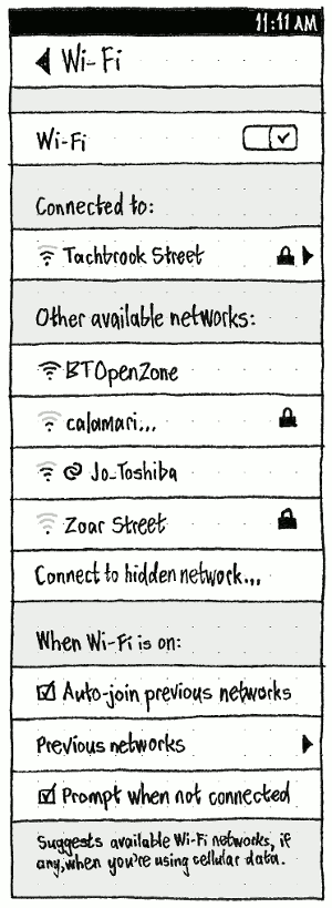
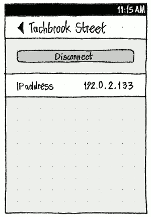
Whenever Wi-Fi is on and a network is connected, “Available networks:” should instead be “Other available networks:”, because it should be preceded by a “Connected to:” section listing the connected network. Unlike the items for selecting a different network, this should be a page stack item. Choosing it should navigate to a screen with the network name as its header, a “Forget This Network” button (which automatically navigates you back to the “Wi-Fi” screen), and an item with a copyable IP address. (In future this screen might also allow entering a static IP address, bug 1445772, and contain router and DNS information.)
Choosing a network from “Available networks:”/“Other available networks:” should attempt to connect to it. And regardless of whether any other networks are detected, the list should end with a “Connect to hidden network…” item, which opens the “Connect to Hidden Network” dialog.
“Previous Networks”
|
|
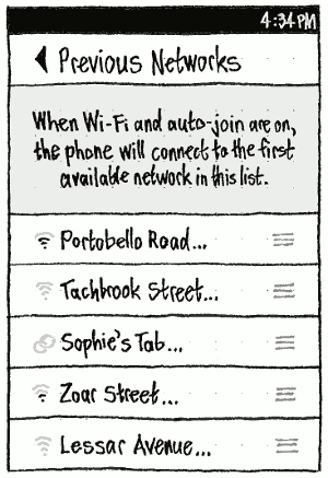
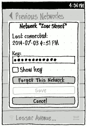
The “Previous Networks” screen should list all remembered currently or previously-used Wi-Fi networks (or “No remembered networks” in placeholder style if there are none), in the usual way except that they should be sorted in the order in which they would be chosen. (Unlike every other list of Wi-Fi networks, in this list most of the networks will usually show zero bars of signal, because they are not active nearby.) When reprioritization of networks has been implemented in NetworkManager (bug 1245986), pressing on a network should make it draggable so that you can reorder the list (bug 1538972).
Tapping a network should open the dialog for its details, a variation of the standard Wi-Fi network dialog.
If Ubuntu is currently connected to the network, “Forget This Network” should also disconnect from it.
If editing authentication details has not yet been implemented, the “Save” button should not be present at all, and the authentication fields should be insensitive, but “Show password” should still be sensitive, so that you can still look up a stored password you have forgotten. If editing authentication details has been implemented, “Save” should be sensitive whenever the current values are different from the stored ones.
Wi-Fi in the network menu
|
|
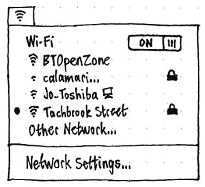
Regardless of form factor, the network menu should have a section for each Wi-Fi card present. (Most devices have exactly one Wi-Fi card.) The section should consist of:
A toggle item for powering the card on and off. As with the Network Settings, in the usual case where there is only one wireless card, this item’s label should be simply “Wi-Fi”. In the rare case where there is more than one wireless card, it should be “Wi-Fi X”, where X = the kernel ID for the card, for example “Wi-Fi wl0”.
If the card is powered on, up to 6 (phone) or 20 (PC) radio items (bug 1322490) representing known Wi-Fi networks:
- up to one item representing the network this card is connected to (or currently trying to connect to), if any;
- the strongest of the currently-detected networks that this card has previously connected to, if any;
- if any slots remain, the strongest of the other broadcast networks currently detected.
The networks should be listed in the usual way, except that a network should have a radio mark if the card is connected to this network, or a spinner if it is currently trying to connect.
An “Other Network…” item that opens the “Connect to Wi-Fi Network” dialog. If the card does not currently detect any other broadcast networks, the name of the item should instead be “Hidden Network…”. If more broadcast networks have been detected than are shown in the menu, the item text should end with a count of all detected networks in brackets, e.g. “Other Network… (11 detected)”.
Suggesting that you connect to Wi-Fi
(bug 1287210)
A prompt should appear, suggesting that you connect to Wi-Fi, if all of these conditions are true:
- “Prompt when not connected” is checked
- you are not connected to the Internet, or you are connected using cellular data
- Wi-Fi is on
- Wi-Fi networks are available
- The “Wi-Fi” (phone/tablet) or “Network” (PC) panel of System Settings is not currently focused (which would make the prompt redundant)
you are on a PC, or a phone/tablet app tries to use the Internet
- Since you last dismissed the prompt (if ever), either:
- you turned Wi-Fi on, or
- at least one hour has passed, or
- the device has slept.
Test case: Turn on “Prompt when not connected”. Leave/close System Settings. Turn Wi-Fi off. Go to an area where Wi-Fi networks are available. Turn Wi-Fi on; the prompt should appear.
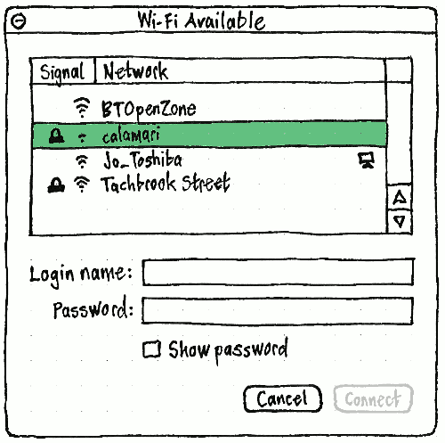
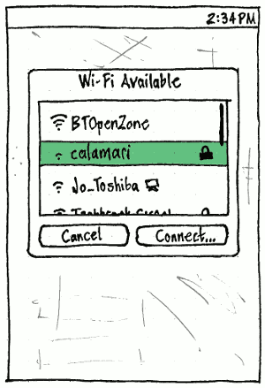
Available networks should be listed in the usual way.
As in System Settings, whenever the selected network is one requiring authentication details that aren’t already stored, the “Connect” button should be “Connect…”, without changing width.
Whenever the selected network does not require new authentiction details (either because it’s an open network, or because details are already stored), connection progress and confirmation should be shown in the dialog.
Entering Wi-Fi network details
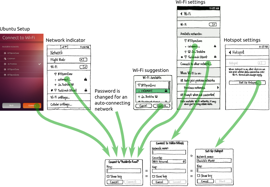
You may need to enter Wi-Fi network details when connecting to a network from from a variety of entry points, including the installer, Ubuntu Touch setup, System Settings, the network menu (PC) or Wi-Fi menu (phone), or the Wi-Fi connection prompt. You may also be prompted to authenticate when an automatic connection fails because the authentication details no longer work (for example, the shared password has changed). Rarely, you may want to change authentication details for a network you are not currently connected to (“Previous networks”), for example when you receive new details over the phone or by secure e-mail. And setting up a hotspot also involves entering network details, this time for a network you are creating.
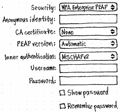
It is often tempting to design custom UI for each of these individual entry points. But that has several disadvantages. First, it reduces consistency between the entry points. Second, it reduces consistency between entering authentication details for a broadcast network and a hidden one, if the entry point even gets around to allowing this at all (for example bug 833312). And third, individual entry points often do not have room for showing all the necessary authentication controls: for example, PEAP authentication requires fields for outer identity, CA certificate, user name, and password, as well as the ability to reveal the typed password. And inside an indicator menu in particular is an impractical place to select a CA certificate, user certificate, or private key, to show connection progress, and to respond if authentication fails.
Therefore, the UI for entering Wi-Fi network details should always be a dialog — regardless of entry point, regardless of whether the network is broadcast or hidden, and regardless of whether you are trying to connect to the network for the first time, correcting details to try a subsequent time, changing details for a previous network, or setting up a hotspot.
Connecting to a broadcast Wi-Fi network
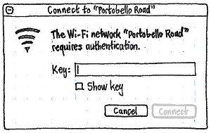
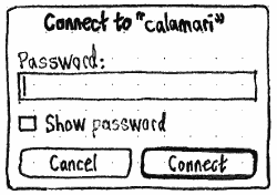
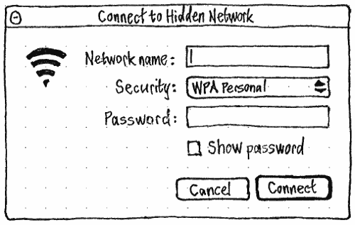
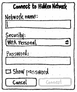
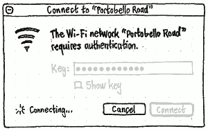
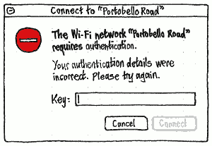
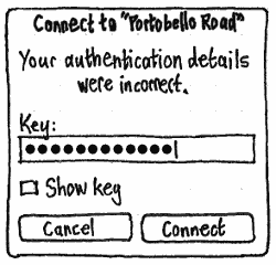
On both PC and phone, the dialog should have title “Connect to {network name}”, “Connect to Hidden Network”, or “{network name} Network Details” for a previous network. In the first two cases it should have buttons “Cancel” and “Connect”; for a previous network, “Forget This Network”, “Cancel”, and “Save”. On the PC, the dialog should have the Wi-Fi icon, and for a broadcast network, the primary text ‘The Wi-Fi network “{network name}” requires authentication.’.
|
|
“Connect” should be insensitive whenever the authentication values are not valid according to the authentication method. |
If the network stops being available while the dialog is still open — for example, if the network is no longer in range, or if you turn off Wi-Fi or turn on Flight Mode — the commit buttons should be replaced by the centered text “Network no longer available”, all the dialog’s controls should become insensitive, and two seconds later, the dialog should close (bug 1407907).
Connecting to a hidden Wi-Fi network
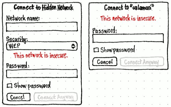
Sometimes a Wi-Fi network does not broadcast its availability, so you need to enter its name manually as well as specifying the security type. This is handled by a “Connect to Hidden Network” dialog — the same as the dialog for authenticating to a normal broadcast network, but with at least two extra controls, “Network name:” and “Wi-Fi security:”.
|
|
“Network name:” should be a verbatim field.
If Ubuntu is confident about which security type the selected network uses, the label for that type should end with “(detected)”, and it should be selected automatically as soon as you type or select that network, while still letting you override it. Otherwise, the default should be “WPA Personal”, since that is most common.

Whenever a “Wi-Fi security:” type is chosen — either automatically or manually — the dialog should morph to show the authentication controls relevant to that type, replacing any authentication controls relevant to the previously chosen type (without forgetting any values you had typed into them, just in case you change back).
Connection progress and confirmation should be shown in the dialog. If authentication fails, the first authentication field (e.g. “Password:”) should be focused and have error highlight. If there is any other error, the “Network name:” field should be focused and have error highlight.
Authentication variations, certificates, and PAC files
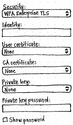
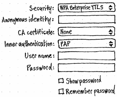
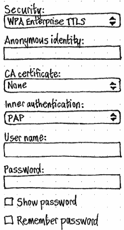
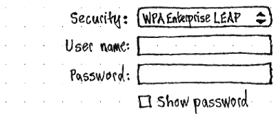
In both the ‘Connect to “{network name}”’ and “Connect to Hidden Network” dialogs, the contents of the dialog, and the behavior of the “Connect” button, should vary depending on the security and authentication methods.
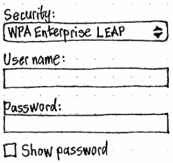
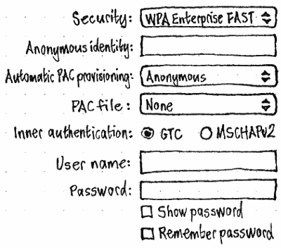
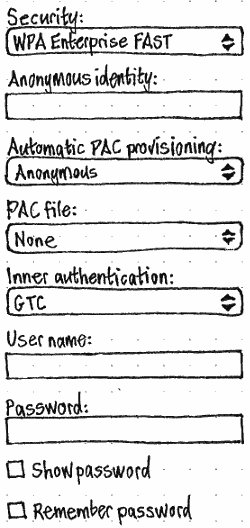
To simplify the dialog, the various security methods (None, WPA Personal, WPA Enterprise, and so on), and the various WPA Enterprise authentication methods (TLS, Tunnelled TLS, LEAP, and so on), should be collapsed into a single “Security:” menu. So it should contain, in order, whichever of these is implemented:
- “None”
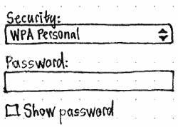
- “WPA Personal”
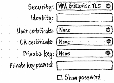
- “WPA Enterprise TLS”
- “WPA Enterprise TTLS”
- “WPA Enterprise LEAP”
- “WPA Enterprise FAST”
- “WPA Enterprise PEAP”
- “WEP”
- “Dynamic WEP”
- “LEAP”
Therefore, the “Security:” menu should be included in the dialog if (a) you choose “Connect to Hidden Network”, (b) Ubuntu can’t tell what security method the selected network uses, or (c) the selected network uses WPA Enterprise and Ubuntu can’t tell what authentication method the selected network uses. In the last case, the menu should contain only the WPA Enterprise authentication methods, not the other items.
Several of the methods involve selecting one or two certificates, TLS involves selecting a private key file, and FAST involves selecting a PAC file. These certificates/keys/files are accessible from the “Certificates & Keys” screen.
Authentication type |
Screen width > 50 GU |
Screen width ≤ 50 GU |
|
None |
There should be no extra controls. |
||
WPA Personal |
|
|
|
“Connect” should be insensitive whenever the “Password:” field contains fewer than 8 characters, more than 64 characters, or exactly 64 characters where any of them are not hexadecimal. Whenever there are exactly 64 characters, any non-hexadecimal characters should be highlighted in the error color. |
|||
WPA Enterprise (bug 1241986) |
|||
TLS |
|
|
|
The “User certificate:”, “CA Certificate:”, and “Private key:” menus should each contain “None”, a separator, the titles of any saved files of that type (ellipsized in the middle if necessary), another separator if there are any, and finally “Choose…”, which opens a picker to select a file of that type from elsewhere. |
|||
TTLS |
|
|
|
LEAP |
|
|
|
FAST |
|
|
|
The “Automatic PAC provisioning:” menu should contain “None”, “Anonymous”, “Authenticated”, and “Both”. The “PAC file:” menu should contain “None”, a separator, the titles of any saved PAC files (ellipsized in the middle if necessary), another separator if there are any, and finally “Choose…”, which opens a picker to select a PAC file from elsewhere. |
|||
PEAP |
|
|
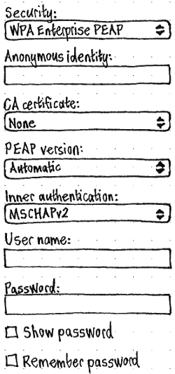
|
WEP |
|
||
On PC, the icon should be overlaid with a warning emblem, the primary text should be ‘The Wi-Fi network “{name of network}” uses WEP, which is insecure. Are you sure you want to connect?’, and there should be secondary text should be “Data sent or received may be intercepted in transit.”. On phone, there should be body text, “This network is insecure.”. And on both PC and phone, “Connect” should be “Connect Anyway”. “Connect Anyway” should be insensitive whenever the “Password:” field does not contain 5 or 10 Ascii characters, or 13 or 26 hexadecimal characters (bug 1091391). The error color should be used to highlight any non-Ascii characters regardless of length, and any non-hexadecimal characters whenever there are 12 or more characters (such that you’re more likely to be aiming for 13 or 26 than for 5 or 10). |
|||
Hotspot setup
(bug 1421583)
Using your phone as a hotspot is handled in System Settings, with one screen and one dialog that has two variations.
![]() not possible
not possible ![]() defined
defined ![]() undefined
undefined
Function |
Phone |
Tablet |
PC |
set up a hotspot for the first time |
|
|
|
turn on previously configured hotspot |
|
|
|
know whether anyone is connected |
|
|
|
turn off hotspot |
|
|
|
change hotspot name/password |
|
|
|
learn how to connect to the hotspot |
|
|
|
On the System Settings main screen, the “Hotspot” icon should have a cross if the hotspot is off and a checkmark if it is on.
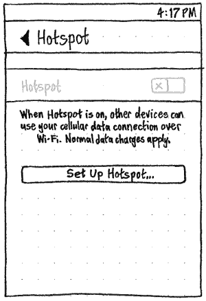
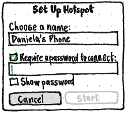
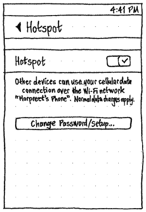
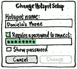
|
When no hotspot settings are stored: |
When hotspot settings are stored: |
The “Hotspot” switch should be: |
both off and insensitive |
sensitive |
The button should be: |
Set Up Hotspot… |
Change Password/Setup… |
The button should lead to a dialog titled: |
Set Up Hotspot |
Change Hotspot Setup |
The dialog should be pre-filled with: |
“Choose a name:” defaulting to the device name, and no password |
the current hotspot details, with the existing password pre-selected for replacement |
The dialog’s main commit button should be: |
Start |
Change |
In both variations, the hotspot name field should not allow more than 32 characters, and the password field and “Show password” checkbox should be sensitive only when “Require a password to connect:” is checked (bug 1431876).
The main commit button should be insensitive when any of the following are true:
- the “Choose a name:”/“Hotspot name:” field is empty; or
- “Require a password to connect:” is checked, but the password field contains fewer than 8 characters, more than 64 characters, or exactly 64 characters where any of them are not hexadecimal.
- this is the “Change Hotspot Setup” dialog, but none of the details have been changed.
(Much of this behavior is shared with the “Connect to Hidden Network” dialog.)
Choosing “Start” should turn on the hotspot immediately (because you probably wouldn’t be setting it up unless you wanted to use it right now), but choosing “Change” should leave the hotspot off if it was off already.
Starting or changing a running hotspot takes a few seconds. Therefore, when you choose “Start”, or choose “Change” when the hotspot is on, progress and confirmation should be shown in the dialog, just as it is for a normal Wi-Fi connection.
When Hotspot is off, the switch caption should be: “When Hotspot is on, other devices can use your cellular data connection over Wi-Fi. Normal data charges apply.” When it is on, the caption should be: ‘Other devices can use your cellular data connection over the Wi-Fi network “{network name}”. Normal data charges apply. {name of this device} stays awake when the hotspot is in use.’
As indicated by that last caption, a hotspot works only when the device is awake. Therefore (bug 1458046):
- Whenever at least one person is using your hotspot, the device should not sleep automatically.
- The indicator icon should be different when anyone is connected than when no-one is.
If a hotspot is set up, there should be a “Hotspot” item in the “Ways to reduce battery use” list in “Power” settings. Unlike the item in the “Cellular” settings, this item should be just a switch.

A hotspot requires exclusive use of your Wi-Fi connection. Therefore:
- If you choose “Set Up Hotspot…” when Wi-Fi is off, the “Set Up Hotspot” dialog should have extra text above the buttons: “Starting the hotspot will turn on Wi-Fi.”.
If you turn on an already-configured hotspot when Wi-Fi is off, a “Start Hotspot” dialog should appear, with the same body text — “Starting the hotspot will turn on Wi-Fi.” — and “Cancel” and “Start” buttons (part of bug 1459701).
Whenever Hotspot is on, wherever Wi-Fi networks are listed, no networks should be shown (bug 1478160).
To warn you that turning off Wi-Fi will turn off the hotspot, whenever Hotspot is on, the “Wi-Fi” switch wherever it appears (in the quick-access area, in the “Wi-Fi” screen, and in the network menu) should instead be “Wi-Fi used for hotspot”.
Whenever Hotspot is on, turning on Flight Mode should warn that it will turn off Hotspot.
If Wi-Fi was turned on automatically for hotspot use, turning off the hotspot should turn off Wi-Fi automatically (bug 1512840).
Progress, errors, and confirmation for Wi-Fi connection or hotspot setup
Whenever Ubuntu is trying to connect to a Wi-Fi network, automatically or manually, or set up a hotspot, the wi-fi component of the network indicator title should be an animated wi-fi icon.
Whenever Ubuntu successfully connects automatically, to the same network as it was connected to previously, this is not a surprise. Most likely it is your home network, office network, or network of somewhere you left briefly. In this case, any notification — beyond the status bar icon changing to show the signal — would be redundant and annoying.
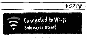

But whenever Ubuntu connects automatically to a network different from the one you were last connected to, this may be a surprise. For example, it may be a result of your usual network failing, and you may wish to investigate. Therefore, an ephemeral notification bubble should appear. It should have a a Wi-Fi icon showing the signal strength, primary text “Connected to Wi-Fi”, and secondary text the name of the network.
Whenever Ubuntu connects manually to a network, or sets up a hotspot, it is the result of an action in a dialog: “Wi-Fi Available”, “Connect to {network name}”, “Connect to Hidden Network”, “Set Up Hotspot”, or “Change Hotspot Setup”. To minimize modes and maximize visual stability, connection/setup progress and confirmation should be shown inside the same dialog, as follows.
|
|
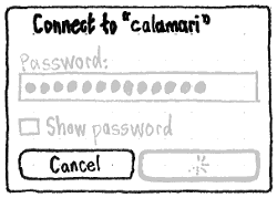
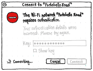
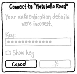
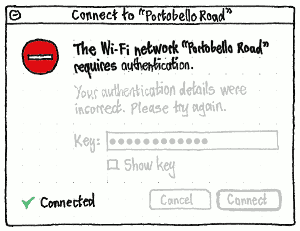
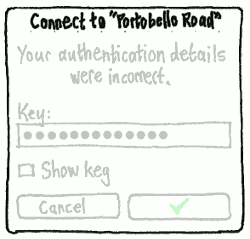
For any connection that involves a dialog, when you choose the commit action, the dialog should remain open to show connection/setup progress. All the controls except “Cancel” (if the connection is cancellable) should become insensitive, and a spinner should appear. On PC, the spinner should accompany a caption “Connecting…” in the corner. On the phone, it should replace the label of the button itself. |
↓ |
↓ |
|
|
|
If connection authentication fails, the dialog should open if was not open already. On PC, it should have secondary text “Your authentication details were incorrect. Please try again.”. On phone, it should have body text “Your authentication details were incorrect.” |
↓ |
↓ |
|
|
|
If you retry, the error dialog should show connection progress just like the normal authentication dialog does. In addition to the “Connect” button being insensitive, the error text on PC should also be insensitive, because it is probably no longer true. |
↓ |
↓ |
|
|
|
When connection/setup succeeds, “Cancel” should become insensitive (if it wasn’t already), the spinner should change to a checkmark, and on PC, the text “Connecting…” should change to “Connected”. After two seconds, the dialog should disappear. |
Cancelling a connection
If you cancel a Wi-Fi connection at any point, Ubuntu should resume its previous connection state — whether that was connected to another network, or to no network at all.
Wi-Fi network properties
Settings for a wireless connection:
- IPv4 mode: DHCP (Renew DHCP Lease) or Manual
- network settings (with DHCP, all are automatic but overridable)
- Name servers (zero or more, but without one you can't use domain names)
- Domains (zero or more, e.g. "millbank")
- IPv4 address
- IPv4 netmask
- IPv4 gateway
- (IPv6: not implemented yet)
- passphrase
- autoconnect
- enabled/disabled
- nameservers
- list of servers, in priority order
- if empty, automatic servers used
- domains
- list of domain names
- if empty, automatic domains used
- ipv4
- method:
- dhcp
- manual
- address
- netmask
- gateway
- off
- method:
- ipv6
- method:
- dhcp
- manual
- address
- netmask
- gateway
- off
- method:
- proxy
- method:
- direct
- auto
- url (if empty wpad is used)
- manual
- servers
- excludes
- method:
Wired connections
Connecting to a wired network, in general
When Ubuntu tries to connect to a wireless network, in addition to the standard connection feedback:
If connection is successful, a notification bubble should appear, with a wired icon, primary text “Connected”, and secondary text the connection name e.g. “Wired connection 2”.
Wired devices in System Settings “Network”
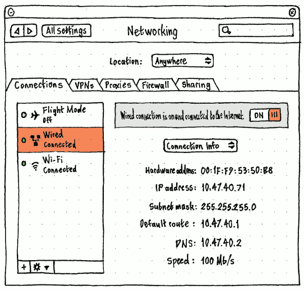
Wired section of the network status menu
|
If the computer has any Ethernet cards, the menu should begin with a wired section. This section should consist of a toggle item for each wireless card, where toggling the item controls both whether it is powered on and being used.
In the usual case where there is only one Ethernet card, its label should be simply “Wired Connection”. In the rare case where there is more than one Ethernet card, the label for each should be “Wired Connection N”, where N = the kernel ID for the card, e.g. “Wired Connection eth1”. If there is no link (e.g. the cable is unplugged), the item should be disabled but not hidden.
We may need to distinguish between {power off, power on but not connected, connected}.
Wired network properties
- autoconnect
- enabled/disabled
- nameservers
- list of servers, in priority order
- if empty, automatic servers used
- domains
- list of domain names
- if empty, automatic domains used
- ipv4
- method:
- dhcp
- manual
- address
- netmask
- gateway
- off
- method:
- ipv6
- method:
- dhcp
- manual
- address
- netmask
- gateway
- off
- method:
- proxy
- method:
- direct
- auto
- url (if empty wpad is used)
- manual
- servers
- excludes
- method:
Cellular connections
SIM identifier

A cellular device on a PC, and a SIM slot on a phone, is interesting only if it contains a SIM. When there are multiple SIMs, they should be distinguished to users using a SIM identifier that has two segments with a space between them: for example, “Slot A (01632123456)” or “SIM 2 (310150123456789)”.
- On a phone, the first segment should be customizable by the hardware vendor, for example “Front Slot” and “Rear Slot”. If it has not been customized, it should be “SIM 1”, “SIM 2”, etc.
The second segment should be in brackets: the phone number, if it is available, otherwise the IMSI.
“Cellular” settings
![]()
“Cellular” settings should be present whenever the device contains cellular hardware (bug 1258210), even if a SIM is not detected. If the device has at least one SIM slot, “Cellular” should be at the top level of System Settings; otherwise it should be an item in the “Network” panel.
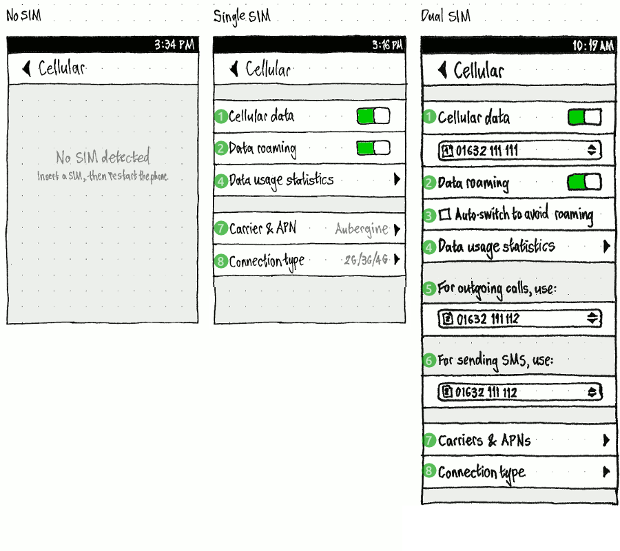
If no SIM is detected, the screen should contain only the placeholder text “No SIM detected”, with caption “Insert a SIM, then restart the phone.”.
On a dual-SIM phone, the “Cellular data” switch (1) should be followed by a radio menu for choosing which SIM is used for data. After first setup and SIM unlock prompt (if any), this setting should be set by default to the only unlocked SIM if there is only one, otherwise the only 4G SIM if there is only one, otherwise the only 3G SIM if there is only one, otherwise the first SIM (bug 1379412).
“Data roaming” (2) should be both off and insensitive whenever cellular data is off. When cellular data is on, “Data roaming” should become sensitive and return to its previous value.
When “Auto-switch to avoid roaming” (3) is implemented, it should be present only when there are two SIMs. Whenever (a) it is checked, (b) a roaming SIM is using cellular data, and (c) another SIM is not roaming, the non-roaming SIM should take over cellular data automatically, and the roaming SIM should become insensitive in the list so that you can’t re-select it. (If you want to override it, you need to uncheck “Auto-switch to avoid roaming” first, otherwise it wouldn’t be clear when it should revert or why it wasn’t.)
“Data usage statistics” (4) should navigate to the “Data usage” screen.
The “For outgoing calls, use:” (5) and “For sending SMS, use:” (6) radio menus should be present only when there are two SIMs.
“Carrier & APN”/“Carriers & APNs” (7) should navigate to the “Carrier & APN”/“Carriers & APNs” screen.
“Connection type:” (8) should be available even if cellular data is off, and should navigate to the “Connection type” screen.
In Flight Mode, “Cellular data” and “Data roaming” should be both off and disabled, returning to their previous state and value whenever Flight Mode is turned off (bug 1508910).
“Data Usage“
Single SIM |
Dual SIM |
|
|
(bug 1287267)
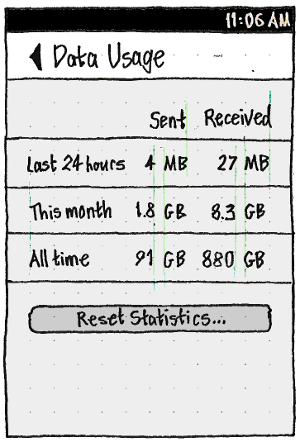
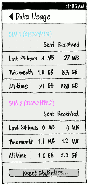
“Data usage statistics” should navigate to a “Data Usage” screen. If the phone has a single SIM, the screen should have one section. If it is dual SIM, the screen should have two sections, with the SIM ID as its header.
“Reset Statistics…” should display an alert with the text “All data usage statistics will be set to zero.”, and “Cancel” and “Reset” buttons.
“Carrier”/“Carriers”
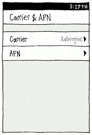
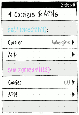
The “Cellular” settings screen should include an item labelled “Carrier & APN” item when the phone has a single SIM card, or “Carriers & APNs” when it has multiple SIM cards. When no SIM cards are present, the item should not be present at all.
Single SIM: |
|
|
|
Dual SIM: |
|
|
|
With a single SIM, the “Carrier & APN” should contain only a “Carrier” item, with the name of the current carrier (or “No carrier” otherwise) as its summary value, and an “APN” item. With multiple SIMs, the “Carriers & APNs” screen should have a section like that for each SIM, each section introduced by an introductory label consisting of the SIM ID followed by a colon.
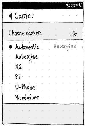
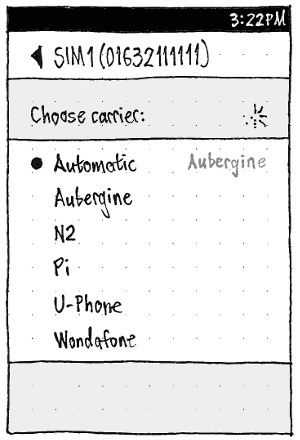
If the SIM does not allow manual carrier selection, the “Carrier” item should be insensitive (bug 1343291). If the SIM does allow manual carrier selection, the item should instead be a page stack item that navigates to a separate screen, titled “Carrier” if there is a single SIM, or the SIM ID if there are multiple SIMs.
Entering this screen should be the way of triggering a scan for carriers (and exiting the screen should stop the scan). To convey this, as long as the scan is in progress, a spinner should appear opposite the “Choose carrier:” label. The radio list of carriers should consist of “Automatic”, followed by an alphabetical list of whichever usable carriers have been found so far. Should we show the signal strength of each?
If you choose a different carrier, the radio mark preceding the previous carrier (if any) should be replaced by a spinner preceding the newly-selected carrier (as in menu layout), and the amount of time the registration has taken so far should be shown at the trailing end in the form “M:SS”. If registration succeeds, that duration should disappear, and the newly-selected carrier should gain its radio mark. If registration fails, the list should revert to its previous display, and an alert should appear with the title “Error”, text “Registration failed. Try again later, or contact the carrier.”, and an “OK” button (bug 1211808).
“APN”
APN (Access Point Name) settings are a group of settings that, combined, let the phone communicate a particular type of data: MMS messages, voice over LTE (if available), or other Internet traffic. For each of these, all the settings need to be correct: the APN itself, a user name, and a password (though sometimes the last two are blank), and for MMS messages, also MMSC, proxy, and proxy port.
Ubuntu uses a database of known APN settings for carriers. Ubuntu can tell which carrier you are using, so in most cases the APN settings are filled in automatically (“provisioned”). If you need to alter APN settings at all, it is because:
you are using an MVNO (mobile virtual network operator);
- the database has multiple settings for different data plans for the same data type, for example pre-paid vs. contract, so you need to choose between them;
- the settings in the database are out of date;
- the database contains settings for some data types but not others; or
- the database does not have settings for your carrier at all.
In some cases, the Internet and LTE settings are the same, and/or the common MMS settings are the same. So if you need to enter settings manually, it is helpful to try the settings for one data type with the others to see if they work. (Android handles this by having you set up “an APN” and then choosing which data types to use it with, but this is needlessly complex for just three data types.)
|
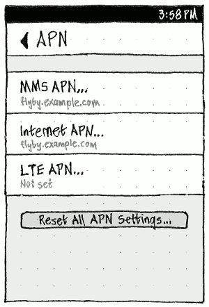
The main “APN” screen should always have three items: “MMS APN…”, “Internet APN…”, and “LTE APN…” (bug 1435360). Each item should have, as its summary value, the carrier= value for those settings if they are present in the APN database (e.g. “Digi.Mobil” or “Jazztel MMS”), otherwise the APN value itself if set (e.g. “internet” or “jazzmms”), otherwise “Not set”. Choosing an item should open the corresponding dialog for showing and/or editing the current settings (bug 1388222, bug 1433357).
|
“Reset All APN Settings…” should open an alert, “Are you sure you want to reset all APN settings?”, with “Cancel” and “Reset” buttons. Choosing “Reset” should clear any custom APN settings, and trigger Ubuntu to auto-detect the settings for all data types.
Whenever Ubuntu is attempting to auto-detect the APN for one or more data types — whether because (a) you have just changed a SIM, (b) you have just activated an Internet APN that might work for LTE as well, (c) you have just started using the phone, or (d) you have just chosen “Reset All APN Settings…” — a spinner should appear below that button. In the last two cases (c) (d), the button should also be insensitive until the auto-detection has completed. (If auto-detection is not successful for one or more data types, they will end up as “Not set”.)
|
|
|
Erratum: “Activate” should be “OK”.
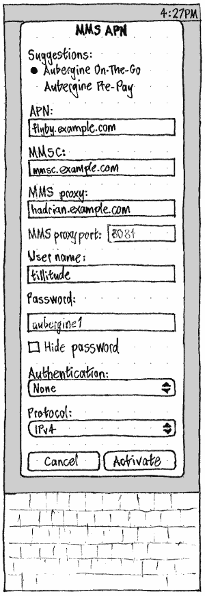
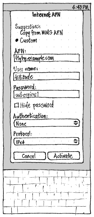
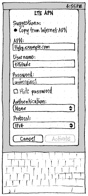
The controls in the dialog for each data type should be identical, except that:
- “MMS APN” should include fields for “MMSC:”, “MMS proxy:”, and “MMS proxy port:”.
“MMSC:” should be an URL field (using the URL OSK and ignoring non-URL characters), auto-inserting http:// on unfocus if no protocol was entered.
- In the “MMS proxy” field, typing “:” in the domain should not enter that character, but should automatically navigate to the “MMS proxy port” field.
- “MMS proxy port” should be a whole number field (using the number OSK and ignoring non-digit characters). In addition, if you paste a colon-delimited proxy:port combination into the “MMS proxy” field, the colon and port number should be stripped, and the port number should instead replace the existing contents of the “MMS proxy port” field.
“Internet APN” should include the suggestion “Copy from MMS APN” (bug 1433357).
- “LTE APN” should include the sugggestion “Copy from Internet APN”.
If the APN database contains one or more entries for the data type with the carrier, they should come first in the list of suggestions, followed by any “Copy from…” item. Selecting a suggestion should update all the fields accordingly. When (and only when) you have changed the contents of any individual fields, a “Custom” item should appear at the end of the list, and should become the checked item, showing that none of the other suggestions are in effect (bug 1399248).
The “APN:” field should allow only letters A~Z and a~z, digits 0~9, hyphens, and non-consecutive periods [3GPP TS 23.003]; any other characters (such as spaces or commas) should be ignored when typing and stripped when pasting.
Since APN passwords are seldom secret, “Password:” fields should reveal text by default, indicated by the fact that “Hide password” below the field is unchecked.
The “Authentication” menu, once implemented, should contain “None” (the default), “PAP or CHAP”, “PAP only”, and “CHAP only”.
The “Protocol” menu, present once IPv6 has been implemented, should contain “IPv4”, “IPv6”, and “IPv4v6”.


“OK” should be sensitive only when all fields have valid values and at least one of them is different from when the dialog opened.
If it is not possible to activate the APN immediately — because you are in Flight Mode, you are out of range, or (for Internet APN settings) you are connected to Wi-Fi instead — tapping “OK” should save the settings and wait to activate the APN when it is next needed, reporting any error then (bug 1275761).
Otherwise, however, to make errors easy to discover and fix, APN activation should be attempted as soon as you tap “OK”. Progress and success/failure feedback should be shown in the same way as connecting to Wi-Fi. Everything in the dialog except for “Cancel” should become insensitive, and the “OK” text should change to a spinner until activation completes. If it succeeds, “Cancel” should become insensitive, and the spinner should change to a checkmark for two seconds before the dialog closes. If it fails, the spinner should revert to “OK”, the dialog contents should become sensitive again, and the dialog contents should scroll to the top to reveal the error text “APN activation failed.”
“Connection type”
(bug 1379850)
|
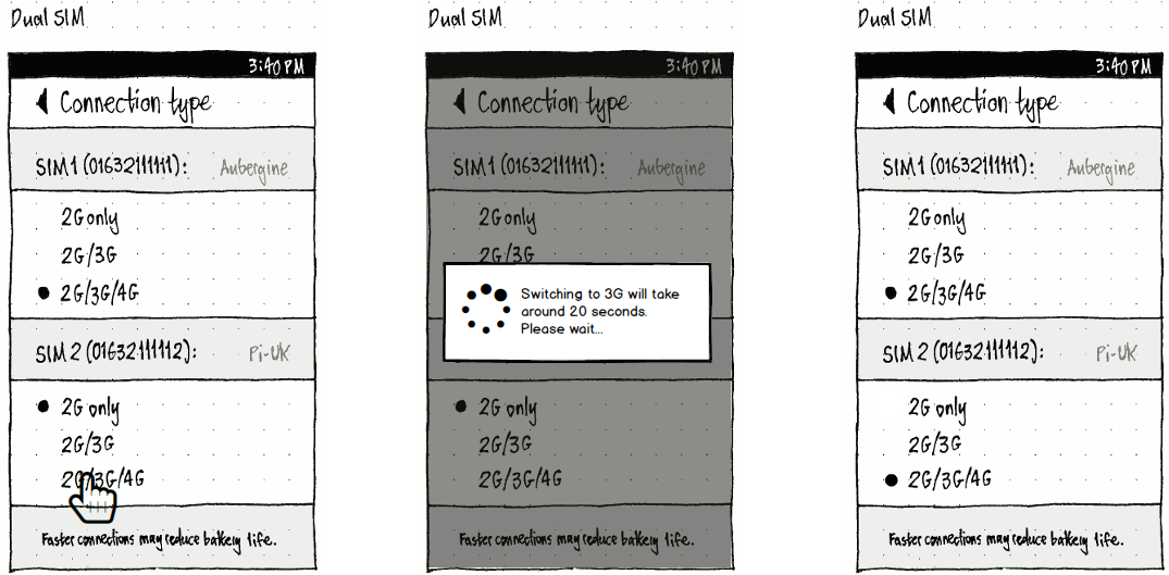
The “Connection type” screen should contain a radio list for each SIM (bug 1383368). If there is more than one, each should be introduced by its SIM name.
As with any radio list, if changing the connection type is taking more than one second, the radio mark for the new value should be replaced by a spinner until the change is complete, whereupon it should revert to a radio mark.
If choosing a different connection type for one SIM (for example, from 2G to 2G/3G) forces a change in the connection type of the other SIM (for example, from 2G/3G to 2G), that change should be shown immediately if possible. However, a modem reset is required when a change to 3G is made. In this case there is a wait time, therefore a dialog should indicate this to the user and the screen should be temporarily inactive.
|
Cellular devices on PC
|
If any cellular devices are connected to a PC, or if it has any Bluetooth cards turned on, the network menu should have a cellular section. (We deliberately exclude from this menu the interface for turning Bluetooth as a whole on or off.)
The cellular section should begin with a “Cellular Setup…” item that opens the “Cellular Setup” window.
Following this, if a cellular device is connected or a Bluetooth modem is connected and configured, and any cellular connections have previously been configured, these connections should be listed as switch items. Toggling an item should connect or disconnect.
These are the parameters for mobile broadband connections:
- PIN for SIM card
- may prompt each time or optionally remember it
- 4~8 digits [3GPP TS 11.11 V8.14.0 (2007-06), 9.3 Definitions and coding]
- If you enter the wrong PIN 3 times, the SIM will lock you out
- the hardware may tell Ofono that a PIN isn't necessary
- autoconnect
- enabled/disabled
- nameservers
- list of servers, in priority order
- if empty, automatic servers used
- domains
- list of domain names
- if empty, automatic domains used
- ipv4
- method:
- fixed (user can't edit)
- method:
- ipv6
- method:
- fixed (user can't edit)
- method:
- proxy
- method:
- direct
- auto
- url (if empty wpad is used)
- manual
- servers
- excludes
- method:
Setting up a cellular connection, prompted
|
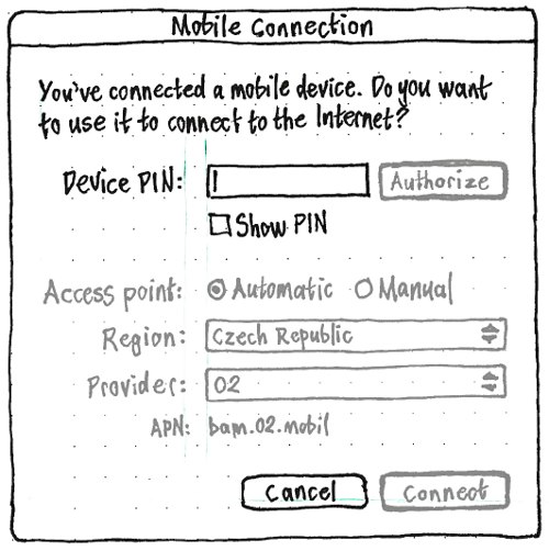
If, while you are logged in, you connect a cellular device to a PC, a “Cellular Connection” dialog should appear. If you disconnect the device, the dialog should close automatically.
The dialog’s primary text should be “You’ve connected a mobile device. Do you want to use it to connect to the Internet?” If the device requires a PIN, there should be a “Device PIN:” field, a “Show PIN” checkbox, and an “Authorize” button.
The “Device PIN:” field should be a password field whenever the “Show PIN” checkbox is unchecked, and a normal text field whenever “Show PIN” is checked. Entering any non-digit character, in any way, should produce an alert sound instead of accepting the character.
Test case: Check “Show PIN”. Copy these characters “1 2 3 4” to the clipboard. Paste them into the “Device PIN:” field. The field should contain “1234”.
The “Authorize” button should be the default button whenever the “Device PIN:” field is focused. It should be sensitive whenever the “Device PIN:” field contains from 4 to 8 digits inclusive.
All other controls in the dialog should initially be insensitive, except for the “Cancel” button.
|
Activating the “Authorize” button should make it insensitive, and make a spinner with the text “Authorizing…” appear at the trailing end of the dialog below the button, for as long as it is trying to authorize with the entered PIN.
If the PIN was incorrect, the primary text of the alert should change to: “The PIN was incorrect. If you enter an incorrect PIN too many times, the device SIM may become locked.” The PIN field should then be focused, and the “Authorize” button should resume sensitivity.
If the authorization succeeded, the “Device PIN:” field should also become insensitive, the “Authorize” button should become an “✔ Authorized” label, the access point controls should become sensitive, and “Connect” should become the default button.
The access point controls should begin with “Access point:” radio buttons: “Automatic” (the default) and “Manual”.
Whenever “Automatic” is selected, the radio buttons should be followed by “Region:” and “Provider:” option menus, populated by the Service Provider Database, and an “APN:” caption displaying the APN for the selected region and provider.
|
Whenever “Manual” is selected, the radio buttons should be followed by an “APN:” text field. This field should accept a maximum of 100 characters; entering any more should produce an alert sound instead of accepting them.
|
What other server/domain settings do we need?
The “Connect” button should be sensitive whenever either a provider is chosen from the “Provider:” menu, or if the “APN:” field is non-empty. Activating the button should make a spinner and the caption “Connecting…” appear in the bottom leading corner of the dialog, change the “Cancel” button to “Stop” (without changing its width), and desensitize the access point controls and the “Connect” button, while trying to connect.
If you activate “Stop”, the connection attempt should stop, the button should desensitize for two seconds (to ignore you if you double-clicked it by mistake), it should turn back into a sensitive “Cancel” button, and the access point controls and the “Connect” button should resume sensitivity.
Setting up or changing a mobile connection, unprompted
|
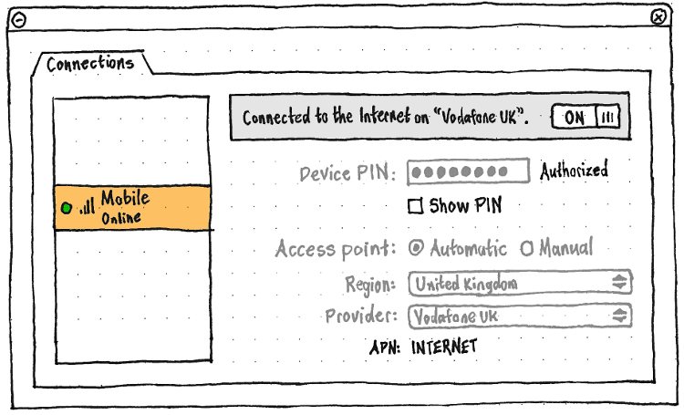
In the “Network Settings” window, the pane for a mobile device should consist of controls that look and behave identically as in the “Mobile Connection” dialog, except that:
- The top of the pane should be a status panel, with text of one of these forms:
- Not connected.
- ❊ Connecting…
Could not connect to {provider}. Can we be more specific?
- You’re connected to the Internet on {provider}.
- You’re connected to {provider}, but not on the Internet.
There should be no “Cancel” or “Connect” buttons. Instead, at the trailing end of the status panel, should be a switch that is sensitive if settings are sufficient to attempt a connection. The switch should be ON whenever the device is connected or attempting a connection, and OFF otherwise.
- All the controls, except the status panel and the “Show PIN” checkbox, should be insensitive whenever you are connected.
So, the process for setting up a mobile connection without using the dialog is:
- Open the Network Settings.
- Select the mobile device in the left pane.
- In the right pane, enter the device PIN and activate “Authorize”.
Once authorized, enter the access point details, and switch the connection ON.
And the process for changing a connected mobile connection is:
- Open the Network Settings.
- Select the mobile device in the left pane.
In the right pane, turn the switch OFF.
Change the access point details, then turn the switch back ON.
“Mobile Setup” window
So that you can easily connect to the Internet using a Bluetooth phone that you may not have paired yet, the “New Mobile Broadband Connection” window should be altered to provide easy access to pairing.
...
Inserting a new SIM
(bug 1332306)
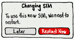
If you insert a new SIM, a “Changing SIM” dialog should appear with the text “To use this new SIM, we need to restart.” and buttons “Later” and “Restart Now”.
Bluetooth connections (PC only)
Things to expose:
- shouldn't need to enter anything after pairing Bluetooth device
- from iPhone, is triggered from the phone, then appears in Mac OS X as a wired connection
- connection type: PAN/DUN (usually automatic, occasionally wrong)
- PAN (Personal Area Networking) [some phones, e.g. iPhones]
- DUN (dial-up networking) [other phones] - not yet implemented
- manual settings
- IP address, DHCP, DNS (usually automatic)
Data
- autoconnect
- enabled/disabled
- nameservers
- list of servers, in priority order
- if empty, automatic servers used
- domains
- list of domain names
- if empty, automatic domains used
- ipv4
- method:
- dhcp
- manual
- address
- netmask
- gateway
- off
- method:
- ipv6
- method:
- dhcp
- manual
- address
- netmask
- gateway
- off
- method:
- proxy
- method:
- direct
- auto
- url (if empty wpad is used)
- manual
- servers
- excludes
- method:
To do
Settings to expose:
- Wireless
- Removing stored wireless networks
- Any combination of these can be used simultaneously
- One is the "main connection" (default route)
- sends and receives your Internet traffic ("You're connected to the Internet using this connection")
- affects your IP address
- shown in the menu title
- drag and drop -- top one in a list is the default route?
- Do we want to convey it inside the menu too?
- others are only for local network
- One is the "main connection" (default route)
- DNS
- usually the same regardless of connection
- often automatic, from DHCP lease
- sometimes automatic from PPP
Property |
Description |
Data constraints |
mode |
ethernet |
wifi |
bluetooth |
cellular |
State |
State of connection |
|
r |
X |
X |
X |
X |
Error |
Last error reason |
|
r |
X |
X |
X |
X |
Name |
Name of connection |
|
r |
X |
X |
X |
X |
Type |
"ethernet, wifi, cellular etc" |
|
r |
X |
X |
X |
X |
Mode |
|
|
r |
- |
X |
- |
X |
Security |
|
|
r |
- |
X |
- |
- |
Passphrase |
|
|
rw |
- |
X |
- |
- |
PassphraseRequired |
|
|
r |
- |
X |
- |
- |
Strength |
|
|
r |
- |
X |
X |
X |
Favorite |
internal only |
|
r |
X |
X |
X |
X |
Immutable |
|
|
r |
X |
X |
X |
X |
AutoConnect |
|
|
rw |
X |
X |
X |
X |
SetupRequired |
|
|
r |
- |
- |
- |
X |
APN |
3G Access Point Name |
max. 100 characters [3GPP TS 23.003 V9.2.0, 9.1 Structure of APN] |
rw |
- |
- |
- |
X |
MCC |
don’t show at all |
|
r |
- |
- |
- |
X |
MNC |
don’t show at all |
|
r |
- |
- |
- |
X |
Roaming |
|
|
r |
- |
- |
- |
X |
Nameservers |
don’t show |
|
r |
X |
X |
X |
X |
Nameservers.Configuration |
|
|
rw |
X |
X |
X |
X |
Domains |
don’t show |
|
r |
X |
X |
X |
X |
Domains.Configuration |
|
|
rw |
X |
X |
X |
X |
IPv4 |
for troubleshooting |
|
r |
X |
X |
X |
X |
IPv4.Configuration |
|
|
rw |
X |
X |
X |
- |
Proxy |
|
|
r |
X |
X |
X |
X |
Ethernet (MAC address) |
|
|
r |
X |
X |
X |
X |
Legend: |
X = available |
- = unavailable |
Spec: http://git.kernel.org/?<p=network/connman/connman.git;a=blob;f=doc/service-api.txt;hb=HEAD
VPNs
(bug 1495553)
Comparison: iOS instructions with screenshots, Android 4.2 instructions with screenshots, Windows Phone 8.1 instructions and screenshots.
Previewing/reviewing a VPN setup
|
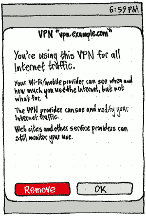
Whenever you download a VPN configuration file, regardless of app, a VPN preview dialog should appear, including “Cancel” and “Install” buttons. (This is equivalent to the preview dialog for certificates.) If you opened the dialog from System Settings, that should be its parent; otherwise the dialog should be parentless (so that you can switch to/from instructions that might be in the same app).
The title of the dialog should be ‘VPN “H”’, where H is the hostname of the VPN.
The dialog’s initial text and buttons should depend on the current status of the configuration, whether the VPN provides a certificate (remote-cert-tls server), and whether the VPN is known to provide its own DNS (the server configuration includes push "redirect-gateway"). Is there an authoritative and safe way of telling this in advance?
This VPN is not safe to use.
- It does not provide a certificate. The VPN provider could be impersonated.
This VPN is not safe to use.
- The server certificate is not valid. The VPN provider may be being impersonated.
Details: error detail
You’re using this VPN for all Internet traffic. (for VPN known to have its own DNS)
- Your Wi-Fi/mobile provider can see when and how much you use the Internet, but not what for.
- The VPN provider can see or modify your Internet traffic.
- Web sites and other service providers can still monitor your use.
You’re using this VPN for all Internet traffic. (for VPN not known to have its own DNS]
- Your Wi-Fi/mobile provider can still see when and how much you use the Internet.
- The DNS provider can see which Web sites and other services you use.
- The VPN provider can see or modify your Internet traffic.
- Web sites and other service providers can still monitor your use.
This VPN is set up, but not in use now.
- When you use it:
- Your Wi-Fi/mobile provider can see when and how much you use the Internet, but not what for.
- The VPN provider can see or modify your Internet traffic.
- Web sites and other service providers can still monitor your use.
- When you use it:
This VPN configuration is not installed. (for VPN that would apply to the whole Internet)
- If you install it:
- Your Wi-Fi/mobile provider can see when and how much you use the Internet, but not what for.
- The DNS provider can see which Web sites and other services you use.
- The VPN provider can see or modify your Internet traffic.
- Web sites and other service providers can still monitor your use.
- If you install it:
This VPN configuration is not installed. (for VPN that would apply to specific routes)
- If you install it:
- Your Wi-Fi/mobile provider can see when and how much you use the Internet, but not what for.
- The DNS provider can see which Web sites and other services you use.
- The VPN provider can see or modify your Internet traffic.
- Web sites and other service providers can still monitor your use.
- If you install it:
You’re using this VPN for specific services.
- Your traffic to these services is private to them and the VPN provider.
- Your Wi-Fi/mobile provider can track your use of any other services.
Installing/reviewing an automatic VPN setup
Should we distinguish between VPN config downloaded over HTTP/IMAP vs. HTTPS/IMAPS?
Reviewing/removing current VPN setups
System Settings should have a “VPN” category.
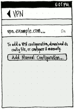
Choosing a VPN from the list should open the dialog for viewing the VPN details, but with “Cancel” and “Change” as its buttons. “Change” should be disabled whenever the current values in the dialog are the same as those stored for that VPN.
Each list item should have Delete as a trailing action.
Setting up a VPN manually
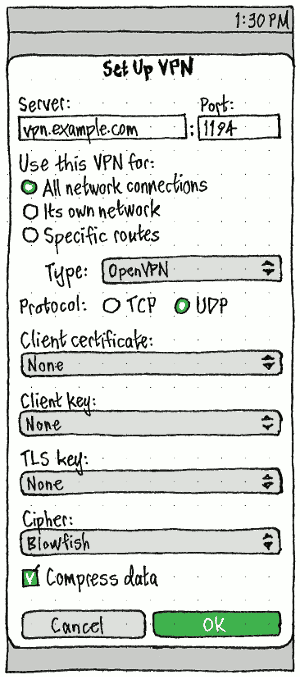
|
The “Server:” and “Port:” fields should be empty by default for a new VPN. In either field, pasting a string of the form “host:port” should result in the “Server:” field contents being replaced by the host segment, and the “Port:” field contents being replaced by the port segment.
The “Server:” field should accept only those characters legal in a domain name or IP number. Entering “:” should automatically navigate to the “Port:” field, and any other characters should be ignored.
The “Port:” field should accept only a port number — that is, only digits that form a number from 1 to 65535.
“Type:” should contain those VPN types currently implemented, currently “OpenVPN”, and eventually “L2TP” and “PPTP”. While only one is implemented, the menu should be present but disabled (an exception to the usual use of disabled controls), to warn you away from trying to use a different type.
The “Client certificate:”, “Client key:”, and “TLS key:” menus should each contain, in order:
- “None” (the default)
- a separator
- an alphabetical list of the certificates/keys of the relevant type that are currently stored on the device
- if there were any, another separator;
- “Choose Certificate…” or “Choose Key…”, as appropriate, which opens a picker for choosing a certificate/key of the relevant type.
Maybe the alphabetical list and the “Choose…” item are mutually incompatible?
The “Cipher:” menu should list available ciphers in the form given by the first word of each line in openvpn --show-ciphers, except that “BF-CBC” should be “Blowfish” and should be the first and default item.
|
If you set “Use this VPN for:” to “Specific routes:”, a list of the routes should appear below. (This is an exception to the usual guideline of disabling rather than hiding, because “Specific routes:” is a minority case and a disabled routes list would be distracting otherwise.)
The “–” button should be enabled whenever a route in the list is selected, and choosing it should delete that route from the list.
|
Whenever the screen is less than 100 GU wide:
The list should present each route in the form “address,netmask,gateway,metric” (to conserve space).
- Choosing “+” should open an “Add Route” dialog, with separate fields for “Address:”, “Netmask:”, “Gateway:”, and “Metric:”, and “Cancel” and “Add” buttons.
Whenever the screen is at least 100 GU wide:
- The list should have four columns, “Address”, “Netmask”, “Gateway”, and “Metric”.
- Choosing “+” should add a new row to the list, and focus its “Address:” cell for text entry (a less modal UI). An incomplete route should change to the error color whenever you unfocus the list, and be discarded altogether if you exit the screen.
Connecting to a VPN
The dialog for a VPN that applies to the whole Internet should have a group of three checkboxes:
- Auto-connect to VPN on:
- All networks
- Unknown networks
This network (Wi-Fi network or carrier name)”
Whenever “All networks” is checked, the other two should be checked and disabled.
Seeing whether you are connected to VPN
Toggling VPN status
|
The VPN section should be present whenever at least one VPN is set up. The section should begin with a “VPN Setup…” item that opens the Network Settings window to the VPNs tab.
Following that item, the configured VPNs should be listed as toggle items. Toggling an item should connect or disconnect from that VPN.
Proxies
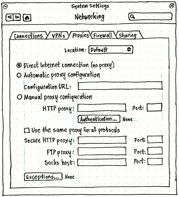
Firewall (PC only)
See also Oneiric desktop networking enhancements.
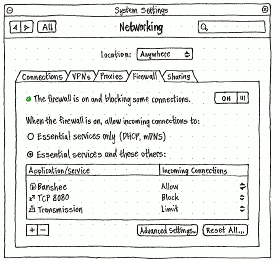
The “Firewall” panel should start with status in one of these forms:
Status light |
Status text |
Switch |
grey |
The firewall is off. |
OFF |
yellow |
The firewall is starting up… |
ON |
red |
The firewall is not blocking any connections. |
ON |
green |
The firewall is on and blocking all non-essential connections. |
ON |
green |
The firewall is on and blocking some connections. |
ON |
green |
The firewall is on with custom settings. |
ON |
yellow |
The firewall is shutting down… |
OFF |
If “The firewall is on with custom settings” (for example, it is blocking any outgoing connections at all), all other controls in the panel should be insensitive, except for the “Advanced Settings…” and “Reset All…” buttons.
The list of applications should be sensitive only when “When the firewall is on, allow incoming connections to:” is set to “Essential services and these others:”.
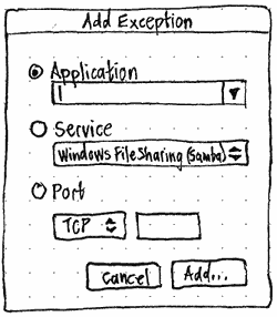
If you choose “+” (which should have the accessible label “Add an Exception”), an “Add Exception” dialog should appear giving you the option of adding an application, service, or port.
Choosing “Advanced Settings…” should open a text editor to the ufw configuration file. Choosing “Reset All…” should open a confirmation alert of the form “Are you sure you want to delete all custom firewall settings?”. If you choose “Delete”, the ufw configuration file should be deleted and settings return to the “Essential services only” defaults.
Sharing
So you can easily share your connection regardless of whether it is wired, wireless, or mobile, there should be a single “Create/Share Connection” window.
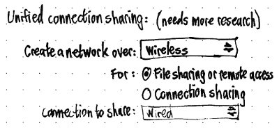
PC-specific designs (to be integrated above)
Ubuntu’s networking interface should consist mostly of a “Network” panel in System Settings to cover networking in general, including connection setup, VPN, proxy, and firewall settings; and a network menu for quick access to connection settings.
Some of this interface is implemented in indicator-network on top of Connection Manager (a.k.a. ConnMan). The interface could also be implemented on top of Network Manager.
Artwork requirements
Wireless connection icons

 (off, 0%, 20%, 50%, 75%, 100%)
 Wired connection icons

 (off, on)
 Computer-to-computer network icon

- Padlock icon for encrypted networks
- Colored light icons for “connected”, “on but not connected”, and “off” (these are drawn dynamically using cairo and so are not needed as files)
- Flight mode icon
Future work
- Following the general principle that people open this menu for the purpose of fixing something wrong with their network connection, we should include, in the menu, items for turning off background tasks (such as Ubuntu One file syncing, or torrent seeding) that are consuming lots of bandwidth.
Locations
Above the tabs in the settings panel should be a “Location:” menu with a radio item for each location profile, followed by a separator and items ‘New Location…’, ‘Rename “{name of current location}”…’, and ‘Delete “{name of current location}”…’. By default, there should be only one location, “Anywhere”; when it is selected, the “Rename” and “Delete” items should be insensitive.
Optional extra: At the bottom of the “Location:” menu should be another separator, and finally a “Location Menu in Menu Bar” checkmark item. When it is checked, a location menu should appear in the menu bar, immediately on the leading side of the networking menu (or if the networking menu is turned off, immediately on the leading side of where it would be). This menu should have a globe icon as its title, and should contain a radio item for each location profile, followed by a separator and a “Network Settings…” item that opens the Network panel of System Settings.
Whichever way it is selected, choosing a location should change all networking settings to those that were last configured in that location.
Creating a location
Choosing “New Location…” should open a “New Location” dialog containing:
a “Choose a name for the new location:” field that, if possible, is pre-filled with the GeoName nearest your current location;
- a “Based on:” menu listing the existing locations, with “Anywhere” as the default;
- “Cancel” and “Create” buttons.
The “Create” button should be insensitive whenever the current value of the “Choose a name for the new location:” field is identical to one of the existing locations.
When a new location is created, it should start out with the same settings as whichever location it was “Based on”.
Renaming a location
Choosing ‘Rename “{name of current location}”…’ should open a “Rename Location” dialog, containing only a ‘Choose a new name for “{name of current location}”:’ field (pre-filled with the existing name), and “Cancel” and “Rename” buttons.
The “Rename” button should be insensitive whenever the current value of the “Choose a name for the new location:” field is identical to one of the other existing locations.
Deleting a location
Choosing ‘Delete “{name of current location}”…’ should open a confirmation alert with primary text ‘Are you sure you want to delete “{name of current location}” and all its settings?’, secondary text “You last used this location on {date}”, and “Cancel” and “Delete” buttons.
Unresolved issues
- We need a thorough test suite for which wireless networks are shown in the menu.
- How is shown that Wired connection is ready (cable plugged in, DHCP settings received) compared to case that cable isn't plugged in or DHCP hasn't answered? Should the ON/OFF switch reflect the state or is it only for user controlling the power of that device? The question also applies to 3G.
- How to handle network updates while menu is open? In some cases networks might change a lot.
- What about usb connections (e.g. USB tethering with a cellphone or USB ethernet modems? They show up as "wired connections" or "generated ethernet connections" atm, what they might not be.
settings:
- edit connections functionality based on the connections property table, for all connection types
- how to show which wifi connection is connected? should we also show connecting states?
- how to disconnect connections from settings window?
- wired settings window missing from the spec
- there should be a separate dialog for mobile PIN
icons:
- what icon to use as indicator icon in the panel when bluetooth connection is the default connection, otherwise there are two bluetooth icons on the panel (bluetooth and indicator-network)
- icon animation for each technology? (wired, wireless, mobile, bluetooth)
- strength icons for mobile and bluetooth as well
mobile wizard:
- when user plugs in a new modem, in some cases, we can automatically detect APN, but should we always ask for confirmation from the user?
- if we can't detect APN automatically, we need to ask from the user by showing a country/provider. how to show that?
other:
- connection information dialog
- IP settings
- statistics
- hardware information?
- driver name
- modem name and info
- driver, firmware, hw versions
Networking (last edited 2016-07-17 14:48:38 by mpt)
