LanguageAndText
Ubuntu’s language text input settings should make it easy to switch between keyboard layouts and input methods, and obvious how to navigate to other keyboard-related settings. On the PC, the main interface components are a tabbed “Language & Text” panel in System Settings, and an optional input source menu. On the phone, the interface components include a “Language & Text” screen in System Settings, and a button for switching layouts on the keyboard itself.
Contents
Use cases
![]() not possible
not possible ![]() defined
defined ![]() undefined
undefined
Use case |
Phone |
Tablet |
PC |
Change the display language |
|
|
|
Switch layouts and input sources quickly |
|
|
|
Choose layouts/sources for quick switching |
|
|
|
Change spell-checking language |
|
|
|
Toggle automatic spelling correction |
|
|
|
Add words to custom dictionary |
|
|
|
Remove words from custom dictionary |
|
|
|
Toggle automatic word suggestions |
|
|
|
Toggle automatic capitalization |
|
|
|
Toggle automatic punctuation |
|
|
|
Toggle keyboard sound |
|
|
|
Toggle keyboard vibration |
|
n/a |
|
Overall settings interface
System Settings should contain a “Language & Text” item. Its icon should include a keyboard, to indicate that it contains keyboard settings; and a colored globe, to guide people who are trying to change the language of a phone currently set to a language they can’t read.
Narrow screens
|
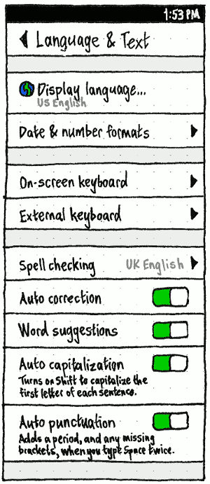
“Display language…” should have an icon of a colored globe, to guide people who are trying to change the language of a phone currently set to a language they can’t read. On a narrow screen, it should open the “Display language” dialog.
(“Date & number formats” should not be present because it is not designed yet (bug 1392699).)
If you are not using a pocket PC, “External keyboard” should not be present, and therefore “On-screen keyboard” should be simply “Keyboard”.
“Keyboard layouts” should navigate to the “Keyboard layouts” screen.
“Spell checking” should navigate to the “Spell checking” screen.
Until bracket completion is implemented, the caption for “Auto punctuation” should be “Inserts a period when you tap Space twice.” (bug 1385288). Once it is implemented, the caption should be “Inserts a period, and any missing brackets, when you tap Space twice.” (bug 1385312).
Erratum: “Adds a period” should be “Inserts a period”.
Wide screens
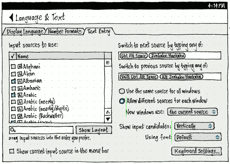
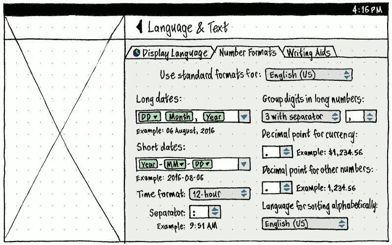
On wide screens, “Language & Text” should have three tabs, in order: “Display Language”, “Number Formats”, and “Text Entry”.
Setting the interface language
|
On narrow screens, the “Display language…” item should have an icon, making the setting easier to find if the current display language is not one you can read. On wide screens, “Display Language” should be the first and default tab.
Sorting languages
Interface languages should always be displayed, and sorted alphabetically, using the name of the language (which is visible to everyone) in its own language (understandable to those who need it), not sorted by the language code (which hardly anyone knows). For example, “Deutsch” (de) comes before “English” (en) which comes before “Qafar” (aa).
When and only when there are multiple available variations of the same language, then:
- All variations should be displayed in the form “{language name} ({territory name})”.
The variation that has the unprefixed language code (or an equivalent) should be sorted first. For example, en_US = en = “English (US)” (not “U. S. English”), nl = “Nederlands (Nederland)”. (This avoids hiding the most common variation amongst many others.)
All other variations should follow it, sorted alphabetically by territory name. For example, “Deutsch (Deutschland)” (de) comes before “Deutsch (Belgien)” (de-BE) which comes before “Deutsch (Österreich)” (de-AT).
|
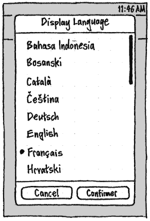
Unlike the other System Settings screens, changes in the “Display language” screen should not take effect immediately, for two reasons. First, the whole UI being in an unfamiliar language would make an accidental change highly disorienting. Second, the list of languages is long, so the previous language may not be visible while scrolling, making reverting an accidental change moderately difficult.
Therefore, instead of being part of the page stack, “Display Language” should be a dialog with a radio list (bug 1289302) “Cancel” and “Confirm” buttons. What should change immediately, when you select a different language, is the language of the “Display Language” header and the “Confirm” button itself (bug 1289313), as a preview of what is about to happen. The “Confirm” button should also be sensitive only when the currently selected language is different from the current language.
Changing the display language should also change all other locale settings that are not currently set to custom values (bug 1236772).
“Number Formats”
“Text Entry”
Input sources
|
An input source is a combination of a language, and optionally a variant and/or an input method that applies to that language, if any. The display name for an input source is the language name, followed by a the input method name in brackets if there is one, otherwise the variant in brackets if there is one. For example, “English (US)”, “English (Dvorak)”, “Chinese (Anthy)”, or “Afghani”.
Each input source should have its own icon.
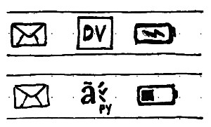
For any input source that does not involve an input method, the icon should consist of a solid rectangle in the theme color, punched with a unique display code representing the source. Normally this display code should be the first two letters of the short name, with the first one capitalized: for example, “Ar” for Arabic, “Hy” for Armenian, “Et” for Estonian. But if this leaves multiple installed input sources with the same letters, they should all be distinguished with a subscript number representing the alphabetical order of their layout name. For example:
Display name |
Short name |
Display code before disambiguation |
Layout name |
Final display code |
English (South Africa) |
en |
En |
za |
En3 |
English (UK, Dvorak) |
en |
En |
gb+dvorak |
En1 |
English (US) |
en |
En |
us |
En2 |
For any input source that does involve an input method, the icon should be custom drawn. (We could start by converting the bitmap icons to pixelated vector icons. Then we can invite people to redraw them as scalable vector icons.)
Wide screen

Narrow screen
“On-Screen Keyboard” and “Hardware Keyboard”
|
|
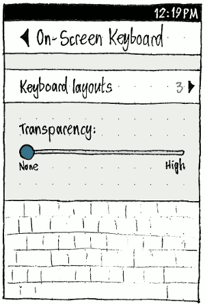
Erratum: The “On-Screen Keyboard” screen should have a “Keyboard sounds” switch.
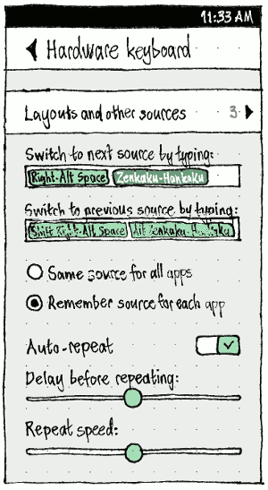
Both “On-Screen Keyboard” and “Hardware Keyboard” screens should begin with a “Keyboard layouts” item. Its summary value should be the name of the current layout, whenever there is only one and it will fit in the space available (for example, the phone is in landscape); otherwise, it should be the number of currently chosen layouts.
On the “On-screen keyboard” screen, this should be followed by a “Keyboard sounds” switch (not shown) and a “Transparency:” slider, with ends labelled “None” and “High”. When, and only when, you are interacting with this slider, the OSK should appear so that you can see the effect in real time.
On the “Hardware Keyboard” screen, “Switch to next source by typing:” and “Switch to previous source by typing:” should be hardware-only1 key/combo2 multiple3-element4 fields. That is, whenever the field is focused:
- The OSK should not appear. (These fields are relevant only to the external keyboard, and usually the key combo you enter involves keys that aren’t even present in any OSK.)
Typing any key or key combo — except Backspace, Delete, Tab, Shift+Tab, Left, or Right — should cause it to appear by name as an element in the field. For example, “(Ctrl \)” or “(Shift Right-Alt Space)”. (Some CJK keyboards have dedicated keys for switching layouts, so we can’t limit switching just to key combos.)
- It should be possible to enter multiple keys/combos in each field. (For example, if people often switch between a keyboard that has those dedicated keys and a keyboard that doesn’t, they shouldn’t have to change the settings each time.)
- As with any element field, an element should become selected if you tap/click it, press Backspace when positioned to its right, or press Delete when positioned to its left. And when an element is selected, typing Backspace/Delete should delete it.
“Same source for all apps” and “Remember source for each app” will eventually change to refer to windows. For now they refer to apps because there is only one window per app.
“Delay before repeating:” and “Repeat speed:” should be sensitive only when “Auto-repeat” is switched on.
TBD: Update to include the IME settings.
“Keyboard Layouts”
|
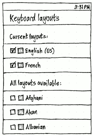
The structure of the “Keyboard Layouts” screen should be the same for on-screen keyboards as for external keyboards, except that the list of possible layouts is different for each.
The label for the first group should be “Current layout:” or “Current layouts:” etc, depending on the current number. Unchecking a layout should, after a two-second delay in case you want to change your mind, remove it from the “Current layouts:” list. Whenever there is only one current layout, its checkbox should be insensitive so that you can’t remove it. Whenever there is more than one current layout, each of them should have a grip handle at its trailing end so that you can reorder the list.
Checking an item in the “All layouts available:” list should animatedly copy it to the “Current layouts:” list, while maintaining your scroll position.
Erratum: The grip handles should be shown.
Switching between keyboard layouts and other input sources
PC: The input source menu
Whenever “Show current input source in the menu bar” is checked, the input source menu should be present.
The title of the menu should consist solely of the icon for the current input source (bug 620331). This lets you quickly identify the current layout. The accessible label should be “{Name of input source} input source”. Middle-clicking the title should cycle to the next source (bug 887139).
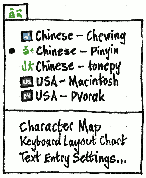
As long as we are using the old “Keyboard Layout” panel, “Text Entry Settings…” should be “Keyboard Layout Settings…”.
Inside the menu, input sources should be listed in the same order as in the settings panel.
Phone: The input source button
Rachel Liu
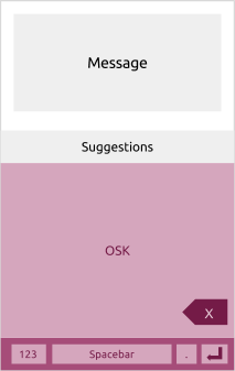
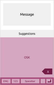
On the phone, keyboard switching is part of the on-screen keyboard itself.
We want to keep the keyboard layout as consistent as possible. This involves the backspace and introduction of the language switching key to remain in similar positions. Therefore, we always have access to the bottom row of the keyboard. Here are some main views based on key interactions related to language switching layouts.
One input source selected (default layout) |
|
|
Whenever more than one input source is selected |
|
An extra button should appear at bottom left of the keyboard (reducing the width of the space bar). If you tap on the button, it should cycle through layouts in order of how recently you entered a character using each one (bug 1438162). Test case: Configure the keyboard with three layouts, English, Polish, and Emoji. Set to English, type a character, then set to Emoji, and type another character. Tap the button five times; it should cycle through English, Polish, Emoji, English, and Polish. Type a character in Polish, then again tap the button five times; it should cycle through Emoji, English, Polish, Emoji, and English again. |
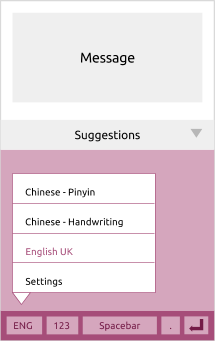
Selecting an input source |
|
Long-press on bottom-left button labelled with current language or an icon indicator. When an option is selected, the pop-over disappears. If ‘Settings’ is clicked then it will take you to the Keyboard settings and current language option selected doesn’t change. |
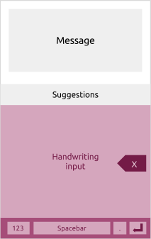
Handwriting mode (not in ELS) |
|
The backspace is positioned in the right-hand side like the normal OSK layout but will be more prominent and vertically centred. |
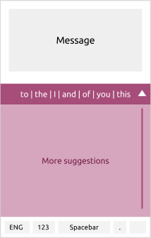
Suggestions expanded |
|
List of suggestions in the expanded view when the arrow is clicked on right-hand side. The arrow is then displayed upwards .When you click on this, it collapses or when you click on a suggestion then it populates text on the message input. The list is scrollable and takes the height of the keyboard (excluding the last row of bottom keys). |
Question to be addressed:
- Do we have the ‘period’ button or not. How many people would use full-stop by tapping the button vs spacebar? Do we need the long-press with punctuation options or when you click on it, it has a popover?
- Settings - where does it take you? Can you get back to the application?
Spell checking
|
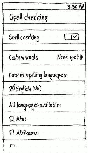
On the main “Language & Text” screen, the “Spell checking” item should have a summary value: “Off” if spell checking is off, otherwise the name of the current spelling dictionary if there is only one, otherwise the number of currently chosen spelling dictionaries.
|
On the “Spell checking” screen itself (bug 1465202), the label for the first group should be “Current spelling language:” or “Current spelling languages:” etc, depending on the current number. Unchecking a language should, after a two-second delay in case you want to change your mind, remove it from the “Current spelling languages:” list. Whenever there is only one current language, its checkbox should be insensitive so that you can’t remove it.
Checking an item in the “Available languages:” list should animatedly copy it to the “Current spelling languages:” list, while maintaining your scroll position.
Custom words
|
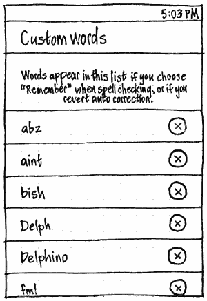
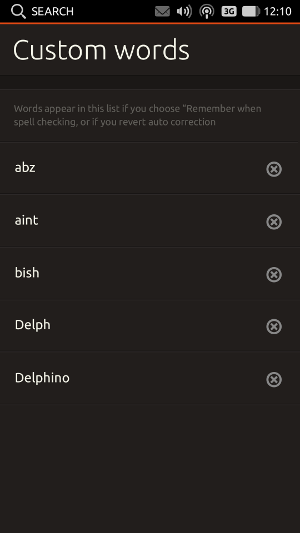
On the “Spell checking” screen, the “Custom words” item should have the value “None yet” if there are none, otherwise their count.
|
|
The “Custom words” screen itself should list all custom words alphabetically, with a delete button alongside each (bug 1318812). (The explanatory text doubles as placeholder text.)
Objectives
User objectives:
- Provide a quick and convenient way for people to:
- see what keyboard layout they are using
- see what input method they are using
- switch layout and/or input method.
- Make it obvious how to:
- Change keyboard layout and input method settings.
Technical objectives:
- Stop using a standalone panel applet or notification area item for these tasks.
- Be responsive and reliable.
Approaches we considered
- One possibility was to combine keyboard layout selection with other hardware-related items, such as Bluetooth, in a single “device” menu. This would centralize hardware-related information, and reduce the number of menus in the panel (as opposed to a separate keyboard menu). However, with a menu title that represented the device, it would not satisfy the objective of letting people see at a glance what keyboard layout or input method they are currently using. Conversely, if we used the icon for the current keyboard layout or input method as the title of a device menu, it would not be discoverable (and would be odd, even when discovered) that the menu contained mostly-non-keyboard-related items. We could conceivably get around this by using both a generic “device” icon and the selected layout/method icon, alongside each other as a combined title. But that would not reduce the number of visual elements in the panel (just squish them together), and it would make both keyboard-related and non-keyboard-related tasks harder to locate inside the menu.
- Another possibility was to move keyboard layout selection into the existing input method floating window. However, many people who switch layouts do not also need to switch IMs, so this would be bothering them with a floating window when they would otherwise not need one.
- We have therefore chosen a third option, combining keyboard layout selection and input method selection into a single menu. This will not add much clutter to the panel, because the menu will not be present by default; it will be used mainly by people who use multiple layouts or input methods.
See also the Gnome Shell design.
User stories
- Shi-Lin is writing a research paper comparing various methods of modulating acetyl-integrin polykinase. She is writing in Simplified Chinese script using an input method, but very often — every minute or so — she has to switch to an English keyboard layout to type a chemical formula or to cite a paper by American or European scientists. To begin with, Shi-Lin used the keyboard menu to switch between US layout and Chinese input. Now she has learned to use the keyboard equivalent to switch layouts instead. But when she is interrupted (usually by an undergraduate or one of her colleagues), returning to the computer she refers to the menu title to remind her what mode the keyboard is in.
- Jesper regularly uses Swedish and English keyboard layouts. He is also trying to learn Korean, so he uses the Korean layout with Korean input method. He does not use any other input methods.
Affected codebases
- ibus
- gnome-settings-daemon
- libgnomekbd
- gnome-control-center
- - possibly related capplet packages
There'll be a need to work with ibus and gnome upstream on some of this, the current control center work might interlock with this in many ways, and changes to ibus might conflict with what we want to achieve.
Unresolved issues
- Many users of input methods will not know what it means to have a different keyboard layout. This is a problem for if we try to merge them into a single screen. [persia]
- Need to clarify terminology:
Keyboard model (e.g. MacBook Pro)
- Keyboard layout (e.g. USA Macintosh)
- Keyboard input method engine (e.g. anthy, pinyin)
- Output character set (e.g. hiragana, katakana, kanji, romaji) We don't need to show all of those, often just one (but which one differs by region).
Background information
Question |
Answer |
Answered by (thanks!) |
How often do people use multiple input methods for a single language? |
Seldom. Usually users have a preferred input method for their language and stick with it. For Chinese, it may be occasionally required to switch from a phonetic to a component based IM, if for example the pronunciation for a specific character is unknown to the user, but the user knows how the character looks like. |
Arne |
How often do people use multiple keyboard layouts for a single language? |
Seldom. Usually users have a preferred layout and type the language with that. For non-native speakers, it may occasionally be useful to switch from a phonetic (transliteration) to a component based (letters and diacritics) layout (i.e. for Indic languages) if they don't know how a specific transliteration is used. |
Arne |
How feasible is merging “Keyboard Preferences” and “IBus Preferences”? Would it require writing the interface from scratch? If so, should we fix other design details at the same time? |
|
|
What is the benefit of “Use custom font” in IBus Preferences? |
This setting refers to the font used in the word candidate chooser window, which pops up once you type something using the IM mode. For CJK characters users may want to use a bigger font size than 10 pt. (16 pt. is common for that) in order to be able to distinguish complex characters with many strokes easier. Also, users may want to use a specific font for that. |
Arne |
What does “Use system keyboard layout” do in IBus Preferences? |
It remaps input methods to match (some) non-US-English keyboard layouts. |
Arne |
Notes from UDS-O session
Use cases:

* uses two layouts to enter same charset
 - e.g. Martin types in English vs. German
  - uses Shift+Shift to switch English vs. German layouts
  - his wife uses the indicator to switch layouts
    - important that the indicator shows the current one
    - nice to have, but not important: layout toggles on clicking indicator
      - maybe mouse-scroll could also toggle to minimize number of clicks required, just like as the sound-indicator changes volume on scroll
 - e.g. Mathieu types in French Canadian sometimes, English other times
 - e.g. switch between Roman and Cyrillic: same keyboard layout, different characters

* uses two layouts to enter two different charsets
 - e.g. type in Latin characters sometimes, Cyrillic other times
 - same handling/workflow in the UI

* uses an IME to enter complex characters
 - modes: ways to enter characters
   - by pronunciation
   - by brushstroke
 - we can assume that everyone using a back end wants to see all modes for that back end
 - need a keyboard way to switch between mode
   -  e.g. right Alt - currently default, in Japanese keyboard, there is a dedicated hardware key)
   - e.g. ctrl+shift+L, but not constantly used;Ctrl+` for Chinese users as well)
 - need a mouse way to switch between methods too (i.e. in the menu)
 - need a way to show the current backend *and* its current mode (enabled or not)
   - e.g. Anthy (back end), Roman/hiragana (mode)
     - and other intra-mode options, e.g. full-width/half-width punctuation for Chinese/hiragana in Japanese too (these half-width characters are in Unicode).
       - a mode is executable, so it could temporarily add its own indicator for intra-mode options

ibus is the only IME system we need to care about
- some IME back ends assume a particular layout (though this is decreasing)
 - but people learn an IME back end on a particular *layout*, and always use it on that layout
 - e.g. Chinese only ever use one layout, US layout
  - so Chinese typists don't need to see, in the menu, that they're using US layout
  - IMEs don't "know" which layout they're being used on

Other features for the keyboard menu:
- toggle on-screen keyboard
- character map
  - maybe merge these two?
- keyboard settings

If there are more questions: ask on ubuntu-devel@, or go to Canonical’s Taipei office
See also
http://live.gnome.org/GnomeShell/Design/Guidelines/SystemStatus/InputLanguage
http://mail.gnome.org/archives/gnomecc-list/2010-July/msg00003.html
http://mail.gnome.org/archives/gnomecc-list/2010-October/msg00006.html
https://blueprints.launchpad.net/ubuntu/+spec/packageselection-dx-n-indicator-keyboard
http://live.gnome.org/UsabilityProject/Whiteboard/KeyboardPreferences
http://blogs.oracle.com/sunwg11nprg/entry/switching_keyboard_layout_in_solaris
LanguageAndText (last edited 2017-01-26 15:58:35 by mpt)

