TimeAndDatePickers
|
Size: 2630
Comment: + Use cases; + What other platforms do
|
Size: 10080
Comment: better describes minimum/maximum handling; + date picker details; month picker details
|
| Deletions are marked like this. | Additions are marked like this. |
| Line 1: | Line 1: |
| Ubuntu Touch should have a set of time and date picker controls. | Ubuntu Touch should have six time and date pickers: '''[[#time|time]]''', '''[[#date|date]]''', '''[[#week|week]]''', '''[[#month|month]]''', '''[[#datetime-local|local datetime]]''', and '''[[#datetime-zoned|zoned datetime]]'''. Each of these should vary in behavior depending on whether they have a '''minimum''', a '''maximum''', and/or a '''precision'''. <<TableOfContents()>> |
| Line 5: | Line 7: |
| * Setting the device time and date [[TimeAndDate|in System Settings]] | * Setting the device time and date [[TimeAndDate|in System Settings]]. |
| Line 7: | Line 9: |
| {{attachment:phone-time-date-settings.png}} | * (Not for the initial release) Adding someone’s birthday to the address book, with or without a year. |
| Line 9: | Line 11: |
| * Adding someone’s birthday to the address book, with or without a year | * Fine-tuning the time and date of a Calendar event. |
| Line 11: | Line 13: |
| * fine-tuning the time and date of a Calendar event | * The Clock app currently uses its own clock hands for setting a timer or countdown value. |
| Line 13: | Line 15: |
| * choosing a timer or countdown value in the Clock | * HTML time and/or date controls in Web pages. |
| Line 15: | Line 17: |
| === Web use cases === | HTML’s `<input>` element, and therefore the Ubuntu Phone browser, requires controls for entering [[http://developers.whatwg.org/the-input-element.html#attr-input-type|particular parts of a date and/or time]]. These are not heavily used yet, but will become more widely used as browsers implement them. |
| Line 17: | Line 19: |
| HTML’s `<input>` element, and therefore the Ubuntu Phone browser, requires [[http://developers.whatwg.org/the-input-element.html#attr-input-type|several controls]] for entering particular parts of a date and/or time. | ||'''Control'''||'''`type=`'''||'''Nullable'''||'''Can have min/max'''||'''Step precision'''||'''Potential components'''|| ||[[http://developers.whatwg.org/states-of-the-type-attribute.html#time-state-%28type=time%29|time]]||`time`||[[http://www.whatwg.org/specs/web-apps/current-work/multipage/states-of-the-type-attribute.html#time-state-%28type=time%29|yes]]||yes||seconds||[[http://developers.whatwg.org/common-microsyntaxes.html#concept-time|hour, minutes, seconds, fraction]]|| ||[[http://developers.whatwg.org/states-of-the-type-attribute.html#date-state-%28type=date%29|date]]||`date`||[[http://www.whatwg.org/specs/web-apps/current-work/multipage/states-of-the-type-attribute.html#date-state-%28type=date%29|yes]]||yes||days||[[http://developers.whatwg.org/common-microsyntaxes.html#concept-date|year, month, day]]|| ||[[http://developers.whatwg.org/states-of-the-type-attribute.html#week-state-%28type=week%29|week]]||`week`||[[http://www.whatwg.org/specs/web-apps/current-work/multipage/states-of-the-type-attribute.html#week-state-%28type=week%29|yes]]||yes||weeks||[[http://developers.whatwg.org/common-microsyntaxes.html#concept-week|year, week]]|| ||[[http://developers.whatwg.org/states-of-the-type-attribute.html#month-state-%28type=month%29|month]]||`month`||[[http://www.whatwg.org/specs/web-apps/current-work/multipage/states-of-the-type-attribute.html#month-state-%28type=month%29|yes]]||yes||months||[[http://developers.whatwg.org/common-microsyntaxes.html#concept-month|year, month]]|| ||[[http://developers.whatwg.org/states-of-the-type-attribute.html#local-date-and-time-state-%28type=datetime-local%29|local date and time]]||`datetime-local`||[[http://www.whatwg.org/specs/web-apps/current-work/multipage/states-of-the-type-attribute.html#local-date-and-time-state-%28type=datetime-local%29|yes]]||yes||seconds||[[http://developers.whatwg.org/common-microsyntaxes.html#concept-datetime-local|year, month, day, hours, minutes, seconds, fraction]]|| ||[[http://developers.whatwg.org/states-of-the-type-attribute.html#date-and-time-state-%28type=datetime%29|global date and time]]||`datetime`||[[http://www.whatwg.org/specs/web-apps/current-work/multipage/states-of-the-type-attribute.html#date-and-time-state-%28type=datetime%29|yes]]||yes||seconds||[[http://developers.whatwg.org/common-microsyntaxes.html#concept-datetime|year, month, date, hours, minutes, seconds, fraction, time zone offset]]|| |
| Line 19: | Line 27: |
| ||'''Control'''||'''`type=`'''||Nullable||Can have minimum||Can have maximum||Step precision|| ||[[http://developers.whatwg.org/states-of-the-type-attribute.html#date-and-time-state-%28type=datetime%29|global date and time]]||`datetime`||[[http://www.whatwg.org/specs/web-apps/current-work/multipage/states-of-the-type-attribute.html#date-and-time-state-%28type=datetime%29|yes]]||yes||yes||seconds|| ||[[http://developers.whatwg.org/states-of-the-type-attribute.html#date-state-%28type=date%29|date]]||`date`||yes||yes||yes||days|| ||[[http://developers.whatwg.org/states-of-the-type-attribute.html#month-state-%28type=month%29|month]]||`month`||yes||yes||yes||months|| ||[[http://developers.whatwg.org/states-of-the-type-attribute.html#week-state-%28type=week%29|week]]||`week`|| ||[[http://developers.whatwg.org/states-of-the-type-attribute.html#time-state-%28type=time%29|time]]||`time`|| ||[[http://developers.whatwg.org/states-of-the-type-attribute.html#local-date-and-time-state-%28type=datetime-local%29|local date and time]]||`datetime-local`|| |
== Specification == |
| Line 27: | Line 29: |
| == What other platforms do == | === Common elements === ==== Time dial ==== ||<tablestyle="float:left;margin:0 1em 1em 0" style="border:none">{{attachment:time-dial.png}}|| A time dial normally consists of two nested dials, with the time displayed in the center. Spinning the inner dial should adjust the hours, the outer dial the minutes. To emphasize this, if you tap the hours or minutes segment of the time, the hour or minute hand should flash respectively. If you tap “AM” it should toggle to “PM” and vice versa, as an alternative to spinning the hour dial 360 degrees. ||<tablestyle="clear:both" style="border:none">|| ==== Spinner ==== ||<tablestyle="float:left;margin:0 1em 1em 0" style="border:none">{{attachment:spinner.png}}|| If you flick a spinner up or down, whichever value ends up in its center should become selected. If you tap a value anywhere in a spinner, that value should immediately become selected, and the spinner should then spin to make it centered too. Where a spinner contains units on a circular scale — seconds in a minute, minutes in an hour, hours in a day, weekdays, or months — the latest value should be immediately followed by the earliest. For example, December should be followed by January. ||<tablestyle="clear:both" style="border:none">|| ==== Handling of default values, minimums, and maximums ==== If an app provides no default value for a picker, its initial value should be as close to the current date and/or time as is possible given any minimum or maximum. If an app asks for a minimum and a lesser maximum, the picker should signal an error and ignore both of them. Otherwise, if an app asks for a default value less than the minimum, or greater than the maximum, the picker should signal an error and set the initial value to the minimum or maximum respectively. <<Anchor(time)>> === Time picker === ||<^ tablestyle="float:left;margin:0 1em 1em 0" style="border:none">{{attachment:picker-time.png}}||<^ style="border:none">{{attachment:picker-time-with-seconds.png}}|| The time picker should consist of a time dial and/or a seconds spinner. '''Minimum/maximum:''' * If the minimum and maximum fall within the same hour, the hour dial should not be present. * If the minimum and maximum fall within the same minute, neither the hour nor minute dial should be present, but the time should still be displayed in place. '''Precision:''' * If the precision is not a multiple of one minute, the dial should be accompanied by a seconds spinner. * If the precision is a multiple of one hour, the minute dial should not be present. ||<tablestyle="clear:both" style="border:none">|| <<Anchor(date)>> === Date picker === ||<^ tablestyle="float:left;margin:0 1em 1em 0" style="border:none">{{attachment:picker-date.png}}|| The date picker should consist of three spinners: year, month, and/or date. The month spinner should list full month names (''e.g.'' “September”). The date spinner should trailing-side-align dates, following them with leading-side-aligned weekdays (''e.g.'' “Monday”) only if there is room for the longest possible one (''e.g.'' in English, “30 Wednesday”). If the currently selected date becomes impossible because either you or the app changes the year (from a leap to a non-leap year when the date is set to February 29th) or the month (''e.g.'' from a month that has 31 days to one that has fewer), the date should reduce automatically, but should immediately return to its previous value if that becomes possible again before you next manually change the date. '''Minimum/maximum:''' * If the minimum and maximum are within the same year, the year spinner should be present but insensitive. * If the minimum and maximum are within the same month, the month spinner should be present but insensitive. ||<tablestyle="clear:both" style="border:none">|| <<Anchor(week)>> === Week picker === ||<^ tablestyle="float:left;margin:0 1em 1em 0" style="border:none">{{attachment:picker-week.png}}|| ||<tablestyle="clear:both" style="border:none">|| <<Anchor(month)>> === Month picker === ||<^ tablestyle="float:left;margin:0 1em 1em 0" style="border:none">{{attachment:picker-month.png}}|| The month picker should consist of a month spinner, and, if minimum and maximum are not in the same year, a year spinner. Because the most common use of a month picker will be to enter start or expiry months for payment cards, the month spinner should include both two-digit months (aligned on their trailing side) and full month names (aligned on their leading side). ||<tablestyle="clear:both" style="border:none">|| <<Anchor(datetime-local)>> === Local datetime picker === {{attachment:picker-time-date-local-time.png}} {{attachment:picker-time-date-local-date.png}} ||<tablestyle="clear:both" style="border:none">|| <<Anchor(datetime-zoned)>> === Zoned datetime picker === {{attachment:picker-time-date-zoned-time.png}} {{attachment:picker-time-date-zoned-date.png}} {{attachment:picker-time-date-zoned-zone.png}} ||<tablestyle="clear:both" style="border:none">|| <<Anchor(process)>> == Design process == === Competitor analysis === |
| Line 30: | Line 131: |
| * iOS [[http://developer.apple.com/library/ios/#documentation/userexperience/conceptual/mobilehig/UIElementGuidelines/UIElementGuidelines.html#//apple_ref/doc/uid/TP40006556-CH13-SW43|date picker]]: “A date picker can have up to four independent wheels, each of which displays values in a single category, such as month or hour … The overall size of a date picker is fixed at the same size as the iPhone keyboard.” | * [[http://developer.apple.com/library/ios/#documentation/userexperience/conceptual/mobilehig/UIElementGuidelines/UIElementGuidelines.html#//apple_ref/doc/uid/TP40006556-CH13-SW43|iOS date picker]]: “A date picker can have up to four independent wheels, each of which displays values in a single category, such as month or hour … The overall size of a date picker is fixed at the same size as the iPhone keyboard.” |
| Line 33: | Line 134: |
=== Design workshop === {{attachment:workshop-android-continued.jpg}} {{attachment:workshop-horizontal-barrel.jpg}} {{attachment:workshop-dual-escalators.jpg}} {{attachment:workshop-horizontal-swipe.jpg}} {{attachment:workshop-dials.jpg}} {{attachment:workshop-vertical-barrel.jpg}} === Applying the basic ideas to the use cases === {{attachment:p1.small.png}} {{attachment:p2.small.png}} |
Ubuntu Touch should have six time and date pickers: time, date, week, month, local datetime, and zoned datetime. Each of these should vary in behavior depending on whether they have a minimum, a maximum, and/or a precision.
Contents
Use cases
Setting the device time and date in System Settings.
- (Not for the initial release) Adding someone’s birthday to the address book, with or without a year.
- Fine-tuning the time and date of a Calendar event.
- The Clock app currently uses its own clock hands for setting a timer or countdown value.
- HTML time and/or date controls in Web pages.
HTML’s <input> element, and therefore the Ubuntu Phone browser, requires controls for entering particular parts of a date and/or time. These are not heavily used yet, but will become more widely used as browsers implement them.
Control |
type= |
Nullable |
Can have min/max |
Step precision |
Potential components |
time |
yes |
seconds |
|||
date |
yes |
days |
|||
week |
yes |
weeks |
|||
month |
yes |
months |
|||
datetime-local |
yes |
seconds |
|||
datetime |
yes |
seconds |
year, month, date, hours, minutes, seconds, fraction, time zone offset |
Specification
Common elements
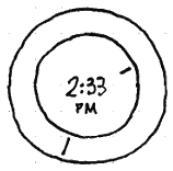
Time dial
|
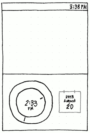
A time dial normally consists of two nested dials, with the time displayed in the center. Spinning the inner dial should adjust the hours, the outer dial the minutes.
To emphasize this, if you tap the hours or minutes segment of the time, the hour or minute hand should flash respectively. If you tap “AM” it should toggle to “PM” and vice versa, as an alternative to spinning the hour dial 360 degrees.
Spinner
|
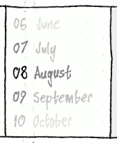
If you flick a spinner up or down, whichever value ends up in its center should become selected.
If you tap a value anywhere in a spinner, that value should immediately become selected, and the spinner should then spin to make it centered too.
Where a spinner contains units on a circular scale — seconds in a minute, minutes in an hour, hours in a day, weekdays, or months — the latest value should be immediately followed by the earliest. For example, December should be followed by January.
Handling of default values, minimums, and maximums
If an app provides no default value for a picker, its initial value should be as close to the current date and/or time as is possible given any minimum or maximum.
If an app asks for a minimum and a lesser maximum, the picker should signal an error and ignore both of them.
Otherwise, if an app asks for a default value less than the minimum, or greater than the maximum, the picker should signal an error and set the initial value to the minimum or maximum respectively.
Time picker
|
|
The time picker should consist of a time dial and/or a seconds spinner.
Minimum/maximum:
- If the minimum and maximum fall within the same hour, the hour dial should not be present.
- If the minimum and maximum fall within the same minute, neither the hour nor minute dial should be present, but the time should still be displayed in place.
Precision:
- If the precision is not a multiple of one minute, the dial should be accompanied by a seconds spinner.
- If the precision is a multiple of one hour, the minute dial should not be present.
Date picker
|
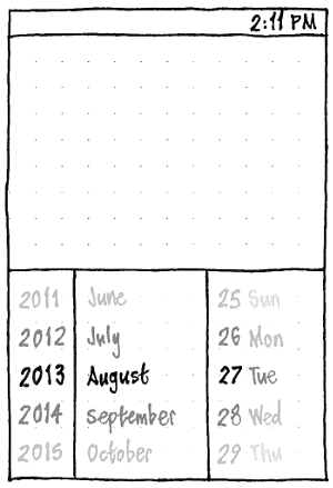
The date picker should consist of three spinners: year, month, and/or date. The month spinner should list full month names (e.g. “September”). The date spinner should trailing-side-align dates, following them with leading-side-aligned weekdays (e.g. “Monday”) only if there is room for the longest possible one (e.g. in English, “30 Wednesday”).
If the currently selected date becomes impossible because either you or the app changes the year (from a leap to a non-leap year when the date is set to February 29th) or the month (e.g. from a month that has 31 days to one that has fewer), the date should reduce automatically, but should immediately return to its previous value if that becomes possible again before you next manually change the date.
Minimum/maximum:
- If the minimum and maximum are within the same year, the year spinner should be present but insensitive.
- If the minimum and maximum are within the same month, the month spinner should be present but insensitive.
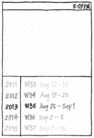
Week picker
|
Month picker
|
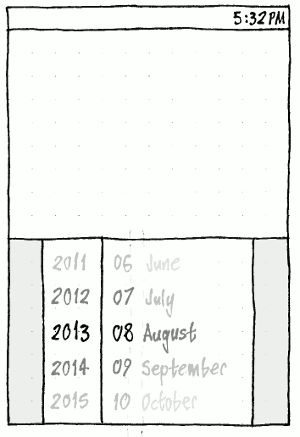
The month picker should consist of a month spinner, and, if minimum and maximum are not in the same year, a year spinner.
Because the most common use of a month picker will be to enter start or expiry months for payment cards, the month spinner should include both two-digit months (aligned on their trailing side) and full month names (aligned on their leading side).
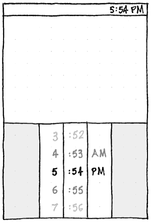
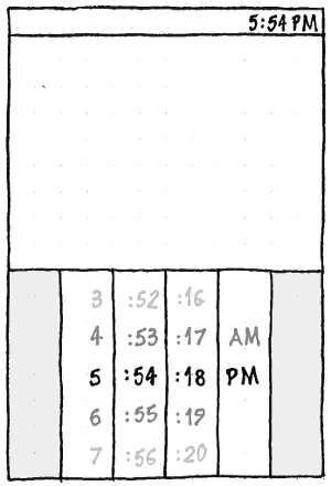
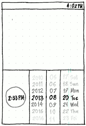
Local datetime picker
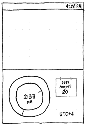
Zoned datetime picker
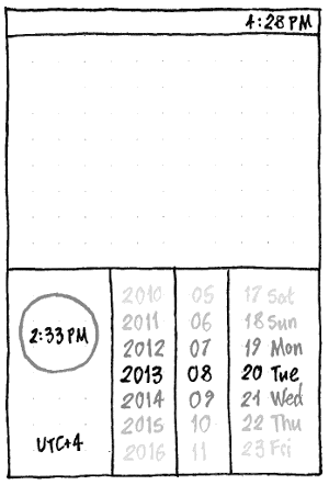
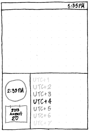
Design process
Competitor analysis
iOS date picker: “A date picker can have up to four independent wheels, each of which displays values in a single category, such as month or hour … The overall size of a date picker is fixed at the same size as the iPhone keyboard.”
Android date and time pickers: “Android provides these as ready-to-use dialogs.”
Windows: “Adding a DatePicker” and “Adding a TimePicker”
Design workshop
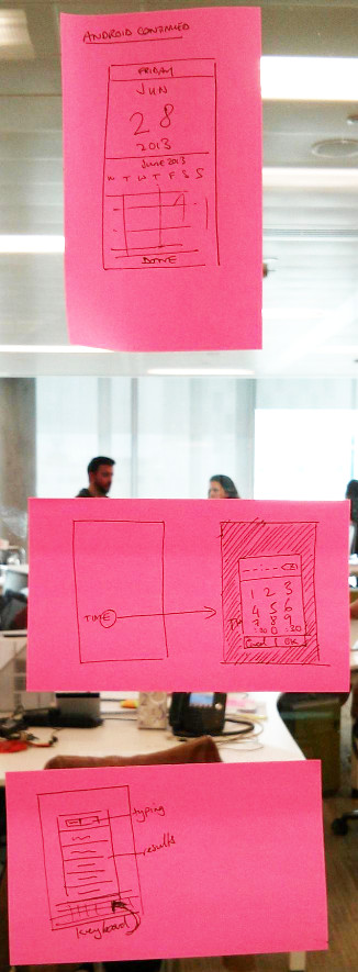
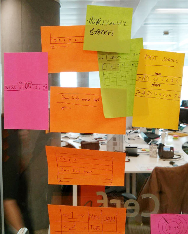
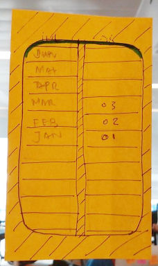
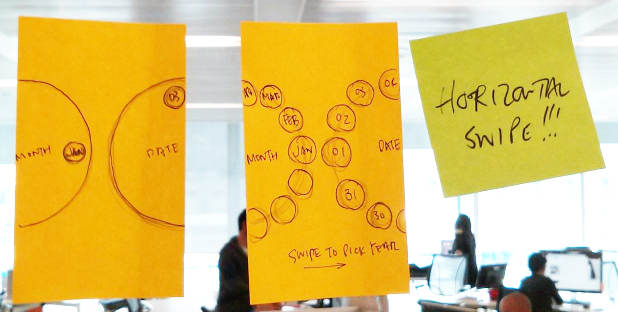
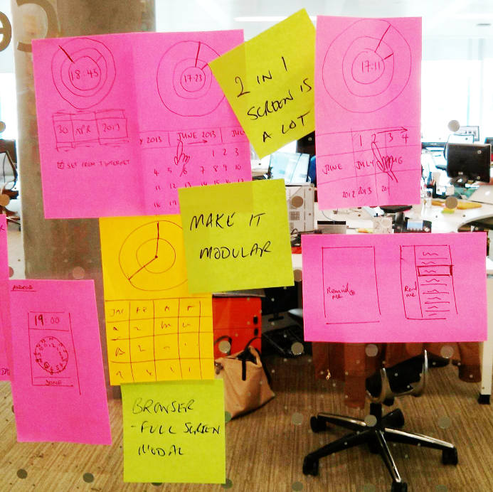
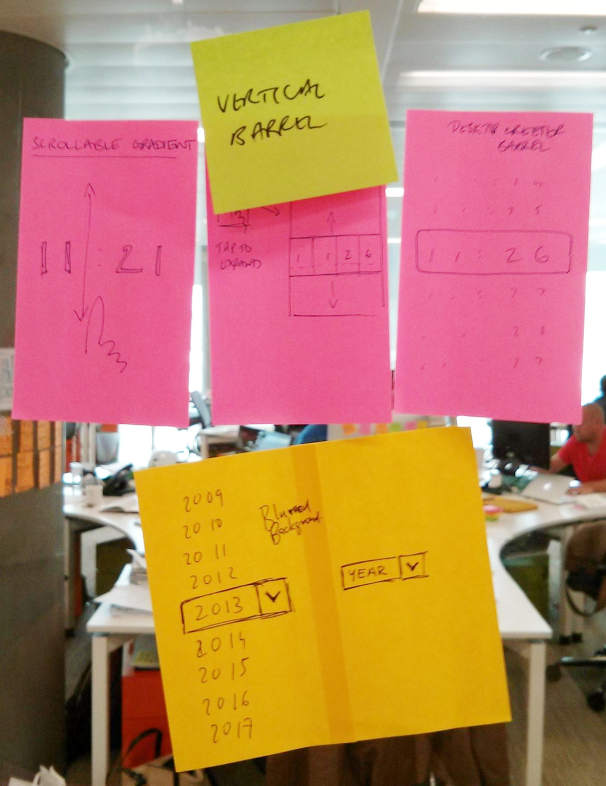
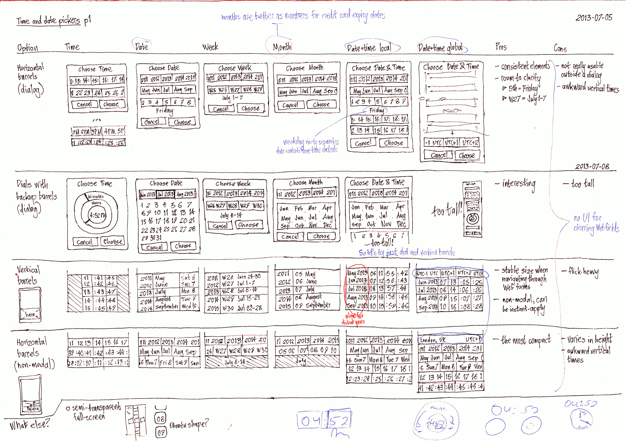
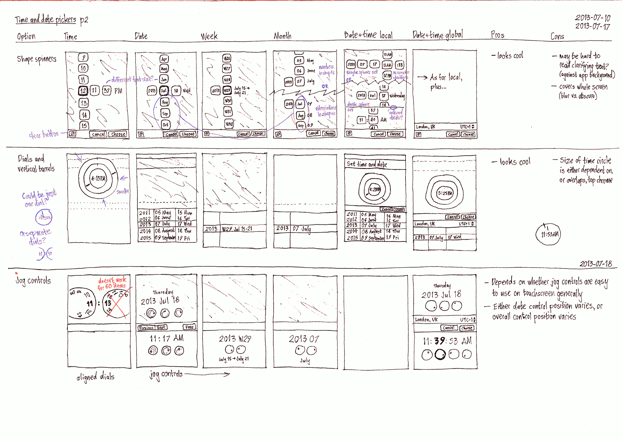
Applying the basic ideas to the use cases
TimeAndDatePickers (last edited 2013-11-13 14:46:11 by faun)
