Countdown banners for Ubuntu 10.04
Post your ideas for a countdown banner here. Guidelines are:
- width: 180px
- height: 150px
- optimized png, gif or jpg, or
- iframe containing interactive content (using static html, css, js and images - no PHP)
- no flash - must work perfectly with only free software
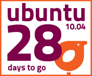
A successful implementation will countdown the days from the Beta to final release. This means 28 images numbered 28 - 1 plus one for day 0 that says "coming soon" and one more that says "it's here" (30 images total).
For reference see the JauntyCountdownBanners
Post your drafts and mock-ups here along with any extra information you feel is useful then send a message to the web presence team mailing list so we can discuss it.
A few of the best will be selected to be syndicated from www.ubuntu.com/getubuntu/countdown and one of the best that harmonizes well with the Ubuntu website colors and look will be shown on the Ubuntu.com homepage.
Submissions
Florian Hubers's Design
I used the new Ubuntu bootscreen logo and "progressdots" for this banners. (Note: Please click the Full Size' link to see the original)

Full Size (Overview) Banner info page
Andrew Higginson's Design
Brandon Ferringer's Design
I will have the rest of them ready if anyone likes the design.

Sorry, I feel these designs look cheap, good idea but I don't like the background effect, the colours are also unrelated to ubuntu's new branding I'll make the rest if anyone likes the design. I think the banner should show off the new wallpaper.
I just wanted to keep it simple and in the same contrast as the new brand graphic. I also can do the rest ;). MTeck: This is my personal favorite. It mixes into the new design very well. The only thing I'm not sure about is the big IS the day it's coming out. Silviu-Ionut Radu: I have made some other versions for the Coming soon! label. Thank you for your opinion MTeck
As my first version, only with a bit of changes MrAndrzejak: I really like this. Its in my top faves. If the top 80% background had more purple in it I would like it even more!
This is the way I see the banner after I sow the new HomePage of ubuntu website.
Building on Muscovy's design, I used the official logo and added a tiny gnome-terminal. I've included the GIMP .XCF for easy changes
Also uses the new aubergine/orange/white palette, together with the open font Titillium—to reflect this release's emphasis on light, and for its wonderful legibility—for everything except the new logotype. Alternate forms with the URL and aubergine background: The .xcf file for GIMP (including all the days and alternate colours) is also attached. MTeck: This is my second favorite. I think the link when it's out is out of place and the numbers seem very narrow and out of place. I think wider numbers would look much nicer.
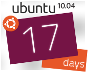
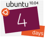
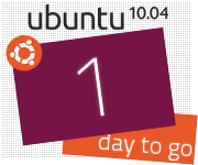
Having looked again at the brand wiki pages, I've created these based on the post-it images used for the fridge The "10.04" is copied from the same mockup ("Announcing Ubuntu 10.04 LTS: The Lucid Lynx") for type matching. Links below are a mockup of this countdown banner in use on the new-look fridge, the source .xcf for GIMP, and a page with working versions. lucid_countdown_marc_stewart_3k_fridge_mockup.png lucid_countdown_marc_stewart_3k.xcf Live versions of these banners
I have the rest of them ready and can upload them if anyone likes them. I was not sure which "it's here" to use so i uploaded them both and you can pick which one looks better.
Hi all! Ubuntu user for 3+ years and looking for more ways to contribute to the community. Here is my first banner set, and working on one more. ALT version with orange "Ubuntu"... I have used several of the new pictograms which could be presented each day as I did above, or change every 4 days from one to the next. My overall idea was to: 1) keep it simple, 2) use the key colors of orange and purple, 3) use a white background to promote the new theme of light. I'll finish up with my mostly orange theme idea... The "coming soon" banner has a spice of purple in it, but I think I prefer the all orange look of the "it's here" banner. Another idea... The lighter orange and purple are easy on the eyes. Could always mix and match the best of my ideas for a final design. Using the new install designs in the background....
This submission celebrates the new Lucid pallet. The first mockup is the "day" countdown. The phrase is from the ubuntu home page and is meant to bring consistency to the messages being delivered from the community. The second mockup is the day-of-release and the third is post release. All three mockups have the ubuntu URL. Arguably this is redundant as clicking the image will transfer the user to ubuntu.com but if the page is printed or captured in a screen shot adding it to image makes it a good reference to someone new to ubuntu.
Light Lynx Going for light Is there a place I can get the background for this for my desktop background?
Live preview (works only from 1st April)
Announce / Generate picture / Pictures
Like last year I will provide the official Banners for situations where Javascript cannot be used, like on Wordpress.com blogs.
I made a small Facebook app to add the Banner to your profile: http://apps.facebook.com/ubuntubanner/ Huber Florian <itshorty@gmail.com> - http://itshorty.soup.io ![]()
Muscovy's Design
Silviu Radu's Design




Silviu Radu's Design v2
![]() And for this one I have used only a free font (Dejavu).
And for this one I have used only a free font (Dejavu). 
Silviu Radu's version 3



Jeff Stone's Design
Marc Stewart's design
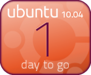




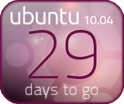
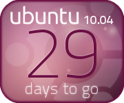 lucid_countdown_marc_stewart_1h.xcf
 Inspired by the new site mockups
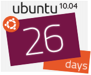


Ty VandeZande's Design



 or
or 
![]() Edit conflict - other version:
Edit conflict - other version: I Heart Ubuntu's Design
![]() Edit conflict - your version:
Edit conflict - your version: I Heart Ubuntu's Design
![]() End of edit conflict
End of edit conflict 












Lucid Colors


Leogg's design
Aubergine 1.0





Aubergine 2.0



Black 1.0
Amanda Warzecha's Design


Immanuel Peratoner's Design


McPeter's Design

No Javascript option
Available under http://neogates.ath.cx/~huwa/ubuntuLucid/
Facebook Banner