Artwork
Contents
Logo
first logo suggestion

One potential problem is the similarity in color scheme to the Kubuntu logo. However, the colors are true to the Xfce logo. A gzipped SVG file of this logo (produced in Inkscape) is available here: xubuntu_logo.svgz
Comments
I like the logo, but I do feel this is to much of kubuntu instead of having its own personality. A logo is whatever we want it to be, as long as we make it exist on people's minds. Therefore, I'd strongly suggest Xubuntu logo to be a radical different color. (violet, purple, green, etc) -- Mauriciohernandez 2005-10-13 02:48:14
I don't think the colour scheme doesn't really matter, because the logo is clearly different. However, I think it would look better if the XFCE mouse was walking on the edges, as if it's a wheel in which mice play. Something like this. -- Vincent 2005-12-01 19:23:22
A. it kinda breaks the convention set by (k/ed)ubuntu logos, which is "we don't have complex objects (well, kubuntu's wheels are a bit complex, but I don't like that logo too much). Suddenly, you have a "naturally shaped" object in here, which just doesn't similar enough to other logos. 2. I've seen several uses of this logo below (splash screens, backgrounds, etc.). Every time the mouse seems to be more important that the rest ("people part"). And it's supposed to be ubuntu, just with another desktop environment, right? 3. Other than that, it looks really nice. -- Muszek
- I like the above logo, but I think the color scheme needs to be greyscale or at least grey/blue scale. Much like the logos below "Xubuntu Hybrid" by Eric Hewitt.
A funny animated gif with the Xubuntu logo suggestion
![]() IIRC, gif work is not Free as In Freedom, is it?
IIRC, gif work is not Free as In Freedom, is it?
http://pregesbauer.blogspot.com/2005/09/xubuntu.html
That's really awesome! That's exactly what I meant (maybe not animated, but that looks even better!). -- Vincent 2006-01-01 16:07:40
Viper 550's idea

My idea is a bit different, the mouse kinda looked ugly inside the Ubuntu device, so I made a new logo, greyscale with a screw design on the dots which looks like an X.
I like this one most. (Alexei aka BSDard)
AbelChiaro's idea
I decided to go for purple and replace the round heads with mice heads.
It looks good. I've one concern, however. If you scale down the logo the fine details regarding the face of the mouse get lost. A good logo should be recognizable, as much as possible, at any resonable magnification. Because of this, I still prefer the first logo proposal, perhaps with different colors.
- Regards, J. Mak
Hmmm... so far this one maybe is the most good looking, but still maybe not the best. ![]() Why? Because it's scary or at least a bit freaky... maybe because it reminds me of Art Spiegelman's cartoon Maus.
Why? Because it's scary or at least a bit freaky... maybe because it reminds me of Art Spiegelman's cartoon Maus. ![]() http://www.amazon.com/gp/product/0679748407/
http://www.amazon.com/gp/product/0679748407/
- cheers, Simon
Derick's idea

I wanted to make something clean and simple, so as a variation of the original ubuntu logo, I split it into 4 people so there is now an X formed where they meet. I also chose to go with a blue-steel type color scheme as it's easy on the eyes and different enough from the Kubuntu scheme to not clash. I tried putting the XFCE mouse in the middle and it looked pretty good too, but that might be too busy. I also thought about tilting it a little so it's not quite so geometric, but I decided to just go with this one for now. The SVG file can be found here if anyone wants to play with it: http://penguin.agrid.usm.edu/~deisenhardt/Xubuntu_x-circle_Derick_Eisenhardt.svg -Derick Eisenhardt (2005-11-31 @ 3:32am CST)
I really like the idea of the four people, but the X is not really clear, how about putting an X in the middle? I don't think that would be too busy. -- Vincent 2006-01-01 16:11:43
Just what we need, Bravo my good sir! So simple yet so elegant! Love the colors as well! - BrianStevenson 2005-01-30 02:16:21
Ubuntu X logo idea

or get the SVG file xbuntu_x.svg
Comments?
![]() Please add a @SIG@ at the end of your comments so we get timestamps macro running, like this -- MauricioHernandez 2005-12-14 14:49:21
Please add a @SIG@ at the end of your comments so we get timestamps macro running, like this -- MauricioHernandez 2005-12-14 14:49:21
I love this idea. Simple, pure, coherent with Ubuntu/Edubuntu logos. Someone pointed out that blue is xfce's traditional color... but it's already taken by Kubuntu. So why not stay with regular Ubuntu's colors? If I was asked about my personal view, I'd say orig. and green are very nice. -- Muszek
Looks a little rushed to me. - BrianStevenson 2005-01-30 02:16:21
I love it! Very clean, and polished. - -- CarlaHufstedler 2006-02-09 18:34:02
Looks great. Especially the purple one. - -- Zettt 2006-09-26 14:41:00
Xubuntu Hybrid
by Eric Hewitt
The banner:

The main menu logo:

I made a hybrid combining the the original idea and Derick's colors. The mouse is a little enlarged to scale, so that it's discernable at smaller resolutions. The x in xubuntu is closer to the logo in the standard *ubuntu logos to create an arrow effect with the logo, so that the mouse is (subliminally) moving foward. In essence, it's the best of both worlds, as it steps away from the Kubuntu color scheme and still has a strong connection to XFCE. You can get the SVG here: xubuntu_banner.svg
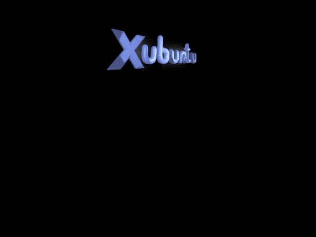
Xubuntu USplash


- - USplash based off my X-Circle idea -- Derick Eisenhardt
My try at the splash screen. I have also uploaded an svg and an xcf (from the GIMP). Feel free to use, edit or whatever suits you. -- Vincent 2006-01-24 15:17:55
Edit: It didn't work because it had more than 16 colours, I now cut it down to 16, however, it doesn't look as good as it used to do. The 16-colour-version is the attachment "XubuntuSplashByVincentCorrect.png", however, if you want to see the good-looking one, you'd have to take a look at "XubuntuSplashByVincent.png". Regards, -- VincentZekred 2006-01-26 14:11:15
Wallpapers
== size 1024x768 JozsefMak==

== size 1024x768 JozsefMak==

== size 1024x768 JozsefMak==
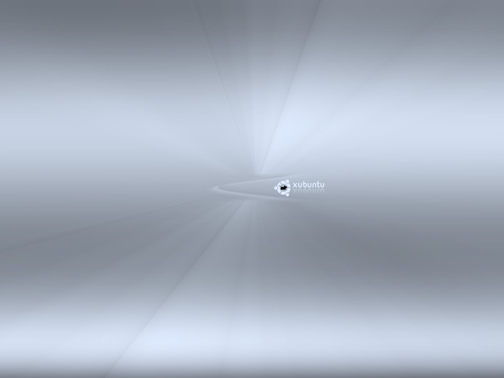
== size 1024x768 JozsefMak==
Userbars
by marines 
by xonTAB 
Login screen design concept
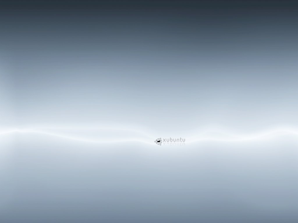
== Size:1024x768 JozsefMak==
