Wall-light
|
Size: 1022
Comment:
|
Size: 5653
Comment:
|
| Deletions are marked like this. | Additions are marked like this. |
| Line 1: | Line 1: |
| [[Include(Artwork/PageTemplate/Header)]] ||<tablestyle="float:right; font-size: 0.9em; width:30%; background:#F1F1ED; background-image: url('http://librarian.launchpad.net/2980250/Emblem-16.png'); background-repeat: no-repeat; background-position: 98% 0.5ex; margin: 0 0 1em 1em; padding: 0.5em;">'''Contents'''[[BR]][[TableOfContents]]|| [[Navigation(children,1)]] |
<<Include(Artwork/PageTemplate/Header)>> ||<tablestyle="float:right; font-size: 0.9em; width:30%; background:#F1F1ED; background-image: url('http://librarian.launchpad.net/2980250/Emblem-16.png'); background-repeat: no-repeat; background-position: 98% 0.5ex; margin: 0 0 1em 1em; padding: 0.5em;"><<TableOfContents>>|| <<Navigation(children,1)>> |
| Line 7: | Line 7: |
| Vote for it: http://brainstorm.ubuntu.com/idea/11805/ <<BR>> Digg it: http://digg.com/linux_unix/Vote_for_a_beautiful_usable_Ubuntu |
|
| Line 8: | Line 11: |
| Just a simple wallpaper for Intrepid Ibex: | A collection of modern interface designs can be seen on my deviant art page, please leave comments there too. http://willwill100.deviantart.com/ Here a the brand new designs: {{http://fc06.deviantart.com/fs32/i/2008/215/a/2/Interpid_Ibex_Mockup_Part_3_by_willwill100.png}} {{http://fc02.deviantart.com/fs31/i/2008/215/e/1/Interpid_Ibex_Mockup_Part_1_by_willwill100.png}} {{http://fc01.deviantart.com/fs31/i/2008/215/0/b/Interpid_Ibex_Mockup_Part_2_by_willwill100.png}} I would love it if these designs received some serious consideration, Ubuntu appears to be just content to settle for the poor and unattractive orange designs. Whilst the current Ubuntu designs have worked until now, if we want to extent the appeal a real rethink and transformation needs to be undertaken. I will add commentaries to each design in due course. Stand by! Just a simple wallpaper for Intrepid Ibex (Its pretty rubbish but ill leave it up out of nostalgia): |
| Line 11: | Line 29: |
| http://fc05.deviantart.com/fs30/f/2008/150/9/d/Interpid_Ibex_Wallpaper_1_by_willwill100.png | {{http://fc05.deviantart.com/fs30/f/2008/150/9/d/Interpid_Ibex_Wallpaper_1_by_willwill100.png}} |
| Line 16: | Line 34: |
| Use footnotes, attachments, and like where appropriate. [[FootNote(Footnote sample)]] | Use footnotes, attachments, and like where appropriate. <<FootNote(Footnote sample)>> * I think this is excellent, i love the sense of the mystical in it and it fits very well with ubuntu, i certainly prefer this type of wallpaper to the purely algorythmical vistaish sort that has become popular recently (like the gutsy default). however there are two problems, firstly you need to get rid of the ubuntu logo, i dont think it goes with the paper (it sort of sits in too a arbitrary position and its colour contrast clashes with the rest of the wallpaper) and i personally dislike ubuntu logos on wallpapers on principle (unless subtle i.e the birth of ubuntu paper which was awesome) secondly i dont think the ibex logo has been merged with the backround perfectly and at the moment has an annoying gey splodgy outline. if you address these two problems i think it will be a really great wall paper and better i think perhaps that the hardy one and certainly better than the gutsy one. * I love the contrast and I love the black icon. Not a lot of complaints besides the lack of flow between the Ibex and the Ubuntu logo. That being said, please don't place the Ubuntu logo inside the Ibex, that just looks cheesy. * Nice but the colours are too vivid. -- Cutter3 <<DateTime(2008-07-20T00:09:25Z)>> * I'm really digging the theme, and I think that it would work great if people could customize the theme to their liking in the settings alá Clearlooks. Gets my vote! * Rounded corners in menus just don't work IMHO... -- VinNL <<DateTime(2008-08-04T10:45:55Z)>> * Gorgeous. Hope you can make the real one soon. --vperetokin<<DateTime>> * Amazing, absolutely amazing. Keep up the great work! * [[http://arstechnica.com/articles/paedia/shuttleworth-oscon-keynote.ars|Mark Shuttleworth]] I hope you are paying attention. Unfortunately AFAIK this mockup is not currently possible. - Jojoman02 * I love it! It is beautiful, and most of it actually can be done. Maybe the dock should be less OSX-like, but other than that, this is the first theme I would use as-is. Ubuntu should settle to this minimalist style, and even though the mock-ups could not be replicated 100%, here's the direction Ubuntu should take. I simply love it! * I like the GDM very much. But the desktop mockup looks too much like a hybrid of Vista and OS X. Modifications need to be done if this mockup where to be finalized in Intrepid Ibex, in order to make Ubuntu having its own identity rather than 'stealing' ideas from other OSes, like some OSes have been criticized for. -- kenji <<DateTime>> * This is simply stunning, and the general consensus on Digg agrees. This is the direction Ubuntu needs to go with its theme. I would have no hesitation in recommending Ubuntu to everyone I know with a theme like this. -- belovedmonster * I made a GTK theme based off of this idea. It's not perfect, and it may need some tweaking. Check it out at http://68.55.24.12/MurrinaIbex.tar.bz2 -- ryawn <<DateTime>> * Really like it as well - behind the nice colours are usability improvements (Love the login screen) -- YannHamon <<DateTime>> * If this mockup could be made into an actual theme I would definitely use it, be it the default theme of Intrepid or not. But I think it has some quite big technical problems. It has been pointed out (by Cory K) that this theme needs compositing - and users with no such capabilities are not able to use it. But still I think it deserves to be made into an actual theme - I recommend to the author to start organizing his team and begin work with it - not mock ups any more. -- Aethralis 2008-08-07 17:56:34 |
Contents |
Wall-light is my ubuntu art area, am planning to update regularly with my musings....
Vote for it: http://brainstorm.ubuntu.com/idea/11805/
Digg it: http://digg.com/linux_unix/Vote_for_a_beautiful_usable_Ubuntu
Description
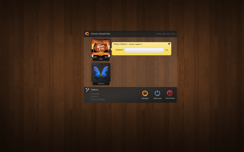
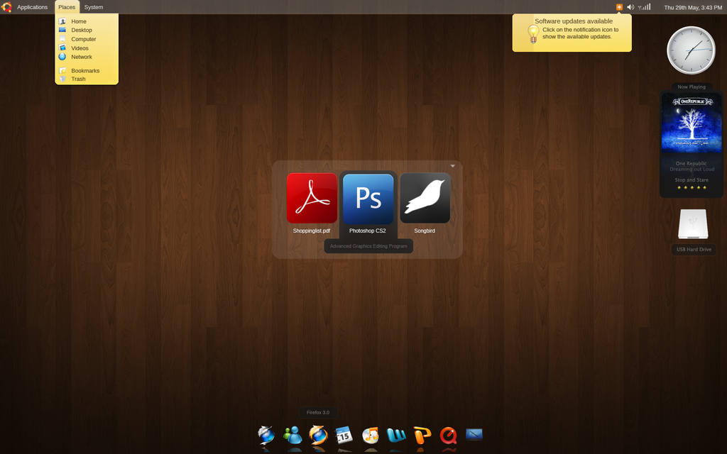
A collection of modern interface designs can be seen on my deviant art page, please leave comments there too. http://willwill100.deviantart.com/
Here a the brand new designs:


I would love it if these designs received some serious consideration, Ubuntu appears to be just content to settle for the poor and unattractive orange designs. Whilst the current Ubuntu designs have worked until now, if we want to extent the appeal a real rethink and transformation needs to be undertaken. I will add commentaries to each design in due course. Stand by!
Just a simple wallpaper for Intrepid Ibex (Its pretty rubbish but ill leave it up out of nostalgia): http://willwill100.deviantart.com/art/Interpid-Ibex-Wallpaper-1-87094933

Hopefully this area will extend into desktop mockups, colour schemes etc similar to my previous entry for hardy (can be found here: https://wiki.ubuntu.com/Artwork/Incoming/Hardy/Alternate/Walllight)
Comments
Use footnotes, attachments, and like where appropriate. 1
- I think this is excellent, i love the sense of the mystical in it and it fits very well with ubuntu, i certainly prefer this type of wallpaper to the purely algorythmical vistaish sort that has become popular recently (like the gutsy default). however there are two problems, firstly you need to get rid of the ubuntu logo, i dont think it goes with the paper (it sort of sits in too a arbitrary position and its colour contrast clashes with the rest of the wallpaper) and i personally dislike ubuntu logos on wallpapers on principle (unless subtle i.e the birth of ubuntu paper which was awesome) secondly i dont think the ibex logo has been merged with the backround perfectly and at the moment has an annoying gey splodgy outline. if you address these two problems i think it will be a really great wall paper and better i think perhaps that the hardy one and certainly better than the gutsy one.
- I love the contrast and I love the black icon. Not a lot of complaints besides the lack of flow between the Ibex and the Ubuntu logo. That being said, please don't place the Ubuntu logo inside the Ibex, that just looks cheesy.
Nice but the colours are too vivid. -- Cutter3 2008-07-20 00:09:25
- I'm really digging the theme, and I think that it would work great if people could customize the theme to their liking in the settings alá Clearlooks. Gets my vote!
Rounded corners in menus just don't work IMHO... -- VinNL 2008-08-04 10:45:55
Gorgeous. Hope you can make the real one soon. --vperetokin2024-11-19 03:22:40
- Amazing, absolutely amazing. Keep up the great work!
Mark Shuttleworth I hope you are paying attention. Unfortunately AFAIK this mockup is not currently possible. - Jojoman02
- I love it! It is beautiful, and most of it actually can be done. Maybe the dock should be less OSX-like, but other than that, this is the first theme I would use as-is. Ubuntu should settle to this minimalist style, and even though the mock-ups could not be replicated 100%, here's the direction Ubuntu should take. I simply love it!
I like the GDM very much. But the desktop mockup looks too much like a hybrid of Vista and OS X. Modifications need to be done if this mockup where to be finalized in Intrepid Ibex, in order to make Ubuntu having its own identity rather than 'stealing' ideas from other OSes, like some OSes have been criticized for. -- kenji 2024-11-19 03:22:40
- This is simply stunning, and the general consensus on Digg agrees. This is the direction Ubuntu needs to go with its theme. I would have no hesitation in recommending Ubuntu to everyone I know with a theme like this. -- belovedmonster
I made a GTK theme based off of this idea. It's not perfect, and it may need some tweaking. Check it out at http://68.55.24.12/MurrinaIbex.tar.bz2 -- ryawn 2024-11-19 03:22:40
Really like it as well - behind the nice colours are usability improvements (Love the login screen) -- YannHamon 2024-11-19 03:22:40
- If this mockup could be made into an actual theme I would definitely use it, be it the default theme of Intrepid or not. But I think it has some quite big technical problems. It has been pointed out (by Cory K) that this theme needs compositing - and users with no such capabilities are not able to use it. But still I think it deserves to be made into an actual theme - I recommend to the author to start organizing his team and begin work with it - not mock ups any more. -- Aethralis 2008-08-07 17:56:34
Footnote sample (1)
Artwork/Incoming/Intrepid/Wall-light (last edited 2008-09-09 17:29:50 by p54A67336)