Demo
Contents
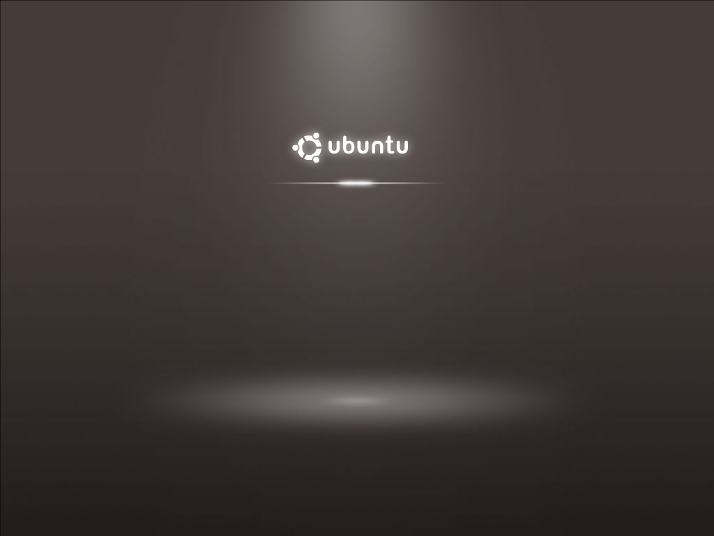
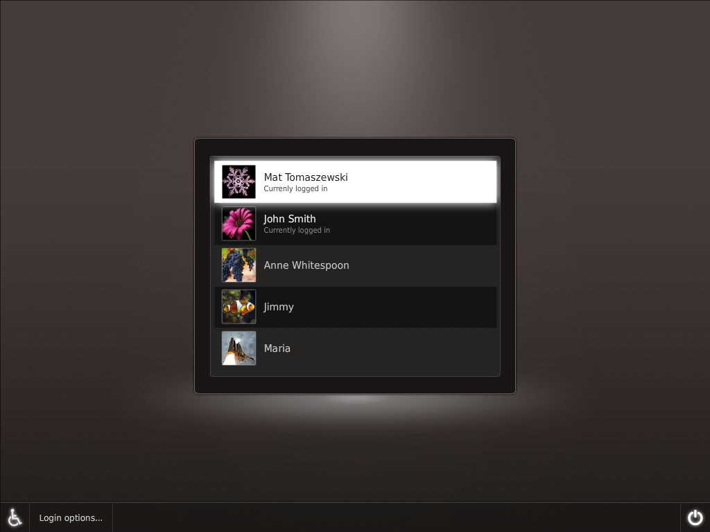
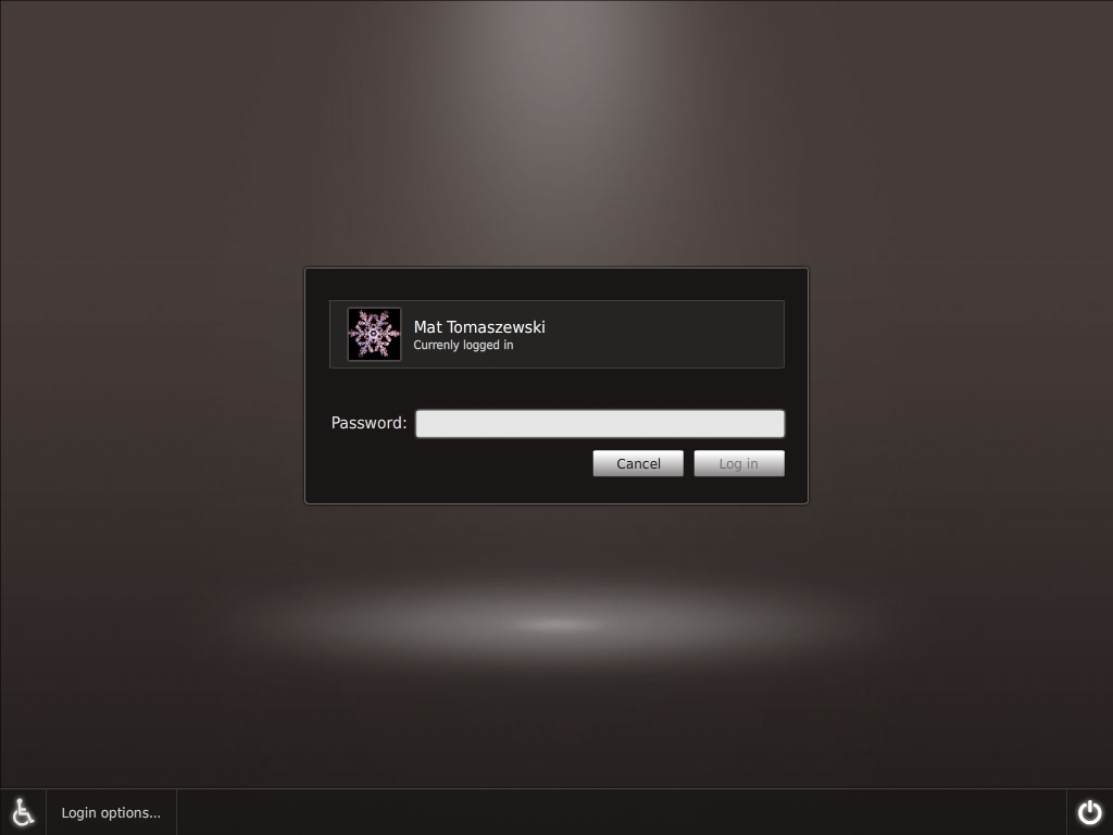
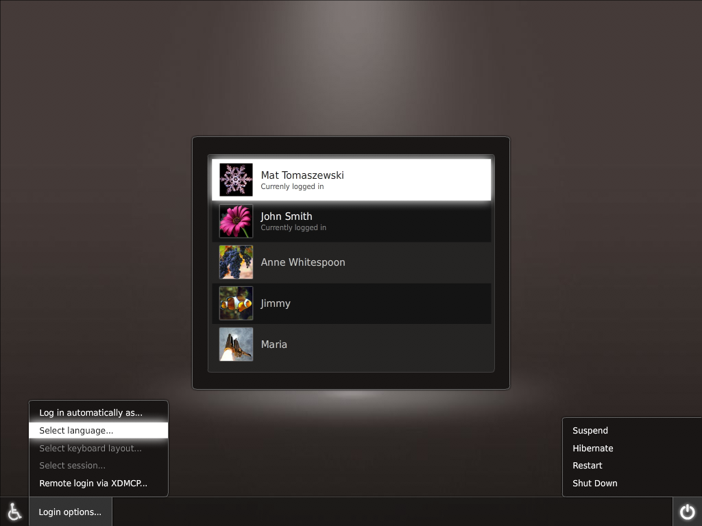
Ubuntu Karmic boot demo and proposed GDM theme
Contributors: Otto Greenslade, Mat Tomaszewski, Mark Shuttleworth, Michael Forrest, Kenneth Wimer
Boot with automatic login - Flash mockup
Splash screen

GDM theme

GDM theme – selected user

GDM theme – menus

Comments/Feedback
What you have done is just superb! If you can implement that then you are the men
 I have some things I'm not sure about but they are not fatal: The right/left edge of menus I would not make round so that it merges better with the bottom bar. Also that spot on the floor and the user selection window don't fit imo but I have no idea how I could improve it
  . Just to mention that this new shiny login will need a whole lot of beautiful preinstalled user images. --AntonKerezov
 - Not bad! But I think you guys can do much better than this. I don't think it feels professional enough. I'll try to remix this and put it up with my suggestions. --mr.doob
- guys please give very high priority to a intuitive keyboard access for all the commands. i would hate it to be usable only with a mouse. and the login and the other button after the login name and password should also have rounded edges. other than that SUPERB job --tgpraveen
I have some constructive criticism as well, first off, I agree with AntonKerezov. Other things: The line separating the options menu button and the weelchairsymbol, is it really neccesary? Think it looks better without. The highlight when going in to the options menu is way to glossy. Otherwise nice! -olskar
- guys please give very high priority to a intuitive keyboard access for all the commands. i would hate it to be usable only with a mouse. and the login and the other button after the login name and password should also have rounded edges.
- I do agree with mr.doob, this doesn't look like it's the best OS in the world ;-). The background color seems a bit dull - perhaps look at mr.doob's submitions for inspiration. I do love the GDM --MadsRH
As promised, here it's my take on this version. I've included the .psd file for everyone's comfort. --mr.doob
- I also agree with mr.doob. It looks good, but somehow a little bit unprofessional and unfriendly. Also it looks a little bit cold (not really "human" but more mechanical :-)). But there are also other problems. The contrast between the background and the ubuntu logo is too low and the background is more intense than the logo.
- Mr. Doobs take is already better. But still I dislike the white glowing selectors. The reason is, that the selected field itself is white-only. This doesn't really look like a glow, because a normal glow has not a flat color inside. Perhaps it would be better to give the selection a slight gradient. The contrast between the selector and the text is too heavy, because the font is too small. For people with visual impairment it would be hard to read. A bolder font, would be better. Also the lines around the selector are looking too small and too sharp for my taste...
Also it looks still a little bit too cold for me to be "human"... (Of course this is *my* opinion. Unfortunately I can't work on an own take these days)-- xfuser4
- Mr. Doob's Mockup beats canonical mockup here. Great job by doob. ;d
I also added a few more colorful mockups here --MadsRH <<DateTime>
- @MadsRH: That's better - it looks less cold. I like the first and the last one. Still I dislike the flat white background of the selected elements. It just doesn't feel like "glowing" for me and the contrast between the text and the background is too heavy. Could you try to experiment with certain kind of gradient in it? Also the thin lines around all boxes are looking still a little bit unprofessional to me. Can you try it without them? -- xfuser4
- I don't like it, quite frankly...I think you should be looking at things done by MadsRH and Mr. Doob's, Canonical... This looks like any theme you could download from gnome-look.org. We need the new theme to be amazing and there are great suggestions out there. Please pay attention to them. This isn't a terrible theme, by the way...but it's not good enough.
- I think they've forget the "Pres ESC to start another operative system" and the DISK CHECK messages, and the NEEDS REBOOT messages. Also, i don't really like the colours, but I don't even want they to be FULL HUMAN, just a little more colourful.--dael99
What about for the GDM when you click on the user, it uses the current background from that user. Have it fade just like when you select a wallpaper for a user. If it were to fade in when the user was selected, I think it would help to make a smoother transition into a session. --natewiebe13
Maybe you don't want your mum to see your pr0n wallpaper... hehe. But it's an interesting idea
 --mr.doob
 Never thought of it that way. Haha.. Why not though? :P But if it's possible, I hope it is implemented, it would give the illusion that you are already a step further to a ready desktop when you click/enter your username. --natewiebe13
really good idea, well, if you don't want your mom to see your p0rn wallpaper, don't use it, put it in a folder with a dot at the beginning (it's not that i'm doing that...)--dael99
Oh, that's clever! I can see you have some experience there...
 Nah, what I mean is that you are giving some kind of privacy by sharing your wallpaper to any computer user. Although you're doing that already by sharing your avatar. I guess it all depends of whether you're aware that your wallpaper is going to be public or not. --mr.doob
 Maybe (if this get implemented) make an option in gnome-appearance-properties to make it public or not. Probably a checkbox underneath the style selection. If the box is checked, it will show during gdm, if not checked, it stays to whatever it was when no user was selected. (Just an idea)
 --natewiebe13
That idea is wonderful, natewiebe13! If it is not implemented I will write it myself. Anyway, I'd just like to say that for as many people who complain about the Human theme, it's certainly puzzling to see that when Canonical finally finds a way to change it a bit, there are more complaints about it not being like the Human theme. --bryanlbasil
Not bad. However, I'd make it browner and add some red and orange in there too (to tie in with the present Human palette) and get rid of the 'spotlight' effect on the background. I'd also be interested to see how the OS/kernel switcher will work, and what would happen when fsck determines the computer needs restarting. -- jrothwell97 2009-08-13 05:29:27
Anyway, the black elemets are a good suggestion to start developing a nice theme, so this way the GDM doesn't look too alien on the first boot (and if it's good enough, i'll be keeped on the next boots..) what i mean is that the theme should be similar to the GDM and to the screensaver lock-dialog coffcoffDustcoffcoff dael99
To me these themes look very, very good; professional and pleasing to the eye. I'd say they are the best mockups I have seen so far. The 'spotlight effect' gives a feel of space, which I find nice. I don't see anything wrong with how the rounded corners are done for the menus. The menus are not supposed to merge with the bottom bar, but the buttons which launch them. I agree with some in that the selected menu item is a little too bright. Congratulations!
