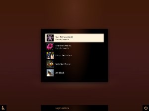
Boot
Contents
|
Karmic Boot Experience
Ubuntu Karmic will get a whole new, shiny and flicker-free boot experience. In other words, the sequence of events between switching on your computer and your desktop session will be largely redeveloped and redesigned.
New stuff includes:
* grub 2, which will be silent, only accessible on-demand (by holding down Shift during Bootloader initialization)
* KMS-powered experiences for the initial boot splash, password encrypted filesystem and disk-check
* Graphical boot splash that will be running on top of X-server, not Usplash
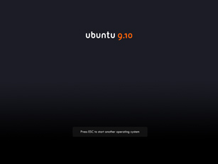
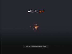
* Graphical OS Switcher available by pressing ESC during the startup sequence, also running on top of X
- GDM 2.
Concept
The standard boot sequence will not include Usplash any longer, instead, the X-session will be started right away. Therefore, the graphical boot splash screen will have the whole X-stack available, including hardware acceleration...
Fresh, innovative concepts is what we're looking for (in-line with Ubuntu branding of course!), in particular regarding the graphical boot splash (spinners, animations, artwork, etc.).
Reference
The design guidelines can be found here
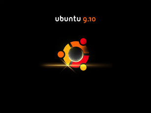
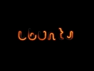
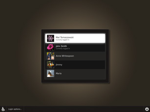
Proposed Look&Feel
https://wiki.ubuntu.com/Artwork/Incoming/Karmic/Boot/Demo
(What is the current status - more than "proposed"? Is this what went in Karmic?)
Contributions
Please add new submissions at the end of existing ones.
The eye of HAL
This is simple circle that glows into red. This idea was once for New Wave usplash but I had no time and knowledge how to realize it so if you find use of it I'll be very glad. --AntonKerezov
Preview:
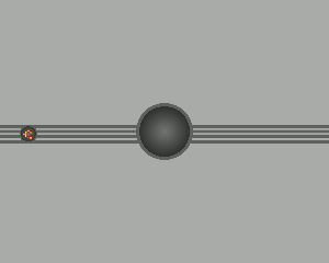
View: Sample Animation
Comments
David Z's Loading Animation
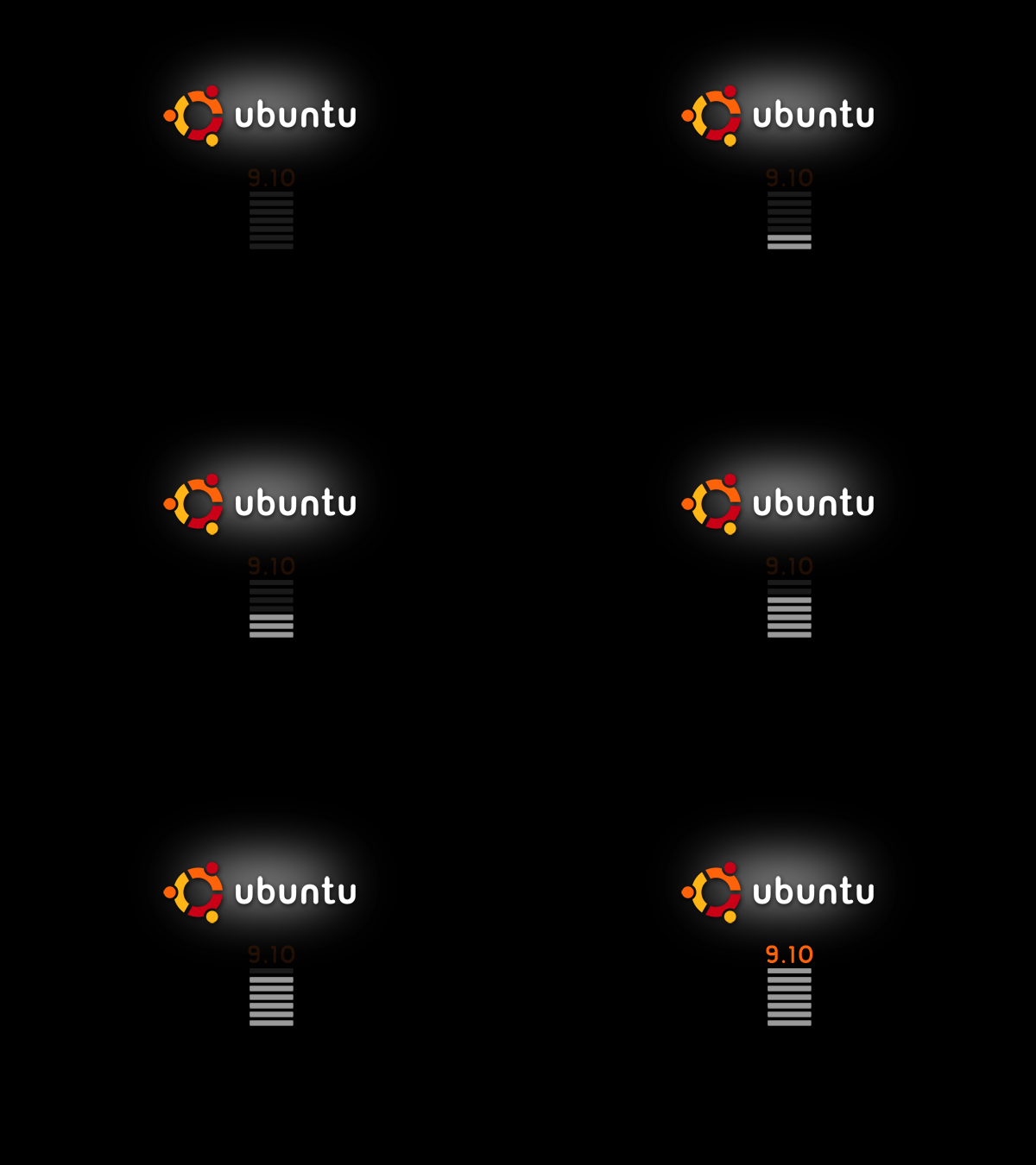
After reading some simple email responses Iv decided to try this. It is a simple picture of the ubuntu logo with a progress bar, the background is a websafe #333 dark gray. My goal for this gif was 'lite'. ~David Zondlo
Preview:

View: Loading Animation
Comments
- David Z's animation looks nice to me, it think that adding a text, focusing on the animal, and lowering the saturation of the progress bar will improve this. currently, the progressbar calls the attention, so, we want the image to call our attention.
- nice idea, but i think the progress bar is too subtle and small ~~~~
David Zondlo's - Going Green
Well after reading that green might be introduced to ubuntu's color palette, I thought it might be a good idea to throw it in the boot screen :).
Submission - #1
Preview:

View: Fullsize
Comments
Awesome. Whilst I am not sure about the green, your design would be a great base for the new usplash/whatever theme. --Tom Wright
As a fan of former Clearlooks and its principles "simple, elegant, and usable" I love your draft together with the mockups of Mr. Doob. When there is the topic new OS design I imagine something like this for the whole desktop experience. At the moment my desktop experience of choice would look like the mixture of your/Mr.Doob's boot design plus the same design for the login screen plus New Wave theme without dark menus plus icon set Erectus with some modifications. I want to add that the other ideas for animation like the african sunrise or the particle animation are alluring as well. Maybe there is a way to change the animations randomly per boot event but keep a consistent overall look at the same time. --S.Erben
Submission Brown - #2
This is with Mr. Doob's most excellent background color choice.
~David Zondlo
Preview:
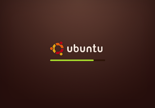
View: Fullsize
Comments
African Sunrise
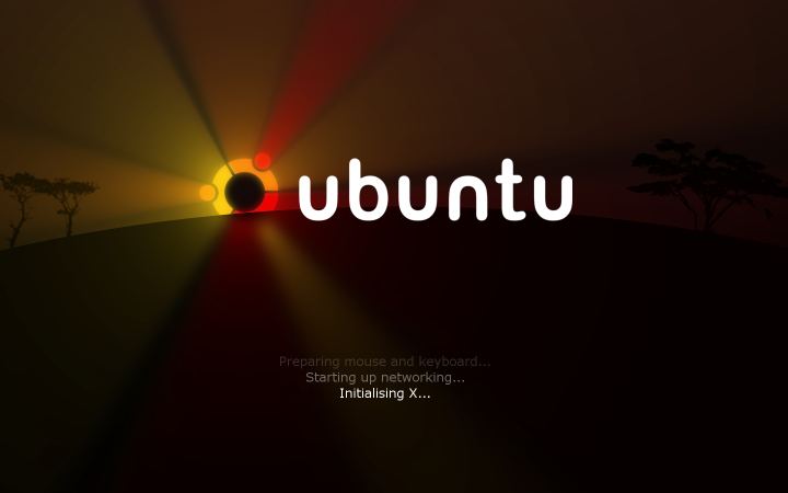
In this idea the boot process shows an African sunrise, where the sun indicates the progress.
Preview:
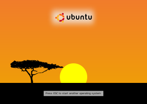
View: Sample Animation Original SVG
Comments
I really like this idea. The colours of the sky should change though as the sun rises. -- flimm 2009-06-29 16:16:02
I think this has the potential to be really cool! Hopefully it can go a bit further. -- leighman 2009-08-02 21:41:26
Beautiful, and really stays in keeping with that "Human" feel. --blueyonder64 2026-05-04 13:44:02
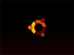
spg76's boot
I made a raw animation of my idea. SebastianPorta
Preview:
View: Sample Animation
Comments
Nice animation I like it. Would be natural next step to the current usplash with more effects. --AntonKerezov
- I love this idea. The logo should fade in piece by piece at first (Like it does now) and then pulse in order from then on instead on blanking and then fading in again. --Washburnello
Wow, what as great idea there. I love it but I would also say that it ends roughly. I would also recommand to make it pulse at the end. Nice job Mr. Porta ! --PierreOlivierDufresne
Mr.doob boot
Iteration 1
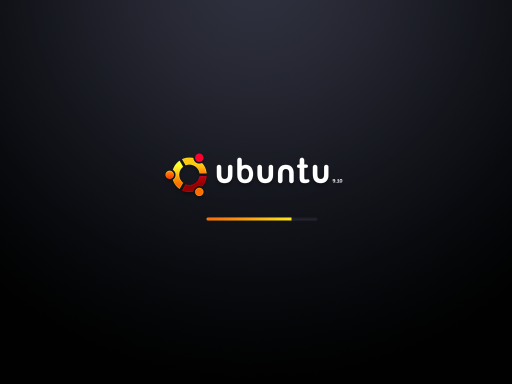
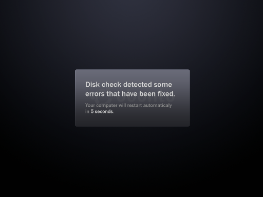
Quick mockup. Tried to have it as simple and elegant as possible. The actual boot loading was a good start I think. If the people like this style I can develop it and create the login panels and so on. --mr.doob
Comments
- Best boot I've ever seen in my life. The way you did the ubuntu logo, and the gradients just make it look very professional and clean. Definately the best splash on this page. I hope this one goes through. While I'm at it, there should be both a widescreen and fullscreen version of this. I think they are trying to get that working properly. Great job! --natewiebe13
- This is a great mock-up, and I hope it gets included somehow in the final release. This may not work, but I thought that adding a slight hint of brown or orange to the background gradient would make it look more at home in ubuntu. --dstansby
Fantastic work Mr.doob
 I would loose the Ubuntu logo and text in the message mockup. Can't wait to see some more work from you - keep up the good work. --MadsRH
 - Awesome 0_0 . The logo looks cooler than the current one and I don't know why :P . I would make some minor changes thou: avoid the 9.10 text, since it draws your attention to it rather than keeping it in "ubuntu", and also remove the loading bar, replacing it with a throbber, since loading bars mean that it will take long and will give that impression. Windows and MacOS already ditched their loading bars.
- First, I noticed that it looks like the red circle on the Ubuntu logo is missing the outline and gradient, it seems very bright compared to the rest. I agree with removing the 9.10, but keep the loading bar. Windows and Mac did remove theirs, but the problem is that you don't know how long it is going to take. With the throbber, it just seems like forever [especially on Windows because it does take a long time], but a loading bar, you can tell how long things are going to take. And with 9.10 to have a faster boot time than now [my boot time is 15 seconds] and 10.04 to have a boot time of 10 seconds, I don't see a big problem with a loading bar. Also, I thought the reason of Ubuntu/Linux was to be different from OSX and Windows.
- Another option would be just to fade in and then out that screen
- Here's my vote for removing the progress bar. Have you seen the animation in Windows 7's login? It's beautiful and I think we could create something similar, but still unique. I also think the '9.10' should be removed. Apart from that, this is great. Love it.
It's great! very elegant and clean, but progress bar should be replaced with something more modern. I also think the '9.10' number should be removed. Anyway, we need something like this in our system boot.
 --Popoi
- First, I noticed that it looks like the red circle on the Ubuntu logo is missing the outline and gradient, it seems very bright compared to the rest. I agree with removing the 9.10, but keep the loading bar. Windows and Mac did remove theirs, but the problem is that you don't know how long it is going to take. With the throbber, it just seems like forever [especially on Windows because it does take a long time], but a loading bar, you can tell how long things are going to take. And with 9.10 to have a faster boot time than now [my boot time is 15 seconds] and 10.04 to have a boot time of 10 seconds, I don't see a big problem with a loading bar. Also, I thought the reason of Ubuntu/Linux was to be different from OSX and Windows.
- I so hope this becomes the boot splash. Simple, clean, elegant. Nice Work! --r00t_ninja
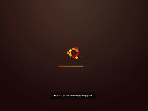
Iteration 2
Thanks a lot for all the feedback guys! ![]() Here is the next iteration of the design. But first, some comments of what I've done:
Here is the next iteration of the design. But first, some comments of what I've done:
So I've changed the background color. A bit more brownish, still, the reason why it was blue at first is because the design gets more rich with different colors. Ubuntu red/browns usually gets a bit plain. However, although it has been a bit of a mistake, the new colors are interesting. Brown but with some greens. Makes it more Ubuntu-like, but keeps the colour richness.
Regarding removing the "9.10"... I've faded it out a bit. The reason I'm putting it there is because right now there is no way to easily know which version of Ubuntu you're running, having the version there could be good knowing what you're booting up (in case you're helping a friend).
Progress bar or not progress bar.. I don't know. I guess that's Canonical's call.
I've also done a quick animation test of an idea I had for the boot/shut down. So the whole experience is horizontal. Starting from left, and reaching the steps until you reach the right. Like if it was a timeline.
Anyway, looking forward to hearing your thoughts about this iteration!
Comments
This is my favourite so far, I think using green atmospherically like this is just brilliant and will help bring about the shift from brown whilst still sticking to 'natural' colours. I love it, good luck. -- jamesmcm03.
This iteration has interesting animations but is not better in color aspect imo. The look is rather greenish which is not very Ubuntu. My advise is to make it dark brown like dust's or leave it grey. Now about the animations: they are good but I think that if the "light" you use from above could vary in its strength that would be wonderful. What I mean is that form black to boot it fades a bit and then from boot to desktop fades from dark to lighter until the bg is shown. As far as the 9.04 text - I agree that it should be there and faded. -- AntonKerezov
- As far as I know, it supossed that we are searching new colours to Ubuntu, and maybe a moss-like green would be great.
- This is by far the most professional looking boot screen I have ever seen. I really love the "Time line" animations, The fade is alright but the "time line" is by far more spectacular! I would really like the progress bar. It would be a shame if it was removed. Although windows 7 doesn't have a progress bar this progress bar is far superior to one Microsoft ever designed! I would really like to see this in ubuntu 9.10! --Ingalls
Wow! This one is awesome! If these transition effects are possible, then great. If not, your other, simpler ones on YouTube would be just as good. In any case, I prefer the black background. -- mikelward 2009-07-22 10:44:23
Iteration 3
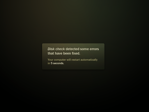
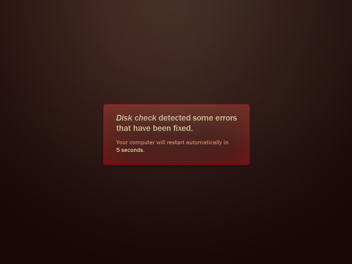
I've made the background a bit more brown now. I'm also testing with just the logo... see what people think. No test animation this time...
EDIT: Actually, there is animation. More subtle this time:
Comments
I don't know about the logo but the warning window's border is too bright. I would keep it as it was in the previous iterations. About color and overall look I think others should say opinion too. I think that the animation is cool now
 -- AntonKerezov
 - The use of the fades (ubuntu is loading at that moment too) help to give the impression the boot time is shorter, plus the artwork is pretty cool. --Artir
- Definitely, the Iteration 2 looks more slick, but the fade in animation from this one (the center-top) should be added to the Iteration 2. Also, a logo animation like spg76's boot will enhance it a lot. Also a brighter colour like this one is not the better chice, think that we have seen a black screen previously (the BIOS boot) and a radical chage like this one would impact too much. That's why a dark background would be better. Also, adding a "Press ESC to load othe OS" would be nice, a faded text on the botton.--dael99
- I'm not sure about spg76 animation... There is a "Press ESC" message at the bottom, or are you talking about iteration 2? --mr.doob
- I think it looks too much plain, brown background does not highlight the other elements. I was talking that if the progress is going to be deleted, a logo animation would be fine. But i prefer to hold the progress bar. A final tough, we are coming from black (the BIOS screen) so, it should fade from a totally black, then we are going to black (the shutdown), so it should go to a totally black screen. -- dael99
But in this video there is no shutdown. I'm getting confused
 --mr.doob
- I think it looks too much plain, brown background does not highlight the other elements. I was talking that if the progress is going to be deleted, a logo animation would be fine. But i prefer to hold the progress bar. A final tough, we are coming from black (the BIOS screen) so, it should fade from a totally black, then we are going to black (the shutdown), so it should go to a totally black screen. -- dael99
- I'm not sure about spg76 animation... There is a "Press ESC" message at the bottom, or are you talking about iteration 2? --mr.doob
I like the brown but it needs to fade from black to brown at the start to cover the bios boot instead of removing it
 begone flashing screen - Killerkiwi2005
 - There is already a fade from black to dark brown, that's the first thing on the animation, but I guess it's too dark. --mr.doob
- I really think brown is the wrong colour to go. If we are coming from a black-ugly-bios screen, we wat to se a beauty boot screen and brown is not truly nice. Also, i think the logo should include the ubuntu name, because once in the desktop we won't see it anymore.
- I got to say, brown isn't the color to go for( although a small hint might do). I think iteration 1 with 3's animations would look the best. Great Job though, this is better than the boot experiences of Windows, and Mac.
- This is by far the nicest boot I've ever seen. I was never really a big fan of the brown, but this seems to work. Perhaps also try a black version as the previous commenter mentioned. - circlingthesun
Aha, great! This mockup is exactly what I was planning to submit, except far prettier. The fade to / from black is perfect, because we have to expect black screens between at least some stages in the boot process. (Unless something astoundingly magical is in the works?). Using a fade makes those moments of blackness look more purposeful and smart. -- dylanmccall 2009-07-14 14:45:08
This is the best bootscreen I've seen so far. Using only the logo is far prettier than using the name as well, in my eyes at least. Adding the version number, as you already did, is needed in this mock-up though. It's good to have something dialogue-like when repairing errors, it gives the user a feeling the OS is more modern than the others that don't look as good. It's very hard to choose the right colour now the first artwork drop hasn't been yet. However, I do certainly think that Canonical should already have a look at this and seriously consider using it. -- qense 2009-07-25 16:21:30
In my opinion this is the best (most professional, and all around pretty) boot screen that has been submitted. In my opinion the flash boot that was previously submitted is no comparison. I truly hope this becomes the boot screen of Ubuntu 9.10 -- DavidZondlo
Took the screenshot and made it an xsplash for my laptop (1440x900, 1280x800) but I kept the xcf file so you can change it for your screen. http://meson.us/community/Doobi3Xsplash.tar.gz Just place the files in /usr/share/images/xsplash/. -- DavidHamm
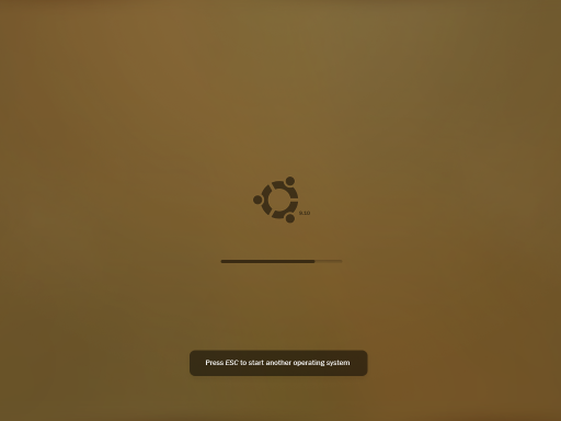
Iteration 4
Here it's another test. Following the guides the most difficult part is the fact that a plain color needs to appear on screen first thing, this color needs to be bright enough to be noticeable so the user knows something is happening. The problem comes when trying to do the transition to the next screen. Doing a transition to a darker screen won't work I think.
Comments
- Now that I see it again. It looks like a gameboy --mr.doob
It is too plain now but I like the graphic look of it. Maybe a bit darker brown will do better job. Btw with what tool are you making the animations? I wanted to create one but The new GAP for gimp is too complex. --AntonKerezov
- Here is when you're going to get disappointed. I've used Photoshop and After Effects on Windows. I tried using Gimp at first (no idea about something like AE for Linux), but Gimp is just missing some things I can't work without. Like resizing and image but keeping the original on memory so the next resize is not destructive. And blending effects, like inner glow with overlay. I wish Gimp could do all this and I could have done on Linux. But believe me, I've tried. --mr.doob
Hmm ok I guess Linux is not yet ready for such things
 --AntonKerezov
- Here is when you're going to get disappointed. I've used Photoshop and After Effects on Windows. I tried using Gimp at first (no idea about something like AE for Linux), but Gimp is just missing some things I can't work without. Like resizing and image but keeping the original on memory so the next resize is not destructive. And blending effects, like inner glow with overlay. I wish Gimp could do all this and I could have done on Linux. But believe me, I've tried. --mr.doob
I like the simplicity, the only thing is I would stay away from using a brown background that light. Sorry to complain
 --Luckenbg
 The first iteration looks the most pleasing to my eye. The contrasting colors gave it a very vibrant look. This iteration looks almost generic. With so little contrast, the logo and progress bar are not very visible on my secondary monitor which has the brightness turned down. --jamesgecko 2009-08-03 00:04:43
I love how minimalistic this theme is, this is especially good when you have a smallish monitor with poor resolution, this theme looks good no matter what. My favourites are iteration 1,2 and 4
 It's all very good to be shiny and high constrasted, but when you boot up everyday, flashy animations can get old pretty quickly (of course, I'm not against wooing girls with your l33t haxorz skillz :P) I hope this and the other themes are listed in the Boot themes in Karmic. Thanks for the great work! -- Zephirum
Iteration 5
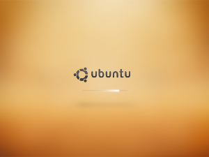
Canonical has presented their version of the boot mock ups. In my opinion it's an interesting approach, but I'm not sure it really give a professional impression. Compression artifacts on the side, I've recreated their mock up and gave it a "gold" tone without overdoing it too much with glows. I still think that the "9.10" version should go along the logo, but seems like Canonical doesn't agree.
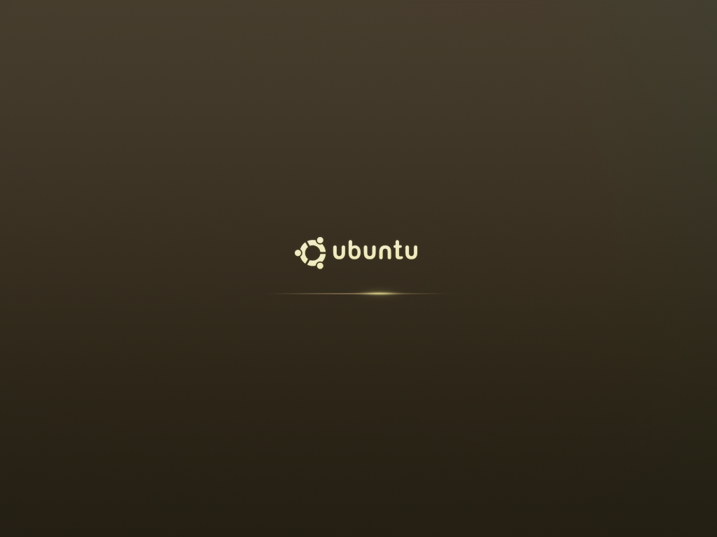
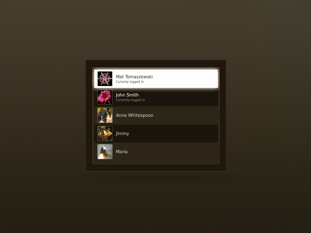
This time I'm also sharing the .psd.
Comments
- could you share the Iteration 3 too? --mac_v
Sure thing! Here you have. --mr.doob
- Sorry but I dont think this looks better than the canonical one.Maybe if you do not remove the lighting effect from bottom, it will look better.-- Shafin
- Don't be sorry. Everyone has the right to have their own opinions. --mr.doob
- The reason Canonical's mockup (and all of the previous usplash themes) use a black background is because on some video/monitor combinations the usplash image does not fill the entire screen and whatever is not filled shows as black. Microsoft does the same thing in Windows XP and newer (and I had a computer that had this problem with Windows 98, looked really unprofessional). The reason Apple can get away with doing this with OS X is because they control the hardware. Short version: use a black background on your usplash
I agree, but on this iteration I'm just trying to continue Canonical's work. -- mr.doob
- I think, of all of these, Iteration 1 still catches my eye the most. I like also the idea of having a loading bar; it seems a regression now to suddenly lose it. -- Matthew
I agree, but on this iteration I'm just trying to continue Canonical's work. -- mr.doob
Iteration 6
Seems like the Design team are interested in experiment with different colours. This iteration is quite aggressive colour wise. Just take your transition time and try to get use to it, see how it feels...
My main concern in Canonical design is the fact that it feels like a closed room. Which doesn't really work (in my opinion) to what Ubuntu is (something open/fresh). Open and fresh are actually quite good terms to define what I've tried to do on this iteration.
As my designs show I'm a fan of simplicity, that's why they are always quite plain, but the design team is more interested on a design with "depth". Having a simple design will make the build much more straight forward, but I guess that's not my call. Hopefully they'll manage to build the design on time :S
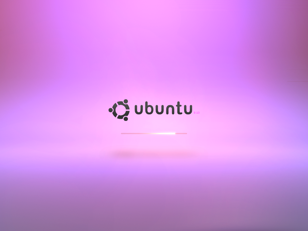
Alternative colours (too pink I think)
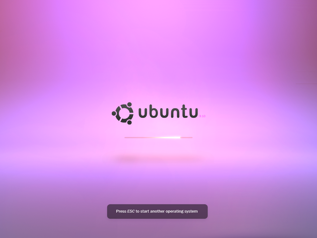
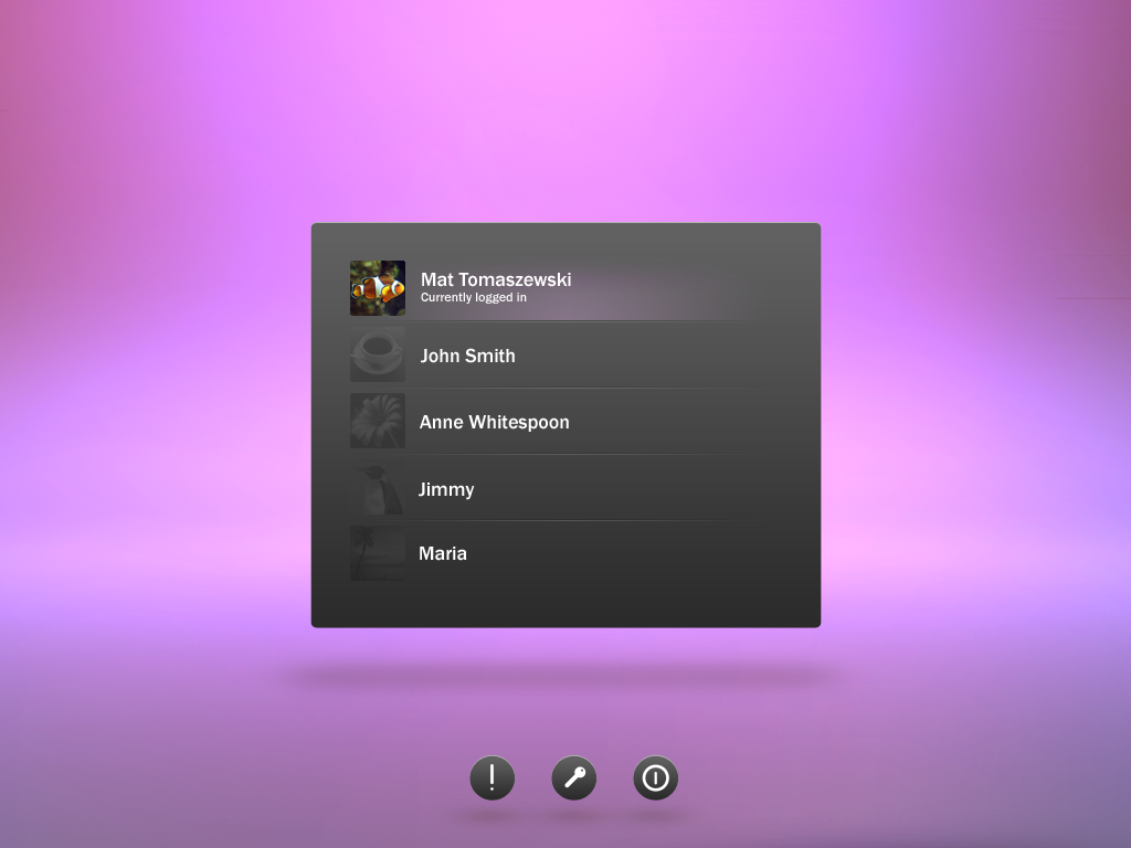
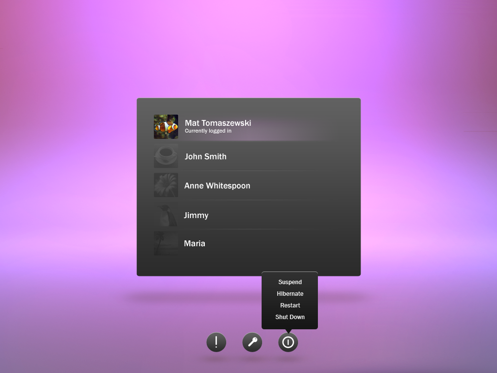
.psd.
By the way, I'm afraid I'm not really aware of the technical limitations, unfortunately I don't have time to study the scenario this time. Hopefully some of the ideas are doable technically.
Comments
- This one looks awesome.On another note, when the xsplash framework is released, do you plan to turn these iterations into themes? -Shafin
- I don't know how to do that. --mr.doob
I really like this one! It's light, fresh and looks like something from this millennium :-). Although the color is open and fresh, I really think that the color lacks some Ubuntu feeling. I'm sure the same open and fresh feeling can be achieved with yellow, red, orange or similar. //MadsRH 2026-05-04 13:44:02
- I agree with MadsRH , The design is great , but the color turned up too pink , and lacks the Ubuntu feeling , Just altering the colors to the above suggestions should do the trick. -- mac_v
- I also agree. But pleasing everyone regarding what ubuntu "feels like" is a hard task just for one. I would really like to invite you guys to load up this mockup on Gimp/Photoshop and play with the colours and post here a version that you think "feels like ubuntu". --mr.doob
I know its tough to please everyone , but the design team would not like this shade , its a bit loud... Anyway, I'v added 2 colors which I feel are more Ubuntu-like because MadsRH already did orange
 , the third is just because I like lavender
  . --mac_v
- I also agree. But pleasing everyone regarding what ubuntu "feels like" is a hard task just for one. I would really like to invite you guys to load up this mockup on Gimp/Photoshop and play with the colours and post here a version that you think "feels like ubuntu". --mr.doob
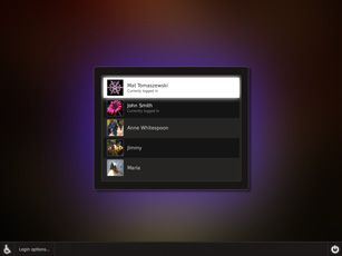
I love the clean design of the GDM Greeter which is free of redundant borders. The simple style matches to Ubuntu's (GNOME's) artwork and therefore looks extremely promising - much better than the ones before. As they don't fit to Ubuntu, i dislike the colors you've chosen. I prefer a panel towards the three buttons at the bottom of the GDM, since they appear a little bit unprofessional (i don't find the right words to describe it atm). Please combine the style of the GDM Greeter of iteration 6 with the colors and the panel of iteration 5 (or try to make use of the colors of iteration 4 as well - if you have the time, play around on it! =]). That would be the perfect one to be integrated in Karmic...btw, i hope that Canonical won't forget the "Press ESC to start another operative system" message of the splash theme. Thank you so much for your nice contributions!! --benii89
That iteration is just coming from the future! Really nice job here - simple and useful. We need more of the priciple 'Less is more' in our designs but unfortunately technology is very limiting right now. But wait... the future is coming brighter
 I even like the colors and if I were a girl I would fall in love with them. --AntonKerezov
Iteration 6 edit by thorwil
Just the splash to suggest a different background coloration:
Iteration 6 edit by MadsRH
I also tried different colors on MrDoob's awesome work, but my orange coloration didn't work out as perfect as I had hoped. //MadsRH 2026-05-04 13:44:02
Pink & Human:
Orange:
Comments
I'm LOVING this orange one. IMHO, these are WAY better than the ones on the demo page. --TheTechFan
The orange variant looks nice and professional. Could you create a GTK-Theme based on it?
 --xfuser4
 The orange variant looks nice and professional. Couldn't you create a GTK-Theme based on it?
 --xfuser4
 the shadow adds a cool "lonesome" and professional feeling. i like the orange one best, but maybe i'm just too used to it -- ~~~
Iteration 6 edit by mac_v
Hmm... another play on the colors. Full credit to mr.doob's original. 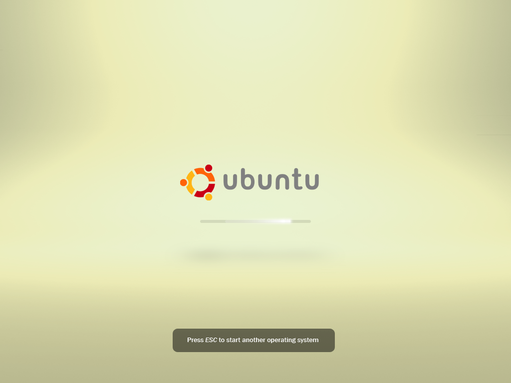
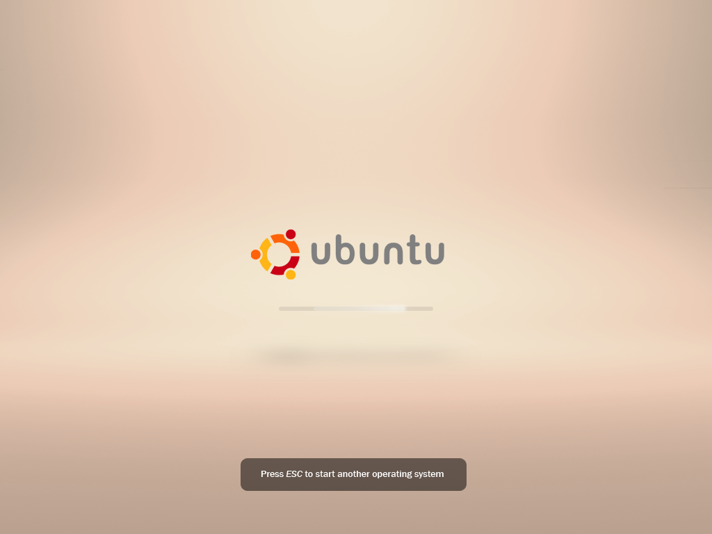
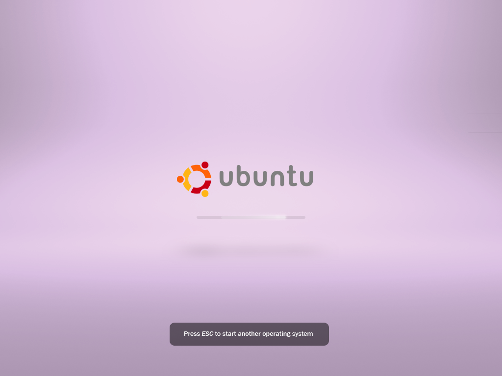
I know... I'll stop now ![]()
Iteration 7
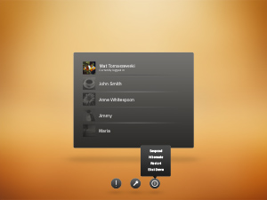
MadsRH's orange version seemed interesting. Maybe it feels more ubuntu now (oranges + browns).
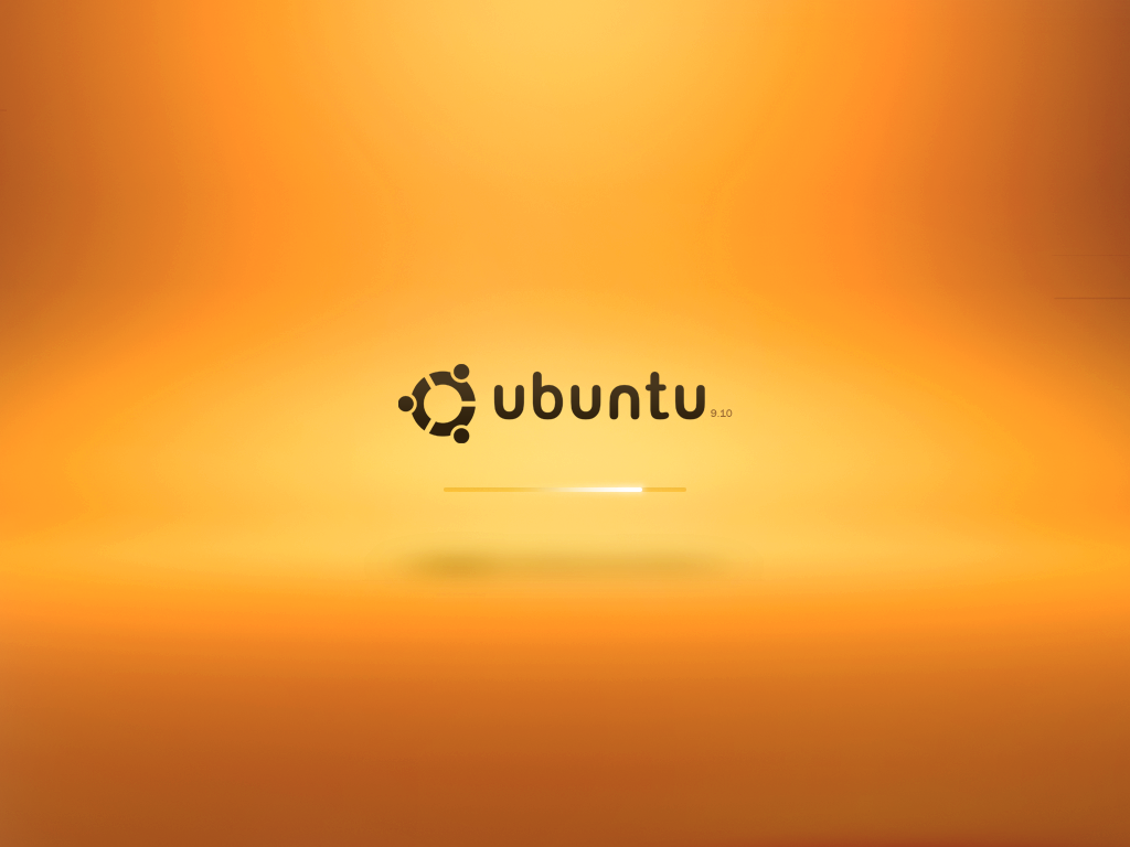
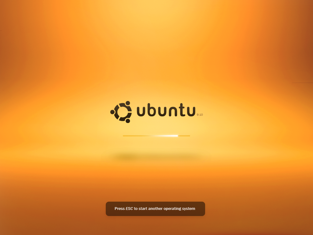
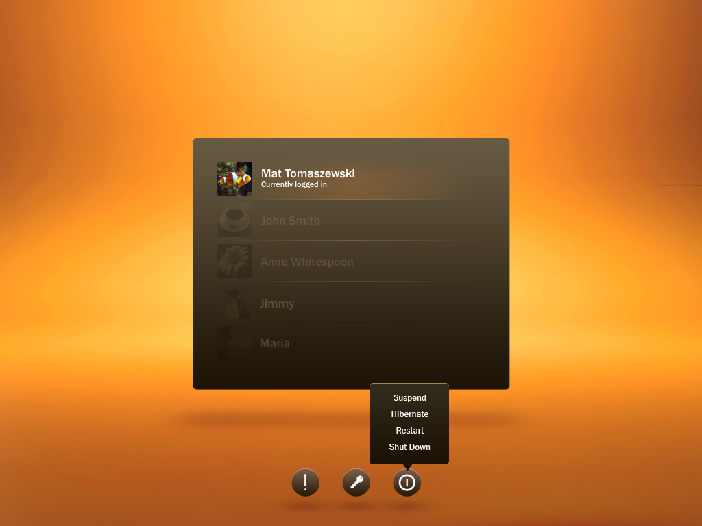
.psd.
Comments
Beautiful! --TheTechFan
Looks ontemporary, lively, refreshing and great
 This iteration keept that 3D depth that my orange version lost. The colors are definitely more Ubuntu-like, but somehow iteration 6 seemed more light (although the color was kind of over the top).
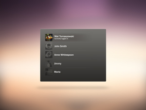
 - That's really great. I really like it. There is only one thing you should change: the names of the non-selected users. People with visual impairments might not be able to read it. And PLEASE: convince the artwork team to use it in Kramic :-)... --xfuser4
- I agree with you on the non-selected users. I would keep the text white no matter what, and just use the glow to identify selected users. --luckenbg
- I think this is definitely what I'd like to see implemented. Marvellous! --Giorgio130
- Wow, this looks reeeeealy good! I hope to see this in 9.10! Or at least something inspired from this, definetely the best here I think:)
I strong disagree, this is way to bright and colorful. It's to overwhelming and in your face, the default theme needs to adhere to the "less is more" approach to makeup, there can be bling but let it be subtle. Furthermore it possesses none of the wonderful minimalism found in the original Canonical mockup (https://wiki.ubuntu.com/Artwork/Incoming/Karmic/Boot/Demo#Splash screen) which is truly a master piece of simplicity, elegance and beauty.
I think MadsRH's orange theme almost nailed it colorwise. ( https://wiki.ubuntu.com/Artwork/Incoming/Karmic/Boot#Iteration%206%20edit%20by%20MadsRH ) The orange/brown combination here on iteration #7 is a little too strong and overpowering. Get rid of the brown. Stick with neutral colors for the buttons, prompts, and user GDM/login. This will create common consistency/uniformity and allow for different color variations (as shown in the various iteration #6 edits) to the actual background (future distro release variations etc?). You're better off using the original dark grey from iteration #6 with a lighter orange combo. What is missing from MadsRH mockup that should be added is the version number as well as fading out of users that are not logged in. (These are present in iteration #7) I really hope that if the Ubuntu design team chooses to ignore your work that you'll release this as a functional boot splash or that you work with someone who can implement it. It would be a shame to see the excellent work here go to waste. --yarly
"I strong disagree, this is way to bright and colorful. It's to overwhelming and in your face, the default theme needs to adhere to the "less is more" approach to makeup, there can be bling but let it be subtle. Furthermore it possesses none of the wonderful minimalism found in the original Canonical mockup". That's your opinion, and you're welcome to it. But there's a difference between minimalist and boring. Sometimes art is about being daring, and I see nothing wrong with experimenting with something a little more bold, as it tends to get people's attention. I personally think this is very close to being a great compromise between Canonical's proposed minimalism (as it still retains elements of the basic concept) while still using eye-catching design and colors, colors which also happen to be two of the colors commonly used in much of Ubuntu's artwork to date. My two cents. -- blueyonder64
MadsRH mockups
Suggestion One
I got some great response on my "Ubuntu 9.10 Promotion intro" video (http://www.youtube.com/watch?v=RdxE55K-Wvw) and and decided to created a suggestion for the graphical boot splash. I got a little carried away during the making of this clip (excessive use of effects - sorry!) and landed far far away from what the guidelines describe. Anyway, I've submitted it anyway for inspiration or perhaps even as a "don't go there" warning LOL. //MadsRH 2026-05-04 13:44:02
View the high resolution .OGV version http://files.getdropbox.com/u/175241/boot/Ubuntu%20Karmic%20Koala%20animated%20boot%20splash%20idea.ogv
Comments
- Looks great! --Mat_t
Yeah, it's a bit over the top. But I'm sure it will give ideas to someone
 --mr.doob
 Very good job MadsRH. I like the way the particles are coming in perspective. --AntonKerezov
- Ououh, fantastic job man! i love, it's clean, simple ,modern and beauty. congratulations. --Daniel Planas
- I love your work, some might say it is over the top but I love it, simply amazing. --Luis
I'm speechless. Your work and African Sunrise have to be the two best boot images I've seen on this wiki so far, hands down. Amazing. --blueyonder64
Suggestion Two
So here is my second suggestion. Instead of loading the desktop after the boot splash, I added the facebrowser preview by Mat Tomaszewski (although we won't see that in Karmic, everybody loves the bling ;-)). Perhaps the throbber should spin a little faster and I should add a bit more motion blur.
UPDATE I've uploaded an updated version that replaces the logo fade-in with a glow/shine. Check it out here... //MadsRH 2026-05-04 13:44:02
Short (boot splash only) .mpg version here...
View the .OGV version here...
Comments
- Personally I like the first suggestion more because it is more expressive and dynamic. The second one just don't feel right to me. Maybe if you use smothering else (not Ubuntu logo) for the spinner it will be better.
I like it, particularly your GDM login theme. But the spinning effect could look pretty bad if it's jerky (e.g. slow computer). -- mikelward 2009-07-22 10:49:35
Suggestion Three
The second one is still my favorite, but here's my 3rd idea. This one could use some fine tuning, but I'm sure the idea will shine through. The backgound is plain black, but the options are (almost) endless.
//MadsRH 2026-05-04 13:44:02
View the high resolution .OGG version here...
Comments
Looks good, but I worry that the burning/spinning effect won't work if the boot takes 20-30 seconds. -- mikelward 2009-07-22 10:49:35
- This looks nice , a bit different from the others, almost like connecting the Circle of Friends , maybe the width of the horizontal light could be lesser. -mac_v
Suggestion Four
The second one is still my favorite, but here's my 4th idea. I just wanted to try something different with the throbber this time. To match the motto "Light Ubuntu inside..." I used fireflies as the animated object. Perhaps the light effect just before the logo appears is a little too fast?
//MadsRH 2026-05-04 13:44:02
Comments
I think that is cool. Only thing I would change is that little participles to form into some similar to the logo shape before they transform into it because the explosion is too sudden and out of nowhere imo. --AntonKerezov
Agree with Anton, a very interesting concept, but particles seem to behave in a very random way - perhaps they could form a more "organised" shape (not necessarily the logo), but still retain the random movement. The flash indeed seems a bit violent
 Good work though! --Mat_t
 This looks nice, But We should stay away from using orbs , since Windows7 uses it for its boot, we would be claimed as copying Windows.
 Suggestion 2 also is a little close to orbs, but better and since it doesnt have the orb glow. --mac_v
 Quite like this one. -- mikelward 2009-07-22 10:49:35
I believe that any one of these four would make a fine choice for the default boot, but I still stand behind my opinion that the first iteration in this series is the best of all your submissions so far. As they say, often your first instinct is ultimately the correct one. --blueyonder64 2026-05-04 13:44:02
As a general remark for all different boot splashes presented here: the left-to-right throbber to me seems less suitable than something circular or here, with the fireflies, something that looks like movement without completion. The reason is that it always annoys me when a progress bar fills up and then the process is not completed. With Karmic's current bootsplash (which is _nice_ btw) the throbber also keeps moving left-to-right quite a few times. I think a circular or 'chaotic' movement gives a sense that something's being done, but without a sense of time to finish. MHB 2026-05-04 13:44:02
Suggestion Five
I was working on some animations (http://www.youtube.com/watch?v=xQqZ7p3BcJE) and I came up with the video below. This wasn't actually intended as a bootsplash suggestion until "shadowh511" suggested it in the YouTube comments.
//MadsRH 2026-05-04 13:44:02
Comments
There is no beginning or an end! If you figure that out , then it could be a boot splash... smaller sized orbs like the initial video would be better. present orbs remind me of Win7
 --mac_v
 Great advertisement, awful boot splash. You've done some great work to this point and I think that you may need to concentrate on making the good ones better and fine-tuning your more popular ideas rather than throwing out new ones, especially ones like this that just detract from your previous efforts. This seems far too commercial and juvenile compared to your prior submissions. Five suggestions is quite a few and IMO it's start to get late enough in the game that you should probably pick one or two and concentrate on those. In short, I guess the point I'm really trying to make is this: perhaps you should quit while you're ahead. --blueyonder64 2026-05-04 13:44:02
blueyonder64 -> This wiki contains concepts, ideas and inspiration for the new bootsplash - not the actual animation that will be used. My fifth suggestion is more inspiration than it is a finished concepts, and was obviously not intended as a bootsplash suggestion. I will not spend time fine-tuning these suggestions! I'm sure the artteam already has started their work as the artwork-deadline is approaching. Glad you like the advertisement
 --MadsRH 2026-05-04 13:44:02
 I love this one! I think it's the best! --andreigherghe
Demo mockups
After seeing the Canonical demo [https://wiki.ubuntu.com/Artwork/Incoming/Karmic/Boot/Demo], I wanted to try to create a more colorful version. Three ideas below:
--MadsRH 2026-05-04 13:44:02
Comments
Sexy!
 --mr.doob
 I think the third one is definitely the best, but there is one thing. Someone mentioned that the gdm may not cover the entire screen, if it doesn't then it may be a good idea to have the gradient fade to black (#000000) around the edge so there isn't a visible cutoff line. If there won't be that issue, I say leave it as-is. But so far out of the demo mockups from everyone, I like your third one the best. For a final product, I would like to see Mr. Doob's "Iteration 3" with your gradient background. I think they would look good together. But thats just my opinion. --natewiebe13
francescoscioff
I'm not sure I like the look of a woman smelling her armpits! Besides, I wonder if photos are really feasible. Do you know what resolutions and how many colours are guaranteed for boot-up screen? Another minus point for photos is that they're not very cross-cultural. -- flimm 2009-08-11 17:57:12
francescoscioff2
rmiller's boot
I enjoy Mr.doob's mockups much better, but I'm just putting these up in the hope that they inspire someone else. So feel free to to do whatever you want with these ideas.
Dorian's shutdown
Animated gif with a slow framerate :
boot-final.gif shutdown-final.gif
Ubunturise boot
A quick idea for a boot screen. The text will come fading in line after line, and slowly fade out when a new one is pushed. --Xunil
Comments
Interesting and quite beautiful. I'd love to see an animation of this boot screen if you get around to producing one. I believe it has just as much potential as the top contenders, just need to add a little more content to illustrate your concept and you will probably get more feedback. BTW, whether it makes it into Karmic or not, I have saved your image to use as a desktop background. Very elegant and well conceived artwork. --blueyonder64 2026-05-04 13:44:02
- I agree; of the artwork on this page; either this one or mr.doob's Iteration One suit me to the ground. I like how we are told something of what is happening in the background too. -- Matthew
oh my god, oh my god, oh my god! a "sun"-rise which slowly floods a desert hill in golden light would be the most awesome good morning call for any Ubuntu user _ -- ~~~~
Iteration 2 edit by thorwil
Examples of options I would explore based on Iteration 2:
- CoF with colors to make things friendlier, livelier and to stay consistent with most occurrences of the logo.
- Hue variations on the background to break away from stifling monochromaticity.
- Less pronounced lighting effect to give the boxes appearing on the background more room to breath. This avoids distraction.
- Uniform box without offset inner area. Also no alternating item backgrounds. Avatar images and spacing are more than sufficient for separation.
- Subtle gradient to establish a connection between background and list box.
- Selected item bg not harsh-white, but toned down.
- 3 separate areas on the bottom instead of one bar.
- Login options aligned with list. Also means large distance between the bottom items.
- Toned down Accessibility, Power and Login Options to make them step behind the list a bit. No glow, could be used on hover, though.
Please try to consider each option in separation.
Source of the above. Archive with screenshots and an SVG.
-- t-w- 2009-08-15 09:28:09
Comments
Artwork/Incoming/Karmic/Boot (last edited 2009-10-25 11:44:44 by 70-91-68-82-Maryland)
