Impression
Team Lead: Kenneth Wimer |
| /Desktop01 /Desktop02 /Desktop03 /Desktop04 /Desktop05 /DiffColors /Metacity /ToolbarDetail |

Design
Enhance the user computing experience by applying balance and harmony to the Gnome Desktop framing applications in such a manner as to permit the eye to focus without distraction on the content displayed. The desire is an optimal result from an optimal process. This version of Impression adds dark metacity borders with an Ubuntu highlight at the bottom.
Issues
Murrine engine - GtkProgressbar trough is not theme-able
Desktop Preview
 Click Image to Zoom
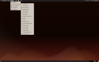
System Monitor |
Menu |
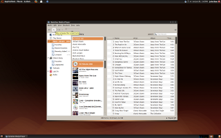
Banshee Music Player |
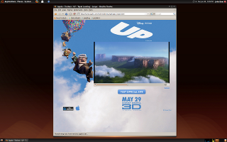
Firefox Browser |
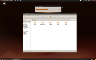
Nautilus File Copy |
Karmic SansDune (2560x1600) |
Karmic SansDune is my adaptation of Jaunty SansDune, one of my favorites.

Application Preview
- Coming
Installation From tar Archive

One method to install a new Gnome theme is to open the "Appearance Preferences" dialogue under System>Preferences menu and click the <Install> button. Gnome will prompt you to select a theme which in this case is Impression.tar.gz. Once installed, select the Impression theme icon from the list of available themes.
Other Pages
Download
Theme: Impression Build 90627-1
Comments
Your comments here.
- your theme to much improved with the new metacity, you must maybe catch some ideas on this metacity theme:
http://www.gnome-look.org/content/show.php/Red+Humanity?content=107657
beautiful species is the gradient at the top in the active windows(semes that your metacity button, but ont op )

Very nice theme, and I am using it as default at the moment. The only part that I really don't like is the little gradient bar at the bottom of each un-mazimized window. Apart from that, great theme and keep up the good work
 --dstansby
 I second this. The gradient bar looks pretty ugly. It should be made smaller and should stand out less. The color also doesn't look that great. Apart from that one point, I think this is a great theme. The only dark theme that works well enough with all applications that it isn't a pain to use and a fantastic theme by itself. --Umang
Is good to see that the people want a DARK theme.... very good to me --dael99
"Is good to see that the people want a DARK theme".. I have to say that I find that comment just a little bit humorous after so many complained about the dark themes in Jaunty.
 I do quite like this theme, though. The darker version (Night Impression, I think?) may be a little too much, though it's growing on me. --blueyonder64
 I love this theme. I think with Humanity Icon Theme is even better. --bognarandras
Artwork/Incoming/Karmic/Impression (last edited 2009-09-23 08:05:07 by catv-86-101-0-75)

