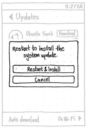
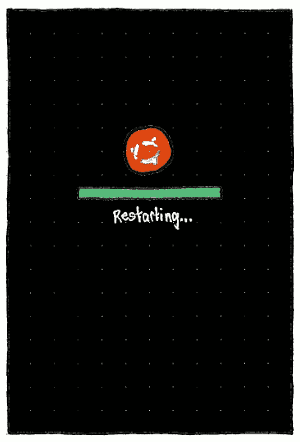
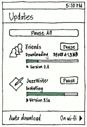
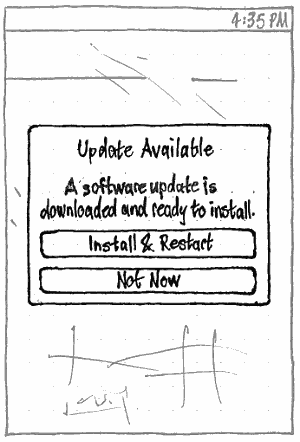
SoftwareUpdates
|
Size: 28044
Comment: restart required is indicated in debian/control
|
← Revision 231 as of 2019-04-14 16:59:44 ⇥
Size: 70756
Comment: + “Extended Security Maintenance”
|
| Deletions are marked like this. | Additions are marked like this. |
| Line 5: | Line 5: |
| * '''Packages affected:''' software-properties, update-manager, update-notifier, release-upgrader This is a living specification for how Ubuntu should present, download, and install software updates. It is part of Ubuntu’s overall [[SoftwareHandling|software handling]]. Our presentation of software updates should carefully balance promptness against interruption, and automation against informed consent, to maximize the prompt installation of updates across the millions of computers on which Ubuntu is installed. |
This is a living specification for how Ubuntu should present, download, and install software updates on PC and phone. It is part of Ubuntu’s overall [[SoftwareHandling|software handling]]. Our presentation of software updates should carefully balance promptness against interruption, and automation against informed consent, to maximize the prompt installation of updates across the millions of devices on which Ubuntu is installed. |
| Line 14: | Line 12: |
| This specification includes many small changes and enhancements to the current update behavior, but they can be implemented in any order. [[https://code.launchpad.net/update-manager|Grab the code]] and submit your own branch. | This specification includes many small changes and enhancements to the current update behavior, but they can be implemented in any order. Grab the code ([[#PC|PC]] or [[#Phone|phone]]) and submit your own branch. |
| Line 18: | Line 16: |
| == PC == * '''Packages involved:''' `update-manager` ([[https://code.launchpad.net/update-manager|code]], [[https://bugs.launchpad.net/ubuntu/+source/update-manager|bug reports]]), `software-properties` ([[https://code.launchpad.net/software-properties|code]], [[https://bugs.launchpad.net/ubuntu/+source/software-properties|bug reports]]), `update-notifier` ([[https://code.launchpad.net/update-notifier|code]], [[https://bugs.launchpad.net/ubuntu/+source/update-notifier|bug reports]]), `ubuntu-release-upgrader` ([[https://code.launchpad.net/ubuntu-release-upgrader|code]], [[https://bugs.launchpad.net/ubuntu/+source/ubuntu-release-upgrader|bug reports]]) |
|
| Line 19: | Line 21: |
| == Update settings == ||<tablestyle="float:left;margin:0 1em 1em 0;" style="border:none;">{{attachment:update-settings.jpg}}|| The “Automatically check for updates:” menu should contain options for “Daily” (the default), “Every two days”, “Weekly”, “Every two weeks”, a separator, and “Never”. The “When there are security updates:” menu should contain options “Display immediately” (the default), “Download automatically”, and “Download and install automatically”. The “When there are other updates:” menu should contain options “Display immediately”, “Display weekly” (the default), and “Display every two weeks”. The “Notify me of a new Ubuntu version:” menu should contain options “For any new version” (the default for a non-LTS, replacing “Normal releases”), “For long-term support versions” (the default for an LTS, replacing “Long term support releases only”), and “Never”, in that order. |
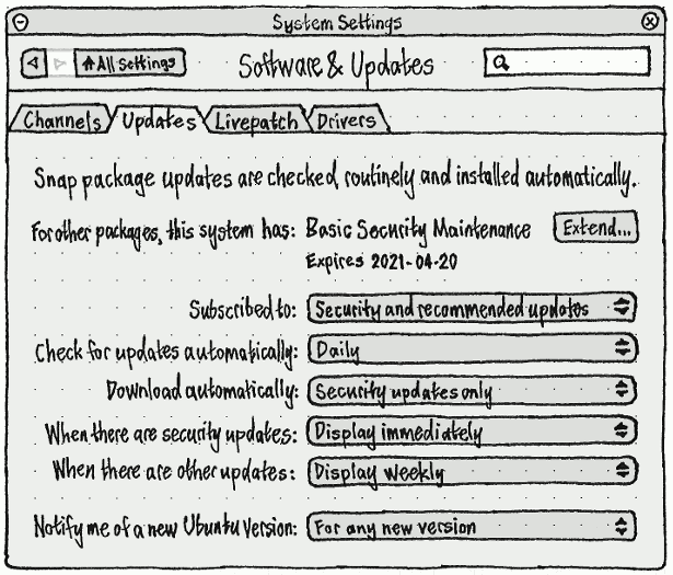
=== Update settings === ||<tablestyle="float:left;margin:0 1em 1em 0;" style="border:none;">{{attachment:settings-updates.png}}|| The “When checking for updates, check for:” menu should contain options for: * “All updates” (the default, `-security` + `-updates` + `-backports`) * “Security and recommended updates” (`-security` + `-updates`) * “Security updates only” (`-security`) (bug Bug:887079). If your current update config does not match one of those three options (for example, if you have opted in to `-proposed`), there should be a fourth, checked, option — “Custom” — and this option should persist until you close System Settings. (UI for configuring `-proposed` should be [[ContributorConsole#updates|provided by the Ubuntu Contributor Console]].) The “Automatically check for updates:” menu should consist of options “Daily” (the default), “Every two days”, “Weekly”, “Every two weeks”, a separator, and “Never”. The “Download updates automatically:” menu should consist of options “None”, “Security updates”, and “All updates” (bug Bug:1173208). Whenever “Automatically check for updates:” is set to “Never” (so any security updates are known from manual or previous checks), the “When there are security updates:” menu should consist of options “Remind me daily” (the default), “Remind me every two days”, “Remind me weekly”, and “Remind me every two weeks” (bug Bug:1817559). Whenever “Automatically check for updates:” is set to anything ''other than'' “Never”, the “When there are security updates:” menu should instead consist of options “Display immediately” (the default) and “Install automatically”. |
| Line 33: | Line 41: |
| ''Idea: Make this more consumer-proof by moving “Proposed”, when off, into a dedicated testing interface like Checkbox. [mpt]'' ||<tablestyle="clear:both;">|| |
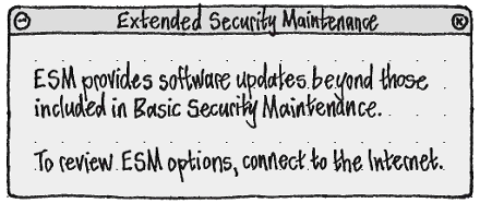
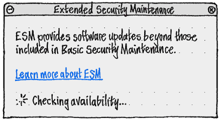
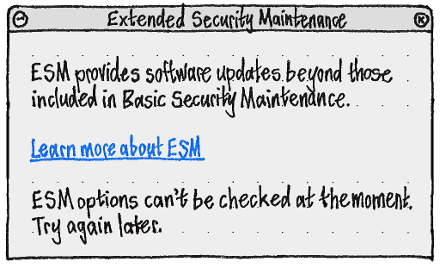
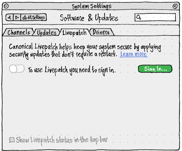
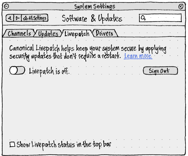
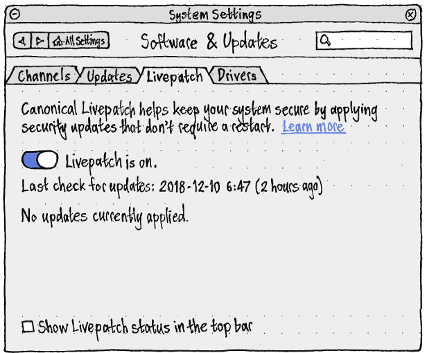
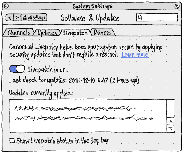
The “When there are other updates:” menu should consist of options “Display immediately”, “Display weekly” (the default), and “Display every two weeks”. The “Notify me of a new Ubuntu version:” menu should consist of options “For any new version” (the default if the original installation was a non-LTS version), “For long-term support versions” (the default if the original installation was an LTS version), and “Never”, in that order. ||<tablestyle="clear:both" style="border:none">|| <<Anchor(esm)>> === Extended Security Maintenance === “For other packages, this system has:” should be followed by: * “Basic Security Maintenance”, if the system has no update subscriptions * the name of the subscription, if there is only one * “{number} subscriptions to updates”, if there is more than one. {{attachment:settings-updates-esm-states.png}} Below this should be text describing the earliest-expiring subscription — or, if there are no subscriptions, the end of BSM: * “Active until {date}” * “Ends on {date} — extend or upgrade soon” (if the earliest ends within 60 days) * “Ended {date} — extend or upgrade now”. ||{{attachment:esm-offline.png}}||Choosing “Extend…” should open an “Extended Security Maintenance” window with a summary of ESM. Whenever you are online, this should be followed by a “Learn more about ESM” link that opens [[https://www.ubuntu.com/esm|ubuntu.com/esm]].|| ||{{attachment:esm-checking.png}}||As long as the ESM status request is still in progress, the link should be followed by a spinner and progress text should be present.|| ||{{attachment:esm-error.png}}||If there is an error, this should be explained: “ESM options can’t be checked at the moment. Try again later.”|| ||{{attachment:esm-none.png}}||If no options are available, or none are applicable to this system, each should be explained in a scrolling pane (as [[#livepatch|with Livepatch]]).|| ||{{attachment:esm-available.png}}||If any options are available, each should be listed with its current state: “Not available because {reason}”, “Active until {date}” if it is subscribed, or “Provided until {date}” if it is available but not subscribed.|| ||{{attachment:esm-activate.png}}||The dialogs for activating and deactivating a plan should use the ESM logo.|| ||{{attachment:esm-deactivate.png}}|| || <<Anchor(livepatch)>> === Livepatch settings === ||<tablestyle="float:left;margin:0 1em 1em 0" style="border:none">{{attachment:livepatch-settings-checking.png}}|| The Livepatch switch should be both off and disabled, and the “Show Livepatch in the top bar” checkbox should be both unchecked and disabled, when: * It is not yet known whether Livepatch is available for this system. In this case the switch should be followed by text “Livepatch requires an Internet connection.” if you are offline, or else “Checking availability…”. * Livepatch is not available for this system. In this case the switch should be followed by text “Livepatch is not available for this system.”, and a text box reporting the reasons. * You are not signed in. In this case the switch should be followed by text “To use Livepatch you need to sign in.”, and a “Sign in…” button. If you sign in successfully, Livepatch should turn on automatically. ||<tablestyle="clear:both" style="border:none">|| ||<tablestyle="float:left;margin:0 1em 1em 0" style="border:none">{{attachment:livepatch-settings-need-to-sign-in.png}}|| “Sign In…” should open the Ubuntu One sign-on dialog. When it becomes enabled, the “Show Livepatch in the top bar” checkbox should be checked by default. Whenever it is checked, a status menu should appear in the top bar, containing: * a disabled “Livepatch is off”/“Livepatch is on” item * if Livepatch is on, a disabled “No current updates”/“N current updates” item * a separator * a “Livepatch Settings…” item. {{attachment:livepatch-status-menu.png}} ||<tablestyle="clear:both" style="border:none">|| ||<tablestyle="float:left;margin:0 1em 1em 0" style="border:none">{{attachment:livepatch-settings-off.png}}|| ||<tablestyle="clear:both" style="border:none">|| ||<tablestyle="float:left;margin:0 1em 1em 0" style="border:none">{{attachment:livepatch-settings-on-not-applied.png}}|| There should be no progress or other confirmation feedback for turning Livepatch on or off, even though the state of the system may lag behind the state of the UI, because there is no benefit from waiting for it to finish. For example, if you turn the switch off, on, and off again quickly, Livepatch should turn off once, with no progress feedback, and nothing further should happen. If Livepatch is on, the switch should be followed by text “Livepatch requires an Internet connection.” if you are offline, or else “Livepatch is on.”. “Last check for updates:” should be followed by “None yet” if there hasn’t been one yet, or else the date and time of the last check. ||<tablestyle="clear:both" style="border:none">|| ||<tablestyle="float:left;margin:0 1em 1em 0" style="border:none">{{attachment:livepatch-settings-on-applied.png}}|| ||<tablestyle="clear:both" style="border:none">|| {{attachment:livepatch-error-alert.png}} If there is a Livepatch setup error that does not occur as part of initial sign-in (such that the Software & Updates settings might not be open), it should be shown in a standalone error alert, with a “Settings…” button to open and focus the settings. |
| Line 38: | Line 122: |
| == Checking for updates automatically == If “Automatically check for updates” is checked, Ubuntu should become '''due to check for updates''' at the specified interval after updates were last checked. Once it is due to check for updates, it should try to check one minute after the first time any administrator connects to the Internet (fixing [[http://launchpad.net/bugs/323108|bug 323108]]). By default, it should not display any interface while checking. |
=== Checking for updates automatically === If “Automatically check for updates” is checked, Ubuntu should become '''due to check for updates''' at the specified interval after updates were last checked. Once it is due to check for updates, it should try to check one minute after the first time any administrator connects to the Internet (bug Bug:323108, bug Bug:414202). By default, it should not display any interface while checking. |
| Line 44: | Line 128: |
| == Downloading and installing updates automatically == If “When there are security updates” is set to “Download automatically” or “Download and install automatically”, and security updates are available, they should download in the background. == Launching == |
=== Downloading and installing updates automatically === If “Download updates automatically” is set to anything except “None”, and relevant updates are available, they should download in the background. {{attachment:livepatch-notification.png}} If a Livepatch update is applied, a notification should appear with the title “Livepatch” and the body text “An update has just been applied.”. === Launching === The Launcher icon for Software Updater should not use a badge, because (unlike with [[SoftwareCenter#updates|opt-in updates]]) the number of system updates available is not interesting. |
| Line 51: | Line 141: |
| === Launching manually === Launching Software Updater manually should immediately begin an interactive check for updates, without showing any other interface beforehand (invalidating [[http://launchpad.net/bugs/289404|bug 289404]]). |
==== Launching manually ==== Launching Software Updater manually should immediately begin an interactive check for updates, without showing any other interface beforehand. |
| Line 56: | Line 146: |
| === Checking manually === When checking interactively, Software Updater should display only a progress window. As with any other progress window, the window should have a minimize button but no maximize or close button. |
==== Checking manually ==== When checking interactively, Software Updater should display only a progress window. As with any other progress window, the window should have a minimize button but no maximize or close button, and should be 33 em wide. |
| Line 62: | Line 152: |
| If the check fails because of an error, the progress window should morph into an error alert, with the title “Software Updater” and primary text depending on the exact situation. {{attachment:check-manual-error.jpg}} If no updates are available, the progress window should morph into a note alert. {{attachment:up-to-date.jpg}} If updates are available, the progress window should instead morph into the “Updates Available” alert. === Launching automatically === Update Manager should launch automatically, in the background but not minimized, when the computer has been connected to the Internet for at least one minute, you are logged in as an administrator, and either: a. security updates are available, it has been at least 24 hours since security updates were last displayed, and ''either'' of these are true: |
''Erratum: The “Cancel” button should read “Stop”, since it’s possible a partial or previous check may have some available updates.'' If you stop the check, the progress window should morph into an info alert with the title “Software Updater” and primary text “You stopped the check for updates.”. If the partial check, and any previous check, found no installable updates, this should be followed simply by “Settings…”, “Check Again”, and “OK” buttons. But if the partial check, and any previous check, ''did'' find installable updates, the alert should be a variation of [[#alert|the updates-available alert]], with the different primary text, and secondary text “Updated software is available from a previous check.”. ||<^ style="border:none;">{{attachment:check-manual-stopped.png}}||<^ style="border:none;">{{attachment:check-manual-stopped-available.png}}|| If the check fails because of an error, the progress window should morph into an error alert, with the title “Software Updater” and primary text depending on the exact situation (bug Bug:1153569, part of bug Bug:1026060). ||<^ style="border:none;">{{attachment:check-manual-error.png}}||<^ style="border:none;">{{attachment:check-manual-error-channel.png}}|| <<Anchor(up-to-date)>> If no updates are available and no previous updates require a restart, the progress window should morph into a note alert. It should have secondary text if: * Livepatch is [[SoftwareAndUpdatesSettings#livepatch|available but not turned on]] for this system (bug Bug:1807900): “Tip: You can use Livepatch to keep your computer more secure between restarts.” * Livepatch is on, and since the last restart, it attempted to apply any updates. For example: * “1 Livepatch update appied since the last restart.” * “7 Livepatch updates applied since the last restart. 1 other update failed to apply.” * “3 Livepatch updates failed to apply since the last restart.” {{attachment:up-to-date.png}} {{attachment:up-to-date-with-livepatches.png}} If updates are available, the progress window should instead morph into [[#alert|the alert showing them]]. ==== Launching automatically ==== Software Updater should launch automatically, in the background but not minimized, when the computer has been connected to the Internet for at least one minute (bug Bug:385433), you are logged in as an administrator, no other package management utility (''e.g.'' Synaptic or `apt-get upgrade`) is running (bug Bug:1365059), and any of these are true: a. security updates are available, it has been at least 24 hours since security updates were last displayed, and ''either'' of these are true: |
| Line 78: | Line 181: |
| b. non-security updates are available, and ''all'' of these are true: 1. the “When there are other updates” interval has passed since Software Updater was last open (either automatically or manually); 2. the “When there are other updates” interval has passed since updates were last installed by any manual method (''e.g.'' `apt-get` or Synaptic, but not `unattended-upgrades`); 3. no other package management utility (''e.g.'' Synaptic or Ubuntu Software Center) is running. |
b. security updates require a restart to finish installing, and it has been at least 24 hours since you were told about this (part of bug Bug:1033226); or c. non-security updates are available, and ''all'' of these are true: 1. the “When there are other updates” interval has passed since Software Updater was last open (either automatically or manually); and 2. the “When there are other updates” interval has passed since updates were last installed by any manual method (''e.g.'' `apt-get` or Synaptic, but not `unattended-upgrades`); or d. non-security updates require a restart to finish installing, and the “When there are other updates” interval has passed since Software Updater was last open (either automatically or manually) (part of bug Bug:1033226). |
| Line 88: | Line 195: |
| 5. Once cron.daily has exited, run `killall update-notifier && NO_FAKE_STAT=1 faketime -f +1d update-notifier` to test the update-notifier behavior. Update Manager should open, displaying only non-security updates. | 5. Once cron.daily has exited, run `killall update-notifier && NO_FAKE_STAT=1 faketime -f +1d update-notifier` to test the update-notifier behavior. Software Updater should open, displaying only non-security updates. |
| Line 93: | Line 200: |
| === Optional updates === Once presentation of any optional (`NotAutomatic`) updates has been [[SoftwareCenter#updates|implemented in Ubuntu Software Center]], those particular updates should no longer cause the “Updates Available” alert to appear. They should still be shown in the alert when it appears for any other reason, but they should not be checked (and should therefore not be installed) by default. |
==== Optional updates ==== Once presentation of any optional (`NotAutomatic`) updates has been [[SoftwareCenter#updates|implemented in Ubuntu Software Center]], those particular updates should no longer cause the alert listing updates to appear. They should still be shown in the alert when it appears for any other reason, but they should not be checked (and should therefore not be installed) by default. |
| Line 98: | Line 205: |
| == Handling uninstallable updates == | === Handling uninstallable updates === |
| Line 102: | Line 209: |
| === Initial implementation === If an automatic check for updates finds that they are uninstallable, Software Updater should not launch at all. |
==== Initial implementation ==== If an automatic check for updates finds that they are uninstallable, Software Updater should not launch at all (unless it needs to remind you to restart to install previous updates). |
| Line 108: | Line 215: |
| === Advanced implementation === * If an automatic check shows that updates to Ubuntu packages are the cause of the problem, Software Updater should not launch at all. |
==== Advanced implementation ==== * If an automatic check shows that updates to Ubuntu packages are the cause of the problem, Software Updater should not launch at all (unless it needs to remind you to restart to install previous updates). |
| Line 122: | Line 229: |
| <<Anchor(restart)>> === Reminding you to restart === {{attachment:up-to-date-with-livepatches.png}} {{attachment:requires-restart.png}} If no updates are installable, but a restart is required to finish installing previous updates, a “Software Updater” alert should appear, with text “This computer needs to restart to finish installing updates”, and “Settings…”, “Restart Later” and “Restart Now…” buttons, none of them the default. “Restart Now…” should open [[SessionHandling#Restart|the usual confirmation alert]]. (The current architecture of Livepatch does not record whether any installed Livepatch update is equivalent to a given installed on-disk update. If this changes in future, we will be able to prompt you less often to restart.) |
|
| Line 123: | Line 239: |
| == Presenting installable updates == If a check shows that updates are available, an “Updates Available” alert should appear. If the check was automatic, the alert should open non-minimized but unfocused. {{attachment:updates-initial.jpg}} If this is the first time Software Updater has launched since Ubuntu was installed, the primary text should be “Updated software has been issued since Ubuntu {version} was released. Do you want to install it now?” Otherwise it should be: “Updated software is available for this computer. Do you want to install it now?” This should be followed by an expander with the label “Details of updates”, that is collapsed by default but remembers its state between sessions. Expanding it should expand the alert to show [[#expanded|the list of updates]]. Collapsing it should return the alert to its previous size. The secondary text for the alert should consist of one or more list items, depending on the exact situation, each introduced by a mini icon: |
=== Presenting installable updates === Status of software updates should never be presented in the menu bar or a notification bubble (bugs Bug:24076, Bug:43089, Bug:190302, Bug:195945, Bug:199669, Bug:249367, Bug:280387, Bug:249957, Bug:263513, Bug:322238, Bug:369611, Bug:436749, Bug:654553, Bug:891421, Bug:906826, Bug:917200, Bug:934517, Bug:987202, Bug:1022443, Bug:1060497, Bug:1061469, Bug:1064865, Bug:1075833, Bug:1177418, Bug:1296958, and Bug:1320550). If a check shows that updates are available, a “Software Updater” alert should appear. (Like any progress window before it, it should be 33 em wide.) If the check was automatic, the alert should open non-minimized but unfocused. {{attachment:updates-initial.png}} {{attachment:updates-available-and-restart.png}} If updates have not been installed since Ubuntu was installed (bug Bug:1100405), ''and'' this is a release version (not a daily/alpha/beta) (bug Bug:1025669), the primary text should be “Updated software has been issued since Ubuntu {version} was released. Do you want to install it now?” Otherwise it should be: “Updated software is available for this computer. Do you want to install it now?” If appropriate, the alert should have secondary text (part of bug Bug:1033226): “The computer also needs to restart to finish installing previous updates.” Next should be an expander with the label “Details of updates”, that is collapsed by default but remembers its state between sessions. Expanding it should expand the alert to show [[#expanded|the list of updates]]. Collapsing it should return the alert to its previous size. Below the “Details of updates” expander should be one or more list items, depending on the exact situation, each introduced by a mini icon: |
| Line 137: | Line 257: |
| * Whenever any of the checked updates will '''require restarting''' the computer (as indicated in `debian/control`), there should be an item with a restart icon and the text: “The computer will need to restart.” ( fixing [[http://launchpad.net/bugs/255443|bug 255443]] ) The item should automatically disappear or appear (with the alert resizing appropriately) if you deselect all, or reselect any, of the updates that require a restart. |
* Whenever any of the checked updates will '''require restarting''' the computer (the package’s `debian/control` contains the `XB-Restart-Required` key), ''and'' the computer does not already need restarting to finish installing previous updates, there should be an item with a restart icon and the text: “The computer will need to restart.” (bug Bug:bug 255443). The item should automatically disappear or appear (with the alert resizing appropriately) if you deselect all, or reselect any, of the updates that require a restart. |
| Line 141: | Line 261: |
| * Whenever the computer is '''running on battery''', there should be an item (fixing [[http://launchpad.net/bugs/484249|bug 484249]] and [[http://launchpad.net/bugs/494772|bug 494772]]) with exactly the same battery icon as [[PowerStatusMenu|the power status menu]] is currently using for the battery, and the text: “It’s safer to connect the computer to AC power before updating.” (fixing [[http://launchpad.net/bugs/426708|bug 426708]]). The item should automatically appear or disappear (with the alert resizing appropriately) if the computer starts or stops using battery while the alert is open (fixing [[http://launchpad.net/bugs/426710|bug 426710]]). | * Whenever there is '''no Internet connection''' and at least one of the updates has not yet been downloaded, there should be an item with exactly the same icon as [[Networking#menu|the networking menu]] is currently using for its title, and the text “You need an Internet connection to download updates.” (bug Bug:246316 and part of bug Bug:1026060). * Whenever the computer is '''running on battery''', there should be an item (fixing [[http://launchpad.net/bugs/484249|bug 484249]] and [[http://launchpad.net/bugs/494772|bug 494772]]) with exactly the same battery icon as [[Power#menu|the battery menu]] is currently using for the battery, and the text: “It’s safer to connect the computer to AC power before updating.” (fixing [[http://launchpad.net/bugs/426708|bug 426708]]). The item should automatically appear or disappear (with the alert resizing appropriately) if the computer starts or stops using battery while the alert is open (fixing [[http://launchpad.net/bugs/426710|bug 426710]]). |
| Line 152: | Line 274: |
| ''What is the rationale behind telling the user that a restart will be required after updates have been installed? As I've mentioned on the ayatana list I feel this offers no benefits to the user, while possibly putting users off performing updates (particularly if they are in the middle of a task).'' -- [[LaunchpadHome:funkyhat]] <<DateTime(2010-09-06T13:45:56Z)>> |
|
| Line 155: | Line 275: |
| === Expanded presentation of updates === | ==== Expanded presentation of updates ==== |
| Line 161: | Line 281: |
| The Updates Available window should be manually resizable only when it is in this expanded state. In the list, updateable packages should be in expandable groups, all collapsed by default: * If a package ''Y'' is a dependency or recommendation of only one application ''X'', there should be a group for ''X'' containing an item for ''Y''. * Otherwise, if the package is a dependency of `ubuntu-desktop`, there should be a group for “Ubuntu base” containing an item for that package. * Otherwise, the package should be presented by itself, not in any group. The list of updates should have three columns by default: an unlabelled restart-required column, an “Install” column, and a “Download” column. For each update or group of updates: * If it will require restarting the computer, the first column should contain a restart icon. This icon should line up exactly with the restart icon used for the secondary text below the list. |
The Updates Available window should be manually resizable only when it is in this expanded state. It should remember its previous expanded size, but by default should be the same width as when not expanded, and tall enough to show six items in the list, with a minimum height of three items. Only if any of the updates are security updates, the updates should be listed in two sections, “Security updates” and “Other updates”, each with a checkbox with bold label. The state of the checkbox should reflect and change the state of the update checkboxes in that section: ☑ checked if they all are, ☐ unchecked if none of them are, and ⊟ indeterminate otherwise. In the list, updateable packages should be in expandable groups ([[http://brainstorm.ubuntu.com/idea/14205/|Brainstorm 14205]]), all collapsed by default, and all collapsible/expandable with Left/Right arrow keys (bug Bug:1160491): 1. An “application” is any package that has a `.desktop` file. Any application that has an update should have its own item. If that application is the only updateable installed package that (recursively) depends on, or (recursively) recommends, another updateable package, the application should be shown as an expandable group containing that other package as well as the application package itself. 2. Any other package that is not part of “Ubuntu base” should be presented by itself, not in any group. 3. The '''base package''' is (a) `ubuntu-desktop` if it is installed, otherwise (b) the alphabetically first of any of the metapackages listed in `/usr/share/ubuntu-release-upgrader/DistUpgrade.cfg` that are installed (for example, `kubuntu-desktop` or `ubuntustudio-desktop`), otherwise (c) `ubuntu-desktop` even though it isn’t installed. Any updateable package not already shown in the list of updates, that is a (recursive) dependency and/or recommendation of the base package, and/or of `ubuntu-standard` and/or `ubuntu-minimal`, should be shown in an “Ubuntu base” or equivalently named group. This group should have `distributor-logo` (''e.g.'' the Ubuntu logo) as its icon. The list of updates should have three columns by default: an unlabelled restart-required column, an “Install” column, and a “Download” column. Clicking any of the column headers should [[#sorting|sort the list]]. For each update or group of updates: * If it will require restarting the computer (for example, `postinst` contains `/usr/share/update-notifier/notify-reboot-required`), the first column should contain a restart icon. This icon should line up exactly with the restart icon used for the secondary text below the list. |
| Line 175: | Line 297: |
| * [[SoftwareCenter#software-icon|the icon]] for the update; * [[SoftwareCenter#software-title|the title]] of the update. |
* [[SoftwarePackageOperations#icon|the icon]] for the package, ''except'' that currently-installed packages should not have the usual installed emblem (because it’s noisy and uninteresting that nearly all updates are to already-installed packages); * [[SoftwarePackageOperations#title|the title]] of the update. |
| Line 180: | Line 302: |
| '''Future work:''' The ability to turn on “Codename”, “Installed Version”, and/or “Available Version” columns? Below the list of updates should be another expander, “Technical description”, which is always collapsed initially. Expanding it should reveal a pane describing the selected update. == Installing == |
'''''Future work:''' The ability to turn on “Codename”, “Installed Version”, and/or “Available Version” columns?'' The list should allow multiple selections using the standard methods (''e.g.'' Shift+Up, Ctrl+click, or “Edit” > “Select All”). Below the list of updates should be another expander, “Technical description”, which is always collapsed initially. The contents of the “Technical description” pane should depend on how many updates are selected in the list above: * If none, centered 50%-opaque text “No updates selected”. * If one, the description of the package followed by a spinner, with the spinner replaced by the changelog for the update once it loads, or by “The list of changes is not available.” if it fails to load. {{attachment:technical-description.png}} * If more than one, the name and version (but not the description) of each selected package, each followed by a spinner which is replaced by the changelog for the update once it loads (or “The list of changes is not available.” if it fails to load), and each separated by a horizontal rule (bug Bug:1077205). {{attachment:technical-description-multiple.png}} <<Anchor(sorting)>> ===== Sorting the list of updates ===== (bug Bug:280298) Sorting by: * “Restart Required” should list updates requiring a restart before those that don’t. * “Install”/“Name” (the default) should list updates in alphabetical order. * “Download”/“Download Size” should list already-downloaded updates first, then the remainder smallest first. Choosing the same sort a consecutive time should reverse the sort order. (For example, choosing “Download Size” twice should display the largest un-downloaded updates first.) If the list of updates has “Security updates” and “Other updates” groups, sorting should retain these groups, but sort the contents of each group. If any “Ubuntu base” groups or subgroups are present, they should always be sorted last, but their contents should be sorted too. === Installing === |
| Line 192: | Line 338: |
| The title of the window should be “Software Updater”, and the primary text should be “Installing updates…”. The button should read “Cancel” until the first update actually starts installing, and “Stop” thereafter; it should be insensitive whenever the update process does not allow stopping safely. | The title of the window should be “Software Updater”, the primary text should be “Installing updates…”, and the secondary text should be [[SoftwarePackageOperations#operations|the status text]] for the operation. The button should read “Cancel” until the first update actually starts installing, and “Stop” thereafter; it should be insensitive whenever the update process does not allow stopping safely. The selected updates should then [[SoftwarePackageOperations#installing|install with the standard interface]]. |
| Line 198: | Line 346: |
| == After installing == If one or more of the updates require restarting the computer, and the progress window is open, it should morph into an alert explaining this. If the progress window was not open (because updates were being installed in the background), the alert should open separately. The alert should have a minimize button but no maximize or close button, the same as in all other stages of the update process. {{attachment:restart-required.jpg}} (If you want to restart now, you can click the button; otherwise, you can minimize the alert.) If updates were completed successfully, and the progress window is open, it should morph into the same alert as is used after a manual check where the system is already up to date. {{attachment:up-to-date.jpg}} |
=== After installing === If there are any errors while installing the updates, then [[ErrorTracker#install-fails|the error tracker should generate its own alert]] (bug Bug:1152578). Therefore, Software Updater should not duplicate the error presentation itself (bug Bug:1118210). Regardless, after installation Software Updater should behave as if it has just finished a manual check for updates, except that the progress window should morph into whatever UI it would normally show in this case — whether it be [[#alert|showing updates that remain uninstallable]], [[#restart|showing that a restart is required]] (part of bug Bug:1033226), showing both at once, or [[#up-to-date|showing that everything is up to date]]. The only exception is if updates were installed in the background, all were installed successfully, and none of them require a restart to finish installing. In that case, Software Updater should remain invisible. If one or more of the updates require logging out, the logout-required alert should appear for ''every user'' currently logged in graphically (except the user who installed the updates, if any of them also require restart). {{attachment:requires-logout.png}} <<Anchor(pre-login)>> === Installing updates automatically when you can’t login === Ubuntu should try to download and install updates automatically if there is a problem that allows Ubuntu startup but prevents logging in — whether it causes a kernel panic, an X crash, or simply a logout — and “Install updates automatically if a problem prevents login” is checked in the [[#settings|settings]]. |
| Line 211: | Line 364: |
| == Upgrading to a new Ubuntu version == | === Upgrading to a new Ubuntu version === |
| Line 215: | Line 368: |
| If no updates are available but a new version of Ubuntu is, the alert should have “Upgrade…” and “OK” buttons (replacing the separate “Ubuntu {version} Upgrade Available” dialog), and text depending on the situation: | If no updates are available but a new supported version of Ubuntu is, the alert should have “Upgrade…” and “OK” buttons (replacing the separate “Ubuntu {version} Upgrade Available” dialog), and text depending on the situation (bug Bug:1199060): |
| Line 219: | Line 372: |
| If no updates are available and no upgrade is possible either (because all upgrade paths are no longer supported), the alert should have “Download…” and “OK” buttons, primary text “Software updates are no longer provided for Ubuntu {version}.”, and secondary text “This version is also too old to upgrade. You should back up your files, then download and install a new version.” Choosing “Download…” should open the default browser to `https://ubuntu.com/download`. |
|
| Line 223: | Line 378: |
| == User stories == | === Menus === When Software Updater is visible in any state, even just an alert box, it should have these menus. {{{ _File ===== Check For Updates Ctrl R ---------------------------- Updates History Ctrl H }}} “Check For Updates” should always be sensitive, except when a check is currently in progress. It should check again for updates without closing and reopening Software Updater. {{{ _Edit ===== Undo Ctrl Z Redo Shift Ctrl Z -------------------------------------- Copy Ctrl C Select All Ctrl A Select Chosen Updates Select None Shift Ctrl A -------------------------------------- Find… Ctrl F -------------------------------------- Software & Updates Settings… }}} “Undo” and “Redo” should be sensitive only when there is a selection or deselection that can be undone or redone, respectively. “Copy” should be sensitive whenever any update or detail text is selected. “Select All” and “Select None” should be sensitive whenever at least one update is available (fixing bug 878203). {{{ _View ===== by Restart Required * by Name by Download Size }}} These items should be sensitive whenever any installable updates are being presented. Choosing any of the items should expand the “Details of updates” section, if it is not expanded already, before [[#sorting|sorting]] the list, so that the sort has a visible effect. (The alternative would be to make the items insensitive whenever the details section was collapsed, but that would be needlessly modal.) {{{ _Help ===== _Help Using Software Updater -------------------------------- _About Software Updater }}} === User stories === |
| Line 232: | Line 441: |
| == Design considerations == | === Design considerations === |
| Line 243: | Line 452: |
| == Overall approaches considered == | === Overall approaches considered === |
| Line 257: | Line 466: |
| Finally, [[http://sparkle.andymatuschak.org/|Sparkle]], a third-party framework ([[https://launchpad.net/sparkle|hosted in Launchpad]]) for updating Mac applications, provides inspiration on how to present updates in a clear and understandable way. == Ideas == |
The current design includes many ideas from [[DesktopUsabilityFeedbackNotification|a cognitive walkthrough and design session at UDS Jaunty]]. And [[http://sparkle.andymatuschak.org/|Sparkle]], a third-party framework ([[https://launchpad.net/sparkle|hosted in Launchpad]]) for updating Mac applications, provides inspiration on how to present updates in a clear and understandable way. === Ideas === |
| Line 264: | Line 473: |
| * Engineer software to be less buggy to begin with. * Engineer software so that proportionally fewer updates require a restart. * Define proportionally fewer updates as critical. * Engineer software so that fewer security problems require critical updates ([[http://en.wikipedia.org/wiki/Defense_in_depth_(computing)|defense in depth]]). * Aggregate same-package updates into a single release more often. * Aggregate different-package updates requiring a restart more often. * Use [[https://launchpad.net/ubuntu/+source/bsdiff|bsdiff]], [[http://dev.chromium.org/developers/design-documents/software-updates-courgette|Courgette]], or similar to make updates smaller. |
* Issue fewer updates. * Engineer software to be less buggy to begin with. * Aggregate same-package updates into a single release more often. |
| Line 272: | Line 479: |
| * Check for security updates every day. But check for non-security updates only (a) a week after the last check or (b) when security updates are available, whichever is earlier. [vish] | * Check for security updates every day. But check for non-security updates only (a) at the scheduled interval (''e.g.'' a week) after the last check, (b) when security updates are available, or (c) on manual launching, whichever is earlier. [vish] |
| Line 274: | Line 481: |
| * Make downloading faster. * Increase the number of [[https://wiki.ubuntu.com/Mirrors|mirrors]]. * [[http://mvogt.wordpress.com/2011/03/21/the-apt-mirror-method/|Automate mirror testing]]. * Use [[http://camrdale.org/apt-p2p/|apt-p2p]] or similar. * Make it easier to download an update once for multiple computers. * Install proportionally more updates in the background. * Install more updates in the background by default. * Make it easier to set updates to install in the background. * Install proportionally more updates at the same time as other interruptions. |
* [[https://lists.ubuntu.com/archives/ubuntu-devel/2014-February/038078.html|Reduce the number of HTTP requests required]]. * [[https://lists.ubuntu.com/archives/ubuntu-devel-discuss/2014-February/014845.html|Use pdiffs]]. * Make mirrors smarter so that they can report just those packages that have been updated since the last check. [~mark-k] * Turn off source packages by default (bug Bug:74747). * Reduce the urgency of updates. * Reduce the proportion of security problems that require critical updates ([[http://en.wikipedia.org/wiki/Defense_in_depth_(computing)|defense in depth]]). * Wait for longer by default before interrupting about updates. * Don’t interrupt at all just for Not``Automatic updates. * Persuade people to agree to installing updates more often. * Reduce the proportion of updates that require a restart. * Aggregate different-package updates requiring a restart more often. * Improve the updates-available alert. * Introduce credible human-readable descriptions for updates. * Better-describe “no-change rebuild” updates. * Install updates more often at the same time as other interruptions. |
| Line 285: | Line 501: |
| * [[FoundationsTeam/Specs/KarmicUpdatesOnShutdown|Install updates at shutdown]]. * Wait for longer by default before presenting updates interactively. * Improve the presentation of the updates-available alert. * Reduce/eliminate the lag between an update being published and its description being available. * Introduce human-readable descriptions for updates. |
* [[FoundationsTeam/Specs/KarmicUpdatesOnShutdown|Install updates at shutdown]], at startup, or a combination of the two. * Install updates more often in the background. * Install more updates in the background by default. * [[#alert-with-background-option|Make it easier]] to set updates to install in the background. * Reduce the download size. * Use [[https://launchpad.net/ubuntu/+source/bsdiff|bsdiff]], [[http://dev.chromium.org/developers/design-documents/software-updates-courgette|Courgette]], or a similar binary diff system. * Stop requiring an update to `-data` and other dependent packages when an application gets a minor update. * Increase the download speed. * Increase the number and speed of [[https://wiki.ubuntu.com/Mirrors|mirrors]]. * [[http://mvogt.wordpress.com/2011/03/21/the-apt-mirror-method/|Automate mirror testing]]. * Download updates from nearby computers using [[http://camrdale.org/apt-p2p/|apt-p2p]] (bug Bug:533416), debtorrent, or similar. * Ease downloading an update once for multiple computers you administer. * Download multiple updates simultaneously when appropriate (bug Bug:275994, bug Bug:313685). * Increase the installation speed. * Install the first update while the second is downloading (bug Bug:313680). * Then download smaller updates first so that the installation process can start sooner (bug Bug:209681). * Increase the speed of restarts (bug Bug:802065). |
| Line 296: | Line 528: |
| === More prominent option to install updates in the background === | ==== More prominent option to install updates in the background ==== |
| Line 306: | Line 538: |
| == Unresolved issues == | === Unresolved issues === |
| Line 309: | Line 541: |
| * How do distinguish security updates from other updates? | |
| Line 311: | Line 542: |
| * Whether an update will require restarting, logging out, or restarting an application, should be presented ''before'' you choose to install it. How will we know this? | |
| Line 313: | Line 543: |
| * Update Manager currently uses headings to separate “Security Updates”, “Distribution Updates”, “Recommended Updates”, “Other Updates (LP-PPA-something)”, etc. Is this necessary, and if so, how should it be presented? | |
| Line 315: | Line 544: |
== Phone == * '''Packages involved:''' `ubuntu-system-settings` ([[https://code.launchpad.net/ubuntu-system-settings|code]], [[https://bugs.launchpad.net/ubuntu/+source/ubuntu-system-settings|bug reports]]) Because the phone uses [[ImageBasedUpgrades|image-based upgrades]], every system update requires restarting the phone. Therefore the default is for system updates to download in the background; and only once the download is completed you are prompted to install and restart. App updates require restarting the app, but this can happen automatically in the background. To minimize UI complexity, and for consistency with the PC, both types of update should be presented in the same interface. The typical '''user story''' is that while not in the middle of a task, you notice — through one of the prompts — that an update has downloaded and is ready for installation. You respond to the prompt. For a system update, you confirm that you want to install and restart now rather than later. The installation and restart takes place as a single action. For an app update, you choose to install the update, then either watch its progress or switch to another task. {X} not possible (./) defined /!\ undefined || '''Use case''' || '''Access point''' || || see whether your phone is up to date || (./) System Settings “Updates” screen || || be prompted that updates are available || (./) System Settings app emblem, System Settings main screen || || install an individual update || (./) System Settings “Updates” screen || || see whether an update has completed || (./) System Settings “Updates” screen || || see updates installed in the past || (./) System Settings “Updates” screen || || see why an update failed || (./) System Settings “Updates” screen || || stop an in-progress download || (./) System Settings “Updates” screen || || install all available updates || (./) System Settings “Updates” screen || || set whether/when updates are downloaded in the background || (./) System Settings “Auto download” screen || <<Anchor(settings-phone)>> === “Auto download” settings === ||<tablestyle="float:left;margin:0 1em 1em 0" style="border:none">{{attachment:phone-settings-updates-automatic-access.png}}{{attachment:phone-settings-updates-automatic.png}}<<BR>>''Erratum: “On wi-fi” and “When on wi-fi” should both be “When on Wi-Fi”.''|| Fixed to the bottom of the “Updates” screen in [[SystemSettings|System Settings]] should be an “Auto download” page stack item. The summary value should be “Never”, “When on Wi-Fi”, or “Always”. The “Auto download” screen should contain the option to “Download future updates automatically:” “Never”, “When on Wi-Fi” (the default), or “On any data connection”. ||<tablestyle="clear:both" style="border:none">|| <<Anchor(check-automatic-phone)>> === Checking for updates automatically === (bug Bug:1409069) The phone should check for updates automatically whenever there is an Internet connection, and at least 24 hours have passed since the last check (manual or automatic). It should not display any progress interface while checking, or any error if the check fails. ''What if broken proxy rules etc prevent successful checks indefinitely?'' <<Anchor(prompt-mobile)>> === Prompting === ||<tablestyle="float:left;margin:0 1em 1em 0" style="border:none">{{attachment:phone-settings-badge.png}}|| ||<tablestyle="float:left;margin:0 1em 1em 0" style="border:none">{{attachment:updates-badge.png}}|| ||<tablestyle="float:left;margin:0 1em 1em 0" style="border:none">{{attachment:phone-settings-quick-access-updates.png}}|| Whenever an update is downloaded and ready to install, ''or'' a background update download has failed repeatedly, ''or'' “Download future updates automatically” is set to “Never” and an update is available for download: * Wherever the System Settings icon appears, it should have a badge with the number of updates available (bug Bug:1362547). * On the System Settings main screen, “Updates” should have the same badge (bug Bug:1362547). * Inside System Settings, the [[SystemSettings#phone-quick-access|quick access area]] should have an “Updates available” or “Update problem” item, with the number of updates available as the summary value. ||<tablestyle="clear:both" style="border:none">|| <<Anchor(check-interactive-mobile)>> === Checking for updates manually === If push notification of updates has not been implemented, and you visit the “Updates” screen when at least 30 minutes has passed since the last check for updates, a new check should be triggered. <<Anchor(presenting-mobile)>> === Presenting available updates === The overall contents of the “Updates” screen depends on five things: * whether a check for updates is currently in progress; * whether there are any system updates; * whether you are signed in to receive app updates; * if so, whether there are any app updates available; and * whether there were any previous updates in the past month. Specifically: 1. If a check for updates ''is'' currently in progress: a. The screen should begin with a spinner, “Checking for updates…” label, and “Stop” button (bug Bug:1272313), all taking up the same vertical space as the “Updates available” heading and “Update All” button would take. (You shouldn’t be trying to “update all” when the list of updates may change at any moment.) a. Any updates from the previous check should be listed below as available updates. {{attachment:phone-settings-updates-checking-none.png}} {{attachment:phone-setting-updates-checking-existing.png}} 1. If a check is ''not'' currently in progress, then: a. If '''no updates''' are available, the screen should begin with a 10-GU-high block containing — or, if the screen contains nothing else, consist entirely of — a centered error message or placeholder text as appropriate: * “Connect to the Internet to check for updates.”, automatically retrying [[#check-interactive-mobile|a manual check]] if an Internet connection begins before leaving the screen (bug Bug:1215901); * “The update server is not responding. Try again later.” (bug Bug:1215901); * “Software is up to date” (placeholder text, therefore without a period). (There is no need for a “Retry” button, in the first case because the check will happen automatically when the problem is fixed, and in the others because the check will happen automatically when you return to the Updates screen and it’s probably a bad idea to try sooner.) {{attachment:phone-settings-updates-unavailable.png}} {{attachment:updates-unavailable-previous.png}} a. If '''at least one''' update is available, they should be [[#presenting-individual|listed]], most recent first, in an “Update available”/“Updates available” section. by itself. If there is more than one, the heading should have an adjacent “Update All” button. {{attachment:phone-settings-updates-available-one.png}} a. If '''more than one''' update is available: * The screen should begin with an “Install {number} Updates” button. * The updates should be listed below [[#presenting-available-mobile|as available updates]]. 1. ''Regardless'' of whether a check is in progress: If there were any previous updates in the past month, the screen should end with a “Recent updates” section, [[#presenting-individual|listing]] them in reverse chronological order of installation. {{attachment:updates-previous.mobile.png}} <<Anchor(presenting-available-mobile)>> “Listed as available updates” means: * If any of the updates is a system update, it should be listed first (because a system update may obviate updating default apps). * Any app updates should be [[#presenting-individual|listed]] in alphabetical order. {{attachment:updates-available.narrow.png}} * If you are not signed in to receive app updates, there should be centered text “Sign in to Ubuntu One to receive updates for apps” and a “Sign In…” button that requests an Ubuntu One account from Online Accounts. (If you set up an Ubuntu One account during the first-run setup, the setup should have granted System Settings permission to access this account by default.) Granting access should trigger a check for updates. * If there is a system update ''and'' you are not signed in to receive app updates, there should be a separator between the system update and the sign-in prompt. {{attachment:phone-settings-updates-available-unauthenticated.png}} ||<tablestyle="clear:both" style="border:none">|| <<Anchor(presenting-individual)>> ==== Presenting an individual update ==== How each update should be presented depends on its current state (before, during, or after installation), and whether it is a system or app update. In general, it includes an icon, title ellipsized in the middle if necessary (bug Bug:1382416), action button, “Version” and version number, and size to 1 decimal place in the most appropriate unit (e.g. “13.8 MB”). If it is a system update, its icon should be the Ubuntu logo, and its title should be “Ubuntu”. If it is an app update, its title should be the name of the app, ellipsized in the middle if necessary. ||'''State''' ||'''System update''' ||'''App update''' || ||'''Available''' ||{{attachment:item-initial-system.phone.png}} ||{{attachment:item-initial-app.phone.png}} || ||'''Downloading automatically'''||{{attachment:item-downloading-auto-system.phone.png}}||{{attachment:item-downloading-auto-app.phone.png}}|| ||'''Downloading manually'''||{{attachment:item-downloading-manual-system.phone.png}}||{{attachment:item-downloading-manual-app.phone.png}} || ||'''Download failed''' ||{{attachment:item-download-failed-system.phone.png}} ||{{attachment:item-download-failed-app.phone.png}} || ||'''Downloaded''' ||{{attachment:item-downloaded-system.phone.png}} ||{{attachment:item-downloaded-app.phone.png}} || ||'''Installing''' ||{{attachment:item-installing-system.phone.png}} ||{{attachment:item-installing-app.phone.png}} || ||'''Installation failed''' ||{{attachment:item-install-failed-system.phone.png}} ||{{attachment:item-install-failed-app.phone.png}} || ||'''Previous''' ||{{attachment:item-previous-system.phone.png}} ||{{attachment:item-previous-app.phone.png}} || When an update completes successfully, it should slide from the list of available updates down to the “Recent updates” section (creating that section if necessary). A recent update should have an “Open” button for an app, not for the system. {{attachment:update-details.mobile.png}} For any update, tapping the secondary text (version number and date) should toggle visibility of the update’s description immediately below the list item (bug Bug:1494699). === Downloading in general === {{attachment:item-downloading-auto-system.phone.png}} {{attachment:item-downloading-auto-app.phone.png}} {{attachment:item-downloading-manual-system.phone.png}} {{attachment:item-downloading-manual-app.phone.png}} When an update is downloading, either automatically or manually, the action button should be “Pause”, and the size should include the amount downloaded in the form “X of Y”, for example “1.3 MB of 21.4 MB”, updated once per second. === Downloading automatically === An automatic download should not inhibit suspend; you may not be aware that it is happening, and it can always be resumed or retried later (bug Bug:1259326). If you change the “Download automatically” setting to “Off”, or change it to “When on Wi-Fi” when you are using a non-Wi-Fi connection, any automatic download should immediately pause, though manual downloads should continue. <<Anchor(phone-progress)>><<Anchor(installing-mobile)>> === Downloading and/or installing manually === A manual download or installation should inhibit suspend (bug Bug:1259326). {{attachment:item-initial-system.phone.png}} {{attachment:item-initial-app.phone.png}} {{attachment:item-downloaded-system.phone.png}} {{attachment:item-downloaded-app.phone.png}} Except for the other cases described here, the action button should be “Download” for a system update that has not completely downloaded, “Update” for an app update that has not completely downloaded, “Install…” for a system update that has completely downloaded, and “Install” for an app update that has completely downloaded. {{attachment:item-downloading-manual-system.phone.png}} {{attachment:item-downloading-manual-app.phone.png}} Whenever any update is waiting to download manually, downloading manually, and/or installing manually, its list item should include a progress bar. (It should not include a progress bar in any other situation, because that would be distracting given that you did not trigger the download yourself (bug Bug:1319037).) The size should stay put, but the version number should move below the progress bar. The space vacated by the version number should house status text: “Waiting to download” (bug Bug:1522248), “Downloading”, or “Installing”. (Time remaining should not be shown, because it is too unpredictable on mobile connections (bug Bug:1215901).) The progress bar should fill depending on the task in question: * For a system update, the task is downloading only, so it should be full when the update is completely downloaded. (Installation progress is shown in [[#installing-mobile-system|a completely separate screen]].) * For an app update, during manual download the progress bar should fill up to 50% × the proportion of the download that had already completed before the update was requested, and the remainder should be allocated to installation. For example, if none of the update was already downloaded, 50% of the bar should be allocated to downloading, and 50% to installation. If half of the update was already downloaded, 25% of the bar should be allocated to downloading, and 75% to installation. <<Anchor(installing-all-mobile)>> === Installing all updates at once === ||<tablestyle="float:left;margin:0 1em 1em 0" style="border:none">{{attachment:phone-settings-updates-available.png}}|| (bug Bug:1333668) Whenever more than one update is available, and they are not all already installing, the list should be preceded by a button labelled “Install {number} Updates…” if it includes system updates (ellipsized because [[#installing-mobile-system|it will lead to a prompt]]), or “Install {number} Updates” if it doesn’t include system updates. For example, once you tap it, all updates should begin installing, so the button should fade away and the list of updates should slide up to fill the empty space. Conversely, if any update is paused or stops due to an error, the button should reappear. ||<tablestyle="clear:both" style="border:none">|| <<Anchor(pausing-mobile)>> === Pausing === The action button should be “Pause” for any update that is downloading or installing. It should be insensitive whenever the download/installation is no longer pauseable. If you choose “Pause” during a download or an app installation, the update should pause and return to its idle presentation. If the update fails to pause, System Settings should report a [[ErrorTracker#app-requested|RecoverableError]] (bug Bug:1215901). Any later download — whether automatic or manual — should download the latest version, regardless of whether it is newer than the one already partially downloaded, but resuming the existing download if it is the same version (bug Bug:1250607). If an automatic download is paused, the pause should last until the phone next restarts or wakes up, whichever is sooner. <<Anchor(installing-mobile-system)>> === Installing updates that include system updates === System updates require restart. So you should be prompted before this happens, it should not interrupt any app updates, and the prompt should not happen repeatedly. Therefore, a prompt should appear when: * you choose “Install…” for an already-downloaded system update; or * you choose “Install {n} Updates…” where at least one of them is an already-downloaded system update; or * you were on the “Updates” screen at the moment a system update finished downloading (suggesting that you had been waiting for it to finish). ||<tablestyle="float:left;margin:0 1em 1em 0" style="border:none">{{attachment:update-system-prompt-power.phone.png}}|| ||<tablestyle="float:left;margin:0 1em 1em 0" style="border:none">{{attachment:update-system-prompt.phone.png}}|| Whenever the phone is not connected to power and the battery charge is below a safe level, the prompt should have the text “Connect to power before installing the system update.” and only a “Cancel” button. Otherwise, it should have the text “Restart to install the system update.”, and “Restart & Install” and “Cancel” buttons. '''Test case:''' With a low battery charge, connect the phone to power and choose “Install” for the system update; the install prompt should appear. Now unplug the phone; the prompt should change to the connect-to-power variant. ||<tablestyle="clear:both" style="border:none">|| <<Anchor(restart-and-install)>> ||<^ tablestyle="float:left;margin:0 1em 1em 0" style="border:none">{{attachment:item-installing-system.phone.png}}{{attachment:item-installed-system.phone.png}}|| Installing a system update involves the device restarting twice, but this is an implementation detail. As far as a user is concerned, it is a single process that they have to wait for. Therefore, '''every step of the system update should show a progress bar, that fills once across all the steps'''. One step of a system update is recompiling AppArmor profiles. In theory this could happen first without blocking your use of the device, before it restarts to flash the new system image. But in practice it would noticably slow down the device, and it would be confusing to have the device restart sometime later — regardless of whether that restart was automatic, prompted, or required manually revisiting this screen. Therefore, the recompilation should be integrated with the rest of the update process. Until bug Bug:1385410 is fixed, the progress allocation should be as follows: || '''Subtask''' || '''Allocation''' || '''Resulting range''' ||'''Progress text'''|| || First restart || 5% || 0~5% || ''none'' || || Recompiling apparmor profiles || 45% || 5~50% ||<:> Preparing update…<<BR>>{number} of {total} || || Flashing || 45% || 50~95% || ''none'' || || Second restart || 5% || 95~100% || ''none'' || Once bug Bug:1385410 is fixed, the progress bar allocation should be as follows: || '''Subtask''' || '''Allocation''' || '''Resulting range''' ||'''Progress text'''|| || Recompiling apparmor profiles || 45% || 0~45% ||<:> Preparing update…<<BR>>{number} of {total} || || First restart || 5% || 45~50% || ''none'' || || Flashing || 45% || 50~95% || ''none'' || || Second restart || 5% || 95~100% || ''none'' || This allocation should be followed even though the progress bar can’t remain visible during the restarts themselves. If any non-system updates were requested to install at the same time, these should begin in the background after the system update has finished, so that the device as a whole is unusable for the minimum time necessary. If installation succeeds, the device should restart. ||<tablestyle="clear:both" style="border:none">|| <<Anchor(installing-mobile-other)>> === Installing app updates alone === ||<tablestyle="float:left;margin:0 1em 1em 0" style="border:none">{{attachment:phone-settings-updates-installing.png}}|| As well as appearing in the “Updates” screen, app update download and installation progress should have the same visual treatment, wherever the app’s icon appears, as [[https://docs.google.com/a/canonical.com/file/d/0B8eY_FZZ1z7IS1FTYkZDdS1OYjg/edit|it does during initial installation]]. ||<tablestyle="clear:both" style="border:none">|| === Download or installation failure === {{attachment:item-download-failed-system.phone.png}} {{attachment:item-download-failed-app.phone.png}} If a system update download fails, or an app update download or installation fails, the action button should become “Retry”, and the text “Download failed” or “Installation failed” should replace the item’s status text (bug Bug:1282499). (An alert should not be used, because the error might occur while “Updates” is not the current screen or “System Settings” isn’t even the focused app.) Below this should be text describing the particular error, for example: * “The update server is not responding. Try again later.” * “The downloaded file was incomplete or damaged. Try again later.” (checksum error) ||<tablestyle="float:left;margin:0 1em 1em 0" style="border:none">{{attachment:item-install-failed-system.phone.png}}|| If a system update installation fails, the full-screen installation progress should be replaced by a full-screen error (bugs Bug:1282499, Bug:1215901). If the update server is reachable, the error message should be of the form “Sorry, the system update failed. You need to install a full update, {size}.”. If the update server is not reachable, the error message should not include the size of the fallback update required, and “Start Full Update” should be insensitive. Whenever there is a Wi-Fi connection, the “Get On Wi-Fi…” button should instead be static text, “✔ Connected to Wi-Fi”. “Get On Wi-Fi…” should open [[Networking#wi-fi-phone|the System Settings Wi-Fi screen]] as a sheet with “Cancel” and “OK” buttons, so that when you dismiss it you return to the error screen. ''TBD: Non-interactive presentation of a flashing failure (bug Bug:1387214).'' ||<tablestyle="clear:both" style="border:none">|| === Alternative prompting === ||<tablestyle="float:left;margin:0 1em 1em 0" style="border:none">{{attachment:phone-update-alert.png}}|| If the in-Dash prompting is not feasible, an alternative method would be to display an “Update Available” alert whenever the phone is unlocked, if the update has been available for more than a week. ||<tablestyle="clear:both" style="border:none">|| |
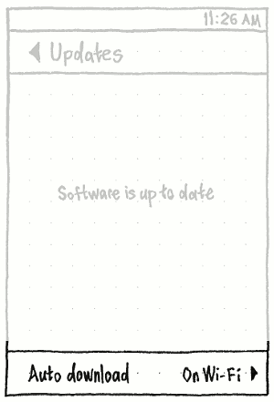
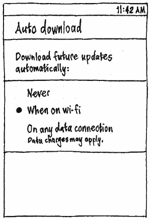
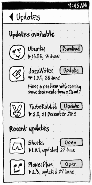
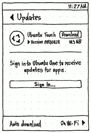
This is a living specification for how Ubuntu should present, download, and install software updates on PC and phone. It is part of Ubuntu’s overall software handling.
Our presentation of software updates should carefully balance promptness against interruption, and automation against informed consent, to maximize the prompt installation of updates across the millions of devices on which Ubuntu is installed.
How you can help
This specification includes many small changes and enhancements to the current update behavior, but they can be implemented in any order. Grab the code (PC or phone) and submit your own branch.
Contents
- How you can help
-
PC
- Update settings
- Extended Security Maintenance
- Livepatch settings
- Checking for updates automatically
- Downloading and installing updates automatically
- Launching
- Handling uninstallable updates
- Reminding you to restart
- Presenting installable updates
- Installing
- After installing
- Installing updates automatically when you can’t login
- Upgrading to a new Ubuntu version
- Menus
- User stories
- Design considerations
- Overall approaches considered
- Ideas
- Unresolved issues
-
Phone
- “Auto download” settings
- Checking for updates automatically
- Prompting
- Checking for updates manually
- Presenting available updates
- Downloading in general
- Downloading automatically
- Downloading and/or installing manually
- Installing all updates at once
- Pausing
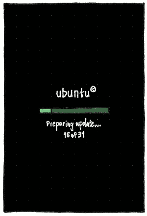
- Installing updates that include system updates
- Installing app updates alone
- Download or installation failure
- Alternative prompting
PC
Packages involved: update-manager (code, bug reports), software-properties (code, bug reports), update-notifier (code, bug reports), ubuntu-release-upgrader (code, bug reports)
Update settings
|
The “When checking for updates, check for:” menu should contain options for:
“All updates” (the default, -security + -updates + -backports)
“Security and recommended updates” (-security + -updates)
“Security updates only” (-security) (bug 887079).
If your current update config does not match one of those three options (for example, if you have opted in to -proposed), there should be a fourth, checked, option — “Custom” — and this option should persist until you close System Settings. (UI for configuring -proposed should be provided by the Ubuntu Contributor Console.)
The “Automatically check for updates:” menu should consist of options “Daily” (the default), “Every two days”, “Weekly”, “Every two weeks”, a separator, and “Never”.
The “Download updates automatically:” menu should consist of options “None”, “Security updates”, and “All updates” (bug 1173208).
Whenever “Automatically check for updates:” is set to “Never” (so any security updates are known from manual or previous checks), the “When there are security updates:” menu should consist of options “Remind me daily” (the default), “Remind me every two days”, “Remind me weekly”, and “Remind me every two weeks” (bug 1817559).
Whenever “Automatically check for updates:” is set to anything other than “Never”, the “When there are security updates:” menu should instead consist of options “Display immediately” (the default) and “Install automatically”.
Idea: Make this more predictable by letting you specify which day of the week it opens. [mvo]
The “When there are other updates:” menu should consist of options “Display immediately”, “Display weekly” (the default), and “Display every two weeks”.
The “Notify me of a new Ubuntu version:” menu should consist of options “For any new version” (the default if the original installation was a non-LTS version), “For long-term support versions” (the default if the original installation was an LTS version), and “Never”, in that order.
Extended Security Maintenance
“For other packages, this system has:” should be followed by:
- “Basic Security Maintenance”, if the system has no update subscriptions
- the name of the subscription, if there is only one
- “{number} subscriptions to updates”, if there is more than one.

Below this should be text describing the earliest-expiring subscription — or, if there are no subscriptions, the end of BSM:
- “Active until {date}”
- “Ends on {date} — extend or upgrade soon” (if the earliest ends within 60 days)
- “Ended {date} — extend or upgrade now”.
|
Choosing “Extend…” should open an “Extended Security Maintenance” window with a summary of ESM. Whenever you are online, this should be followed by a “Learn more about ESM” link that opens ubuntu.com/esm. |
|
As long as the ESM status request is still in progress, the link should be followed by a spinner and progress text should be present. |
|
If there is an error, this should be explained: “ESM options can’t be checked at the moment. Try again later.” |
|
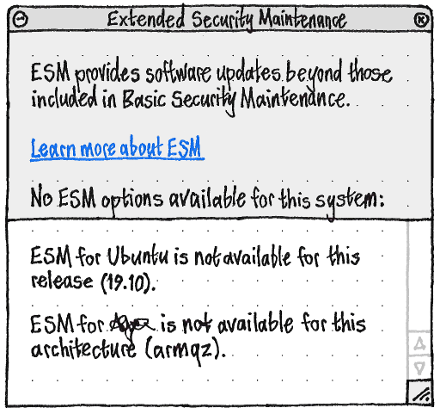
If no options are available, or none are applicable to this system, each should be explained in a scrolling pane (as with Livepatch). |
|
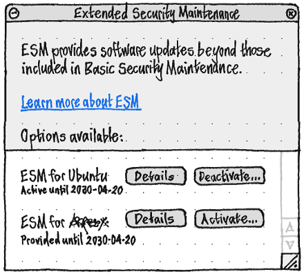
If any options are available, each should be listed with its current state: “Not available because {reason}”, “Active until {date}” if it is subscribed, or “Provided until {date}” if it is available but not subscribed. |
|
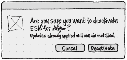
The dialogs for activating and deactivating a plan should use the ESM logo. |
|
|
Livepatch settings
|
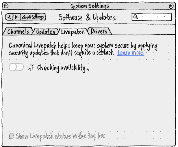
The Livepatch switch should be both off and disabled, and the “Show Livepatch in the top bar” checkbox should be both unchecked and disabled, when:
- It is not yet known whether Livepatch is available for this system. In this case the switch should be followed by text “Livepatch requires an Internet connection.” if you are offline, or else “Checking availability…”.
- Livepatch is not available for this system. In this case the switch should be followed by text “Livepatch is not available for this system.”, and a text box reporting the reasons.
- You are not signed in. In this case the switch should be followed by text “To use Livepatch you need to sign in.”, and a “Sign in…” button. If you sign in successfully, Livepatch should turn on automatically.
|
“Sign In…” should open the Ubuntu One sign-on dialog.
When it becomes enabled, the “Show Livepatch in the top bar” checkbox should be checked by default. Whenever it is checked, a status menu should appear in the top bar, containing:
- a disabled “Livepatch is off”/“Livepatch is on” item
- if Livepatch is on, a disabled “No current updates”/“N current updates” item
- a separator
- a “Livepatch Settings…” item.
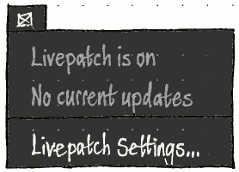
|
|
There should be no progress or other confirmation feedback for turning Livepatch on or off, even though the state of the system may lag behind the state of the UI, because there is no benefit from waiting for it to finish. For example, if you turn the switch off, on, and off again quickly, Livepatch should turn off once, with no progress feedback, and nothing further should happen.
If Livepatch is on, the switch should be followed by text “Livepatch requires an Internet connection.” if you are offline, or else “Livepatch is on.”.
“Last check for updates:” should be followed by “None yet” if there hasn’t been one yet, or else the date and time of the last check.
|
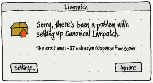
If there is a Livepatch setup error that does not occur as part of initial sign-in (such that the Software & Updates settings might not be open), it should be shown in a standalone error alert, with a “Settings…” button to open and focus the settings.
Checking for updates automatically
If “Automatically check for updates” is checked, Ubuntu should become due to check for updates at the specified interval after updates were last checked. Once it is due to check for updates, it should try to check one minute after the first time any administrator connects to the Internet (bug 323108, bug 414202). By default, it should not display any interface while checking.
What if broken proxy rules etc prevent successful checks indefinitely?
Downloading and installing updates automatically
If “Download updates automatically” is set to anything except “None”, and relevant updates are available, they should download in the background.

If a Livepatch update is applied, a notification should appear with the title “Livepatch” and the body text “An update has just been applied.”.
Launching
The Launcher icon for Software Updater should not use a badge, because (unlike with opt-in updates) the number of system updates available is not interesting.
Launching manually
Launching Software Updater manually should immediately begin an interactive check for updates, without showing any other interface beforehand.
Checking manually
When checking interactively, Software Updater should display only a progress window. As with any other progress window, the window should have a minimize button but no maximize or close button, and should be 33 em wide.
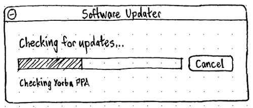
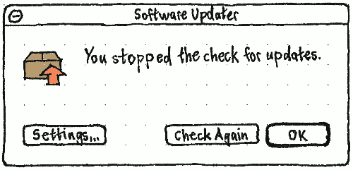
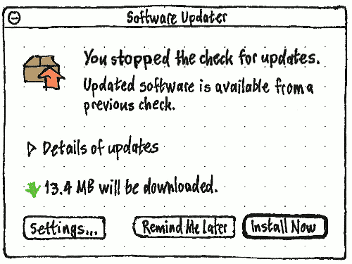
Erratum: The “Cancel” button should read “Stop”, since it’s possible a partial or previous check may have some available updates.
If you stop the check, the progress window should morph into an info alert with the title “Software Updater” and primary text “You stopped the check for updates.”. If the partial check, and any previous check, found no installable updates, this should be followed simply by “Settings…”, “Check Again”, and “OK” buttons. But if the partial check, and any previous check, did find installable updates, the alert should be a variation of the updates-available alert, with the different primary text, and secondary text “Updated software is available from a previous check.”.
|
|
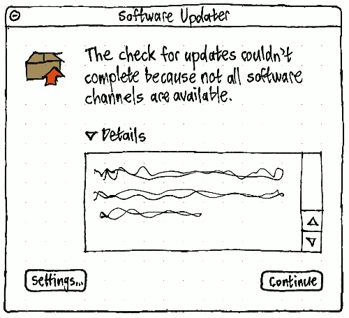
If the check fails because of an error, the progress window should morph into an error alert, with the title “Software Updater” and primary text depending on the exact situation (bug 1153569, part of bug 1026060).
|
|
If no updates are available and no previous updates require a restart, the progress window should morph into a note alert. It should have secondary text if:
Livepatch is available but not turned on for this system (bug 1807900): “Tip: You can use Livepatch to keep your computer more secure between restarts.”
- Livepatch is on, and since the last restart, it attempted to apply any updates. For example:
- “1 Livepatch update appied since the last restart.”
- “7 Livepatch updates applied since the last restart. 1 other update failed to apply.”
- “3 Livepatch updates failed to apply since the last restart.”
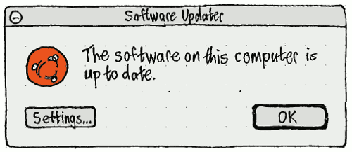
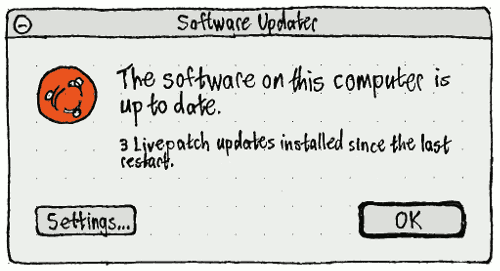
If updates are available, the progress window should instead morph into the alert showing them.
Launching automatically
Software Updater should launch automatically, in the background but not minimized, when the computer has been connected to the Internet for at least one minute (bug 385433), you are logged in as an administrator, no other package management utility (e.g. Synaptic or apt-get upgrade) is running (bug 1365059), and any of these are true:
a. security updates are available, it has been at least 24 hours since security updates were last displayed, and either of these are true:
- “When there are security updates” is set to “Display immediately”; or
- “When there are security updates” is set to “Download automatically”, and the security updates have finished downloading; or
b. security updates require a restart to finish installing, and it has been at least 24 hours since you were told about this (part of bug 1033226); or
c. non-security updates are available, and all of these are true:
- the “When there are other updates” interval has passed since Software Updater was last open (either automatically or manually); and
the “When there are other updates” interval has passed since updates were last installed by any manual method (e.g. apt-get or Synaptic, but not unattended-upgrades); or
d. non-security updates require a restart to finish installing, and the “When there are other updates” interval has passed since Software Updater was last open (either automatically or manually) (part of bug 1033226).
Test case: (su-001)
- Install Ubuntu.
- Log in to the new Ubuntu installation for the first time.
In “Software Sources” > “Updates”, choose “Check for updates: Daily” and “Install security updates without confirmation”.
At a terminal, run sudo /etc/cron.daily to trigger the background installation of security updates.
Once cron.daily has exited, run killall update-notifier && NO_FAKE_STAT=1 faketime -f +1d update-notifier to test the update-notifier behavior. Software Updater should open, displaying only non-security updates.
Need several more test cases here.
Optional updates
Once presentation of any optional (NotAutomatic) updates has been implemented in Ubuntu Software Center, those particular updates should no longer cause the alert listing updates to appear. They should still be shown in the alert when it appears for any other reason, but they should not be checked (and should therefore not be installed) by default.
Handling uninstallable updates
If installing available updates would remove ubuntu-desktop, Software Updater should treat the updates as uninstallable.
Initial implementation
If an automatic check for updates finds that they are uninstallable, Software Updater should not launch at all (unless it needs to remind you to restart to install previous updates).
If a manual check for updates finds that they are uninstallable, the progress window should morph to an error alert with “Settings…” and “OK” buttons. Its primary text should be “Ubuntu can’t be updated at the moment. Please try again later.”. Its secondary text should be “Updates currently available would remove critical Ubuntu components. If this problem persists, contact the software vendor.” And above the “Settings…” button should be a “Details” expander that expands to reveal a pane containing the apt error message.
Advanced implementation
- If an automatic check shows that updates to Ubuntu packages are the cause of the problem, Software Updater should not launch at all (unless it needs to remind you to restart to install previous updates).
- If a manual check shows that updates to Ubuntu packages are the cause of the problem, then:
- If you are running a pre-release Ubuntu version, then the progress window should morph to an error alert as described above, except that its secondary text should be “Updates currently available would remove critical Ubuntu components. This sometimes happens with pre-release Ubuntu versions.”
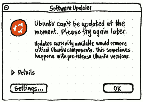
- If you are running an Ubuntu release, then the progress window should morph into an error alert as described above, except that its secondary text should be “Updates currently available would remove critical Ubuntu components. If this problem persists for several days, seek technical support.”
- If you are running a pre-release Ubuntu version, then the progress window should morph to an error alert as described above, except that its secondary text should be “Updates currently available would remove critical Ubuntu components. This sometimes happens with pre-release Ubuntu versions.”
If either an automatic or manual check shows that updates to third-party software are the cause of the problem, then an error alert should open (or the progress window should morph into an error alert) with “Settings…” and “OK” buttons. Its primary text should be “Software updates are available, but some installed software is preventing updates.” Its secondary text should be ‘Updates to “{package name}” would remove critical Ubuntu components. If this problem persists for several days, contact the software vendor.’
Reminding you to restart


If no updates are installable, but a restart is required to finish installing previous updates, a “Software Updater” alert should appear, with text “This computer needs to restart to finish installing updates”, and “Settings…”, “Restart Later” and “Restart Now…” buttons, none of them the default. “Restart Now…” should open the usual confirmation alert.
(The current architecture of Livepatch does not record whether any installed Livepatch update is equivalent to a given installed on-disk update. If this changes in future, we will be able to prompt you less often to restart.)
Presenting installable updates
Status of software updates should never be presented in the menu bar or a notification bubble (bugs 24076, 43089, 190302, 195945, 199669, 249367, 280387, 249957, 263513, 322238, 369611, 436749, 654553, 891421, 906826, 917200, 934517, 987202, 1022443, 1060497, 1061469, 1064865, 1075833, 1177418, 1296958, and 1320550).
If a check shows that updates are available, a “Software Updater” alert should appear. (Like any progress window before it, it should be 33 em wide.) If the check was automatic, the alert should open non-minimized but unfocused.


If updates have not been installed since Ubuntu was installed (bug 1100405), and this is a release version (not a daily/alpha/beta) (bug 1025669), the primary text should be “Updated software has been issued since Ubuntu {version} was released. Do you want to install it now?” Otherwise it should be: “Updated software is available for this computer. Do you want to install it now?”
If appropriate, the alert should have secondary text (part of bug 1033226): “The computer also needs to restart to finish installing previous updates.”
Next should be an expander with the label “Details of updates”, that is collapsed by default but remembers its state between sessions. Expanding it should expand the alert to show the list of updates. Collapsing it should return the alert to its previous size.
Below the “Details of updates” expander should be one or more list items, depending on the exact situation, each introduced by a mini icon:
The first item should be the amount that needs downloading, of the form “{amount} will be downloaded.”, e.g. “17.4 MB will be downloaded.”, with a download icon. If all the updates have already been downloaded, it should be of the form “The update has already been downloaded.” or “The updates have already been downloaded.”, with a greyed-out download icon. The amount should update automatically whenever you unselect or reselect updates in the list, or once per second when updates are downloading in the background.
Whenever any of the checked updates will require restarting the computer (the package’s debian/control contains the XB-Restart-Required key), and the computer does not already need restarting to finish installing previous updates, there should be an item with a restart icon and the text: “The computer will need to restart.” (bug bug 255443). The item should automatically disappear or appear (with the alert resizing appropriately) if you deselect all, or reselect any, of the updates that require a restart.
Whenever the current Internet connection is mobile broadband, there should be an item with a mobile broadband icon and the text: “You may want to wait until you’re not using a mobile broadband connection.” (fixing bug 776374). The item should automatically appear or disappear (with the alert resizing appropriately) if the computer starts or stops using mobile broadband while the alert is open.
Whenever there is no Internet connection and at least one of the updates has not yet been downloaded, there should be an item with exactly the same icon as the networking menu is currently using for its title, and the text “You need an Internet connection to download updates.” (bug 246316 and part of bug 1026060).
Whenever the computer is running on battery, there should be an item (fixing bug 484249 and bug 494772) with exactly the same battery icon as the battery menu is currently using for the battery, and the text: “It’s safer to connect the computer to AC power before updating.” (fixing bug 426708). The item should automatically appear or disappear (with the alert resizing appropriately) if the computer starts or stops using battery while the alert is open (fixing bug 426710).
The alert should have three buttons.
The main action, and default, should be “Install”; activating it should install the updates. Whenever the computer is not connected to the Internet, the button should be insensitive and have the tooltip “Not available because there is no Internet connection.”.
In the Cancel position should be “Cancel” if automatic checking is off, or “Remind Me Later” if it is on. (The button text should change automatically if automatic checking is turned on or off while the alert is open.) In the latter case, activating it should reset the timer for automatic checking for updates.
- In the secondary action position should be “Settings…”. Activating it should leave the alert open, and non-modally open the Software Sources window to its Updates tab.
What happens if you open it manually while updates are downloading?
What happens if you get disconnected from the Internet while the alert is open?
Expanded presentation of updates
Activating “Details of updates” should expand the window to accommodate the list of updates.

The Updates Available window should be manually resizable only when it is in this expanded state. It should remember its previous expanded size, but by default should be the same width as when not expanded, and tall enough to show six items in the list, with a minimum height of three items.
Only if any of the updates are security updates, the updates should be listed in two sections, “Security updates” and “Other updates”, each with a checkbox with bold label. The state of the checkbox should reflect and change the state of the update checkboxes in that section: ☑ checked if they all are, ☐ unchecked if none of them are, and ⊟ indeterminate otherwise.
In the list, updateable packages should be in expandable groups (Brainstorm 14205), all collapsed by default, and all collapsible/expandable with Left/Right arrow keys (bug 1160491):
An “application” is any package that has a .desktop file. Any application that has an update should have its own item. If that application is the only updateable installed package that (recursively) depends on, or (recursively) recommends, another updateable package, the application should be shown as an expandable group containing that other package as well as the application package itself.
- Any other package that is not part of “Ubuntu base” should be presented by itself, not in any group.
The base package is (a) ubuntu-desktop if it is installed, otherwise (b) the alphabetically first of any of the metapackages listed in /usr/share/ubuntu-release-upgrader/DistUpgrade.cfg that are installed (for example, kubuntu-desktop or ubuntustudio-desktop), otherwise (c) ubuntu-desktop even though it isn’t installed. Any updateable package not already shown in the list of updates, that is a (recursive) dependency and/or recommendation of the base package, and/or of ubuntu-standard and/or ubuntu-minimal, should be shown in an “Ubuntu base” or equivalently named group. This group should have distributor-logo (e.g. the Ubuntu logo) as its icon.
The list of updates should have three columns by default: an unlabelled restart-required column, an “Install” column, and a “Download” column. Clicking any of the column headers should sort the list. For each update or group of updates:
If it will require restarting the computer (for example, postinst contains /usr/share/update-notifier/notify-reboot-required), the first column should contain a restart icon. This icon should line up exactly with the restart icon used for the secondary text below the list.
- The “Install” column should contain:
- an expander (always collapsed initially) for each top-level update where any of that package’s dependencies also have updates, or a blank space otherwise;
- a checkbox, checked by default, for whether the update or group of updates will be installed (using indeterminate state if the checkbox is for a group where only some of the updates are checked);
the icon for the package, except that currently-installed packages should not have the usual installed emblem (because it’s noisy and uninteresting that nearly all updates are to already-installed packages);
the title of the update.
- The “Download” column should contain a check mark “✓” (with accessible label “downloaded”) if the update has already downloaded, and the size to one decimal place (e.g. “7.1 MB”, “883.0 KB”) if it has not.
Future work: The ability to turn on “Codename”, “Installed Version”, and/or “Available Version” columns?
The list should allow multiple selections using the standard methods (e.g. Shift+Up, Ctrl+click, or “Edit” > “Select All”).
Below the list of updates should be another expander, “Technical description”, which is always collapsed initially. The contents of the “Technical description” pane should depend on how many updates are selected in the list above:
- If none, centered 50%-opaque text “No updates selected”.
- If one, the description of the package followed by a spinner, with the spinner replaced by the changelog for the update once it loads, or by “The list of changes is not available.” if it fails to load.
If more than one, the name and version (but not the description) of each selected package, each followed by a spinner which is replaced by the changelog for the update once it loads (or “The list of changes is not available.” if it fails to load), and each separated by a horizontal rule (bug 1077205).
Sorting the list of updates
(bug 280298)
Sorting by:
- “Restart Required” should list updates requiring a restart before those that don’t.
- “Install”/“Name” (the default) should list updates in alphabetical order.
- “Download”/“Download Size” should list already-downloaded updates first, then the remainder smallest first.
Choosing the same sort a consecutive time should reverse the sort order. (For example, choosing “Download Size” twice should display the largest un-downloaded updates first.)
If the list of updates has “Security updates” and “Other updates” groups, sorting should retain these groups, but sort the contents of each group. If any “Ubuntu base” groups or subgroups are present, they should always be sorted last, but their contents should be sorted too.
Installing

If you activate “Install Now”, the alert should morph into a progress window.
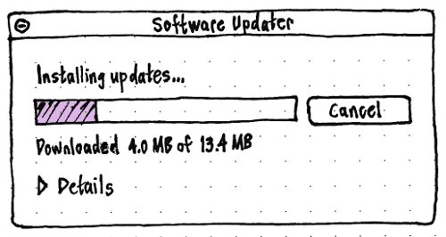
The title of the window should be “Software Updater”, the primary text should be “Installing updates…”, and the secondary text should be the status text for the operation. The button should read “Cancel” until the first update actually starts installing, and “Stop” thereafter; it should be insensitive whenever the update process does not allow stopping safely.
The selected updates should then install with the standard interface.
If you choose to restart or shut down the computer while updates are installing, regardless of whether they are installing in the progress window or in the background, then:
- all updates after the current one should be postponed;
- for as long as the current update takes to finish installing, the Plymouth shutdown screen should contain the centered text “Ubuntu needs to finish installing an update. One moment, please…”
After installing
If there are any errors while installing the updates, then the error tracker should generate its own alert (bug 1152578). Therefore, Software Updater should not duplicate the error presentation itself (bug 1118210).
Regardless, after installation Software Updater should behave as if it has just finished a manual check for updates, except that the progress window should morph into whatever UI it would normally show in this case — whether it be showing updates that remain uninstallable, showing that a restart is required (part of bug 1033226), showing both at once, or showing that everything is up to date.
The only exception is if updates were installed in the background, all were installed successfully, and none of them require a restart to finish installing. In that case, Software Updater should remain invisible.
If one or more of the updates require logging out, the logout-required alert should appear for every user currently logged in graphically (except the user who installed the updates, if any of them also require restart).
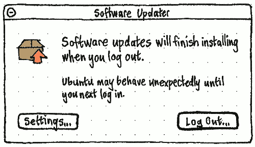
Installing updates automatically when you can’t login
Ubuntu should try to download and install updates automatically if there is a problem that allows Ubuntu startup but prevents logging in — whether it causes a kernel panic, an X crash, or simply a logout — and “Install updates automatically if a problem prevents login” is checked in the settings.
Upgrading to a new Ubuntu version
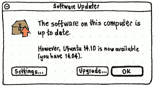
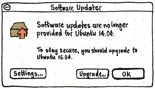
If no updates are available but a new supported version of Ubuntu is, the alert should have “Upgrade…” and “OK” buttons (replacing the separate “Ubuntu {version} Upgrade Available” dialog), and text depending on the situation (bug 1199060):
- If the system is up to date, the primary text should be “The software on this computer is up to date.” and the secondary text “However, Ubuntu {version} is now available (you have {version}).”
- If the system is obsolete, the primary text should be “Software updates are no longer provided for Ubuntu {version}.”, and the secondary text “To stay secure, you should upgrade to Ubuntu {version}.”
If no updates are available and no upgrade is possible either (because all upgrade paths are no longer supported), the alert should have “Download…” and “OK” buttons, primary text “Software updates are no longer provided for Ubuntu {version}.”, and secondary text “This version is also too old to upgrade. You should back up your files, then download and install a new version.” Choosing “Download…” should open the default browser to https://ubuntu.com/download.
Test case: From a released version of Ubuntu, at a terminal enter check-new-release-gtk -d or update-manager -cd.
If you choose “Upgrade…”, Ubuntu should begin the release upgrade process.
Menus
When Software Updater is visible in any state, even just an alert box, it should have these menus.
_File
=====
  Check For Updates  Ctrl R
----------------------------
  Updates History    Ctrl H
“Check For Updates” should always be sensitive, except when a check is currently in progress. It should check again for updates without closing and reopening Software Updater.
_Edit
=====
  Undo                         Ctrl Z
  Redo                   Shift Ctrl Z
--------------------------------------
  Copy                         Ctrl C
  Select All                   Ctrl A
  Select Chosen Updates
  Select None            Shift Ctrl A
--------------------------------------
  Find…                        Ctrl F
--------------------------------------
  Software & Updates Settings…
“Undo” and “Redo” should be sensitive only when there is a selection or deselection that can be undone or redone, respectively.
“Copy” should be sensitive whenever any update or detail text is selected.
“Select All” and “Select None” should be sensitive whenever at least one update is available (fixing bug 878203).
_View
=====
  by Restart Required
* by Name
  by Download Size
These items should be sensitive whenever any installable updates are being presented. Choosing any of the items should expand the “Details of updates” section, if it is not expanded already, before sorting the list, so that the sort has a visible effect. (The alternative would be to make the items insensitive whenever the details section was collapsed, but that would be needlessly modal.)
_Help
=====
  _Help Using Software Updater
--------------------------------
  _About Software Updater
User stories
- Sam is a college student who has recently migrated from to Windows XP to Ubuntu because he was fed up with adult sites installing spyware on his computer. The reason he had so much trouble with spyware was that XP kept on popping up balloons in the corner of the screen to tell him about security updates, but he closed them because that was the easiest thing to do. A few weeks after he installs Ubuntu, there is an important security update to Firefox.
- A computer running Ubuntu unattended is being used as part of a shop-window display. While the machine was still connected to the Internet, the window dresser cancelled a software update reminder.
- Helen is happily using Ubuntu 10.10 when it tells her that Ubuntu 11.04 has been released. Before she upgrades, she has some basic questions. What will the upgrade do? How long will it take? How much will it cost? Will she lose any of her files? What should she do if something goes wrong?
Design considerations
- The easiest path should be to install updates.
That Ubuntu updates are split into individual packages is an irrelevant detail that must not be exposed by default. For example, Microsoft ExpertZone’s “Comparing Windows 7 to Linux” retail course claims: “Linux can require a lot of time to maintain. For example, Ubuntu (a variety of Linux) may have hundreds of updates per month.” [screenshot from Overclock.net]
- Checking for updates should not be confused with downloading updates. For example, one netbook purchaser wondered why Update Manager said it was downloading the same 91 updates every time, because she thought the updates were actually being downloaded. [Dave Morley]
- Checking for, and installing, updates should not consume large amounts of bandwidth per month — especially when on mobile broadband.
Overall approaches considered
The ideal situation would be that Ubuntu never needs updates at all. However, our development process does not allow for that (and if it did, probably we would have no users).
The next best situation would be for updates to be completely automatic, as they are in Chrome and as they will be in Chrome OS. Unfortunately, large organizations using Ubuntu would likely object to this on several grounds, including bandwidth and retraining costs. However, we should minimize the interactivity of updates, by encouraging people to download updates in the background and/or install them during shutdown.
In Ubuntu 8.10 and earlier, we used a notification area icon to advertise updates, with a notification balloon initially pointing to it. This worked poorly — because an icon that small could never communicate, to a usefully large proportion of people, something as bureaucratic as software update availability. The notification balloon was necessary to explain the icon, but was annoying because it floated on top of every other window, and is basically incompatible with our new notification model.
Since before the initial release of Ubuntu Software Center, we have considered integrating updates into that interface instead of having a dedicated interface. However, this turns out to be less compelling than it might first appear. It is not a serious use case to be reminded of updates and to decide, upon that reminder, to install or remove other software at the same time. And the extra quantity of interface in Ubuntu Software Center would be quite distracting when trying to persuade people to install security updates (especially if they’ve never needed to install extra applications at all).
However, Ubuntu Software Center is a good place to offer optional, non-urgent application updates, where they can be presented for individual selection.
The reverse case is also practical. When you are manually installing new software, bundling any pending updates along with it reduces the need to interrupt you later. We can achieve this by presenting the download and installation process in Ubuntu Software Center, while still doing the basic prompt in a separate interface for consistency with other update situations.
The current design includes many ideas from a cognitive walkthrough and design session at UDS Jaunty. And Sparkle, a third-party framework (hosted in Launchpad) for updating Mac applications, provides inspiration on how to present updates in a clear and understandable way.
Ideas
The process of keeping Ubuntu up to date has many steps, involving software, hardware, and human factors. There are potential opportunities at each step to increase the proportion of people who have secure and up-to-date software.
In order from source to destination:
- Issue fewer updates.
- Engineer software to be less buggy to begin with.
- Aggregate same-package updates into a single release more often.
- Make checking for updates faster.
Check for security updates every day. But check for non-security updates only (a) at the scheduled interval (e.g. a week) after the last check, (b) when security updates are available, or (c) on manual launching, whichever is earlier. [vish]
- Reduce the amount of data that needs to be downloaded to check for updates.
- Make mirrors smarter so that they can report just those packages that have been updated since the last check. [~mark-k]
Turn off source packages by default (bug 74747).
- Reduce the urgency of updates.
Reduce the proportion of security problems that require critical updates (defense in depth).
- Wait for longer by default before interrupting about updates.
Don’t interrupt at all just for NotAutomatic updates.
- Persuade people to agree to installing updates more often.
- Reduce the proportion of updates that require a restart.
- Aggregate different-package updates requiring a restart more often.
- Improve the updates-available alert.
- Introduce credible human-readable descriptions for updates.
- Better-describe “no-change rebuild” updates.
- Install updates more often at the same time as other interruptions.
- Invite installation of updates when installing a new application.
Install updates at shutdown, at startup, or a combination of the two.
- Install updates more often in the background.
- Install more updates in the background by default.
Make it easier to set updates to install in the background.
- Reduce the download size.
- Increase the download speed.
- Increase the installation speed.
To know whether any of these techniques are effective, we also need to collect statistics on how many people install updates how quickly. [Oli Warner]
More prominent option to install updates in the background
If fixing the existing settings did not result in as many people installing security updates in the background as we think should do so, we could add an extra checkbox to the alert itself whenever it appears for security updates.
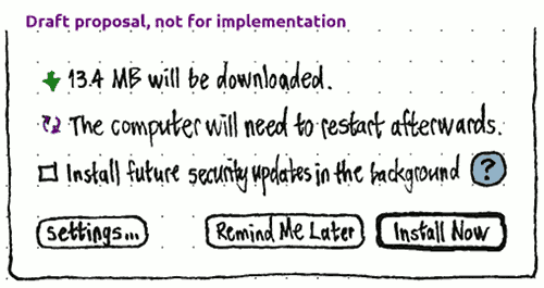
The checkbox would be checked whenever “When there are security updates:” is set to “Download and install automatically” (so it would be unchecked by default), and would track that setting even if it was changed while the alert was open.
The icon-only help button would open a short help page describing the benefits and drawbacks of installing security updates in the background. The same help button would be present on the trailing side of the “When there are security updates:” menu in the settings (unless another help button is present in the window when those settings are shown).
Unresolved issues
- What should happen with various HTTP errors?
- How should automatic installation interact with interactive installation and the various session commands?
In terms of distinguishing, security updates are to be distinguished from the rest in preferences, so they should be distinguished in the UI. The difference between distribution updates and recommended updates isn't important—I've been using Ubuntu since Jaunty and don't know the difference, but I've gotten along just fine. Other updates might be important, but I don't really think so—why should I care where caffeine came from, or whether an Ubuntu repo or a PPA has the latest version of GIMP or Firefox? —zpletan
Phone
Packages involved: ubuntu-system-settings (code, bug reports)
Because the phone uses image-based upgrades, every system update requires restarting the phone. Therefore the default is for system updates to download in the background; and only once the download is completed you are prompted to install and restart. App updates require restarting the app, but this can happen automatically in the background. To minimize UI complexity, and for consistency with the PC, both types of update should be presented in the same interface.
The typical user story is that while not in the middle of a task, you notice — through one of the prompts — that an update has downloaded and is ready for installation. You respond to the prompt. For a system update, you confirm that you want to install and restart now rather than later. The installation and restart takes place as a single action. For an app update, you choose to install the update, then either watch its progress or switch to another task.
![]() not possible
not possible ![]() defined
defined ![]() undefined
undefined
Use case |
Access point |
see whether your phone is up to date |
|
be prompted that updates are available |
|
install an individual update |
|
see whether an update has completed |
|
see updates installed in the past |
|
see why an update failed |
|
stop an in-progress download |
|
install all available updates |
|
set whether/when updates are downloaded in the background |
|
“Auto download” settings
|
Fixed to the bottom of the “Updates” screen in System Settings should be an “Auto download” page stack item. The summary value should be “Never”, “When on Wi-Fi”, or “Always”.
The “Auto download” screen should contain the option to “Download future updates automatically:” “Never”, “When on Wi-Fi” (the default), or “On any data connection”.
Checking for updates automatically
(bug 1409069)
The phone should check for updates automatically whenever there is an Internet connection, and at least 24 hours have passed since the last check (manual or automatic). It should not display any progress interface while checking, or any error if the check fails.
What if broken proxy rules etc prevent successful checks indefinitely?
Prompting
|
|
|
Whenever an update is downloaded and ready to install, or a background update download has failed repeatedly, or “Download future updates automatically” is set to “Never” and an update is available for download:
Wherever the System Settings icon appears, it should have a badge with the number of updates available (bug 1362547).
On the System Settings main screen, “Updates” should have the same badge (bug 1362547).
Inside System Settings, the quick access area should have an “Updates available” or “Update problem” item, with the number of updates available as the summary value.
Checking for updates manually
If push notification of updates has not been implemented, and you visit the “Updates” screen when at least 30 minutes has passed since the last check for updates, a new check should be triggered.
Presenting available updates
The overall contents of the “Updates” screen depends on five things:
- whether a check for updates is currently in progress;
- whether there are any system updates;
- whether you are signed in to receive app updates;
- if so, whether there are any app updates available; and
- whether there were any previous updates in the past month.
Specifically:
If a check for updates is currently in progress:
The screen should begin with a spinner, “Checking for updates…” label, and “Stop” button (bug 1272313), all taking up the same vertical space as the “Updates available” heading and “Update All” button would take. (You shouldn’t be trying to “update all” when the list of updates may change at any moment.)
- Any updates from the previous check should be listed below as available updates.
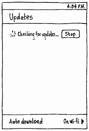
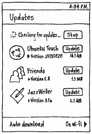
If a check is not currently in progress, then:
If no updates are available, the screen should begin with a 10-GU-high block containing — or, if the screen contains nothing else, consist entirely of — a centered error message or placeholder text as appropriate:
“Connect to the Internet to check for updates.”, automatically retrying a manual check if an Internet connection begins before leaving the screen (bug 1215901);
“The update server is not responding. Try again later.” (bug 1215901);
- “Software is up to date” (placeholder text, therefore without a period). (There is no need for a “Retry” button, in the first case because the check will happen automatically when the problem is fixed, and in the others because the check will happen automatically when you return to the Updates screen and it’s probably a bad idea to try sooner.)
If at least one update is available, they should be listed, most recent first, in an “Update available”/“Updates available” section. by itself. If there is more than one, the heading should have an adjacent “Update All” button.
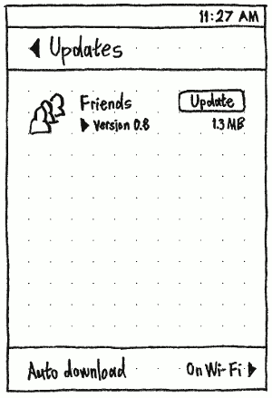
If more than one update is available:
- The screen should begin with an “Install {number} Updates” button.
The updates should be listed below as available updates.
Regardless of whether a check is in progress: If there were any previous updates in the past month, the screen should end with a “Recent updates” section, listing them in reverse chronological order of installation.
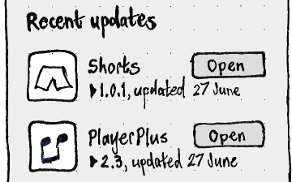
“Listed as available updates” means:
- If any of the updates is a system update, it should be listed first (because a system update may obviate updating default apps).
Any app updates should be listed in alphabetical order.
- If you are not signed in to receive app updates, there should be centered text “Sign in to Ubuntu One to receive updates for apps” and a “Sign In…” button that requests an Ubuntu One account from Online Accounts. (If you set up an Ubuntu One account during the first-run setup, the setup should have granted System Settings permission to access this account by default.) Granting access should trigger a check for updates.
If there is a system update and you are not signed in to receive app updates, there should be a separator between the system update and the sign-in prompt.
Presenting an individual update
How each update should be presented depends on its current state (before, during, or after installation), and whether it is a system or app update. In general, it includes an icon, title ellipsized in the middle if necessary (bug 1382416), action button, “Version” and version number, and size to 1 decimal place in the most appropriate unit (e.g. “13.8 MB”).
If it is a system update, its icon should be the Ubuntu logo, and its title should be “Ubuntu”. If it is an app update, its title should be the name of the app, ellipsized in the middle if necessary.
State |
System update |
App update |
Available |
|
|
Downloading automatically |
|
|
Downloading manually |
|
|
Download failed |
|
|
Downloaded |
|
|
Installing |
|
|
Installation failed |
|
|
Previous |
|
When an update completes successfully, it should slide from the list of available updates down to the “Recent updates” section (creating that section if necessary). A recent update should have an “Open” button for an app, not for the system.
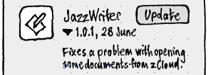
For any update, tapping the secondary text (version number and date) should toggle visibility of the update’s description immediately below the list item (bug 1494699).
Downloading in general


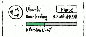
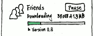
When an update is downloading, either automatically or manually, the action button should be “Pause”, and the size should include the amount downloaded in the form “X of Y”, for example “1.3 MB of 21.4 MB”, updated once per second.
Downloading automatically
An automatic download should not inhibit suspend; you may not be aware that it is happening, and it can always be resumed or retried later (bug 1259326).
If you change the “Download automatically” setting to “Off”, or change it to “When on Wi-Fi” when you are using a non-Wi-Fi connection, any automatic download should immediately pause, though manual downloads should continue.
Downloading and/or installing manually
A manual download or installation should inhibit suspend (bug 1259326).


Except for the other cases described here, the action button should be “Download” for a system update that has not completely downloaded, “Update” for an app update that has not completely downloaded, “Install…” for a system update that has completely downloaded, and “Install” for an app update that has completely downloaded.


Whenever any update is waiting to download manually, downloading manually, and/or installing manually, its list item should include a progress bar. (It should not include a progress bar in any other situation, because that would be distracting given that you did not trigger the download yourself (bug 1319037).) The size should stay put, but the version number should move below the progress bar. The space vacated by the version number should house status text: “Waiting to download” (bug 1522248), “Downloading”, or “Installing”. (Time remaining should not be shown, because it is too unpredictable on mobile connections (bug 1215901).)
The progress bar should fill depending on the task in question:
For a system update, the task is downloading only, so it should be full when the update is completely downloaded. (Installation progress is shown in a completely separate screen.)
- For an app update, during manual download the progress bar should fill up to 50% × the proportion of the download that had already completed before the update was requested, and the remainder should be allocated to installation. For example, if none of the update was already downloaded, 50% of the bar should be allocated to downloading, and 50% to installation. If half of the update was already downloaded, 25% of the bar should be allocated to downloading, and 75% to installation.
Installing all updates at once
|
(bug 1333668)
Whenever more than one update is available, and they are not all already installing, the list should be preceded by a button labelled “Install {number} Updates…” if it includes system updates (ellipsized because it will lead to a prompt), or “Install {number} Updates” if it doesn’t include system updates.
For example, once you tap it, all updates should begin installing, so the button should fade away and the list of updates should slide up to fill the empty space. Conversely, if any update is paused or stops due to an error, the button should reappear.
Pausing
The action button should be “Pause” for any update that is downloading or installing. It should be insensitive whenever the download/installation is no longer pauseable.
If you choose “Pause” during a download or an app installation, the update should pause and return to its idle presentation. If the update fails to pause, System Settings should report a RecoverableError (bug 1215901). Any later download — whether automatic or manual — should download the latest version, regardless of whether it is newer than the one already partially downloaded, but resuming the existing download if it is the same version (bug 1250607).
If an automatic download is paused, the pause should last until the phone next restarts or wakes up, whichever is sooner.
Installing updates that include system updates
System updates require restart. So you should be prompted before this happens, it should not interrupt any app updates, and the prompt should not happen repeatedly.
Therefore, a prompt should appear when:
- you choose “Install…” for an already-downloaded system update; or
- you choose “Install {n} Updates…” where at least one of them is an already-downloaded system update; or
- you were on the “Updates” screen at the moment a system update finished downloading (suggesting that you had been waiting for it to finish).
|
|
Whenever the phone is not connected to power and the battery charge is below a safe level, the prompt should have the text “Connect to power before installing the system update.” and only a “Cancel” button. Otherwise, it should have the text “Restart to install the system update.”, and “Restart & Install” and “Cancel” buttons.
Test case: With a low battery charge, connect the phone to power and choose “Install” for the system update; the install prompt should appear. Now unplug the phone; the prompt should change to the connect-to-power variant.
|
Installing a system update involves the device restarting twice, but this is an implementation detail. As far as a user is concerned, it is a single process that they have to wait for. Therefore, every step of the system update should show a progress bar, that fills once across all the steps.
One step of a system update is recompiling AppArmor profiles. In theory this could happen first without blocking your use of the device, before it restarts to flash the new system image. But in practice it would noticably slow down the device, and it would be confusing to have the device restart sometime later — regardless of whether that restart was automatic, prompted, or required manually revisiting this screen. Therefore, the recompilation should be integrated with the rest of the update process.
Until bug 1385410 is fixed, the progress allocation should be as follows:
Subtask |
Allocation |
Resulting range |
Progress text |
First restart |
5% |
0~5% |
none |
Recompiling apparmor profiles |
45% |
5~50% |
Preparing update… |
Flashing |
45% |
50~95% |
none |
Second restart |
5% |
95~100% |
none |
Once bug 1385410 is fixed, the progress bar allocation should be as follows:
Subtask |
Allocation |
Resulting range |
Progress text |
Recompiling apparmor profiles |
45% |
0~45% |
Preparing update… |
First restart |
5% |
45~50% |
none |
Flashing |
45% |
50~95% |
none |
Second restart |
5% |
95~100% |
none |
This allocation should be followed even though the progress bar can’t remain visible during the restarts themselves.
If any non-system updates were requested to install at the same time, these should begin in the background after the system update has finished, so that the device as a whole is unusable for the minimum time necessary.
If installation succeeds, the device should restart.
Installing app updates alone
|
As well as appearing in the “Updates” screen, app update download and installation progress should have the same visual treatment, wherever the app’s icon appears, as it does during initial installation.
Download or installation failure
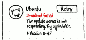
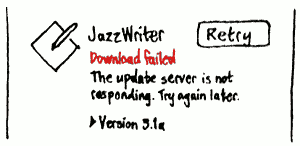
If a system update download fails, or an app update download or installation fails, the action button should become “Retry”, and the text “Download failed” or “Installation failed” should replace the item’s status text (bug 1282499). (An alert should not be used, because the error might occur while “Updates” is not the current screen or “System Settings” isn’t even the focused app.) Below this should be text describing the particular error, for example:
- “The update server is not responding. Try again later.”
- “The downloaded file was incomplete or damaged. Try again later.” (checksum error)
|
If a system update installation fails, the full-screen installation progress should be replaced by a full-screen error (bugs 1282499, 1215901).
If the update server is reachable, the error message should be of the form “Sorry, the system update failed. You need to install a full update, {size}.”.
If the update server is not reachable, the error message should not include the size of the fallback update required, and “Start Full Update” should be insensitive.
Whenever there is a Wi-Fi connection, the “Get On Wi-Fi…” button should instead be static text, “✔ Connected to Wi-Fi”. “Get On Wi-Fi…” should open the System Settings Wi-Fi screen as a sheet with “Cancel” and “OK” buttons, so that when you dismiss it you return to the error screen.
TBD: Non-interactive presentation of a flashing failure (bug 1387214).
Alternative prompting
|
If the in-Dash prompting is not feasible, an alternative method would be to display an “Update Available” alert whenever the phone is unlocked, if the update has been available for more than a week.
SoftwareUpdates (last edited 2019-04-14 16:59:44 by mpt)
