SoftwareCenter
Launchpad entry: software-library
Created: 2005-08-29 by MatthewPaulThomas
Ubuntu Software Center is a utility for installing, purchasing, and removing software in Ubuntu, a major part of Ubuntu’s overall software handling. This design specification describes, for designers, developers, testers, and potential contributors, how USC is supposed to work. The project is open source.
Contents
-
Rationale
- Branding
- Launching
- Main window
- Common interface components
- Determining information about software items
- Searching
- Custom package lists
- Copying a Web link for a package
- Installing software
- Removing software
- Add-on packages
- ISV software
- Ratings and reviews
- Recommendations
- Support and problem reporting for ISV software
- Comparing and syncing installed software between computers
- Help
- About window
- Features that were planned for future versions
-
Features you can implement
- “Go” menu and simplified navigation bar
- Installing from external media
- “What’s Popular” overall
- Subcategories for “Tweaks & Themes”
- Subcategories for “Sound & Video”
- Encouraging use an archived version instead of a standlone .deb
- Launching from multiple standalone .deb packages
- Opening a standalone package from within USC
- Dragging a software item
- Dragging Web site links
- Being encouraged to submit a review
-
“Updates” section
- Minimal implementation
- Enhancement: Navigation bar emblem
- Enhancement: Launcher item emblem
- Enhancement: Install Ubuntu updates together with application updates
- Enhancement: “Hide” function for updates
- Enhancement: Updates to other NotAutomatic channels
- Enhancement: New Ubuntu versions shown in “Updates”
- Smarter ellipsis of software list view items
- Copying software list view items to the clipboard
- Pausing or cancelling all queued tasks
- More informative text for waiting tasks
- Downloading while waiting to install
- Reordering queued tasks
- Consistent progress bar for installations and removals
- Copying a Web link for an “In Progress” package
- “Where Is It?” button
- “Reinstall” command
- “Remove Including Settings” command
- Residual files
- “Package Info” window
- History enhancements
- Animation of the main pane
- Wine integration
- Security information for the store
- Access to your store account details
- Yet-to-be-specified features
- Definitions used in this specification
- Roadmap
- Eventual scope
- Similar efforts
- How you can help
- Where to report bugs
- Unresolved issues
Rationale
Early versions of Ubuntu shipped many graphical utilities for installing and removing software: Add/Remove Applications, Synaptic Package Manager, Update Manager, Software Sources, apturl, GDebi, and Computer Janitor. This redundancy increased the amount of interface people had to learn, wasted space on the Ubuntu CD, fragmented development effort, and made people more likely to think that unsanctioned software installation methods were safe. Ubuntu Software Center replaces Add/Remove Applications, Synaptic, apturl, and GDebi, and acts as one of the main entry points to Software & Updates Settings.
Beyond providing a central point for installing and removing software, USC played a small but important part in encouraging application development on Ubuntu, by providing application developers with a prominent way to offer their software for installation.
Branding
The program itself, as well as application launchers, help pages, and marketing materials, should consistently follow these guidelines:
✔ |
Ubuntu Software Center |
✘ |
the Ubuntu Software Center |
✘ |
Software Center |
✘ |
the Software Center |
For example, you might say “JazzWriter, the hit note-taking app, has just arrived in Ubuntu Software Center.”
The name should be localized, for example as “Centre” in Commonwealth countries. It is not necessary to translate it word-for-word, but translations should (a) include the word “Ubuntu” (to reduce confusion with Debian Software Center etc), and (b) should not use a word that means “applications” in particular (because it also allows installation of non-application software such as add-ons, fonts, and themes).
The package name and executable name should both be software-center.
The application Comment should be “Lets you choose from thousands of applications available for Ubuntu” (without a period), and the summary in the About window should be “Lets you choose from thousands of applications available for Ubuntu.” (with a period). The package Summary should be “Utility for browsing, installing, and removing applications” (without a period).
The package Description should be:
Ubuntu Software Center lets you browse and install thousands of free and paid applications and other software available for Ubuntu. You can view available software by category, or search quickly by name or description. You can also examine the software already installed, and remove items you no longer need. |
The application icon should be of an attractive shopping bag with handles, such as you might get from a high-class department store.
|
|
Versions 1~4 |
Version 5+ |
Launching
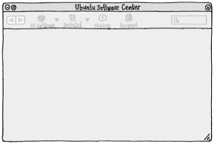
If USC is launched by any means when it is already open, the existing instance should be focused. Otherwise, the main window should open within five seconds on benchmark hardware, even if most of the UI is not ready yet, so that all controls need to be disabled.
|
→ |
|
→ |
|
→ |
|
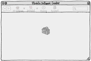
If USC isn’t ready after two seconds, a USC icon should appear centered in the window.
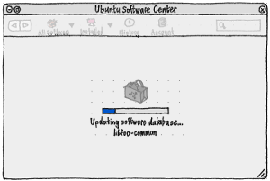
If, after two more seconds, the system has not finished generating an up-to-date package database in your current UI language, a progress bar should appear below the icon, showing the database generation (bug 434601). If after two more seconds it still hasn’t finished, progress text should begin appearing below the progress bar: “Updating package database…” followed by the latest package name.
Directly
In Unity, Ubuntu Software Center should be a default item in the launcher.
In the standard gnome-panel “Menu Bar” applet, “Ubuntu Software Center” should be the last item in the “Applications” menu, with a separator immediately before it. In the gnome-panel “Main Menu” applet, “Ubuntu Software Center” should similarly be after the list of application categories, with separators immediately before and after it.
When opened directly, USC should by default display the home screen of the “All Software” section, scrolled to the top. The search field should be empty. Default focus should be on the search field (so that you can start searching immediately, or use Down followed by other arrow keys to navigate the items in the home screen).
From an apt: link
Opening an apt: URL should launch Ubuntu Software Center directly to the appropriate screen; or if it is already open, focus it, wait until any currently-open alerts or dialogs have been dismissed, and then switch to the appropriate screen. What that “appropriate screen” is depends on the URL and whether the package is known to exist.
If the URL is of the form “apt:package-name”:
If the package is known, the software item screen for the package. Test case: (sc-001) Follow the link apt:python-wxtools. It should show the item screen for “All Software” > “System” > “python-wxtools”.
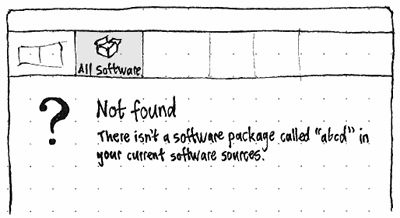
If the package is not known, an ephemeral error screen in the “All Software” section. It should be possible to return to this screen later in the navigation history, but it should not be possible to navigate to it directly. Test case: (sc-009) Follow the link apt:abcdefghijklmnop.
If the URL is of the form “apt:package-name?minver=1.0”:
If the package is not known, the same kind of ephemeral error screen as used for apt:unknown-package-name.
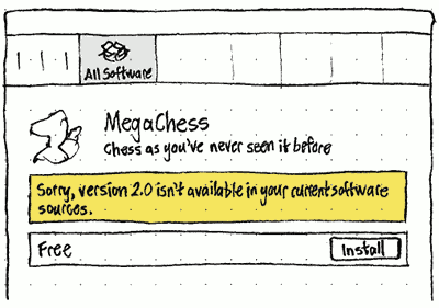
If the package is known, the software item screen for the package. If a version late enough is not available, this screen should include an extra ribbon, between the summary and the installation state bar: “Sorry, version {minver} isn’t available in your current software sources.”.
If the URL is of the form “apt:package1,package2,…”: A custom package list for the package names (including displaying the comma-separated names in the search field).
If the URL is of the form “apt:package-name?section=multiverse”:
- If the section is not currently enabled, a placeholder for the package screen, inviting you to enable the section. It should use the package name as its heading, the text ‘This software is available from the “{source}” source, which you are not currently using.’, and a button “Use This Source”. Activating the button should add the source, and the software item screen should automatically expand to its normal format.
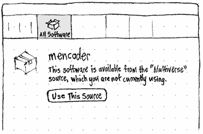
Erratum: The text currently implemented is shorter and better.
If the section is enabled but the package is not present in it, the same ephemeral error screen as used for apt:unknown-package-name.
Otherwise, the software item screen for the package.
If the URL is of the form “apt:package-name?channel=lucid-partner”: Exactly the same appearance and behavior as for apt:package-name?section=multiverse, but enabling a whitelisted repository as listed in /usr/share/app-install/channels/, rather than a section.
When this feature is fully implemented, the software-center package should be marked as Provides: apturl and Replaces: apturl.
from a standalone .deb package
While installing Skype, I was informed that a “later version is available in a software channel. You are strongly advised to install the version from the software channel, since it is usually better supported.” I'm pretty sure that could have been translated to, “Click ‘Next’ to install a newer version of Skype.” |
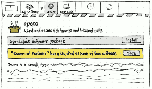
Opening a .deb package should launch Ubuntu Software Center (or focus it, wait until any dialogs are dismissed, and then navigate) to a temporary software item screen for the package.
In the navigation bar, the screen should be located in an “Other” source, following “All Software” or “Installed” depending on whether this package version is already installed.
This software item screen should differ from the standard one:
- Its visual design should hint that this is a little less safe than installing a package from a repository.
- The installation state bar should say “Standalone software package”, not “Free”. (For all USC knows, you might have had to pay to download the package in the first place.)
- If one of your repositories contains a package with the same name but a higher version number, there should be an extra bar below the installation state bar, with text of the form ‘Ubuntu has a newer version.’ (without quotes) or ‘“Other Repository Label” has a newer version.’ (with quotes). Activating the adjacent “Newer Version” button should navigate to the software item screen for the newer version.
The software-center package should be marked as Provides: gdebi and Replaces: gdebi.
from the command line
software-center should launch USC to its default view. software-center package-name should open USC to display that package. If the package is unknown, it should display the same unknown-package screen as apturl uses.
Main window
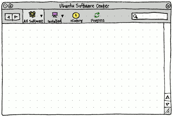
The main window should be a normal, resizable window containing a navigation bar and a main pane. Initially, the window should be centered on the main display, but its size and position should persist between sessions.
The navigation bar should contain:
- Back and Forward buttons.
- Tab-like buttons for navigating between sections. Exactly one should be selected at any time:
Available software, defaulting to “All Software”, with a menubutton for all available software sources.
- The individual available software source you are currently looking at, if any. (Before this item appears, all those on the trailing side should slide out to make room, and after it disappears they should slide back.)

Installed software, defaulting to “All Installed” (appearing as “Installed” in the navigation bar), with a menubutton for all installed software sources.
- The individual installed software source you are currently looking at, if any. (Before this item appears, all those on the trailing side should slide out to make room, and after it disappears they should slide back.)
“History”
(“Popular”, “Updates”, and/or “Account” sections may be added later.)
“Progress”, present only occasionally.
The search field, visible for any searchable screen.
Test case: (sc-002) Launch USC. From the “All Software” menu, choose “Canonical Partners”. All following items in the navigation bar should slide to the right, making room for a “Canonical Partners” item, highlighted, between “All Software” and “Installed”. Next, from the “Installed” menu choose “For Purchase”. The “Canonical Partners” item should disappear, and the “Installed” item should slide to the left, making room for a “For Purchase” item, highlighted, between “Installed” and “History”. Click Back; the “For Purchase” item should disappear from the navigation bar, and the “Canonical Partners” item should reappear, highlighted once more.
Navigation
Navigation in general
Whenever USC navigates to a screen, whether directly (with mouse or keyboard) or indirectly (e.g. when it first launches), it should:
- immediately reveal (if necessary) and highlight the appropriate item in the navigation bar, if it has changed;
- begin displaying the corresponding screen in the main pane;
- if the corresponding screen has not displayed within 2 seconds, display a blank screen with a horizontally and vertically centered spinner, until the screen is available.
Unless the screen was navigated to by Back/Forward or by editing the search field, the screen should be focused as a whole (fixing bug 832265). From this initial focus, pressing Down or Tab should focus the first item in the screen, and pressing Shift+Tab should focus the sort menu if present.
Test case: (sc-003) On a slow computer, choose “System”; the spinner screen should appear until the full list is available. Press Down; the first item in the category should be selected. Press Shift+Tab; the sort menu should be selected.
Section navigation
The section navigation commands — “All Software”, “Installed”, and so on — should always navigate to the top level of that section, with no search text or scroll position. (The alternative would have been to remember your exact position in each section, as in previous versions of USC, but that made it harder to understand how to navigate up to the top level in each. Instead, we rely on Back and Forward navigation to preserve state.) Test case: (sc-006) In the “All Software” section, navigate to AbiWord. In the navigation bar click on “Installed”, then on “All Software”. USC should return to the home screen.
Back/Forward navigation
The navigation history (not to be confused with USC’s “History” section) is a browser-like history of which screens USC has navigated to, either directly (for example, by clicking a link or using the navigation bar) or indirectly (for example, by following an apt: link), since it opened. Unlike previous versions of USC, it should include screens from any section.
The Back and Forward commands should navigate through this navigation history, as with a Web browser: navigating using the history should not add items to it, and navigating without using the history should discard all forward items from the history. The Back command should be unavailable whenever no previous screens exist in the history, and the Forward command whenever no later screens exist in the history.
Test case: (sc-007)
- Launch USC. In both the navigation bar and the menus, the Back and Forward commands should be unavailable.
- Choose “History”. The Back command should become available.
- Choose Back. USC should return to the home screen, Forward should become available, and Back should no longer be.
- Choose Forward. USC should return to the History screen, Back should become available, and Forward should no longer be.
Each item in the history should remember its scroll position, whether items hidden by default were shown, what software item was selected (if any), and what element was focused (if any). These attributes should persist if you return to the screen using Back/Forward navigation, but not if you navigate to the screen any other way.
If the search field was non-empty when you navigated to a separate screen, the search you had entered just before you navigated should be stored as its own history item. Intermediate searches should not be in the history.
Whenever a screen in the navigation history does not currently exist (for example, the “Progress” screen when no tasks are in progress, or the software item screen for an item that was uninstalled and doesn’t exist in any software source), the Back and Forward commands should skip over that screen in the history — and the commands should be unavailable if all previous or later screens, respectively, consist of screens of that sort.
Test case: (sc-008)
Launch USC. In Software & Updates Settings, add a new PPA. In USC, choose “All Software From Source” > that PPA. Back should become available.
- Choose Back. Back should become unavailable, and Forward should become available.
In Software & Updates Settings, remove the PPA. Forward should no longer be available.
In Software & Updates Settings, re-add the same PPA. Forward should become available once more.
- Choose Forward. USC should return to the screen for that PPA.
“All Software” section
The “All Software” section should present the union of {all software that is available, from any of the computer’s current software sources, plus any software source represented by a X-AppInstall-Channel attribute in app-install-data}, and (unlike previous versions of USC) {all software that is installed, regardless of whether it is installed from any of the computer’s current software sources}.
The section encompasses a home screen, as well as screens for top-level search results, individual categories, category search results, subcategories, subcategory search results, software sources and search results, and individual software items.
Whenever you are in the “All Software” section, the “View” > “Software Maintained by Anyone” and “View” > “Software Maintained by Canonical” items should be enabled. Changing the selection should determine whether all software or just Canonical-updated software is are shown. The selection should persist regardless of which screen in the “All Software” section is being displayed.
Whenever a software item is selected — whether searching from the home screen, in a category, in a subcategory, or implicitly because you are at a software item screen itself:
If it is an item that is not currently installed nor being installed, “File” > “Install” should be enabled. Selecting it should install the selected item.
If it is an item that is currently installed and not currently being removed, “File” > “Remove” should be enabled. Selecting it should remove the selected item.
Home screen
|
Erratum: “Most Popular” should be “What’s Popular”. |
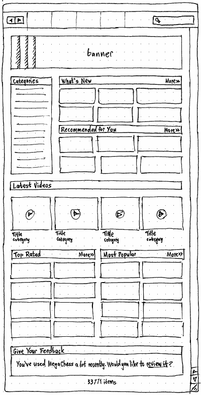
The home screen should be a searchable screen containing as many of these elements as have been implemented so far:
- “Recommended For You”
- “Latest Videos”
- “Give Your Feedback”
- a footer of the form “29 079 items available”.
Arrow keys should change focus between the selectable items in the home screen.
The “Categories” section of the home screen should list (without icons) alphabetically all categories, as defined and sorted under “Genre”, which contain any items matching the current repositories and view options.
Exhibit banners
An exhibit is either a single item, or a collection of items on a theme, that is temporarily promoted at the top of the home screen. Exhibits are stored and transmitted as mini-HTML documents from the USC server.
Whenever the server provides exhibits for your Ubuntu version, and any of those exhibits are for — or are collections that contain any — items available with your current filters, the banner area on the home screen should show a carousel of those particular exhibits. When there are multiple applicable exhibits, the current one should fade into the next one after ten seconds. The carousel should pause whenever the window is not focused.
In any other case (for example, if there is no Internet connection, or there are no exhibits for the Ubuntu version you’re running), the banner area should show a fallback banner (included in the USC code) that links to the canned list of Featured applications.
Activating the banner for a single-item exhibit should navigate to the software item screen for that item. Activating the banner for a multi-item exhibit should navigate to a list view, with the appropriate heading, showing whichever items match your current filters.
Future work: Switch from a list view to a tile view.
“What’s New”
On the home screen, the “What’s New” area should use tiles to list, newest first, the applications that appeared most recently in any of your software channels, excluding items that you have already installed. (For this purpose, an “application” is any package containing a .desktop file.) The number of applications should be as many as fills the height of the “Categories” area next to it (or, if “Recommended For You” has been implemented, half the height).
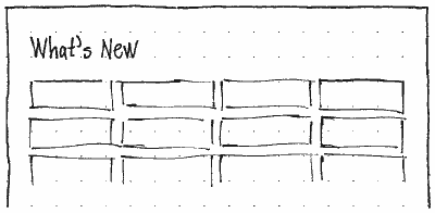
Choosing “More” in the home screen area should navigate to a separate “What’s New” screen that uses a software tile view to list, newest first, the 60 applications that appeared most recently in any of your software sources, regardless of whether they are installed (bug 1009967).
“Top Rated” overall
An item’s dampened rating (DR) should be 3 plus the sum, for each possible number of stars (1, 2, 3, 4, and 5), of (that number of stars – 3) multiplied by the lower bound of the Wilson score confidence interval with a 90% confidence level for the proportion of ratings that had that number of stars.
For example:
★☆☆☆☆ |
★★☆☆☆ |
★★★☆☆ |
★★★★☆ |
★★★★★ |
DR |
0 |
0 |
0 |
0 |
0 |
3.0 |
16 |
0 |
0 |
0 |
0 |
1.19 |
8 |
0 |
0 |
0 |
0 |
1.34 |
4 |
0 |
0 |
0 |
0 |
1.58 |
2 |
0 |
0 |
0 |
0 |
1.90 |
1 |
0 |
0 |
0 |
0 |
2.24 |
0 |
1 |
0 |
0 |
0 |
2.62 |
0 |
0 |
1 |
0 |
0 |
3.00 |
0 |
0 |
0 |
1 |
0 |
3.38 |
0 |
0 |
0 |
0 |
1 |
3.76 |
0 |
0 |
0 |
0 |
2 |
4.10 |
0 |
0 |
0 |
0 |
4 |
4.42 |
0 |
0 |
0 |
0 |
8 |
4.66 |
0 |
0 |
0 |
0 |
16 |
4.81 |
Sorting items by “Top Rated” should sort them by their DR, so that (for example) an item with ten reviews, nine 5-star and one 4-star, is appropriately ranked higher than an item that has only two reviews, both 5-star.
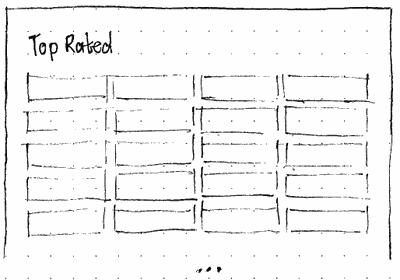
On the home screen, the “Top Rated” area should use tiles to list, in descending order of DR, the items with the highest DR (out of all items that USC is configured to display), regardless of whether they are installed (bug 1009967). The number of items shown in this area depends on whether “What’s Popular” has also been implemented: 24 if it hasn’t, 12 if it has.
Choosing “More” in the “Top Rated” area should navigate to a separate “Top Rated” screen that uses a software tile view to list, in descending order of DR, the 60 items with the highest DR, regardless of whether they are installed. (As usual, the number of stars shown for each item should represent the median rating, not the DR itself.)
Category screen
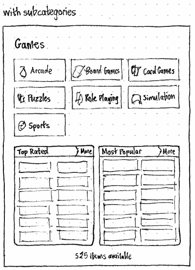
A category screen should be searchable. It should always begin with a heading giving the name of the category, and end with centered text of the form “1234 items available” (this count should include items in any subcategories).
If the category is set to “Show non-applications by default”, it should use a software listing view. Otherwise, it should use a software tile view, and non-application items should be hidden by default.
If it has any subcategories that contain any items matching the current repositories and view options, the screen should have buttons for each subcategory, a “Top Rated” area listing the 12 top rated items in that category, and (once implemented) a “What’s Popular” area listing the 12 most installed items in that category that are not already in the “Top Rated” area. (Using 12 items produces a filled last row whether there are 1, 2, 3, or 4 items per row.)
Erratum: “Most Popular” should be “What’s Popular”.
Otherwise, if “What’s Popular” has been implemented and the category contains more than 60 items, the screen should consist only of the “Top Rated” and “What’s Popular” areas, each listing 12 items.

Erratum: “Most Popular” should be “What’s Popular”.
Otherwise, if “What’s Popular” has not yet been implemented or the category contains up to 60 items, the screen should consist of a software tile view listing every item in the category. Opposite the heading should be an option menu for choosing the sort order, “By Rating” (the default), “By Name”, or “Newest First”.
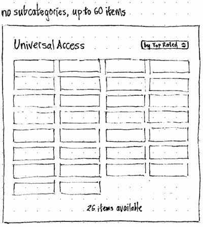
Whenever the screen contains a “Top Rated” area, that area should list, in descending order of dampened rating, the 12 items with the highest DR in that category. Choosing “More” should navigate to a separate “Top Rated in {Category Name}” screen, listing, in descending order, the 60 items with the highest DR in that category.
Whenever the screen contains a “What’s Popular” area, that area should list, in descending order, the 12 most popular items in that category, that are neither installed nor already shown in the “Top Rated” area. (This avoids repetition, giving visibility to more items.) Choosing “More” should navigate to a separate “What’s Popular in {Category Name}” screen, listing, in descending order, the 60 most popular items in that category regardless of whether they are installed or in a “Top Rated” list.
If the category is not set to “Show non-applications by default”, non-application items should be hidden by default.
Subcategory screen
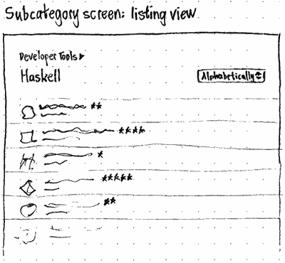
|
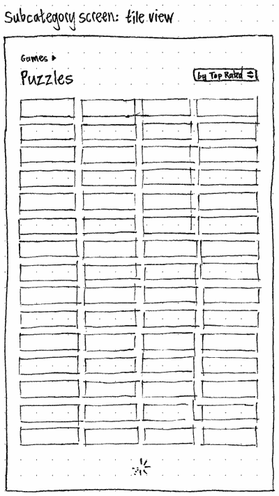
|
Like the category screen, a subcategory screen should be searchable. It should always begin with a link to the parent category and a heading naming the subcategory, and end with centered text of the form “1234 items available”. If more than one sort order has been implemented, opposite the heading should be an option menu for sorting “By Rating” (the default), “By Popularity” (once implemented), “By Name”, or “Newest First”.
If the subcategory is set to “Show non-applications by default”, it should use a software listing view. Otherwise, it should use a software tile view, and non-application items should be hidden by default.
Where to show the number of items in the subcategory? We can’t nicely show them at the bottom, because in a tile view the bottom will always be scrolling out of view.
“Installed” section
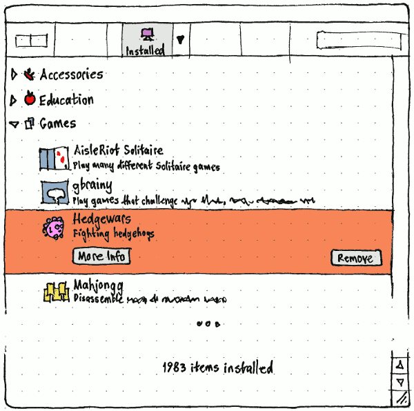
|
In the navigation bar, “Installed” should have an icon of a computer. It may have an emblem indicating inconsistent package state.
The “Installed” screen should show all software items currently installed, regardless of whether they are available from any of the computer’s current software sources.
The items should be grouped into the primary categories (but not the subcategories) to which they belong. Categories for which no items are installed should not be shown. A category should expand or collapse if you click anywhere in its row; expand if you press Right when it is highlighted; and collapse if you press Left when it is highlighted. The expanded or collapsed state of every category should be remembered between sessions.
At the end of the list should be centered text of the form “1047 items installed”.
Whenever you are in the “Installed” section, the “View” > “All Software” and “View” > “Canonical-Updated Software” items should be enabled. Changing the selection should determine whether all software is shown, or just Canonical-updated software. The selection should persist regardless of which screen is being displayed.
The “Installed” screen should be searchable. Whenever the search field is non-empty, a software item should be visible only if it matches the search text. A category should be visible only if either (a) it contains any matching software items, or (b) the category name itself matches the search text. Searching should not cause a category to expand or collapse by itself.
Software items in the “Installed” screen should show their icon, title, and summary. The icon should be indented so that it lines up with the start of the category name above.
Apart from that extra indentation, individual items in the “Installed” section should look and behave just as in any other software list view.
Software item screen
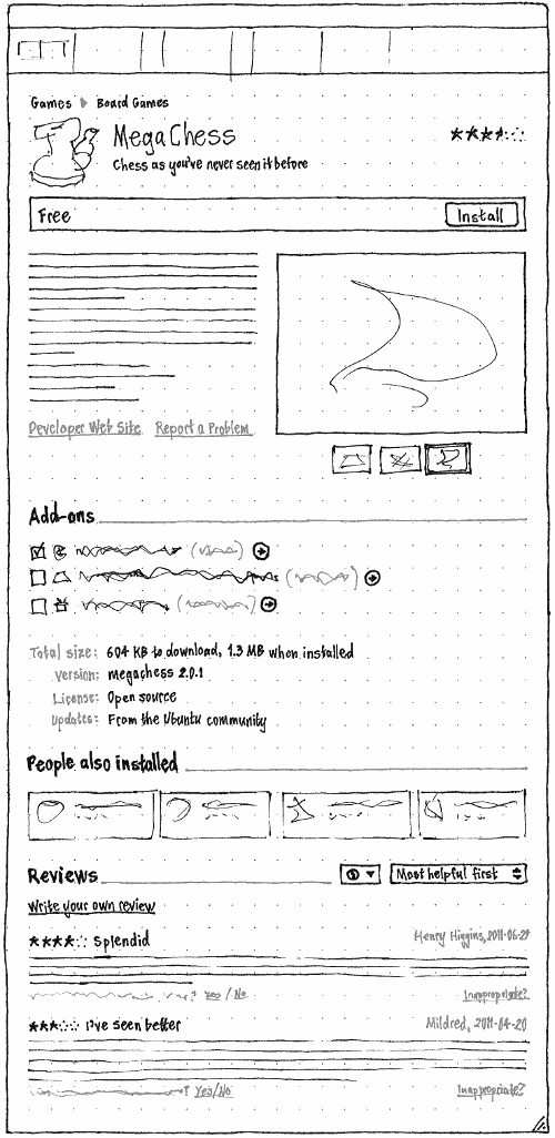
|
A software item screen should show information about an item, let you install or remove it or change any add-ons, and (if you have currently or previously installed it) rate and review it.
A software item screen is not searchable.
Whenever a software item screen is being displayed:
If it is installed or currently being removed, “Installed” should be highlighted in the navigation bar. Otherwise, “All Software” should be highlighted. Test case: (sc-012) Navigate to an item that isn’t installed; “All Software” should be highlighted. Install it; once installation finishes, “Installed” should be highlighted. Now remove it; once removal finishes, “All Software” should be highlighted once more.
If it is an item that is neither currently installed nor being installed, “File” > “Install” should be enabled. Selecting it should install the selected item.
If it is an item that is currently installed and not currently being removed, “File” > “Remove” should be enabled. Selecting it should remove the selected item.
Whenever text is selected in the screen, the copy action (“Edit” > “Copy” and Ctrl C) should be enabled. Choosing it should copy the selected text to the clipboard.
“Edit” > “Copy Web Link” should be enabled. Choosing it should copy a Web link for the relevant package.
If the relevant package is not maintained by Canonical and you then choose “View” > “Canonical-Updated Software”, USC should automatically navigate up to the subcategory screen; or, if the entire subcategory contains no Canonical-updated items, up to the category screen; or, if the entire category contains no Canonical-updated items, up to the home screen).
Except where specified elsewhere, a software item screen should contain:
A link to its primary category.
A triangle (▶) and a link to its primary subcategory, if it has one.
Its icon, except that the installed emblem should not be shown for an installed application (because it’s shown in the installation state bar immediately below instead, which clarifies that the emblem is not part of the application icon itself).
- On the trailing side, stars representing the item’s average rating.
Its title, wrapping to multiple lines if necessary.
Its summary, wrapping to multiple lines if necessary.
If the item is not installed nor queued for installation, the price of the item (e.g. “Free”) at the leading end, and a button at the trailing end: “Buy…” if installation requires sign-in and payment, “Install…” if it requires sign-in only, or “Install” if it requires neither.
- If the item is installed and not queued for removal, the installed emblem and the text “Installed” (or, if known, “Installed on {date}”) at the leading end (except for Ubuntu Software Center itself, where it should say “Installed (you’re using it right now)”), and a “Remove” button at the trailing end.
If the item is being installed or removed, or is queued for installation or removal (but not if its add-ons are being changed), the status text for the installation at the leading end, and a progress bar at the trailing end.


Its description. If the item is in app-install-data and refers to a package that is not present in the apt cache, the text “To show information about this item, the software catalog needs updating.”, and an “Update Now” button. Choosing “Update Now” should update the screen to its usual format. And if the item is not available for this architecture, instead of the description should appear the text “Sorry, <Title> is not available for this type of computer (<Architecture>).”.
A “Developer Web site” link to the URL in the package’s Homepage: field, if there is one. The link should have a context menu containing “Open Link” and “Copy Link Address” items.
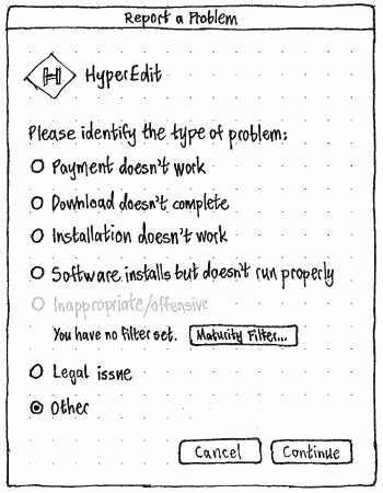
A “Report a Problem” link, if the vendor has registered a support URL.
If the item is or would be recommended for you, the reason or the hidden status.
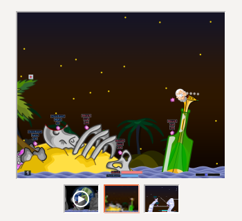
A mini gallery of all available videos and/or screenshots of the item (bug 1049988), if there are any. (If there are none, the description should extend to the space they would normally occupy (bug 1056897).) To emphasize that it is a gallery (bug 691594), the gallery should include thumbnails of each item even if there is only one. The currently displayed media, and each thumbnail, should each appear inside an inset border, with the border of the focused item highlighted. The selected screenshot or video should take up to half the width of the window, and up to the full height of the window, while maintaining its aspect ratio (bug 673214). If you activate a screenshot or video (by clicking it, or pressing Space or Enter when it is focused), a small determinate progress meter should appear centered over it, showing download or buffering progress. If it loads, the screenshot or video should then visibly zoom into a chromeless overlay window that is the height of the display, the width of the display, or the original size of the image, whichever results in the smallest scaled image (bug 995129). Clicking or pressing any key should zoom the overlay back into the main display.
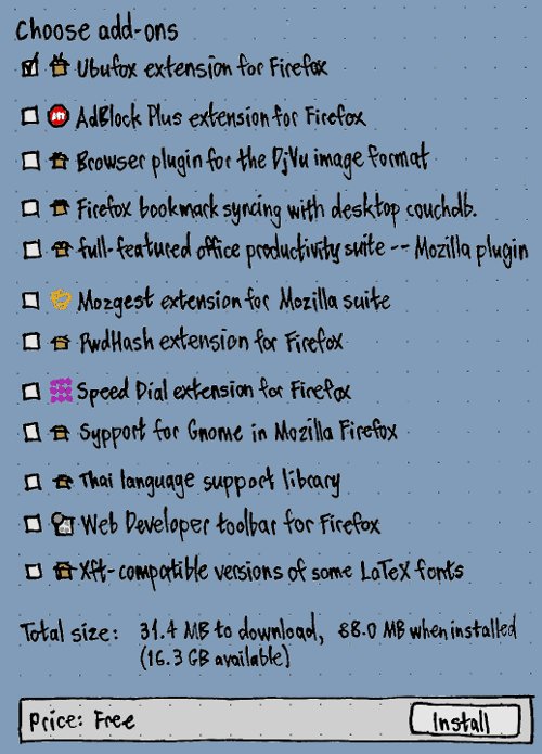
The add-ons section.
- Text describing the “Total size:” of the item:
if it is not downloaded or installed, “{X} to download, {Y} when installed”, where X is the download size including not-yet-installed dependencies, and Y is the installed size including not-yet-installed dependencies;
if it is already downloaded but not installed, “{Y} when installed” (bug 851222);
- if it is installed, and you have not specified any changes to add-ons, “{Y} on disk”
if it is installed, and you have specified changes to add-ons, “{X} to download, {Y} on disk”.
- Text of the form “Version: {package name} {version number}”.
Text of the form “Last update: {full date}” (bug 680523).
The label “License:” followed by its license text.
The label “Downloaded from:” followed by the appropriate text (private bug 882831).
The label “Updates provided:” followed by the appropriate text.
- A “People also installed” area, if there are any relevant items.
The item’s ratings and reviews.
Copy-editors |
Within USC, examine the title, summary, and description of an item. Is it concise and helpful? Is the spelling, grammar, and paragraph formatting correct? If it’s a non-geek application, does the description avoid geek language? Is it in the appropriate category? If you find a problem, and you are comfortable diving into code to fix it yourself, follow the distributed development instructions with the app-install-data-ubuntu package to fix problems in an application’s title or summary, or the package itself to fix problems with its description. Otherwise, report a bug with (a) the current text, (b) what needs improving, and (c) your proposed replacement text, and give the bug report the metadata tag. |
Packagers |
Please look for bugs that people have reported about inappropriate application names or summaries, or package descriptions or categories, and fix them. Thanks for your help. |
Packagers |
If a single package contains multiple applications, and people might reasonably want to install these applications separately, work to separate the packages into one per application. |
“History” section
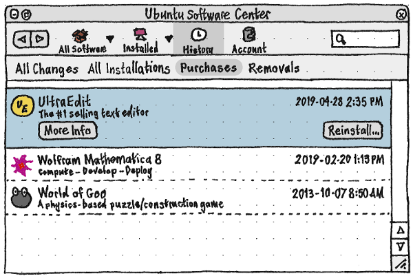
The “History” section should display all installations, updates, removals (including purges), and other changes, in reverse chronological order.
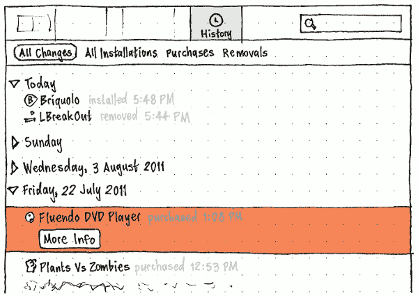
Below the navigation bar, a filter bar should have items for “All Changes”, “All Installations” (including purchases), “Purchases”, and “Removals” (including purges) (bug 990998). (It does not need an item for “Updates”, because the use case for seeing those — debugging a problem — involves seeing all other package changes too.)
History entries should be grouped in branches labelled by day. Clicking anywhere on a branch — or pressing Space when it is selected — should expand it if it is collapsed, and collapse it if it is expanded. When a branch is selected, pressing Right should also expand it, and Left collapse it. For the day on which the most recent events happened, that branch should be expanded by default from the start of every USC session.
The “History” screen should be searchable. Whenever the search field is non-empty, a history entry should be shown only if it matches the search text, and a date branch should be shown only if it contains any items matching the search text. Searching should not cause a date branch to expand or collapse by itself.
Each history entry should consist of an icon, text, a time, and a price.
The icon should be that of the relevant software item.
- The text should be of the form:
“{short name} installed”
- “{short name} removed”
- “{short name} purged”
- “{short name} updated from version {version} to {version}”
- “{short name} downgraded from version {version} to {version}”
- The time should be of the form “4:08 PM”.
- The price should be of the form “$4.99” if it was a purchase, or “—” otherwise.
“Progress” section
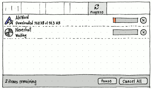
The “Progress” section should be visible only when items are being installed or removed, or when the last installation or removal finished less than five seconds ago. If the section disappears while being displayed, USC should return to the section that was previously being displayed.
In the navigation bar, the section should have an animated icon of two semicircular arrows chasing each other clockwise. The icon should be overlaid with an emblem showing the number of tasks yet to be completed.
The section itself should list the items requested for installation or removal, earliest first. The rows in the list should be based on a software item list view, with these differences:
the second row of text is the task status text, rather than the package summary or package name;
each row has a (text-less) progress bar representing the task progress proportion;
- each row representing an installation has a cancel button (which can be triggered by the Esc key when the row is selected), while each row representing a removal has a gap the same size as a cancel button (so that its progress bar lines up with the progress bars of installation rows).

The cancel button for an individual item should be present only when the item has not yet started or is still downloading.
Common interface components
Menus
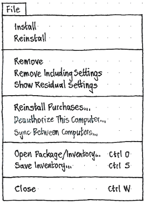
_File
=====
  _Install
  _Remove
---------------------------
  Reinstall _Purchases…
  _Deauthorize Computer…
  Sync Between Computers…
---------------------------
  _Close            Ctrl W
“Install” and “Remove” should activate the Install and Remove functions respectively. “Close” should, by default, close the window and exit USC.
_Edit
=====
  _Undo                     Ctrl Z
  _Redo               Shift Ctrl Z
-----------------------------------
  Cu_t                      Ctrl X
  _Copy                     Ctrl C
  Copy _Web Link      Shift Ctrl C
  _Paste                    Ctrl V
  _Delete
-----------------------------------
  Select _All               Ctrl A
-----------------------------------
  Searc_h…                  Ctrl F
-----------------------------------
  _Software & Updates Settings…
“Software & Updates Settings…” should open the Software & Updates Settings control panel. (software-properties-gtk should be responsible for focusing an existing copy of itself if it is already open.)
All other items in this menu should be disabled by default; their availability and behavior is defined elsewhere in this specification.
_View
=====
* Software Maintained by Anyone
  Software Maintained by Canonical
------------------------------------
  Go Back                        [
  Go Forward                     ]
------------------------------------
/ New Applications in Launcher
------------------------------------
  Turn On Recommendations… | Turn Off Recommendations
  Reset Recommendations…
The “Software Maintained by Anyone”, “Software Maintained by Canonical”, and “Reset Recommendations…” items should be disabled by default; their availability and behavior is defined elsewhere in this specification.
The “Go Back” and “Go Forward” items should represent the Back and Forward actions.
Test case: (sc-003) Start installing something in USC. While it is installing, navigate to the “In Progress” section, and open the “View” menu. Its items should be disabled.
_Help
=====
  Ubuntu Software Center _Help…
  Help With _Payments
  _Terms of Use
--------------------------------
  For Software _Developers
--------------------------------
  _About This Version
By default, “Ubuntu Software Center Help…” should open the help viewer to the front page of the help.
“Help With Payments” should open the default Web browser to https://help.ubuntu.com/community/Pay (bug 1107824).
“For Software Developers” should open the default Web browser to https://developer.ubuntu.com/.
“About This Version” should open or focus the About window.
Software item tiles
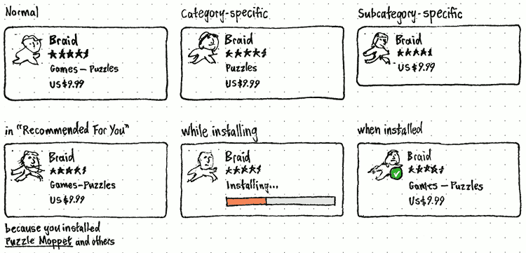
Errata: “Games — Puzzles” should be “Puzzles”.
Tiles are used to present software items on the home screen, category screens, subcategory screens, search results, and other listings.
Tiles have a minimum width. In an area that is to be filled with tiles, the number of tiles on each row should be based on the minimum width, with each tile stretching equally to fill any remaining width.
A normal software item tile contains the item’s:
Icon. If the icon is scalable, or larger than 4 em in either dimension, it should be scaled down proportionally so that it is 4 em in its largest dimension. To subtly encourage developers to produce large/scalable icons, if the icon is already smaller than 4 em in both dimensions, it should be drawn at actual size and centered (both horizontally and vertically) inside a 4 em square that has a 0.05-em-wide border of color 170,170,170 (#aaaaaa).
Title, ellipsized in the middle if necessary to fit on one line.
- Average rating (omitted entirely if there are not enough ratings).
Subcategory name if it has one, otherwise its Category name, either ellipsized at the trailing end if necessary to fit on one line.
- Price (or “FREE” if the price is zero).
A category-specific software item tile is identical except that it omits the category name (because it would be identical for every item). And a subcategory-specific software item tile omits the category and subcategory names.
If the package is not available for this computer’s architecture, the whole tile should have 50% opacity, but should still be clickable.
The whole tile should have a pointing-hand pointer when moused over, and should be a darker shade whenever it is being clicked (bug 1017454). Single-clicking should navigate to that item.
Software tile view
A software tile view is used to present software items on various screens. It includes a heading, followed by a grid of software item tiles.
Where there is no limit on the number of items shown, initially only 60 items should be loaded and shown initially (60 because that will produce a decent batch of complete rows whether there are 2, 3, 4, 5, or 6 tiles per row). If there are more items, the bottom of the view should have enough space for a spinner. When you scroll to the bottom of the view, the spinner should appear until the next 60 items load and replace it.
Software list view
A software list view is used for the “History” and “Progress” sections. A variation of the list view is used in the “Installed” section. In future it may also be used in “All Software” for technical categories and subcategories (instead of the usual tile view), and for search results in those categories and subcategories.

In a list view, each software item should have a row displaying the item’s icon, title, and summary. The row’s accessible name should be the item’s title, and its accessible description should be the item’s summary. If either row of text is wider than the space available, it should be ellipsized at the trailing end.
In “All Software” and “Installed”, the titles of items with ratings should be followed by stars for the average rating, and the number of ratings in brackets. If the width of those three things is greater than the width of the list, the stars and number should together be flush at the trailing end of the row, while the title is ellipsized at its end. (Previously the stars were always flush at the trailing end, making it difficult to see which rating belonged to which item. Moving them next to the title means stars are not aligned for different rows, but that matters little, because the ratings will much more often be used for sorting than for direct comparison.)
|
⇄ |
|
In the “All Software”, “Installed”, and “History” sections, when (and only when) an item is selected, the row should expand to reveal buttons: “More Info” and “Remove” for an item that is installed, queued for removal, or being removed, and “More Info” and “Install” etc for an item in any other state.
The “More Info” button should have Enter as its access key. Activating it should navigate to the software item screen.
The “Install” button should be disabled if the item is currently installing or queued for installation. Similarly, the “Remove” button should be disabled if the item is currently being removed or queued for removal, or if its add-ons are being changed or queued for change. Neither button should have an access key (because that would interfere with typing letters to navigate the list).
The “More Info” in the row should, if it is enabled, be focused by default (otherwise no button should be focused); pressing Tab should cycle through any remaining buttons before leaving the list (bug 634952)). Test case: (usc-005) Navigate to “All Software” > “Universal Access”. Select “Indic Onscreen Keyboard”. Press Ctrl F; the search field should be focused. Press Tab; the ttf-alee row and its “More Info” button should be focused. Press Tab again; the “Install” button should be focused.

When an item is being installed, being removed, having its add-ons changed, or queued for any of those tasks, the trailing end of the row should have a progress bar showing progress of the task. If the item is being installed or is having its add-ons changed, it should also have an icon-only cancel button. During this time the secondary text for the row should be the status text for the task, instead of the item’s summary.
If the item is not installable for this computer’s architecture, the icon and the text — but not any buttons when the row is expanded — should have 50% opacity, but the item should still be selectable.
By default, none of the rows in a software list view should be selected. If the view allows selection, clicking anywhere in an row should select that item, and Ctrl+clicking on a selected item should deselect it. If no item is selected, pressing the Down arrow key should select the first row, and conversely pressing the Up arrow key should select the last row. If the view does not allow selection, the arrow keys should scroll the view without highlighting rows.
Whenever an item is selected in a software list view, “Edit” > “Copy Web Link” should be enabled. Choosing it should copy a Web link for the relevant package.
Unless otherwise specified, a software list view should always have a vertical scrollbar. (This prevents elements at the trailing end from jumping about when the view contents switches between shorter than, and longer than, the container’s height). A software list view should never have a horizontal scrollbar.
If a software list view has items hidden by default, the bottom of the pane containing the view should have a panel (below the bottom of the scrollbar) containing a hyperlink of the form “Show 17 technical items”. Following the link should display the items that were hidden by default, and make the link change to the form “Hide 17 technical items”. Except in Back/Forward navigation, revisiting the software list view should not persist in showing items; it should resume hiding them by default.

Software sources
|
In most cases, the collection of software that USC presents should consist of the aggregate of available software items from all enabled software sources, plus any software currently installed that has no known source.
When it is appropriate to present individual software sources separately, they should be presented as follows (and in this order):
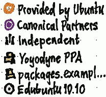
Source |
Icon |
Label |
“Downloaded from” text |
“Updates provided” text |
Main and Restricted for the current Ubuntu version |
the Ubuntu logo |
“Provided by Ubuntu” |
“Ubuntu” |
“by Canonical until June 2027”, or “none (Canonical updates ended June 2011)” |
Universe and Multiverse for the current Ubuntu version |
“Ubuntu” |
“by the Ubuntu development community” |
||
The Canonical partner repository for the current Ubuntu version |
the Canonical logo |
“Canonical Partners” |
“Canonical” |
“by the vendor” |
Any other sources represented by an X-AppInstall-Channel attribute in app-install-data, sorted alphabetically |
a generic repository icon |
the contents of the Label: field from their Release file |
domain name of the repository |
“unknown” |
Purchasable items |
money |
“For Purchase” |
“Canonical” |
“by the vendor” |
the Independent repository for the current Ubuntu version |
a cluster of people |
“Independent” |
“Canonical” |
“by the developer” |
Any PPAs (not including those for purchased items), sorted alphabetically |
The same PPA icon that Launchpad uses |
the contents of the Label: field from their Release file, once retrieved from Launchpad — until then, the same naming scheme as any other non-CD source |
“Launchpad” |
“by the developer” |
Any other network sources, sorted alphabetically |
a generic repository icon |
its URI with the protocol stripped, e.g. “packages.example.org/ubuntu/” (we don’t use the Label: here because we don’t trust third-party repositories as much as we trust PPAs) |
domain name of the repository |
“unknown” |
Any volumes (such as CDs, DVDs, or USB sticks) containing packages, sorted alphabetically |
the same icon as it has in the file manager |
If a volume contains a /.disk/info file, “{OS version}”, where the OS version is the contents of /.disk/info up to but not including the first " character nor any spaces immediately preceding it. Otherwise, the same label as is used in the file manager. |
“—” |
“none” |
Packages without an associated source |
a question mark in a disc |
“Other” |
“unknown” |
“none” |
The available software sources should consist of this full list, except for “Other”.
The installed software sources should consist of all those items in this list from which you have installed any software.
Test case: (sc-013)
- Launch USC.
Add a PPA in Software & Updates Settings.
- Open the “All Software” menu; the PPA should be shown in the menu.
- Open the “Installed Software” menu; the PPA should not be shown in the menu.
- Install a package from that PPA. When it finishes installing, open the “Installed Software” menu again; the PPA should now be present.
- Select that menu item, and remove the package; when it finishes uninstalling, the PPA should disappear from the “Installed” menu, and USC should automatically navigate to the main “Installed” screen.
Select the PPA from the “All Software”, then remove the PPA from Software & Updates Settings. The PPA should disappear from the “All Software” menu, and USC should automatically navigate to the home screen.
Test case: (sc-014)
Download and install a standalone .deb package, such as Opera.
- Open the “Installed Software” menu; it should have an “Other” child item that, if selected, shows the item you installed.
- Open the “All Software” menu; it should have an identical “Other” child item.
- Uninstall the package; the “Other” item should disappear from both menus, if that was the only standalone item installed.
Software list view for individual software sources
When any individual software source inside “All Software” is selected, the main pane should show a software list view of all the packages that source contains, with status text of the form “17 items available”.
When any individual software source inside “Installed” is selected, the main pane should show a software list view listing all the packages currently installed (or in the process of being removed) from that source, with status text of the form “3 items installed”.
For all sources except “Provided by Ubuntu”, the items in the “View” menu should be disabled, because they do not apply.
Determining information about software items
Most information about a package — its title, short name, summary, and license info — should come from Aptdaemon. These are the exceptions:
Icon and genre
The icon should be the usual icon for the package, except that unless otherwise specified, a package that is currently installed should have its icon overlaid in the bottom left corner with the installed checkmark emblem.
The summary should be the application Comment, if there is one; otherwise the package synopsis with its first word capitalized, if the application has a Name but not a Comment; otherwise the package name (because if you’re looking at a non-application package in the first place, you’re fairly likely to be the sort of user who wants to know the package name).
The license label for an item should be:
- “Open source”, if it is in Main or Universe;
- “Proprietary”, if it is in Restricted or archive.canonical.com;
- “Unknown”, if it is anywhere else (including Multiverse and standalone packages).
If you want this to be more specific (bug 435183), do what you can to get DEP-5 implemented. When it is implemented in USC, the words “Open source” (or their localized equivalent) should be included in the string for each license, rather than in a separate string (bug 811489).
Finally, every item has a genre represented by a primary category, and sometimes also by a primary subcategory and/or a secondary category. If an item has a secondary category, it may also have a secondary subcategory. Each category, and each subcategory, should have its own icon.
As used elsewhere in this specification, an item’s category means its primary category, and its subcategory means its primary subcategory.
These are the categories and subcategories, in the order in which they should be presented when presented together:
Category |
Equivalent menu spec categories |
Equivalent sections |
Package name pattern |
Show non-application packages by default |
- Subcategory |
||||
Accessories |
Utility, System |
- |
|
- |
Books & Magazines |
X-Publication |
- |
|
- |
Education |
Education |
- |
|
- |
Fonts |
- |
- |
(t,o)tf-* |
yes |
Games |
Game, Sports |
- |
|
- |
- Board Games |
BoardGame |
- |
|
- |
- Card Games |
CardGame |
- |
|
- |
- Puzzles |
LogicGame |
- |
|
- |
- Role-Playing |
RolePlaying |
- |
|
- |
- Shooter (bug 626414) |
Shooter |
- |
- |
- |
- Sports |
SportsGame |
- |
|
- |
Graphics |
Graphics |
- |
|
- |
- 3D |
3DGraphics |
- |
|
- |
- Drawing |
VectorGraphics |
- |
|
- |
- Painting |
RasterGraphics |
- |
|
- |
- Photography |
Photography |
- |
|
- |
- Publishing |
Publishing |
- |
|
- |
- Scanning & OCR |
Scanning, OCR |
- |
|
- |
- Viewers |
Viewer |
- |
|
- |
Internet |
Network |
- |
|
- |
- Chat |
InstantMessaging, IRCClient |
- |
|
- |
- File Sharing |
FileTransfer |
- |
|
- |
- (not mail) |
|
- |
||
- Web Browsers |
WebBrowser |
- (not web) |
|
- |
Office |
Office |
- |
|
- |
Science & Engineering |
Science |
science |
|
yes |
- Astronomy |
Astronomy |
- |
|
- |
- Biology |
Biology |
- |
|
- |
- Chemistry |
Chemistry |
- |
|
- |
- Computing & Robotics |
ArtificialIntelligence, ComputerScience, Robotics |
- |
|
- |
- Electronics |
Electronics |
- |
|
- |
- Engineering |
Engineering |
- |
|
- |
- Geography |
Geography |
- |
|
- |
- Geology |
Geology, Geoscience |
- |
|
- |
- Mathematics |
DataVisualization, Math, NumericalAnalysis |
math, gnu-r |
|
yes |
- Medicine |
MedicalSoftware |
|
|
- |
- Physics |
Electricity, Physics |
|
|
- |
Sound & Video |
AudioVideo, Audio, Video |
- (not sound or video) |
|
- |
Themes & Tweaks |
Settings |
|
|
- |
- Background Pictures |
- |
- |
*-backgrounds, *-wallpapers, ubuntu-wallpapers-* |
yes |
- Dash Search Plugins (bug 1025333) |
- |
- |
unity-lens-* but not *-dbgsym |
yes |
- Themes |
- |
- |
*-theme |
yes |
Universal Access |
Accessibility |
|
|
- |
Developer Tools |
Development |
devel |
|
yes |
- Debugging |
Debugger |
- (not debug) |
|
- |
- Graphic Interface Design |
GUIDesigner |
- |
|
- |
- Haskell |
- |
haskell |
|
yes |
- IDEs |
IDE |
- |
|
- |
- Java |
- |
java |
|
yes |
- Libraries |
- |
libdevel (not libs or oldlibs) |
|
yes |
- Lisp |
- |
lisp |
|
yes |
- Localization |
Translation |
- (not localization) |
|
- |
- Mono/CLI |
- |
cli-mono |
|
yes |
- OCaml |
- |
ocaml |
|
yes |
- Perl |
- |
perl |
|
yes |
- Profiling |
Profiling |
- |
|
yes |
- Python |
- |
python |
|
yes |
- Ruby |
- |
ruby |
|
yes |
- Version Control |
RevisionControl |
vcs |
|
yes |
- Web Development |
WebDevelopment |
- |
|
- |
System |
- |
- |
|
yes |
Librarians |
If debtags had become available, we would have refined this classification scheme. For example, what subcategories could the “Games” category have? And how could the items in the “Internet” menu be redistributed? Ideas were invited on the Classification page. |
The algorithm for determining an item’s primary category and subcategory should be:
If it has a .desktop file with at least one Category: value that matches one of the subcategories listed above, then:
Use the first recognizable Category: value to determine the subcategory from the table.
- Determine the category from the subcategory’s location in the table.
- Stop.
If it has a Section: that matches one of the subcategories listed above, then:
Use the Section: value to determine the subcategory from the table.
- Determine the category from the subcategory’s location in the table.
- Stop.
If it has a .desktop file with at least one Category: value that matches one of the categories listed above, then:
Use the first recognizable Category: value as the category.
- Stop.
If it has a Section: that matches one of the categories listed above, then:
Use the Section: value to determine the category from the table.
- Stop.
Use “System” as the primary category, with no primary subcategory.
The algorithm for determining an item’s secondary category and subcategory should be:
If the .desktop file has at least one X-Ubuntu-Category-Secondary: field that matches one of the known categories, then:
Use the first X-Ubuntu-Category-Secondary: value as the subcategory.
- Determine the category from the subcategory’s location in the table above.
- Stop.
- The item has no secondary category or subcategory.
Test case: We should have a test repository containing packages with various combinations of Category: and/or X-Ubuntu-Category-Secondary:.
Hardware requirements

If a package has one or more of the following requires-hardware:: debtags, then in the software item screen, the “Total size:” row should be followed by an “Also requires:” row listing the requirements in human-readable form. (A translator note should explain that the “Also” refers to the preceding “Total size” requirement.) The requirements should be comma-separated, each preceded by a text-colored checkmark if it detectably meets that requirement, an error-colored cross if it detectably fails, or nothing if the requirement is (currently) untestable.

In addition, whenever the computer detectably does not meet the requirements, immediately above the installation state bar should be an extra bar containing a warning specific to the unmet requirements, with a ![]() icon aligned with the button below. And if the software is not currently installed, that “Install” or “Buy…” button should read “Install Anyway” or “Buy Anyway…” instead.
icon aligned with the button below. And if the software is not currently installed, that “Install” or “Buy…” button should read “Install Anyway” or “Buy Anyway…” instead.
(These requires-hardware:: tags are largely parallel to Debian’s existing hardware:: tag hierarchy, with some improvements.)
debtag |
“Also requires:” text |
Warning text |
::camera |
camera |
This software requires a camera, but none are currently connected. |
::gps |
GPS |
This software requires a GPS, but the computer does not have one. |
::input:joystick |
joystick |
This software requires a joystick, but none are currently connected. |
::input:mouse |
mouse |
This software requires a mouse, but none are currently set up. |
::input:touchscreen |
touchscreen |
This software requires a touchscreen, but the computer does not have one. |
::laptop |
notebook computer |
This software is for notebook computers. |
::memory:1GB |
1 GB memory |
This software requires {size} memory, but the computer has only {size}. |
::power:ups |
UPS |
This software requires an uninterruptable power supply, but none is connected. |
::printer |
printer |
This software requires a printer, but none are currently set up. |
::scanner |
scanner |
This software requires a scanner, but none are currently set up. |
::storage:cd |
CD drive |
This software requires a CD drive, but none are currently connected. |
::storage:cd:writer |
CD burner |
This software requires a CD burner, but none are currently connected. |
::storage:dvd |
DVD drive |
This software requires a DVD drive, but none are currently connected. |
::storage:dvd:writer |
DVD burner |
This software requires a DVD burner, but none are currently connected. |
::storage:floppy |
floppy disk drive |
This software requires a floppy disk drive, but none are currently connected. |
::video:opengl:2.1 |
hardware graphics acceleration (OpenGL x.y+) |
This computer does not have graphics fast enough for this software. |
::video:opengl:3.0 |
||
::video:opengl:3.1 |
||
… |
||
::video:opengl:driver-blacklist:amd |
Graphics driver that is not {comma-and-space-separated list} |
This software does not work with the “amd” graphics driver this computer is using. |
::video:opengl:driver-blacklist:fglrx,intel |
This software does not work with the “fglrx” graphics driver this computer is using. |
|
::video:opengl:driver-blacklist:intel,nouveau,nvidia |
This software does not work with the “nvidia” graphics driver this computer is using. |
|
… |
… |
|
Multiple unmet requirements |
This software has multiple requirements missing from this computer. |
|
Searching
Whenever the current screen is searchable, the navigation bar should contain a search field (with accessible label “Search”), and the “Edit” > “Search…” command should be enabled. Activating that command should focus the search field, and (even if it is focused already) select its entire contents.
The search field

Whenever the search field is focused, the “Edit” > “Undo”, “Redo”, “Cut”, “Copy”, “Paste”, “Delete”, and “Select All” items should have their usual enabled/disabled state and operation for a text field.
Inside the leading end of the field should be a symbolic magnifying glass icon. Clicking the icon should focus the field and select its entire contents.
When (and only when) the search field is not empty, the trailing end of the field should have a symbolic clear icon. Clicking the icon should focus the field and clear its contents.
Besides the normal behavior for text fields, whenever the insertion point (caret) is at the trailing end of the search field, pressing the Down arrow key should focus the contents of the main pane and select the first item — such as the first category in the home screen, or the first result in any list of search results.
Interpreting search text
When searching anywhere in USC, any word in the search string that is followed by a space or punctuation should be treated as a a complete word, while any word that is not should be treated as if it may be either a complete word or the beginning of a word. Test case: (sc-004) From the top-level “All Software” screen, search for “atom”; it should return both Atomix and Liferea (an Atom feed reader). Now search for “atom ” (with a trailing space); it should return only Liferea.
For the sake of people who are unfamiliar with how they should use the search, there should be a greylist of words that are downplayed when searching. “Downplayed” in this sense means that:
- A search that consists only of greylisted words should work just as if none of the words were greylisted.
- In any other search that contains one or more greylisted words, the greylisted words should be ignored: only the words that are not greylisted should be searched for. However, once the results are chosen, the presence of any greylisted words should cause a result to appear higher in the list.
For English, the greylist should be “app application package program programme suite tool”. The greylist should have a translation note: “Do not translate this list directly. Instead, provide a list of words in your language that people are likely to include in a search but that should normally be ignored in the search.”
Test case: (sc-011) From the home screen, search for “drawing ” (with a trailing space). Then search for “drawing program”. USC should return exactly the same results for both searches, though possibly in a different order.
Search results and behavior
If the search field contains text at the moment you navigate to any other view, that search should be added to the end of the Back/Forward navigation history, with the previous item being the same screen without any search text. (So clicking Back is one way to clear a search.)
Test case: (sc-010) Launch USC. Type Ctrl F; the search field should be focused. Type “fire” (without quotes or pressing Enter); the main pane should be replaced by search results, with Firefox first. Press the down arrow key once; Firefox should be selected in the results. Press Enter; USC should navigate to the software item screen for Firefox. Choose Back once; USC should return to the “fire” search results. Choose Back again; USC should return to the home screen.
If there are no results, the main pane should temporarily be replaced by a screen of this form:
No results for “google mail”
No items in Internet ▸ Chat match “google mail”. Suggestions:
Try the 2 items in Internet that match.
- [Present only if there is a parent category that has any matches.]
Try the 1 item that matches in software not maintained by Canonical.
- [Present only if you’re viewing “Canonical-Updated Software” and there are matches in “All Software”.]
- Try using a different word. / Try using fewer words or different words.
- [Text dependent on how many words are in the search string.]
- Check the search is spelled correctly.
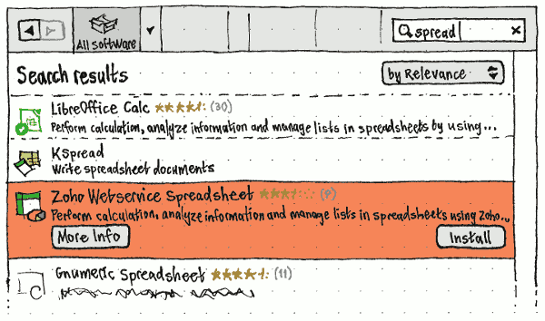
If there are any results, then at the top of the main pane should be a heading, “Search results”, opposite a menu (if there’s more than one result) for sorting the results “by Relevance” (the default), “by Rating”, or “by Name”. The rest of the main pane should contain search results for that scope. (For example, in a subcategory, the results should be limited in scope to that subcategory.)
In search results, a non-application item should be hidden by default:
- from a subcategory screen, if that subcategory does not “Show non-application packages by default”;
from a category screen, if (a) it is in one subcategory of that category and that subcategory does not “Show non-application packages by default”, (b) it is in multiple subcategories of that category, and its primary subcategory does not “Show non-application packages by default”, or (c) it is not in any subcategories and the category itself does not “Show non-application packages by default”;
- from the home screen, if its primary subcategory (or, if it has no subcategory, its primary category) does not “Show non-application packages by default”;
- never, in any other screen (such as “History”).
If the search terms exactly match a package name, that package should be returned first in the results, even if the package was hidden by default.
Testers |
You can help us improve the search function by testing it in successive versions. |
Custom package lists
For ease of sharing lists of software, USC should allow “searches” that return ad-hoc package sets.
From the home screen, whenever a search string consists entirely of characters allowed in package names, interspersed with commas (and no spaces), and optionally followed by a comma:
The main pane should display an “All Software” list view of the software items corresponding to those package names. Unlike usual search results, this list should be sorted in exactly the same order as the search string. If any of the package names does not have a corresponding package in your current software sources, its item in the list should have a question mark as its icon, “Not found” as primary text, and the package name as secondary text; the icon and text should both be greyed out, and selecting the row should not expand it.
The bottom of the pane should have an action bar. At its leading end should be text of the form “{X} items”, where X = the number of recognized items (not including any “Not found” items). If any of the recognized items are not currently installed, its trailing end should have a button of the form “Install {X} Items”, where X = the number of items not currently installed (regardless of whether they are queued for installation).
Test case: (sc-016) On a machine that has Gobby and Gimp installed but neither 9base nor abcde, with “View” > “All Software” selected:
- Navigate to the home screen and enter “gobby,gimp” (without quotes) in the search field. The main pane should list “Gobby” and “GIMP Image Editor”, and the action bar should say “2 items”.
- Add “,9base” to the search text (“gobby,gimp,9base”). The list should change to “Gobby”, “GIMP Image Editor”, and “Plan 9 userland tools”, in that order; an action bar should appear offering to “Install 1 Item”; and the action bar should say “3 items”.
- Add a comma to the end of the string (“gobby,gimp,9base,”). Nothing should change.
- Add the letters “abcd” to the end of the string (“gobby,gimp,9base,abcd”). A greyed-out item should appear at the end of the list: “Not found”/“abcd”. The button should still say “Install 1 Item”, and the action bar should still say “3 items”.
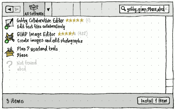
- Finally, add the letter “e” to the search string (“gobby,gimp,9base,abcde”). The “Not found” item should change to “A Better CD Encoder”/“abcde”, and “Install 1 Item” should change to “Install 2 Items”.
Copying a Web link for a package
Whenever you choose to copy a Web link for a package, USC should copy to the clipboard text of the form http://apt.ubuntu.com/p/package-name (without a leading or trailing line break).
Installing software
When you request to install a software item:
- The “Install” command should become unavailable for that item, and remain unavailable until the installation has been completed or cancelled.
If the item is published through MyApps or the ARB, and either (a) you have never yet accepted the terms of use or (b) the terms have changed substantially since you last accepted them (bug 1107802), a “Terms of Use” dialog should open for you to accept or decline them. “Decline” should always be enabled, but “Accept” should be enabled only when the terms have loaded completely and successfully.
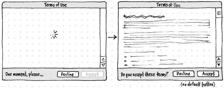
- If the item requires sign-in and/or filling in a purchase form, USC should navigate through those steps, then return to the previous screen (the listing or software item screen).
If installing the software would involve removing ubuntu-desktop, the package should be treated as uninstallable (just as it is with software updates) (bug 1110188).
If the relevant package cannot be installed, for that reason or any other, an error alert should appear, with primary text “Sorry, {title} can’t be installed at the moment. Try again in a day or two.”. A “Details” expander should reveal a text frame containing the dpkg error, or, depending on the problem, the text “Installing this software would remove critical Ubuntu components. If this problem persists, contact the software vendor.”.
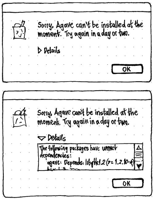
If “View” > “New Applications in Launcher” is checked (as it should be by default), and the item is an application without NoDisplay=True (bug 1006483):
- If the Launcher was in auto-hide mode, it should temporarily reveal itself.
- A copy of the item’s icon shown in USC (in the software list view or software item screen, whichever was being used) should be hoisted from that spot to a space the Launcher has just freed for it, resizing as necessary as it moves. If the Launcher was in auto-hide mode, it should then hide again.
- For as long as the item is waiting for other package transactions, the Launcher should show it as a greyed-out icon, with the help tip “Waiting to install”. Trying to launch the item should do nothing.
- While the item is installing, the Launcher should show installation progress with an overlaid progress bar. Trying to launch the item should still do nothing.
The item should be installed with the standard interface.
- The item should appear in the “Progress” section.
If the item is queued waiting for another package manager to close, the status text for the item should be “Waiting for {Application Name} to exit” (bug 995149). Otherwise it should be the standard status text for the operation.
When installation completes, either successfully or unsuccessfully:
- If the item is present in the Launcher (that is, it was added and you didn’t remove it during the installation), then:
- If installation was unsuccessful, the item should disappear from the Launcher.
- If installation was successful, the launcher item should flash and become launchable.
- If installation was successful, the “installed” emblem should be applied to the item icon inside USC, and the status text should be set to “Installation complete”.
- Five seconds later, the item should disappear from the “Progress” section.
For an item being installed, 50 % of the progress bar length should be allocated to the downloading process, and 50 % to running the installation script.
Packagers (and testers) |
Wait, what? Fifty percent? That’s not accurate! Perhaps not, but even a progress bar that varies a bit in speed is infinitely more accurate than one that fills up completely only to jump back to zero for the next step. And you can help us make it even better. |
Removing software
The Remove function should be disabled by default, enabled only when one or more items are selected or you are at an individual software item.
When you request to remove a software item:
- The Remove function for that item should become disabled, and remain disabled until the removal has been completed or cancelled.
USC should handle inconsistent package state if necessary.
The package removal should be presented in the standard way.
- At the same time, the item should appear in the “Progress” section. If the item is queued waiting for another package manager to close, the status text for the item should be “Waiting for {Application Name} to exit”. If the item is queued waiting for any other activity to complete, the status text for the item should be “Waiting”.
If at any point removal is blocked by a debconf question, the status text for the item should be set to “Waiting for your response…”
Add-on packages
|
Package A should be treated as a recommended add-on of package X if either of these are true:
X Recommends A
X is the only known package that Depends (directly or indirectly) on some other package Y, and Y Recommends A.
Package A should be treated as a suggested add-on of package X if any of these are true:
X Suggests A
X is the only known package that Depends (directly or indirectly) on some other package Y, and Y Suggests A
A Enhances X (or Enhances a virtual package that X Provides), and A is not a language pack (i.e. does not match a name or pattern in /usr/share/language-selector/data/pkg_depends)
A Enhances some other package Y, where X is the only known package that Depends (directly or indirectly) on Y.
What about where X depends on a virtual package that A1 or A2 provide? Perhaps show a menu of the options? This applies not just to add-ons but to dependencies too. Also consider the possibility that installing A1 requires uninstalling something else, while installing A2 does not…
What if A Enhances X or X Suggests A, but another installed package Y Depends on A? Maybe checked and disabled?
What if A Enhances X or X Suggests A, but another installed package Y Recommends A? Maybe checked by default?
If a software item has any add-ons, it should have an “Add-ons” section in its software item screen. The list of add-ons for the item should be presented as a series of checkboxes. Recommended add-ons should be listed first alphabetically, then suggested add-ons alphabetically.
The add-on’s package name, in brackets, should follow the trailing end of the label for each checkbox. The package name should be a link that navigates to the software item screen for the package.
At the leading end of the label for each checkbox should be a text-sized version of the add-on’s icon. This should be followed by as much of the add-on’s title as fits in the rest of the window width (without obscuring the package name), ellipsized at the trailing end if necessary.
If the main package is not installed already, the checkboxes for recommended add-ons should be checked by default, while the checkboxes for suggested add-ons should be unchecked by default. If the main package is installed already, the checkboxes for add-ons that are currently installed should be checked by default, while those that are not should be unchecked by default. The “Total size:” text should update immediately whenever checking or unchecking a checkbox.

If the main package is already installed, whenever the current checkbox values no longer match the add-ons currently installed, an add-ons state bar should appear immediately below the list of checkboxes. Initially, this bar should contain the total price of any newly-selected add-ons (e.g. “Free”) at its leading end, and “Cancel” and “Apply Changes” buttons at its trailing end.
Activating “Cancel” should reset the checkboxes to match the add-ons currently installed (and therefore cause the bar to disappear). Activating “Apply Changes” should install and/or remove the add-ons as specified, showing the status of this process in the add-ons state bar itself.
In the “Progress” section, when installing an item, installing any of its add-ons should be presented as part of the same task. But changing add-ons for an installed item should be presented as a separate task for each add-on.
ISV software
This includes software published through MyApps and the ARB.
Installing ISV software

For any software item that costs money and that (to USC’s knowledge) you have not already purchased:
When it is selected in a software list view, the text at the leading end should display the price instead button at the trailing end should be “Buy…” instead of “Install”.
Both when it is selected in a software list view, and when you are at its software item screen, “File” > “Install” should instead be “File” > “Buy…”.
If you choose the “Buy…” command by any of these routes:
- If necessary, an Ubuntu Single Sign-On/Registration dialog should appear.
If you sign on successfully and USC realizes you have already purchased this item, it should return to the software item screen, which should now be showing the download and installation progress. Do we need to show more feedback?
Otherwise, USC should navigate to a new screen that is blank initially except for a spinner and the text “Connecting to payment service…”.
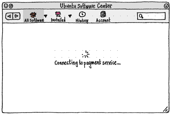
Once it has loaded completely, the main pane should display the Canonical Payment Service screen for buying the item.
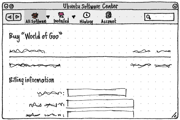
- Once you complete the payment, USC should return to the software item screen, which should now be showing the download and installation progress.
Need to handle the edge case where the price changes while you’re purchasing. Perhaps highlight the change and ask you to reconfirm.
Reinstalling previous purchases

Whenever an item is not currently installed (or queued for installation) but USC knows that it has been previously purchased:
Its “Buy…” button in a software list view should instead be “Reinstall”.
When it is selected or navigated to, “File” > “Buy…” should instead be “Reinstall Purchase”.
The “Install” button at the trailing end of its installation state bar should be “Reinstall” instead.
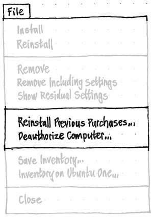
To make it easier to find previous purchases, the “File” menu should contain a “Reinstall Previous Purchases…” item. This should navigate to the “Purchases” view of the “History” tab.
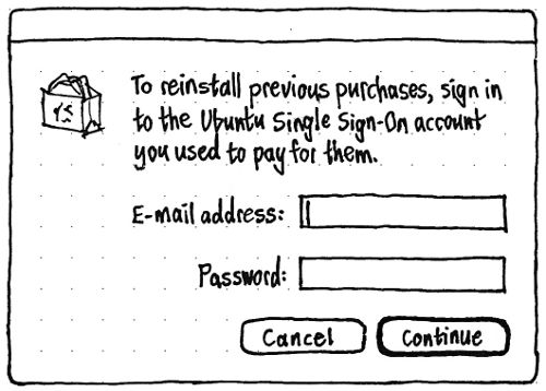
Wherever it appears, “Reinstall” or “Reinstall Purchase” should end with an ellipsis if you are not currently signed into the account that was used to purchase it. In that case, choosing it should open a sign-on dialog that allows only sign-on, not registration, with primary text “To reinstall this item, sign in to the Ubuntu Single Sign-On account you used to pay for it.”.
If/once you are signed in, the item should install without any further interaction.
Ratings and reviews
Specification: SoftwareCenter/RatingsAndReviews
For the review guidelines see SoftwareCenter/RatingsAndReviewsGuidelines. For the moderation guidelines see SoftwareCenter/RatingsAndReviewsModerationGuidelines
Recommendations
Specification: SoftwareCenter/Recommendations
Support and problem reporting for ISV software

|
For any software item in “For Purchase” or “Independent”, its software item screen should include a “Report a Problem” link alongside the “Developer Web Site” link.
Activating this link should open a “Report a Problem” dialog with the icon and name of the application. It should ask you to “Please identify the type of problem:”, with radio buttons for the options: “Payment doesn’t work”, “Download doesn’t complete”, “Installation doesn’t work”, “Software installs but doesn’t run properly”, “Inappropriate/offensive” (only once maturity ratings are implemented), “Legal issue”, and “Other” (the default).
Regardless of reason, if you choose “Continue”, USC should open a Web browser to a URL with the package name and reason as query parameters. That URL should then redirect to the developer support site, or the Canonical Support form, depending on the reason.
Comparing and syncing installed software between computers
|
The “File” menu should contain a “Sync Between Computers…” item. If syncing is not already set up, choosing it should:
- Navigate to the “Installed” section, if USC is not there already.
- If you are not signed in to Ubuntu SSO, open an SSO sign-on dialog with primary text “With multiple Ubuntu computers, you can publish their inventories online to compare the software installed on each.” and secondary text “No-one else will be able to see what you have installed.”
- Reveal a sidebar in the “Installed” screen, and focus it. This sidebar should remain visible whenever you view the “Installed” section subsequently.
Begin publishing the name and source, for each package installed on this computer, to the OneConf server.
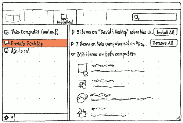
If syncing is already set up, choosing “Sync Between Computers…” should just navigate to the “Installed” screen and focus its sidebar.
The sidebar should list all computers registered with this account, starting with “This Computer ({hostname})”, then a space, then any others sorted alphabetically. Whenever there are no others, the remaining space in the sidebar should instead contain horizontally and vertically centered text: ‘To sync with another computer, choose “Sync Between Computers” from that computer.’ Exactly one computer in the sidebar should be selected at any time.
Whenever “This Computer” is selected in the sidebar, the rest of the main pane should contain the usual contents of the main pane for a single computer.
Whenever any other computer is selected, and that computer has not yet finished pushing its list of software to the Ubuntu One account, the rest of the main pane should contain horizontally and vertically centered text: ‘“{name}” hasn’t finished publishing its inventory yet. Try again in a few minutes.’
Whenever the other computer has finished pushing its list of software, the rest of the main pane should consist of a software list view with three branches:
- ‘{number} items on “{name of other computer}” not on this computer’, with an “Install All” button at the trailing end, and each item inside having “More Info” and “Install” buttons when selected;
- ‘{number} items on this computer not on “{name of other computer}”’, with a “Remove All” button at the trailing end, and each item inside having “More Info” and “Remove” buttons when selected;
- ‘{number} items on both computers”, with no button at the trailing end, and each item inside having only a “More Info” button when selected.
The “Install All” and “Remove All” buttons should be the same width.
As with the normal list view, only one branch — or software item inside that branch — should be selected at any time, and whenever an item is selected it should expand to reveal a “More Info” button. In addition, a selected item inside the that-computer-but-not-this-one branch should have an “Install” button at the trailing end, and a selected item inside the this-computer-but-not-that-one branch should have a “Remove” button at the trailing end.

The menubutton at the bottom of the sidebar should contain one item, ‘Stop Syncing “{name of selected computer}”’. If the selected computer is the computer you are using right now, the “Installed” screen should return to single-computer mode, and stop publishing this computer’s inventory to the server. If the selected computer is any other computer (for example, one that has been lost or destroyed), “Stop Syncing” should remove that computer both from the sidebar, and from the set of computers that will be synced.
Help
The help should cover these topics:
- What is the Ubuntu Software Center?
- Why are all the programs free?
- Installing a program
- Using a program once it’s installed
- Removing a program
- Why is it asking me to remove several programs together?
- “Provided by Ubuntu” — what’s that?
- “Canonical-updated” — what’s that?
- What if a program I want isn’t in Ubuntu Software Center?
- Using software from multiple sources
- What if a program doesn’t work?
There is also an online FAQ for issues with purchases. These are based on the questions most frequently asked by real customers:
Software Center purchase issues
About window
The About window should be a standard window (not a dialog) following the standard Gnome About window layout, using the appropriate application summary.
Features that were planned for future versions
Learning how to launch an application
(bug 761851)
Draft implementation plan: USC should calculate where on screen it is displaying the application’s icon, then issue a D-Bus call of the form “com.canonical.Unity.Launcher AddLauncherItemFromPosition (icon, title, icon_x, icon_y, icon_size, desktop_file, aptdaemon_task)”, where:
icon is the icon USC was displaying
title is the title of the item
icon_x and icon_y are the screen coordinates of the center of the icon inside the USC window
icon_size is the maximum of the width and height of the icon
desktop_file is the desktop file that the item will launch once the installation is complete
aptdaemon_task is the aptdaemon transaction ID.
The Launcher should handle the rest.
For alternative designs that were considered, see /LaunchingApplications.
Future work: On the screen for an already-installed application, show an invitation to add it to the launcher if it isn’t there already.
Deauthorizing your computer

So that you can be honest about using keeping purchased software only on your own computers, the “File” menu should contain a “Deauthorize Computer…” item. This item should be enabled only when you are already signed in or when any USC purchases are installed.
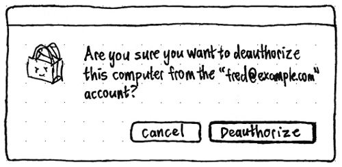
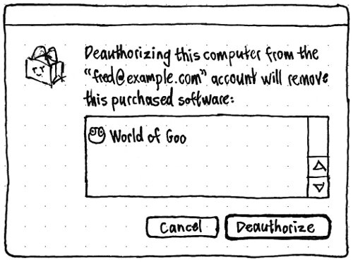
Activating the item should open a confirmation alert, which lists installed purchases only if there are any. Choosing “Deauthorize” should queue any purchased items for removal, and clear your Ubuntu SSO credentials from the computer.
Choosing between backport and non-backport versions
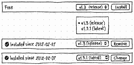
Whenever the Backports channel contains a version of any item that is greater than the version that would normally be installed, the installation state bar should contain a radio menu on the leading side of the Install/Remove button.
The menu should contain two items, the backport version and the version that would normally be installed, in ascending order. Both should start with “v {version number}”. If the backport version is higher, this should be followed by “(latest)”. And if the normally-installed version is from the Ubuntu archive, this should be followed by “(release)”. The default should be the release version, if it is one of the items, otherwise the highest version.
If the item is not currently installed at all, the adjacent button should be “Install”. If a version different from the selected item is installed, the button should be “Change”. And if the selected version is installed, the button should be “Remove”.
Region restrictions
For any item which you may not install in your region:
- The Install command should not be available.
In the software item screen, the installation state bar should contain only the text “Sorry, this software is not available in your region.”
- In the software item screen, screenshots should not be displayed. (A common reason for region restrictions is banning of particular logos or imagery.)
Features you can implement
These are mini-specifications for new features and other changes that anyone is welcome to implement. Some are more important than others; some are more difficult than others. If you would like to implement any of them, please do so in a branch and propose it for merging. Thanks! (Once a feature is implemented, the mini-specification here will similarly be merged into the main specification.)
“Go” menu and simplified navigation bar
Between the “Edit” and “View” menus should be a “Go” menu. This should replace the “Go Back” and “Go Forward” items, and the following separator, from the “View” menu.
_Go
===
  Back                        [
  Forward                     ]
---------------------------------
  All Software           Ctrl 1
  All From Source               >
  Installed              Ctrl 2
  Installed From Source         >
  History                Ctrl H
  Progress               Ctrl 0
The “All From Source” submenu should consist of an item, with icon, for each available software source. The “Installed From Source” submenu should consist of an item, with icon, for each installed software source.
Atop the screen for each individual software source should be a header containing the icon and name for the source. This should be followed by a software list view of all the items in that source, then centered text of the form “141 items”. In the “Provided by Ubuntu” screens, non-application packages should be hidden by default.
Once this is implemented, the dropdown menus should be removed from the “All Software” and “Installed” navigation bar buttons, simplifying the navigation bar (bug 1020521).
Installing from external media
(bug 449337)
If you insert a volume that consists of software packages, but is not installation media, Ubuntu Software Center should launch to (or navigate to) the screen for that volume as an individual source.

The usual header pane should have a checkbox at its trailing end, “Use as a software channel”, reflecting whether the volume is currently in your sources.list.
If a volume is added as a software channel, Ubuntu should cache all its package details so that you can request installation without having the media inserted. If you request to install an item from media that is not currently inserted, an “Insert Media” alert should appear using the volume’s icon, primary text “To insert {name of item}, you need to insert the volume “{name of volume}”, and “Cancel” and “Retry” buttons. If the media is detectably inserted, the alert should go away automatically.
“What’s Popular” overall
|
Erratum: “Most Popular” should be “What’s Popular”. |
(bug 432525)
An item’s popularity should be determined by the proportion of people, who have opted in to recommendations, who have the item installed.
On the home screen, the “What’s Popular” area should use tiles to list, in descending order, the 12 most popular items that are not currently installed and that are not already shown in the “Top Rated” section. (This avoids repetition on the home screen, giving visibility to more items.)
Choosing “More” in the “What’s Popular” area should navigate to a separate “What’s Popular” screen that uses a software tile view to list, in descending order, the 60 most popular items overall — regardless of whether they are installed or whether they are also in any “Top Rated” listing.
Subcategories for “Tweaks & Themes”
(Implementing this will have no effect until Ubuntu archives contain debtags.)
Any package that is not already in another category, and matches any of these patterns, should appear in a subcategory of “Themes & Tweaks”.
Subcategory |
Rule |
Show non-application packages by default |
Automation |
debtag admin::automation |
yes |
Backup |
debtag admin::backup |
yes |
Benchmarking |
debtag admin::benchmarking |
yes |
Dash Search Plugins |
package name unity-lens-* but not *-dbgsym |
yes |
Data Recovery |
debtag admin::recovery |
yes |
Disk Utilities |
debtag admin::filesystem or admin::forensics |
yes |
Package Management |
debtag admin::package-management |
yes |
Themes |
??? |
yes |
The category should be renamed to “Tweaks & Themes” to reflect the shift in emphasis.
(unity-scope-* is not included in “Dash Search Plugins” because scopes are only useful inside, and already show up as add-ons for, individual lenses.)
Subcategories for “Sound & Video”
(This should not be implemented until Ubuntu archives contain debtags, otherwise there would be only one subcategory.)
Any package that is not already in another category, and matches any of these patterns, should appear in a subcategory of “Sound & Video”.
Subcategory |
Rule |
Examples |
Show non-application packages by default |
Amateur Radio (fixing bug 905894) |
Section hamradio |
ibp, morse, qrq, tk2, wsjt |
yes |
Audio Utilities |
tags scope::utility + works-with::audio |
aconnectgui, bitmeter, earcandy, gladish |
no |
Camera |
tag hardware::camera |
cameramonitor, camorama, cheese |
no |
CD/DVD Authoring |
? |
bombono, brasero, dvdstyler, devede, ogmrip |
no |
CD/DVD Ripping |
? |
asunder, audex, dvdrip, k9copy |
no |
Codecs & Converters |
? |
arista, gstreamer0.10-fluendo-plugins, transmageddon |
no |
Media Players |
? |
audacious, banshee, clementine, decibel, enna, fluendo-dvd |
no |
Music Notation |
tag works-with::music-notation |
canorus, denemo, frescobaldi |
yes |
Music Organization |
|
cowbell, easytag, entagged, exfalso, tagtool |
no |
Radio |
|
betaradio, kradio4, lastfm, pithos, radiotray |
no |
Sequencers & Synthesizers |
? |
aeolus, amsynth, djplay, drumpads, freemix |
no |
Sound Editors |
? |
brp-pacu, cecilia, easymp3gain-gtk, fillmore, freqtweak |
no |
Speech |
? |
daisy-player, espeak-gui, festival, gespeaker |
no |
Pitch Tuning |
? |
fmit, gxtuner, lingot, gtkguitune, solfege |
no |
TV |
? |
episoder, freeguide, gnome-dvb-client, me-tv, ubuntu-tv |
no |
Video Editing |
? |
avidemux, gnome-subtitles, gopchop |
no |
Encouraging use an archived version instead of a standlone .deb
When you open a standalone .deb package, if one of your repositories contains a package with the same name, regardless of version number, there should be an extra bar below the installation state bar. Its text should be whichever is appropriate of these:
- Ubuntu has a newer version of this software.
- “Other Repository Label” has a newer version of this software.
- Ubuntu has a trusted version of this software.
- “Other Repository Label” has a trusted version of this software.
The button at the trailing end of the bar should be labelled “Show” in any case.
Launching from multiple standalone .deb packages
(bug 1190469)
If you select multiple .deb packages in a file manager, and open them with Ubuntu Software Center, it should display a custom list for the packages.
Opening a standalone package from within USC
(bug 782617)
At the start of the “File” menu — before “Install”, “Remove” and other actions — should be an “Open Package…” item, with the keyboard equivalent Ctrl O, followed by a separator.
Choosing “Open Package…” should open an “Open Package” file picker that allows selection only of package files. If you choose one to open, USC should display a centered spinner with the caption “Opening package…” until the standalone package screen can be shown.
Dragging a software item
(bug 1088085)
A software item should be draggable, wherever in USC it appears — on the home screen, in any other tile view, in a list view, or (for its icon only) in the software item screen itself.
If you drag an item to the Launcher, then:
If the item is an application without NoDisplay=True, the drag should cancel. Otherwise:
- If the item is already installed, and already in the Launcher, the Launcher item should move to the new location. Otherwise:
If the item is already installed, and not already in the Launcher, it should be added to the Launcher at that location. Otherwise:
- The icon should appear as a greyed-out item in the Launcher until installation completes or fails.
The item should install as usual, without a separate icon for the same item appearing in the Launcher, and remaining in the Launcher regardless of the “New Applications in Launcher” setting.
Dragging an item anywhere else, except the Launcher, should drop its icon as a graphic or its title as text.
Dragging Web site links
Any “Developer Web Site” link should be draggable outside of USC. When dragged to a file manager, it should produce a shortcut with the name “{Title} (Developer Web Site)”; to a rich text document, a hyperlink with the text “{Title} (Developer Web Site)”; and to a plain text field, just the URL.
Being encouraged to submit a review

If you have installed an application, and used it at least three times in the past week, the end of the home screen should have a “Give Your Feedback” box with text of the form: “You’ve used {title} a lot recently. Would you like to review it?”. The link should begin the review process for that application.
Can we vary the “a lot” wording sensibly?
“Updates” section
Minimal implementation
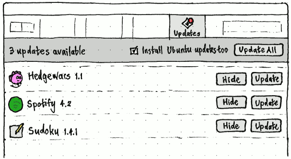
Whenever the Backports channel contains a version of any item that is newer than the version you have installed (or fewer than five seconds have passed since that stopped being true), an “Updates” item should appear last in the navigation bar (except for the “Progress” item, when present).
The “Updates” section should begin with a panel giving the number of updates at the leading side, and an “Update All” button on the trailing side. Each individual item should consist of its icon, title, and the new version number on the leading side, and an “Update” button on the trailing side.
Whenever an item is selected, Enter should activate its “Update” button. Whenever an update is installed or waiting to be installed, its “Update” button should be disabled.
Test case: Install an application for which Backports has a newer version. As soon as its installation finishes, “Updates” should appear in the navigation bar.
Enhancement: Navigation bar emblem
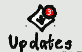
In the navigation bar, the icon for the “Updates” item should have a badge containing the number of updates.
Enhancement: Launcher item emblem
In the Unity launcher, the icon for Ubuntu Software Center should have a badge containing the number of updates, regardless of whether USC is running.
Enhancement: Install Ubuntu updates together with application updates

The panel atop the “Updates” screen should contain an “Also install Ubuntu updates” checkbox. Whenever Ubuntu updates are not available, the checkbox should be both disabled (because changing it has no effect) and unchecked (because no Ubuntu updates will be installed when you update anything else). Whenever Ubuntu updates are available, the checkbox should be enabled, and default to whichever checked/unchecked state it was in last time it was enabled (checked by default).
Test case: (replaces previous test case) Install Ubuntu without installing updates. Install an application for which Backports has a newer version; as soon as its installation finishes, “Updates” should appear in the navigation bar. Navigate to the “Updates” screen; the “Also install Ubuntu updates” checkbox should be enabled and checked. Use Update Manager to install all updates; as soon as they finish, the “Also install Ubuntu updates” checkbox should become disabled and unchecked.
If you choose “Update All”, or “Update” for any individual item while the checkbox is checked, installation of Ubuntu updates should be queued ahead of whichever update or updates you chose with that action.
Enhancement: “Hide” function for updates
In the “Updates” screen, each individual update should have a “Hide” button on the leading side of its “Update” button. The “View” menu should have a corresponding “Hide This Update” item that is disabled except when you are in the “Updates” section and an update is selected. Activating this command should remove the update from the list indefinitely.
Below “Hide This Update” in the “View” menu should be a “Show Previously Hidden Updates” item, which is enabled whenever there are any, regardless of which screen you happen to be in. Selecting the item should navigate to the “Updates” screen if you are not there already, and indefinitely un-hide all updates.
Enhancement: Updates to other NotAutomatic channels
The “Updates” screen should show updates for not just Backports, but any NotAutomatic channel, for example “For Purchase”.
Enhancement: New Ubuntu versions shown in “Updates”
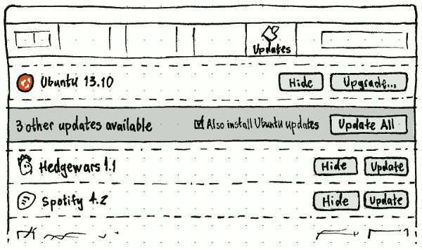
When a new version of Ubuntu is available, it should appear as the first row in the “Updates” screen, above the “Update All” panel. In this case the panel should say not “{N} updates available”, but “{N} other updates available”. The row itself should, instead of an “Update” button, have an “Upgrade…” button that opens the upgrade dialog.
Smarter ellipsis of software list view items
In a software list view, if the secondary text is wider than the space available, it should be ellipsized in the middle, not the trailing end (because unique parts of package names are often at the trailing end).
Copying software list view items to the clipboard
Whenever an item in a software list view is selected, “Edit” > “Copy” should be enabled. Choosing it should copy to the clipboard the item’s title and summary as plain text separated by one line break. If the item has a custom icon, it should also be copied as both a bitmap and as a vector image if available.
Pausing or cancelling all queued tasks

At the bottom of the “Progress” section should be an action bar, with text of the form “2 items remaining” or “All items completed” (as appropriate) at the leading end, and “Pause” and “Cancel All” buttons at the trailing end. When “Pause” is clicked, it should change to “Resume”, the “Progress” navigation bar element should change to “Paused”, and all tasks (except for the current one, if it is no longer pauseable), even any you add after you clicked “Pause”, should be greyed out except for their cancel buttons. (bug 584687)
Once that’s implemented: The list of paused tasks should persist even if you close and reopen USC or restart the computer.
Finally: Whenever the computer is not connected to the Internet, USC should go into Paused mode automatically.
More informative text for waiting tasks
(bug 444330)
When you request to install an item and it is waiting for other tasks in the “In Progress” queue, its status text should be “Waiting to install”.
When you request to remove an item and it is waiting for other tasks in the “In Progress” queue, its status text should be “Waiting to remove”.
Downloading while waiting to install
(bug 438870)
When an item to be installed is waiting for other tasks, but the package is not yet downloaded, it should start downloading immediately. Or maybe when fewer than 3-ish items are already downloading?
Reordering queued tasks
(bug 465531)
For any task in the “Progress” screen that has not yet begun (or that, if parallel downloading has been implemented, has started downloading but not yet installing), mousing over the list item should produce a grabbing-hand cursor. If you drag the row up or down, the rows for other unstarted tasks should scoot out of the way to show where the dragged row would end up if dropped. As a keyboard equivalent, Ctrl Up and Ctrl Down should, when possible, make the selected task swap places with the previous or next task respectively.
Consistent progress bar for installations and removals
Regardless of whether you are installing a free item, installing a for-purchase item, or removing an item, the progress bar in the installation state bar should appear at exactly the same moment: immediately after USC knows that you are authenticated for the action.
Copying a Web link for an “In Progress” package
Whenever an item is selected in the “In Progress” section, “Edit” > “Copy Web Link” should be enabled. Choosing it should copy a Web link for the selected package.
“Where Is It?” button
In the screen for a graphical application in the “Installed Software” section, there should be a “Where Is It?” button. Clicking the button should:
over two seconds, draw a ring around the interface element (e.g. the Ubuntu button, or the “Applications” menu) in which the application resides
- wait for you to activate it
- instantly remove the previous ring
- over two seconds, draw a ring around the application, or around the submenu or section that contains the application
- wait for you to select the item or open the submenu
instantly remove the previous ring, etc.
At any time, focusing another window or pressing any key should cancel the process and make any ring disappear.
“Reinstall” command
|
In the “File” menu, immediately following the “Install” item should be a “Reinstall” item. This item should be enabled whenever you have selected or navigated to an installed software item.
Activating the command should reinstall the item (equivalent to apt-get reinstall). The progress feedback should be the same as for installation, using the same PolicyKit privilege, but with “Reinstalling…” as the text in the installation state bar.
The help should include a page on the “Reinstall” command.
“Remove Including Settings” command
(bug 1029008)
In the “File” menu, immediately following the “Remove” item should be a “Remove Including Settings” item. This item should be enabled whenever you have selected or navigated to an installed software item.
Activating the command should remove the package, its settings (equivalent to apt-get purge), and any cached package data. The progress feedback should be the same as for removal, using the same PolicyKit privilege, but with “Removing package and settings…” as the text in the installation state bar.
The help should include a page on the “Remove Including Settings” command.
Residual files
In the “File” menu, immediately following the “Remove Including Settings” item should be a “Show Residual Files” item. This item should always be enabled.
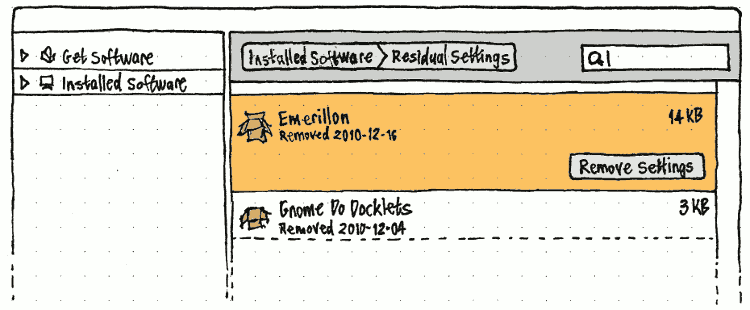
Activating the command should be the only way (other than subsequently using Back and Forward) of navigating to an “Installed Software” > “Residual Files” screen. This screen should be a software list view of all packages that have been removed from your computer but that have either left behind configuration files, or that have the package still cached (bug 684495). It should be different from a normal software list view in that:
At the trailing end of each row should be the size of the settings and cached package files, e.g. “11 KB”.
- The secondary text for each item should be the date on which the package was uninstalled.
When an item is selected, at its trailing end should be a button labelled “Delete Files”, and the “File” > “Remove Including Settings” menu item should temporarily also become “Delete Files”.
Activating the “Delete Files” command should remove the package’s settings and/or the cached package. The progress feedback should be the same as for removal, using the same PolicyKit privilege, but with “Deleting residual files…” as the text in the installation state bar.
At the bottom of of the main pane should be an action bar containing a “Delete All” button, aligned with the “Delete Files” button for the selected item. Activating the “Delete All” button should remove residual settings for all packages displayed.
The help page on the “Remove Including Settings” command should be expanded to cover the “Show Residual Files” command too.
“Package Info” window
(bug 432879)
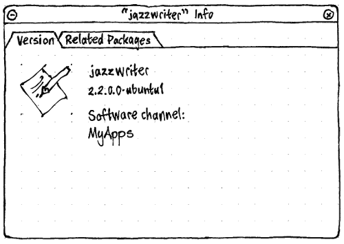
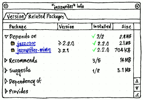
In the “File” menu, following the package operation items should be a separator and a “Package Info” item with keyboard equivalent Ctrl I. It should be enabled whenever you are on a software item screen or a software item is selected. Choosing “Package Info” should open a normal window with the title ‘“{package name}” Info’, that persists until you close it regardless of what you do elsewhere in USC. Multiple package info windows may be open simultaneously.
The “Version” tab should show the package’s icon, name, version number, and “Software channel:”, each wrapping to multiple lines if necessary.
The “Related Packages” tab should have a tree with branches for “Depends on”, “Recommends”, “Suggests”, “Dependency of”, “Provides”, “Replaces”, “Conflicts”, and “Breaks” in that order. Inside each branch, individual packages should be shown as hyperlinks: choosing one should open a separate package info window for that package. If any branch contains no items, it should be expanded by default, so that you can see it is empty without having to expand it first.
The “Version” column should use “≥” or “=” before version numbers as appropriate. The “Installed” column should use a checkmark graphic plus the version number for an individual package, a checkmark graphic plus “{total}/{total}” for the “Depends on” branch as a whole, just “{total}/{total}” for the “Recommends” and “Suggests” branches as a whole, and just “{total}” for any other non-zero branches.
History enhancements
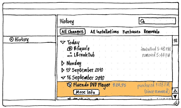
History rows should have the same layout and behavior as rows in a categorized software list view, except that:
- They should use a text-sized icon instead of a double-sized one (because the icon is less important here, and the history is likely to be long).
They should use the software’s short name rather than its title.
- For purchases, the short name should be followed by the price paid at that time, in the disabled text color.
- At the trailing end of the first line should be the time at which the action occurred, again in the disabled text color. In the “All Changes” screen only, the time should be preceded by the type of action: “purchased”, “installed”, “reinstalled”, “updated”, “removed”, or “purged”. For example, a removal that happened at 4:52 PM should appear in “All Changes” as “removed 4:52 PM”, but in “Removals” just as “4:52 PM”.
- Choosing “More Info” should navigate to the item’s screen in either “All Software” or “Installed Software”, depending on whether the item is currently installed.
If the row is for any action that would leave the item installed (such as an installation or an update), but the item is not currently installed, the text “(since removed)” should be at the trailing end of the second line in the disabled text color. Conversely, if the row is for any action that would leave the item uninstalled (such as a removal or a purge), but the item is currently installed, the text “(since reinstalled)” should be at the trailing end of the second line in the disabled text color.
Animation of the main pane
Whenever you navigate from within a category screen to a software item screen, over 0.5 seconds, the icon of that package that was visible in the category screen should simultaneously zoom and move linearly to become the icon of the software item visible in the software item screen. At the same time, the rest of the contents of the category screen should linearly crossfade into the rest of the contents of the software item screen. Both of these effects should also happen when navigating the reverse direction, from the package screen back to the category screen.
Wine integration
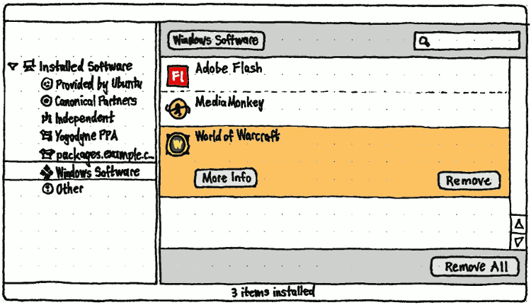
If there are any installed Windows applications that are automatically removable by Wine, the installed software sources list should include a “Windows Software” child item. This should be the last item except for “Other”, and should use the generic Windows icon (the same used in Ubuntu Light).
Selecting this item should display a “Windows Software” screen in the main pane, listing those Wine applications. At the bottom of of the main pane should be an action bar containing a “Remove All” button, aligned with the “Remove” button for the selected item.
These removable Windows applications should also show up when browsing or searching the top-level “Installed Software” list.
Do Windows applications have a title and a summary, or just a title?
For implementation details, see NattyWineSoftwareCenter.
Security information for the store
(bug 637649)
The “View” menu should contain a “Security Info” item that is disabled by default.
For every page in the sign-on and payment process, if the page is not encrypted — or if there is a problem with the site’s certificate — the page should not display at all. Instead, USC should show a centered error message: “Sorry, the store is not available right now. Try again later.”

Whenever the page is encrypted and the certificate is okay, at the trailing end of the navigation bar should be a padlock icon with the label “Secure”, and the “Security Info” item should be enabled. If you choose either of those, a “Security Info” window should open with text “The connection to the store is encrypted.” and information about the connection and certificate.
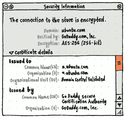
Future work: Abstract out this window so that it can be used by other applications that deal with certificates.
Access to your store account details
In the navigation bar, between “History” and “Progress” should be a new item, “Account”, with a wallet icon. The “Go” menu, if implemented, should have a corresponding “My Store Account” item.
_Go
===
  Back                        [
  Forward                     ]
---------------------------------
  All Software           Ctrl 1
  All From Source               >
  Installed              Ctrl 2
  Installed From Source         >
  History                Ctrl H
  My Store Account
  Progress               Ctrl 0
Selecting either should navigate to an online “Account” screen.
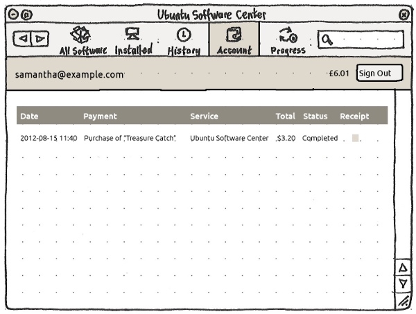
Regardless of whether you are online, the screen should begin with a local banner showing the e-mail address, balance (if available), and a “Sign Out” button. Signing out should work even if you are offline.
If you have not been online since navigating to this screen, the rest of the screen should display horizontally and vertically centered text, “Connect to the Internet to see your purchase and account history.” If you have been online but the page did not load successfully, it should instead be centered text “The account service isn’t available right now. Try again in a few minutes.”, with a “Try Again” button below. Otherwise, it should be a page listing your USC payments, refunds, and other account activity.
Yet-to-be-specified features
- codec search
font search [idea 15333]
- scope control for search (All / Name / Description / Package Codename / Alternatives)
- icon view as an alternative to list view
- Melatie runs an accounting business that is far too small to have its own IT manager. She has a support contract for the Ubuntu software on the office PCs, and she knows that this doesn’t cover all the available software, so she wants to keep track of exactly what software is installed that isn’t covered.
Ladina works as a developer at a molecular biology lab where she is not a sysadmin. She is having a bit of trouble with Biopython, and wants an easy way of seeing which version of python-biopython is installed and where its files are.
- Installing paid add-ons for free software (for example, filters for Inkscape)
Dragging installed applications from USC to a launcher
Launching via inserting an Ubuntu CD
USC needs to be able to tell whether a CD containing packages is:
- for a previous version of Ubuntu
- for the same version of Ubuntu
- for a future version of Ubuntu
- for a different OS altogether.
Launching via file of unknown type
USC needs to be able to display applications that handle a particular filetype, i.e. an equivalent to gnome-app-install --mime-type text/html. (Maybe distinguish between file viewers and editors?)
Nautilus then needs to be able to launch USC to this search.
License information
Developer tools
- For a particular package, show which packages are required for development or debugging of that package.
Maybe treat -dev packages specially?
Eliminating the “{title} can’t be installed at the moment” alert
Instead of an impossible installation causing an alert saying “Sorry, {title}” can’t be installed at the moment. Try again in a day or two.”, the task should show its error status inline in the “In Progress” section somehow, and sit there across USC launches until you retry it or cancel it. The “In Progress” arrows would need to stop spinning for cases like this, because nothing is actually happening.
Others
- make clear which packages are currently subject to CVE vulnerabilities
- ensure double-clicking on a downloade .deb or .rpm gives an explanation that every user can understand. Perhaps also show an apt: -link as a suggestion for the better way of installing said package?
OpenPrinting: “To make installing printer drivers not provided by the Linux distributions easier for users, and to make providing printer drivers easier for the printer manufacturers, we have introduced a new concept of distribution-independent printer driver packages.”
- While installing, the window should be reducible (or perhaps reduce by default) to show only install progress.
- Make installation asyncronous (background process) and allow user to continue browsing the Software Center meanwhile
- Replace the “These items must be removed as well” alert with a box embedded in the package screen when you click “Remove”?
“Also a permalink on the description page, would be pretty nice. You want to suggest a package to someone? You just have to copy paste the (apt url) application link into your IM or blog post.” [Stefano Forenza]
“FooBar is not available for this version of Ubuntu, but it is available for version X.Y…”
Smith Review Project: making package descriptions and debconf questions human-readable
- Maybe the Firefox start page could contain an "Ubuntu software" link, that opens the Store, alongside its "Ubuntu help" link? [Vincenzo Ciancia]
SummerOfUsability mockup design iterations by Monica Maceli
- Installing software locally when the user doesn't have administrator rights
- If the user does not have admin rights then the program would offer to queue the program for the system admin. This is very useful when the user can just say check your install queue instead of remembering the exact packages that he needed. Especially when he is just clicking a link on the internet. Could also be useful for parents.
- Multi-level undo.
- Updates are aggregated by source package, with packages hidden inside an expander.
- Recommendations and suggestions are shown as children of an item in the list (recommendations selected by default, suggestions not).
Incorporate PackageMaintainednessPresentation.
- Add a “Date Installed” column to the “Installed Software” section.
- Handle the “Extends” field for packages.
- Provide an easy mechanism for applications such as Inkscape to select and install plug-ins.
- Need to define the exact behavior when waiting for other package managers to quit.
Provide an optional "Donate" button for projects that need donations to keep going. The button could open up the donate page on their website. Or if non-free (as in beer) software is sold through the software store then the money could go through the site ... (The need was talked about in FLOSS Weekly 86 - Ardour).
- Alternatively provide a way of a project displaying a web page instead of the package description. This allows the project to collect revenue via adverts, subscription or donation. It puts the handling of revenue into the hands of the project. If the web page data isn't available then it could revert by default back to the package description. This could also be a preference option.
Drag installed applications to gnome-panel or other launchers.
- Saved searches (with an emblem if they contain new stuff since you last looked at them)
Add apt: URL syntaxes for category pages, and for search results.
- Prioritize reviews from your contacts. [Matt Griffin]
- Accessible names for other items that have no explicit label.
How can we integrate cross-platform add-on repositories, e.g. Firefox add-ons, Ruby Gems, CPAN, CTAN, CRAN, CEAN?
- Log searches so that we can tweak metadata to suit them. [Randy Linnell]
Purge PPAs (i.e. offer to downgrade to the non-PPA versions of packages).
Definitions used in this specification
- alert
A dialog that emits the standard alert sound (if any) when it opens, and requests attention if it opens in the background.
- alphabetically
Following the Unicode Collation Algorithm for the user’s locale. For example, in an English locale, “Déjà Dup Backup Utility” should be sorted alphabetically between “Debian Documentation Browser” and “DeskScribe”. There are some existing bugs with categories not being sorted alphabetically.
- dialog
- A window that is modal to its parent (if it has one), only ever minimizes together with its parent (if it has one), and does not have any buttons in its title bar (except Minimize if it has no parent).
- em
- The height of the Gnome application font setting. For example, if the current Gnome application font setting works out to be 12 pixels, then 3 em = 36 pixels.
- leading
- Left whenever the system is using a left-to-right language. Right whenever the system is using a right-to-left language. (All mockups in this specification are of left-to-right layouts.)
- software item
A package or an application. If app-install-data or an archive index refer to one and only one application in a package, the package itself should not be treated as a software item, because it is represented by the application instead. But if there are multiple applications in a package, or none at all, the package should be treated as a software item in itself.
- trailing
- Right whenever the system is using a left-to-right language. Left whenever the system is using a right-to-left language.
Roadmap
Ubuntu 9.10 (October 2009) shipped Ubuntu Software Center 1.0.2. This included:
- a graphical main entrance, that invited searching or browsing software by category
- fast search
- attractive, informative, and easy-to-understand presentation of individual applications within the interface
- the ability to continue browsing available software, and queue up installation/removal tasks, while other changes were being made
better security than Add/Remove Applications (i.e. use of PolicyKit instead of gksudo)
a redirector Web service (redirecting from http://apt.ubuntu.com/p/package-name to apt:package-name), to better cater for forums and other CMSes that do not allow direct apt: links.
Ubuntu 10.04 LTS (April 2010) included Ubuntu Software Center 2.0.2. This version:
- presented non-application packages in an understandable way
- helpfully subcategorized applications such as games, and also categorized non-application packages such as programming utilities, fonts, database software, and screensavers
- offered distinct listings for PPAs and other third-party repositories.
Ubuntu 10.10 (October 2010) included Ubuntu Software Center 3.0.4. This version:
- allowed software purchases from within USC
incorporated apt: URL handling (replacing apturl)
handled standalone .deb packages (replacing gdebi)
- showed a history of past installations/removals/purchases, including the ability to undo specific changes
- improved the presentation of category (then “department”) screens
- improved search results.
Ubuntu 11.04 (April 2011) included Ubuntu Software Center 4.0, with ratings and reviews for software, and many performance improvements.
Ubuntu 11.10 (October 2011) included Ubuntu Software Center 5.0, with a simpler layout, and “Top Rated” sections to feature interesting software.
Ubuntu 12.04 (April 2012) included Ubuntu Software Center 5.2, with personalized recommendations, Unity launcher integration, system requirements disclosure, and access to backports.
Ubuntu 12.10 (October 2012) included Ubuntu Software Center 5.4, and Ubuntu 13.04 (April 2013) included Ubuntu Software Center 5.6.
Eventual scope
You should be able to:
find software by: [idea 18315]
- name
purpose (e.g. “wireframe” → Dia)
category and subcategory (e.g. Games: Card Games) [idea 14857]
name of competitor (e.g. “excel” → OpenOffice.org Spreadsheet, Gnumeric, KSpread)
misspelling (e.g. “pigeon” → Pidgin)
- needed right now (by MIME type, codec, font, etc)
- vendor?
class (debug vs. non-debug, applications vs. not [idea 3144], etc)
- recommendation [Andrew Sayers]
- alternatives to programs you used in Windows (via Migration Assistant)
- software to make use of your custom hardware
results previously returned by command-not-found
habit (people who installed X also installed Y) (suggested by Enrico Zini)
- suite (software for Java developers, software for film makers)
what’s new [idea 13762]
whether it was recently installed or removed [idea 16953]
- get information about software
- what it does
what people think of it (ratings and reviews) [UserReviewsInSynaptic] [idea 18729]
what it looks like (screenshots or short videos) [idea 15774]
what the current version number is [idea 13036]
- whether it is installed by default in Ubuntu
whether it’s installed right now [idea 19068]
if it’s installed, how to launch it [idea 16216]
if it’s not installed, how much there is to download, including dependencies [idea 4613]
- whether it’s localized into your native language
- what it costs
- what its license is
- who provides updates for it, and for how long
- who provides tech support for it, and for how long
- how many of your friends have it installed already
- whether you have it installed already (and if so, how to find it)
- … all in your native language
- install software
purchasing commercial software [idea 18538]
- quickly
- unpack — and maybe even install — downloaded packages while downloading the rest
download a package only once when installing it over a LAN [idea 19265]
- asynchronously (browse and select more stuff while other stuff is installing)
pausing if you need to use your bandwidth for something else [idea 16643]
- downloading it once for multiple computers (subsuming APTonCD)
- read about updates while they are installing
using PolicyKit to install/uninstall/etc, but not needing authorization to update package lists
- get an overview of installed software
- how much is maintained for how long
- how much receives tech support from whom, and for how long
- how much is under which license
even applications you installed from a .deb or compiled yourself [idea 18408]
- upgrade to the next version of Ubuntu
- know why you should upgrade
- without breaking PPAs
- insert an Ubuntu CD in Ubuntu and get an understandable result
Similar efforts
dotdeb.com (Ubuntu software)
djl (games only)
Game Store (games only)
How you can help
We welcome useful contributions from anyone, regardless of age, gender, or experience. If your expertise is in one of these areas, search through this specification for the color-coded sections relevant to you:
Artists |
Copy-editors |
Interface designers |
Librarians |
Packagers |
Otherwise, if you are a Python programmer, get the latest code and try fixing existing bugs, or implementing something for a future version. When you have something ready, propose it for merging.
If you are a tester, look through this specification and compare the behavior described, sentence by sentence, to the behavior you see in the trunk version. If something has been implemented but behaves differently from how the specification describes it, report a bug if it hasn’t been reported already.
Where to report bugs
Ubuntu Software Center relies on several lower-level components, presents data from various sources, and interacts with multiple server-side components that track their bugs separately. Here’s a quick guide:
Project/Package |
Kinds of bugs that belong there |
Problems that also occur with apt-get |
|
Stuck tasks; Poor feedback for tasks in the “Progress” screen; Poor error messages when tasks fail |
|
The sign-in dialog for reinstalling purchases or submitting reviews |
|
Bad ratings and reviews data (but not presentation) |
|
Bad “Recommended For You” data (but not presentation) |
|
Duplicate apps in search results; “There isn’t a software package” errors |
|
individual packages |
Other problems with icons, descriptions, and categories |
The sign-in process during purchasing |
|
The terms inside the “Terms of Use” dialog when purchasing |
|
The rest of the purchase process |
|
apps.ubuntu.com |
|
Anything else, or you aren’t sure |
Unresolved issues
Popularity measurements are skewed by default installs. [Idea #16411: Do not rate the popularity of default apps]
- Need to define keyboard navigation order.
- How to expose the package names in application lists, for those people who want to see them? Perhaps an off-by-default column in the listing.
- What USC should do differently when it is running in a live CD session.
- What if the dependencies of something you choose to install conflict with the dependencies of something already waiting in the queue?
- How should we present items that Recommend (but do not Depend on) an item that you are about to remove?
- How should we present items that Recommend (but do not Depend on) an item that is about to be removed because of an item you are about to install?
- How to prioritize toolkits?
For applications that have both GTK and Qt versions (e.g. GDebi, Jockey, Qalculate), we should display the GTK+ version more prominently than the Qt version.
To manage expectations, perhaps an application that uses a strange toolkit (e.g. Tk, Gnustep) should be indicated with some sort of warning that it will behave differently from most Ubuntu applications.
- Handling broken packages.
- Handling packages with recommended add-ons that aren’t installed. [Seeker]
We need keyboard equivalents for the common functions. This might include key combos for various sections (e.g. a key combo for “Get Software”). [Jorge Castro]
- When a PPA maintainer changes the label of the PPA, when will USC update it?
How do we use font screenshots from http://fonts.debian.net/ instead of screenshots.debian?
- How to provide better search results (facet search tags/categories on e.g. the left hand?)
SoftwareCenter (last edited 2019-04-28 16:57:10 by mpt)
