banshee redesign
Concept
Banshe needs more inteligent design for advantadge screen space.
mockups on banshee(redesigned)
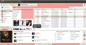
Mockup 1(actual status)
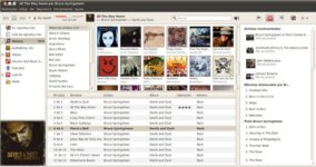
Mockup 2(my proposal redesign)
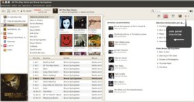
Mockup 3(context pane maxmimized)
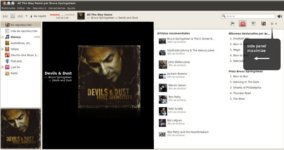
Mockup 4(context pane wiht actual play window)
Comments
* I love your mockup, it really saves space! Unfortunately, Banshee design doesn't depend on Canonical. If I would be you, I'd file a bug against Banshee itself in their own bug tracker (http://banshee.fm/contribute/file-bugs/), then posted it to their mailing list (see http://banshee.fm/about/contact/). Since Banshee is being integrated into MeeGo, where saving screen space is really important. It's a good idea to remind about it ![]() --Sergey "Shnatsel" Davidoff
--Sergey "Shnatsel" Davidoff
Artwork/Incoming/Maverick/banshee redesign (last edited 2010-09-01 13:29:04 by host-81)


