Matthew Paul Thomas, Canonical Design
Ubuntu contains System Settings on PC (gnome-control-center), based on my original design from 2008, and on phone and tablet. (For a summary of the design process on phone, see my 2013 article on the subject.)
Categories and panels
In line with the goal of a convergence device — not to mention, ordinary learnability and efficiency — these settings, and their categories, should be shared across form factors whenever practical. However, some settings should be present only when relevant hardware or software is, or could be, present; and some should be grouped or named differently depending on their frequency of use.
PC |
Phone/Tablet |
About This Device, including Storage and Developer Mode |
|
Accessibility |
|
— |
|
- |
|
- |
|
- |
Phone, including SIM services |
- |
|
Security & Privacy, including Location |
|
- |
|
- |
|
This index does not yet include all settings panels included on the PC. It does include other things — such as version information — that, for want of better placement, are presented inside the System Settings UI in some situations.
Contents
General layout and behavior
The “System Settings” app should be unremovable, and should be in the Launcher by default.
All interface elements in System Settings should instantly reflect any changes made to the same settings elsewhere. And unless specifically noted, interacting with System Settings should similarly change the underlying settings instantly. Exceptions are made when partial input that wasn’t explicitly discarded would be harmful (for example, SIM PIN) or cause confusing errors (APN, manual VPN), and/or for consistency when the same UI is invoked outside of System Settings (Wi-Fi authentication, or Online Accounts registration). This is usually made clear by presenting those settings inside a dialog, since it has explicit Cancel and Confirm buttons.
Main screen
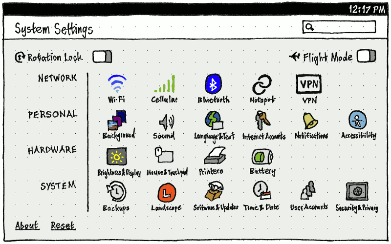
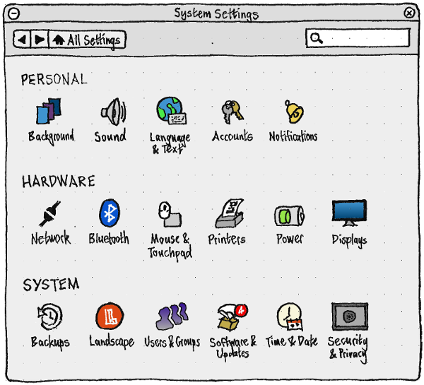
Regardless of screen size or mode, the main screen layout should show a grid of panel names separated by category labels.
|
|
Quick access area
The quick access area is a group of list items at the top of the overview screen. It will be phased out if/when indicators are greatly simplified. In the meantime, it should contain items for:
“Rotation Lock”, if the device has an orientation sensor
“Flight Mode”, if the device does not have a mouse connected (in which case choosing Flight Mode from the network indicator is much easier).
Following those, it may also contain other items, in order:
“Updates available”, if the entire UI is not visible (otherwise it is redundant with the “Updates” category).
All other items in the main screen should act as page stacks, regardless of whether they are list items (like “About This Phone”) or grid items (like “Sound”).
Navigation
The appearance of the navigation controls should depend on the width of the surface:
- If narrower than 100 grid units, it should be only a Back button.
- If 100 grid units or wider, it should take advantage of that space by adding Forward and “All Settings” buttons.
Regardless, the behavior of the Back button should be:
- If you came to the current screen from its parent screen, it should return to that parent screen.
- Otherwise, if you came to the current screen any other way (for example from a “deep link” in a different app), it should navigate to the screen you were most recently on.
- If neither is true, the button should be disabled.
The Forward button should return to the most recent screen, if any, that you came Back from and have not since gone Forward to. Whenever there is no such screen, the button should be disabled.
At every level of System Settings, all page stack items — whether standard list items, or the grid items on the main screen — should have the same feedback for maximum responsiveness (bug 1488005):
- If you navigate directly by choosing an item, that item should highlight until the screen is loaded or two seconds have elapsed, whichever is greater.
- If the screen has not loaded within two seconds, a placeholder screen should appear with an empty header and an optically centered spinner.
- If the actual screen still has not loaded after another two seconds, following standard toolkit behavior, the spinner should actually appear.
If you externally access a System Settings panel — for example, from an indicator menu, or from an app’s permissions failure UI — any dialog that is currently open in System Settings should be cancelled so that it can navigate to the correct screen (bug 1514679).
Search
The appearance of the search function should depend on the width of the surface:
If narrower than 100 grid units, it should be a button in the header, which enters search mode.
- If 100 grid units or wider, it should take advantage of that space by having a non-modal search field always present.
Either way, whenever the search field is not empty, the rest of the System Settings main screen should consist only of those items matching the contents of the field. For example, if the search field contains “wallpa”, only the “Backgrounds” panel should remain. The search field should empty itself if you had switched to other apps for at least five minutes (because you have likely forgotten that you searched for anything).
Any word in the search string that is followed by a space or punctuation should be treated as a a complete word, while any word that is not should be treated as if it might be either a complete word or the beginning of a word (bug 1446086). (This is the behavior devised for Ubuntu Software Center.)
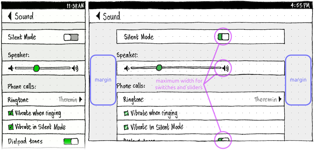
Handling unadapted views on large screens

Many System Settings views were originally designed for phones, with list items that are hard to scan when stretched out to a tablet display.
To mitigate this, whenever a view has not been specifically adapted for wide displays:
- There should be a margin on the left and right of the entire view.
- Therefore, standalone labels (such as “Speaker:” and “Phone calls:” in this example) should not have their usual extra margin to align with text inside the list. Instead they should align with the edge of the view contents.
- Any switch+label or slider+icons, even when they are in a list, should have a total width that is consistent but less than the usual width of a list item.
“Reset Phone”
|
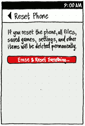
The “Reset Phone” screen should begin with the text: “If you reset the phone, all files, saved games, settings, and other items will be deleted permanently.”
If you use any phone locking scheme, choosing “Erase & Reset Everything…” should first prompt you to unlock (bug 1388942).
Regardless, it should then display a confirmation alert (so that someone can’t confirm the reset and then leave the phone on the passcode/password prompt waiting for you to return, not realizing what the prompt is for). The alert should have text “Are you sure you want to reset your phone?”, and “Cancel” and red “Reset” buttons.
After the reset, you should be returned to the phone welcome screen.


