Impression
Contents |
| Slideshow ^ |< << Slide 12 of 55 >> >| |

Impression
Impression-ism was a 19th-century art movement that began as a loose association of Paris-based artists exhibiting their art publicly in the 1860s. The name of the movement is derived from the title of a Claude Monet work, Impression, Sunrise (Impression, soleil levant), which provoked the critic Louis Leroy to coin the term in a satiric review published in Le Charivari. Characteristics of Impressionist painting include visible brush strokes, open composition, emphasis on light in its changing qualities (often accentuating the effects of the passage of time), ordinary subject matter, the inclusion of movement as a crucial element of human perception and experience, and unusual visual angles.
Design
|
Desktop Menus: Zoom |
Enhance the user computing experience by applying balance and harmony to the Gnome Desktop framing applications in such a manner as to permit the eye to focus without distraction on the content displayed. The desire is an optimal result from an optimal process.
Kyūdō Approach
Kyūdō is the Japanese art of archery. From it we derive the thought that an optimal result follows from an optimal process.
The current goal of Project Kyūdō is to create an optimal theme for the Ubuntu GNU/Linux distribution. In the long run, the theme should be the central piece in an effort to achieve an optimal presentation.
Due to this being a community effort, we don't have the decision power to put things into place. We will offer an alternative and intend to convince by delivering high quality work resulting from a traceable process.
Impression - Kyūdō Briefing
Top Level
- Enhance the user computing experience by applying balance and harmony to the Gnome Desktop framing applications in such a manner as to permit the eye to focus without distraction on the content displayed. The desire is an optimal result from an optimal process.
Target Audience
- Ubuntu is used by a broad spectrum of individuals, this solution is targeted toward those who spend a significant amount of their professional or personal day at their computer.
Assumptions
Some level of customization may be required
Although the desire is to craft a very usable solution it is assumed some will need to change the result to better suite theirs needs. Reasons include but are not limited to:- Personalization to achieve user satisfaction and enhance usability
- Satisfy physical differences in vision and/or color perception
- Compensate for environmental differences and viewing conditions
- Accommodate hardware differences
The Pareto Principle
Known as the 80-20 rule, the law of the vital few and the principle of factor sparsity states that, for many events, roughly 80% of the effects come from 20% of the causes. It is assumed at any given moment the desire of the user will be to focused on an area of the screen which is less than the total amount of available.
Asthenopia and Poor Design
Many computer users experience Asthenopia or visual stress due to:- an increase in the number and complexity of necessary eye movements and focusing skills
- poor lighting conditions, glare and distracting reflections
- screen flicker rate
extended amount of computer use
Performance Is Built-in
It is assumed using a robust theme engine like Murrine will provide acceptable performance metrics.
Transparency to Applications
- To be transparent, your eyes should not be drawn to the window frame or the supporting control widgets. Control widgets should be available in a manner which enhances usability and are easily identified as needed.
Issues
Murrine engine svn132 + - GtkProgressbar trough is not theme-able
Desktop Preview
|
|
Jaunty Boat Desktop: Zoom |
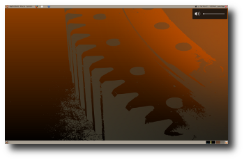
Jaunty Gear Desktop: Zoom |
|
|
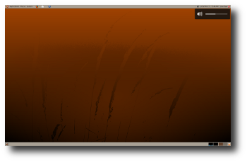
Jaunty Grass Desktop: Zoom |
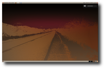
Jaunty Highway Desktop: Zoom |
|
|
Jaunty Tumbleweed Desktop: Zoom |
![]() Click Zoom to view and/or download wallpaper.
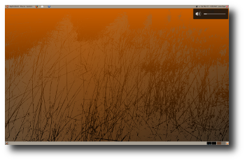
Click Zoom to view and/or download wallpaper.
Application Preview
|
|
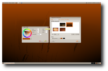
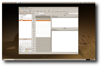
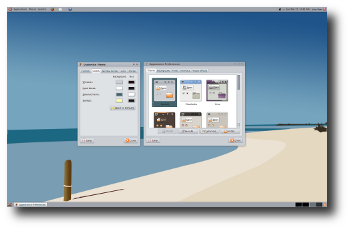
Appearance Preferences: Zoom |
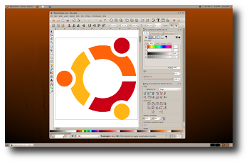
Inkscape: Zoom |
|
|
The Widget Factory: Zoom |
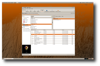
Rhythmbox: Zoom |
|
|
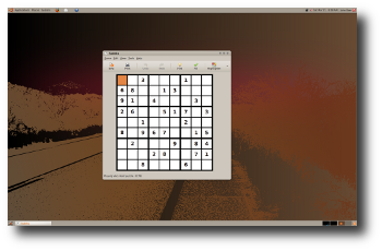
Sudoku: Zoom |
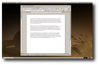
Open Office: Zoom |
|
|
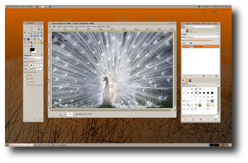
Gimp: Zoom |
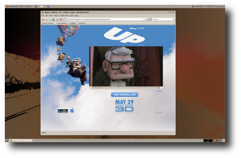
Firefox Totem: Zoom |
|
|
Evolution: Zoom |
Customized colors: Zoom |
Installation From tar Archive
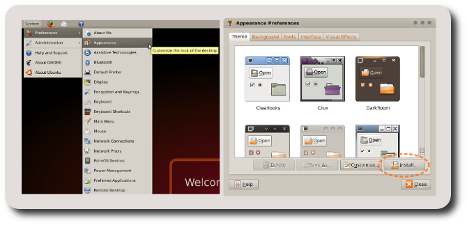
One method to install a new Gnome theme is to open the "Appearance Preferences" dialogue under System>Preferences menu and click the <Install> button. Gnome will prompt you to select a theme which in this case is Impression.tar.gz. Once installed, select the Impression theme icon from the list of available themes.
Other Pages
Download
Theme: Impression tar
Supports Murrine svn090, depends on svn132
Murrine SVN Engine
Currently svn090
Comments
It would be nice if you would use the Murrine engine.
Exsecrabilus, Exsecrabilus@Gmail.com
Done! ![]()
.develops its theme successfully but is still very inconsistent. you have to unify the color of the selection (gray or orange?). Remove metacity border would also be quite good;)<daniel planas(marmol themes and alegre themes creator)
. i created a alternative metacity for impresion. I think it's more neutral and modern(dust port)daniel's metacity
This theme passes the test: I have been running it on my computer for over a day now and I Am Not Going Back. I like the default colour scheme. It fits awesomely with the brownish Ubuntu look. I like how you aren't trying to look Macy or Windowsy; this fits very smoothly in its own style. I also really appreciate that Impression isn't achieving this magic via slow pixmaps and whatnot, and how there don't seem to be any compatibility issues (even with the worst offender, Evolution). I like how you have managed to fit in window borders, but have done them in a way that is practically invisible yet still carrying the usability goodies. The theme feels quite nice with them.
One thing. The scroll bar buttons! They look kind of shrunken, since everything else in the theme is fairly big. They aren't easy to click like that, either. I wouldn't want the actual scroll bar to be bigger, but are the buttons able to ignore that little margin inside the trough and span as wide as possible from edge to edge? Maybe being taller would help, too.
Also, the orange text can be a bit strange. What is the motivation behind it? I notice that labels for checkboxes turn from black to orange when the boxes are unchecked, then back to black when checked. Feels kind of funny in some cases.
-- dylanmccall 2009-03-18 08:48:57
Thanks!
This release of Impression supports the svn090 version of the Murrine engine which is available from launchpad.
The Tale of Jaunty Jackalope
Many folks ask what is the difference between a Jackalope and a common hare. Although distantly related to the "jack rabbit" their ability to move quickly from a complete stop gives the illusion of vanishing. Known to be very shy, the male Jackalope sports distinguishing antlers which are only viewable by the light of a full moon or the light of early dawn. Energized by the heavenly glimmer which dusts the grassy plains he moves like the wind among the tumble weed and straw. Those who have witnessed this rare event report it is truly magic.
![]()
Your comments here.
