Alternate_Themeandpanel
Contents |
Themes for Karmic
Themes for Karmic...
changes like different..
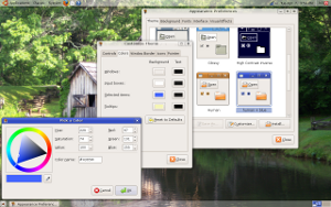
panel color, Windows, selected items,
Windows borders, icons, controls
Submissions for the default Theme for karmic
David's Themes
Comments
Dae99's Themes
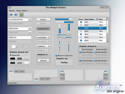
Using Aurora Engine
The big avantage is the posibility to colour it.
Using Murrine Engine
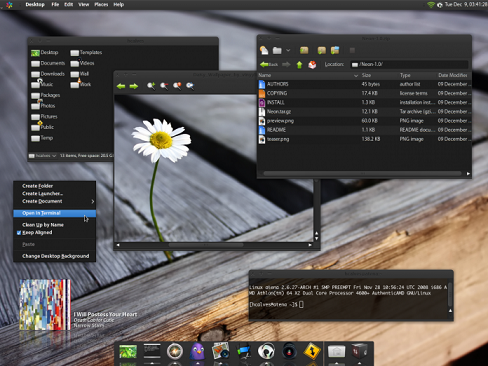
Neon Theme
http://www.cimitan.com/murrine/node/173 credit: http://hcalves.deviantart.com/
Icons
Elementary icon Set 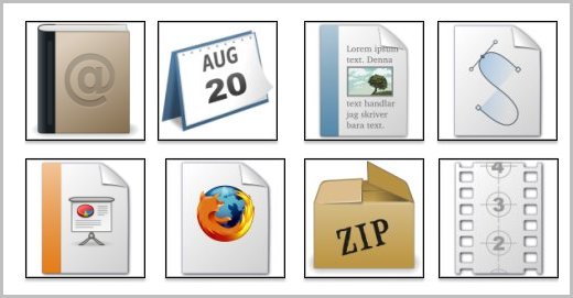
http://www.gnome-look.org/content/show.php/Elementary+Icons?content=73439
Comments
(using package2.0.5.4) There is an "e" to the left of applications, maybe your could change this to an ubuntu logo, or nothing. Everything else looks very sharp and clean. The icons that look "off" to me are; Desktop, one bar on top looks funny since the Ubuntu default is two, it is also really small in the bottom toolbar; Computer, it just looks like a monitor to me... I don't really have any suggestion for anything better though, sorry; I see what you were going for with the network icon and the home folder icon looking similar, but the network icon just doesn't look as sleek as the other ones you've made; The icon for lowering the volume is a "cancel" symbol, why not a negative sign to match the plus for increasing volume?; My biggest gripe is with the appearances icon, as a visual learner this one just did not click with me. There are too many icons that I really like to list, keep up the good work. -- adam-w-knox 2009-06-02 20:12:50
Knoxy's Proposal
Though it may be a bit cumbersome, or feel a bit clunky. I think we should provide the user with theme options upon their first boot. I think having a default is still a stellar idea, but I feel as though this is a customization that users don't know they can take advantage of. I think having the theme dialogue box pop up and offer them a selection of themes, along with an "Ask me next time" button, is a great way to help a user make their experience feel unique. This could also include a progression type menu that let's them select a background.
Light Themes: Sun, Sky, Earth Dark Themes: Ocean, Cave These themes are saved in Adobes Kuler program if you want to edit them. -- adam-w-knox 2009-05-29 20:32:12
So without further ado;
Sun
Sun Comments
Sky
Sky Comments
Ocean
Ocean Comments
Earth
Earth Comments
Cave
Cave Comments
Proposal Comments
"I think having the theme dialogue box pop up and offer them a selection of themes, along with an "Ask me next time" button, is a great way to help a user make their experience feel unique." I think that's a wonderful idea. Variety is the spice of life and choice is what Linux is all about.
 Have you submitted this idea to Brainstorm as well? --blueyonder64 2025-04-17 14:40:43
 Thanks for the tip! Apparently someone out there thought it was a great idea already. Please vote on it over at brainstorm: http://brainstorm.ubuntu.com/idea/14963/
Artwork/Incoming/Karmic/Alternate_Themeandpanel (last edited 2009-09-15 05:02:24 by 210)
