Redux
Human Redux
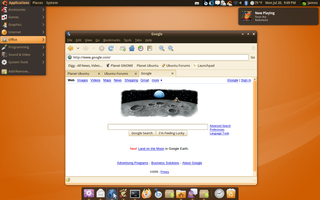
A modern refresh to the Human look utilizing the best aspects of various engines. This truly creates an original asthetically pleasing desktop theme. The theme is dark, but just dark enough to contrast with the bg_color adding subtle hints of orange/peach(salmon). This stays true to the Ubuntu look using some of the past favorite colors with a new twist. Clean and something you have not seen before.
Concept
I have been theming for quite some time and have come to the conclusing that for us (Ubuntu) to do something different we must 1) develope an entirely new engine or 2) Use the best of what is currently available engine-wise. I chose the latter because of the time and effort required to code a new engine (why reinvent the wheel). This theme requires heavily on the murrine engine as it by far the most polished. Although, murrine is quite polished there a few aspects it can not accomplish. I am using the pixmap-engine for a truly unique dimensional scrollbar look with a themeable through design (a light peach colored gradient) with custom steppers. Downfall is the scrollbar color, prelight, steppers, and through are always the same color. Nodoka removed due to difficuly of installation of bleeding edge elements for new users.
Desktop
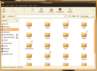
Nautilus
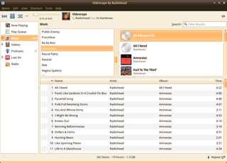
Banshee
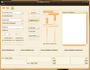
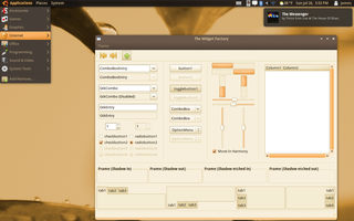
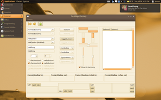
The Widget Factory
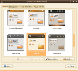
GNOME Appearance Preferences
Redux 07262009
Clean
Inspirations
This theme has been largely inspired by the Dust Theme, which I had the pleasure to have my recent murrine chages comitted to trunk. There are elements of DarkRoom utilizing the dark brown of the theme. The Human inspirations are the obvious subtle hints of orange/peach (salmon). The toolbar uses gradients for a dimensional feel. The button prelight uses a light orange (salmon) gradient to integrate nicely with the theme. Imagine this as a rebirth of Kin, Kith, Didymous, Human, Dust, and DarkRoom all together in one theme. I will make a dark toolbar version as well not requiring many changes to the gtkrc.
Metacity
The metacity is a complete refresh from my original Hanso metacity. There is a subtle peach/orange gradient add to the bottom_edge of the metacity which adds a bit of flair. All four corners are rounded and the titlebar has a dark gradient.
Issues / Call for Feedback
The panel is not complete as I am waiting for response from the community. Macrvr recommened a transparent panel, which I have yet to design a feasible one. The issue is one that appeared in the Human theme in the last cycle or two when trying to customize the theme. This may not be an issue as there are only so many colors that will blend with the metacity / scrollbars. I am using murrine's engine default to draw the panel, but suggestions are welcomed.
Reference
Source : Launchpad
This theme utilizes the latest murrine engine 0.90.3 and pixbuf engine.
Background by parityb : Karmic Eucalyptus
Icon Set Humanity
Download
0703009
- Initial upload
gnome-themes-ubuntu_0.4 Debian package (Testing Hanso, New Dust, Karmic Impression, and Redux)
07142009
* Smaller gtk-icon-size;
* Remove toolbar gradient (flat);
* Add support for new gdm-user-switch applet in Karmic
* Match menu_item prelight and menu (now same color) via panel;
* tweak murrine options menu_item;
* Lighter menu; lightened color and contrast on progressbar;
* lightened scale; switched scale to nodoka for nice through details;
* lightened menu_item to compliment menu;
* clean code
07192009
* New Metacity based on Shiki-Color with added Wasp buttons
* Testing dark text on menu_item fg[PRELIGHT]
* Lowered button bg[PRELIGHT] for more color
* Add Humanity icon set to index
* Add active pixmap sliders to scrollbars/gtkrc
* Synced color definitions, contrast, and buttons with Humanity gtkrc for consistency
* Add new panel_bg
Comments
- The theme is pretty good. I think this will fit well with the Ubuntu brown/orange/human theme. There's just one thing that can be changed in my opinion. I still don't think dark brown makes it that aesthetically pleasing. Well, honestly you've found a very good shade of brown, that actually looks good, but still, brown is brown, and I don't think a lot of users will like that. Have you tried a bit darker shade of Orange for the window decorations? I don't know how well it will work, but the New Wave's grey might work with this too. I don't know, it may not, but just a suggestion. Hope this helps. - xubean
Thanks for the feedback. Can you test this Redux Mod(Light Metacity) and let me know if this works better for you? I'd like to retain some brown, but not to where it becomes an overwhelming palette to the theme. -- dashua 2025-06-14 05:04:05
I think you've gone a bit too far in the opposite direction with the light mod. I'm personally just as put out with orange as some are with brown. I like brown well enough, maybe just need to tone it down a bit more (possibly a brown gradient rather than a flat, dark brown?). There's got to be a happy medium somewhere without completely changling the look and feel of the theme altogether. Just another suggestion. blueyonder64
Please see attached screenshot and advise if that is closer to your suggestion. Attach screenshots or mockups of what color palette you think would work better. Regards -- dashua 2025-06-14 05:04:05
That appears much, much warmer, IMO. I am not much of an artist (but a pretty decent opinionist), but I will see if I can generate a palette out of Agave or something of what I think would work, although I think you are much, much closer now and would be even better if there were a slight gradient fade (if that's a proper term) toward the bottom of the title bar. Thanks very much for your attention and your hard work, it's greatly appreciated. blueyonder64 2025-06-14 05:04:05
Artwork/Incoming/Karmic/Redux (last edited 2009-07-27 11:24:48 by pool-141-150-201-174)
