SatinRibbon
|
Size: 808
Comment:
|
Size: 5879
Comment: converted to 1.6 markup
|
| Deletions are marked like this. | Additions are marked like this. |
| Line 1: | Line 1: |
| ||<tablestyle="float:right; font-size: 0.9em; width:30%; background:#F1F1ED; background-image: url('http://librarian.launchpad.net/2980250/Emblem-16.png'); background-repeat: no-repeat; background-position: 98% 0.5ex; margin: 0 0 1em 1em; padding: 0.5em;">'''Contents'''[[BR]][[TableOfContents]]|| [[Navigation(slides)]] [[Navigation(siblings,1)]] |
||<tablestyle="float:right; font-size: 0.9em; width:30%; background:#F1F1ED; background-image: url('http://librarian.launchpad.net/2980250/Emblem-16.png'); background-repeat: no-repeat; background-position: 98% 0.5ex; margin: 0 0 1em 1em; padding: 0.5em;">'''Contents'''<<BR>><<TableOfContents>>|| <<Navigation(slides)>> <<Navigation(siblings,1)>> |
| Line 8: | Line 8: |
| In general, I prefer minimalism and subtlety. I wanted to think past the contemporary use of glass controls and translucent windows and imagine what would come next after the appearance of OSX had grown as old as System 7.x and Vista users admitted that invisible windows are counter-productive. | |
| Line 9: | Line 10: |
| The concept provides a nearly flat window interior, bordered on top and bottom by bars with a subtle gradient creating a satiny sheen and a sense of depth. Indeed, the title and bottom bars are like the rolls of a scroll, separated to reveal the flat paper between. The title and bottom bars should appear as two satin ribbons that are slightly closer to the view in the center. | |
| Line 10: | Line 12: |
| [[Anchor(ConceptArt)]] | The menu bar is shadowed by the title bar overhead. The idea is not to suggest that the title bar is rounded in any way but to reinforce the flatness of the interior and the dimensional aspect of the title bar. In keeping with the slight depth cue the title bar provides, the selected menu header and attached menu appear above the plane of the window interior, at the same perceived plane of title bar. Thus, the selected menu header is not shadowed by the title bar. The selected menu header and menu appear as one continuous object with a slight sheen propagating towards the lower right-hand corner, as a wide satin ribbon would appear when viewed flat. To create a softer appearance, borders between elements are formed with drop shadows or brown lines only a few shades darker than the surroundings. To enhance the legibility of the title bar text and window controls without harshness, a darker brown outer glow is used instead of outlines. <<Anchor(ConceptArt)>> |
| Line 12: | Line 18: |
| ||<tablestyle="text-align:center">attachment:u-theme-satin-1t.png|| ||[attachment:u-theme-satin-1.png Fullsize] Image by Lassegul|| |
||<tablestyle="text-align:center">{{attachment:u-theme-satin-1t.png}}|| ||[[attachment:u-theme-satin-1.png|Fullsize]] Image by aremes|| == Icons == Icons to match the Satin Ribbon Theme <<Anchor(ConceptArt)>> ||<tablestyle="text-align:center">{{attachment:u-icon-satin-folder.png}}||{{attachment:u-icon-satin-computer.png}}||In Progress|| ||Folder||Computer||Trash|| Icons by srattan == Implementation == I've not created "themes" since the days of Kaleidoscope 1.01 on Mac System 7.5 - amazingly, still on the web at http://www.kaleidoscope.net/cgi-bin/schemes.cgi?author=ryansmith. (In fact, while flirting with Mandrake and KDE long ago, I discovered my "Khaki" theme, with widgets from my "Althea" series themes, had been ported - no credit was given, though). I'm still figuring out the architecture of how windows are displayed in linux. The available options for display managers, window theme engines and gtk themes offer great control but also a lot of confusion for newcomers. From what I've learned so far, it seems that this concept could be realized with Emerald. Can it be done with Metacity? |
| Line 17: | Line 38: |
| Line 19: | Line 42: |
| [wiki:Self:/?action=AttachFile Attach File] | == GTK2 Theme == THIS IS PRELIMINARY WORK. It doesn't look that good, yet. (Oh, and I'm still waiting for widget concepts. :D -kido) |
| Line 21: | Line 45: |
| [[Include(Artwork/Incoming/SubmissionGuidelines/Guidelines)]] | Known limitations: * Can't do statusbar like in mockup. Applications handle them differently, and I can't get the background image to stretch anyway. * Drop shadows will have to be composited, i.e. out of the scope of the theme. To make the menus still look correct with shadows on, try moving the shadow's top component down. (e.g. for xcompmgr, try "xcompmgr -cft 0") Update! 0.3 (yes, we have versions now!) is Clearlooks-based. Changes include fixes for the panel, and a much much better metacity theme (I think). Download here: [[attachment:Satin Ribbon_0_3.tar.gz]] 0.2 is Murrine-based. Tell us if you like this one more than the new one. Note that both archives extract to the same folder, so unzipping both in the themes folder directly will overwrite one of them. Try it here: [[attachment:Satin_Ribbon.tar.gz]] == Progress == Thank you, kido, for starting work on a GTK theme! I installed it and took a screenshot: ||<tablestyle="text-align:center">{{attachment:SatinRibbonGTK01t.png}}|| ||[[attachment:SatinRibbonGTK01.png|Fullsize]] Image by aremes|| Maybe I should work on some concepts for buttons, check boxes, progress bars, etc. -aremes [[/?action=AttachFile|Attach File]] <<Include(Artwork/Incoming/SubmissionGuidelines/Guidelines)>> |
| Line 25: | Line 68: |
I like it -- Jm55 <<DateTime(2007-11-28T01:18:15Z)>>Jm I like it too! -Linducker Really stands out! -maumac This is awesome. If you can make it just a tad less 'golden/metallic' it would be perfect. Come to think of it, it is already pretty close to perfect, are you going to be makin a GTK+ theme anytime soon? - PrashantVaibhav I really like this. It is strikingly different without being overly complex. Best of all it is not just trying to copy Windows or Apple, it is forging new ground. Please keep working on this concept! -Lee Sharp Very good gtk theme mockup! Make more contrast between the active menuitem and menu. I don't care if it's looks like metallic bronze, it's nice. - kikke Great! I already use it on a day-2-day basis. See it with a matching wallpaper here: {{http://frontiernet.net/~robkam/WoodUbuntu.png}} -Truefire I really like the original concept art. But I'm not very fond of the GTK implementation. The original is similar to what I had in mind when I posted "Garyu's idea" linked above. -- Garyu <<DateTime(2008-04-16T00:00:56Z)>> |
|
| Line 27: | Line 90: |
| [[AttachList]] | <<AttachList>> |
Contents |
| Slideshow ^ |< << Slide 46 of 81 >> >| |
Satin Ribbon
Concept
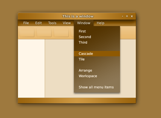
In general, I prefer minimalism and subtlety. I wanted to think past the contemporary use of glass controls and translucent windows and imagine what would come next after the appearance of OSX had grown as old as System 7.x and Vista users admitted that invisible windows are counter-productive.
The concept provides a nearly flat window interior, bordered on top and bottom by bars with a subtle gradient creating a satiny sheen and a sense of depth. Indeed, the title and bottom bars are like the rolls of a scroll, separated to reveal the flat paper between. The title and bottom bars should appear as two satin ribbons that are slightly closer to the view in the center.
The menu bar is shadowed by the title bar overhead. The idea is not to suggest that the title bar is rounded in any way but to reinforce the flatness of the interior and the dimensional aspect of the title bar. In keeping with the slight depth cue the title bar provides, the selected menu header and attached menu appear above the plane of the window interior, at the same perceived plane of title bar. Thus, the selected menu header is not shadowed by the title bar. The selected menu header and menu appear as one continuous object with a slight sheen propagating towards the lower right-hand corner, as a wide satin ribbon would appear when viewed flat.
To create a softer appearance, borders between elements are formed with drop shadows or brown lines only a few shades darker than the surroundings. To enhance the legibility of the title bar text and window controls without harshness, a darker brown outer glow is used instead of outlines.
Concept Art
|
Fullsize Image by aremes |
Icons
Icons to match the Satin Ribbon Theme
|
|
In Progress |
Folder |
Computer |
Trash |
Icons by srattan
Implementation
I've not created "themes" since the days of Kaleidoscope 1.01 on Mac System 7.5 - amazingly, still on the web at http://www.kaleidoscope.net/cgi-bin/schemes.cgi?author=ryansmith. (In fact, while flirting with Mandrake and KDE long ago, I discovered my "Khaki" theme, with widgets from my "Althea" series themes, had been ported - no credit was given, though).
I'm still figuring out the architecture of how windows are displayed in linux. The available options for display managers, window theme engines and gtk themes offer great control but also a lot of confusion for newcomers. From what I've learned so far, it seems that this concept could be realized with Emerald. Can it be done with Metacity?
Reference
Contributions
GTK2 Theme
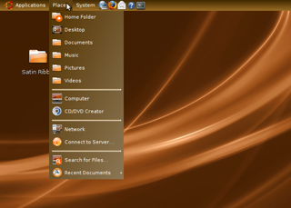
THIS IS PRELIMINARY WORK. It doesn't look that good, yet. (Oh, and I'm still waiting for widget concepts. ![]() -kido)
-kido)
Known limitations:
- Can't do statusbar like in mockup. Applications handle them differently, and I can't get the background image to stretch anyway.
- Drop shadows will have to be composited, i.e. out of the scope of the theme. To make the menus still look correct with shadows on, try moving the shadow's top component down. (e.g. for xcompmgr, try "xcompmgr -cft 0")
Update! 0.3 (yes, we have versions now!) is Clearlooks-based. Changes include fixes for the panel, and a much much better metacity theme (I think). Download here: Satin Ribbon_0_3.tar.gz
0.2 is Murrine-based. Tell us if you like this one more than the new one. Note that both archives extract to the same folder, so unzipping both in the themes folder directly will overwrite one of them. Try it here: Satin_Ribbon.tar.gz
Progress
Thank you, kido, for starting work on a GTK theme! I installed it and took a screenshot:
|
Fullsize Image by aremes |
Maybe I should work on some concepts for buttons, check boxes, progress bars, etc. -aremes
Guidelines
- For images, use a low resolution picture in the wiki page. It should be no taller than 240 pixels. If you need to upload higher resolutions, please upload them as an attachment and link to them from the page.
There are two tools located at Artwork/Documentation/Software/Wiki_Scripts to help you with this
Use attachment:thumbnail.png and [attachment:file.png linkname]
Use @SIG@ to leave your signature at the end of your comment. New comments should be placed at the bottom of the feedback.
Comments
I like it -- Jm55 2007-11-28 01:18:15Jm
I like it too! -Linducker
Really stands out! -maumac
This is awesome. If you can make it just a tad less 'golden/metallic' it would be perfect. Come to think of it, it is already pretty close to perfect, are you going to be makin a GTK+ theme anytime soon? - PrashantVaibhav
I really like this. It is strikingly different without being overly complex. Best of all it is not just trying to copy Windows or Apple, it is forging new ground. Please keep working on this concept! -Lee Sharp
Very good gtk theme mockup! Make more contrast between the active menuitem and menu. I don't care if it's looks like metallic bronze, it's nice. - kikke
Great! I already use it on a day-2-day basis. See it with a matching wallpaper here:  -Truefire
I really like the original concept art. But I'm not very fond of the GTK implementation. The original is similar to what I had in mind when I posted "Garyu's idea" linked above. -- Garyu 2008-04-16 00:00:56
Attachment List
Artwork/Incoming/Hardy/Alternate/SatinRibbon (last edited 2008-08-06 17:00:08 by localhost)

