Ubuntu_8.10_Guideline_Proposal_(Keyhole)
| Slideshow ^ |< << Slide 66 of 79 >> >| |
Ubuntu 8.10 Guideline Proposal: "Keyhole"
The "Keyhole" guideline proposal gets its name from one of its main design elements. The basic concept is to achieve a new look by keeping the parts of the Human theme that were effective, and build on those. A whole new look should achieved by focusing on dozens of small design refinements to totally remake the whole.
Proposed Guidelines
I. Regardless if the theme is light or dark, it should do the following:
- Window borders should blend into the body of the window panel itself
- Taskbar (upper panel) and window panel design should be consistent
- Use gradient look as opposed to glassy look for widgets
- Nautilus should use gradient coloring in the top part of the panel, from dark (bottom) to light (top). The side panel should be one plain color.
- The type of brown used to shade the panel is up for grabs, but I suggest an ashy gray-brown.
- Active windows should be non-transparent and fully lit. Inactive windows should appear to be in shadow (if possible) and appear more transparent (the whole window should be semi-transparent, not just the window border)
- Window title font should not use drop shadows, they obscure some internationalized text.
- In complex international text renderings, such as Chinese, bold fonts can also make some characters hard to read. Non-bold window titles may be superior in that regard. This may change if Droid font is used.
- Button widgets should have gradient effects like the window panes -- from dark (bottom) to light (top)
- Gradients should suggest a consistent light source, making windows look three dimensional and solid. Button widgets for some functions could use them.
- Progress bars should also use a matt/non-glassy look. But gradient flow should be light at the top AND bottom, and darker in the middle.
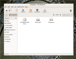
"Keyhole" navigation buttons -- the theme should incorporate some variation of a "keyhole" design for the backward/forward buttons in nautilus. This is a IU innovation from Firefox, and an example of what a keyhole design looks like can be seen via the following link: http://blog.mozilla.com/faaborg/2007/11/15/the-shape-of-things-to-come/
Sample of How a "Keyhole" Might Appear |
|
View Large :: Image by Brian Fleeger |
II. Suggested Color use (light theme):
- Use the basic color of the current (Hardy Heron) theme as a starting point.
- Suggest an ashy-brown for the gradients.
III. Suggested Color use (dark theme)
- Use Ubuntu Studio’s dark gray as a starting point. Focus on gradients of dark grays as opposed to the turbid colors used in Intrepid Alpha1.
- Window and fill-in fields should be white or light gray, as in Ubuntu Studio.
The Intrepid Alpha1 experiment demonstrated that too dark a secondary color makes many web-pages and programs like OpenOffice unattractive and in some cases unusable.
IV. Things to Consider:
- Brown is very risky to use as a primary panel or window color. The theme will probably be accepted by the largest number of people if brown is used only as a highlighting color for window panels.
- The main window panel color should be calming to a user, and be as inoffensive as possible to the largest number of people -- people will be looking at this every day for long periods.
Reference
These guidelines borrow heavily from the New Wave theme development guidelines, with modification. Though there are many differences, the New Wave team's guidelines can clarify many of the points discussed here: https://wiki.ubuntu.com/Artwork/Incoming/Intrepid/NewWave?action=AttachFile&do=get&target=graphical_guidelines.pdf
Contributions
Guidelines
- For images, use a low resolution picture in the wiki page. It should be no taller than 240 pixels. If you need to upload higher resolutions, please upload them as an attachment and link to them from the page.
There are two tools located at Artwork/Documentation/Software/Wiki_Scripts to help you with this
Use attachment:thumbnail.png and [attachment:file.png linkname]
Use @SIG@ to leave your signature at the end of your comment. New comments should be placed at the bottom of the feedback.
Comments
I really like the guidelines proposed here, except a few things:
- I'm not too fond on window transparency except for a few choice places like e.g. the terminal. They give a messy and distracting overall visual impression, and I'd prefere if not even window borders on inactive windows were transparent. On the other hand, a lowering of brightness and contrast that could make the window appear to be in shadow would be very nice. ADDhelper plugin in Compiz kan partly do this, but for some reason can't lower contrast. I think it is important to have windows appear as solid objects, and if there is transparency, it should be only in places where it's kept transparent consistently to suggest matte glass.
- Boldface window titles are a must in my opinion, to clearly distinguish them from the menu bars that are places very close to the window titles. Also, I'd prefer a boldface main menu bar in the upper panel.
- The "Keyhole" is an important part of the Firefox branding and therefore should not be used to brand Ubuntu, as this would confuse branding. A shame since I like it a lot. But Ubuntu should search out its own visual profile, not copy the (good!) one of Firefox.
Lusepuster
Another thing to gonsider is a clearer distinction than the present between content and menu-/toolbars and content. E.g. in Evolution, when the mail list is scrolled, it seems to disappear into nothing, because the colors are almost the same of content and chrome. Maybe a drop shadow or something to make the content seem more physically embedded in the chrome?
Lusepuster
Attachment List
Artwork/Incoming/Intrepid/Ubuntu_8.10_Guideline_Proposal_(Keyhole) (last edited 2008-08-12 11:28:03 by 0307ds4-vbr)
